Color by numbers, number by colors
| Title | Density of Population in Greater Tokyo - Census of 1926 |
| Year | 1928 |
| Dimensions | 49 × 64 cm |
| Location | Leventhal Map & Education Center at the Boston Public Library |
One of the most popular methods for showing quantities is the choropleth map, which uses colored or shaded areas to show the numerical value inside of a unit geography. This population map of Tokyo based on data from the 1926 Tokyo Census depicts population data. The dark purple shows a dense population in the city center, while orange, green, and yellow show districts with progressively less population. A librarian, probably around the time that this map was received in the 1920s or 30s, has translated the Japanese legend into English, noting that blue letters indicate the number of families in each district, while red numbers indicate the total count of population.
Choropleths like these are now one of the most common visual methods for showing statistical counts by area. But though they seem relatively familiar today, choropleth maps only came into common use towards the end of the nineteenth century. Census agencies were amongst the first to put them into use, when national governments, eager to modernize their bureaucracies and gather more information about their populations, began to create data visualizations like this one.
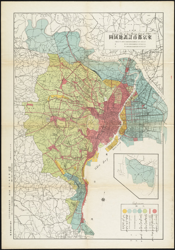
This map is one in a series of seven maps that display information about the city, likely used as part of the rebuilding efforts after The Great Kantō Earthquake in 1923. Several use color, but not all in the same way. For example, this land use map, which is similar to land use maps city planners use today, highlights residential, commercial, and industrial districts. A map showing the limits of the fire that followed the earthquake also uses color, but in this map the colors indicate areas of the city that were devastated by the firestorm that was a result of the earthquake.
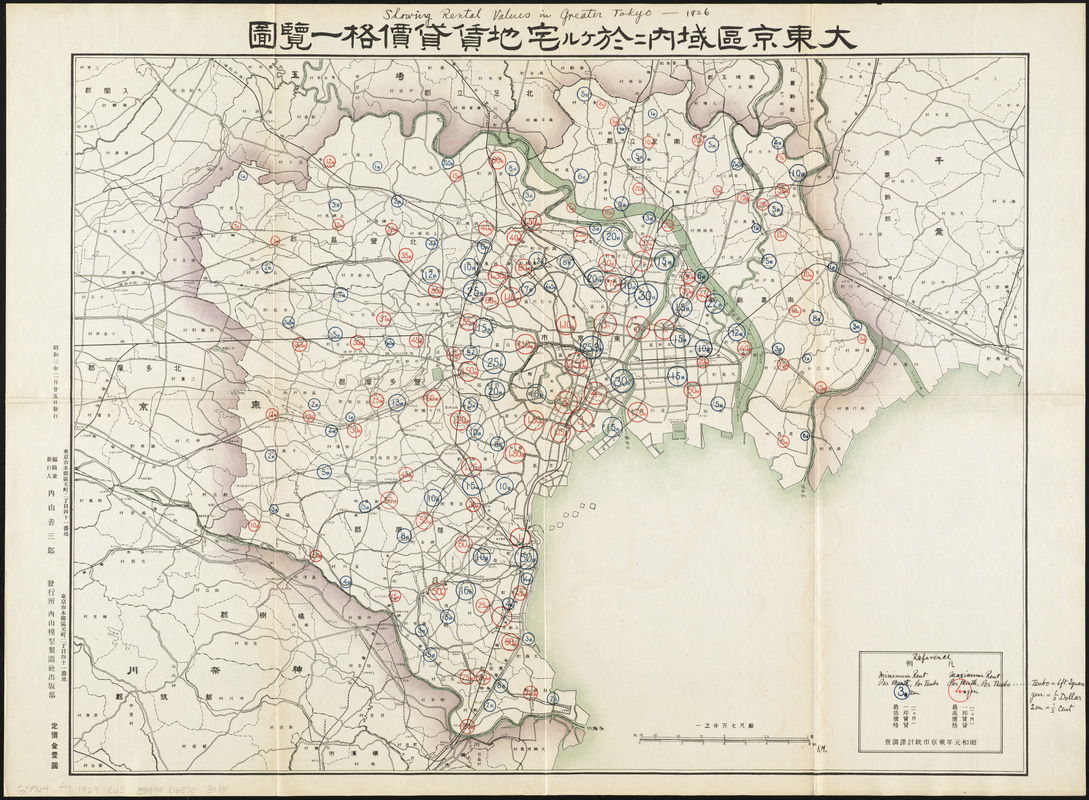
Other maps in this series use different techniques to display data sets. A map on rental data uses circle sizes, numbers, and text color to convey the minimum and maximum rent prices, while a map on reconstruction activities uses line thickness and color to indicate existing and proposed roads.
See the entire collection of maps from this portfolio here.