Electoral Campaigns
Where you vote, and how your vote is counted, is based on where you live. In a representative democracy like the United States, the results of an election are reported out by geography: this candidate performed strongly in such-and-such precinct, another candidate carried so-and-so state. Our representative structure is also based on geography, since elected officials “represent” a community that's based on borders drawn on a map. All of this makes maps powerful—and sometimes dangerous—tools for electoral campaigns.
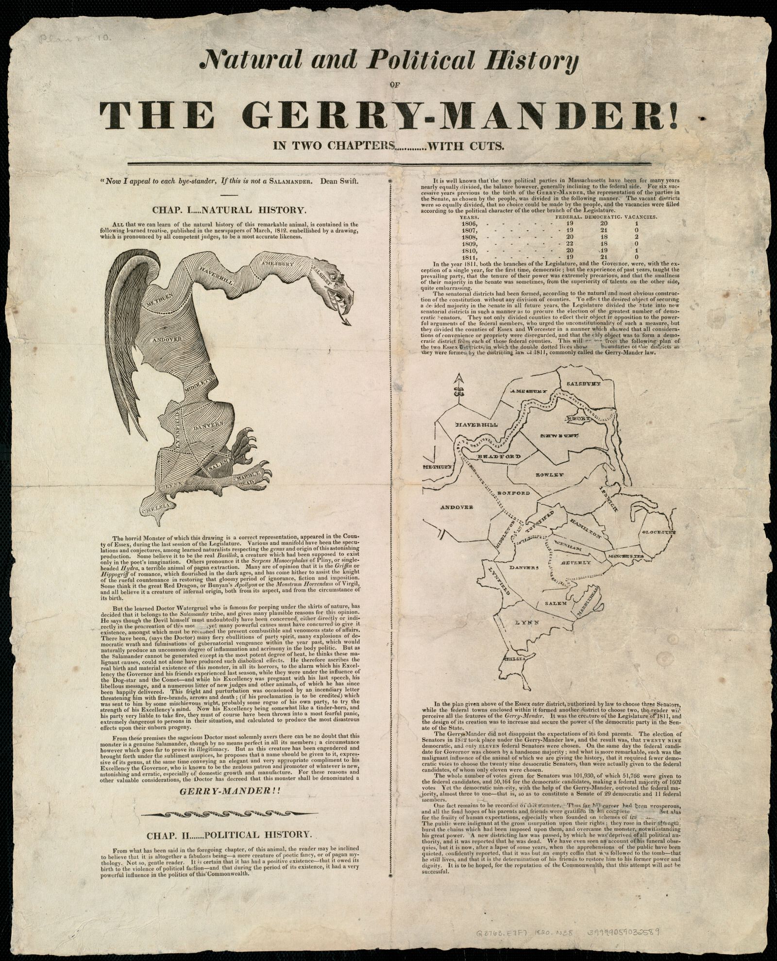
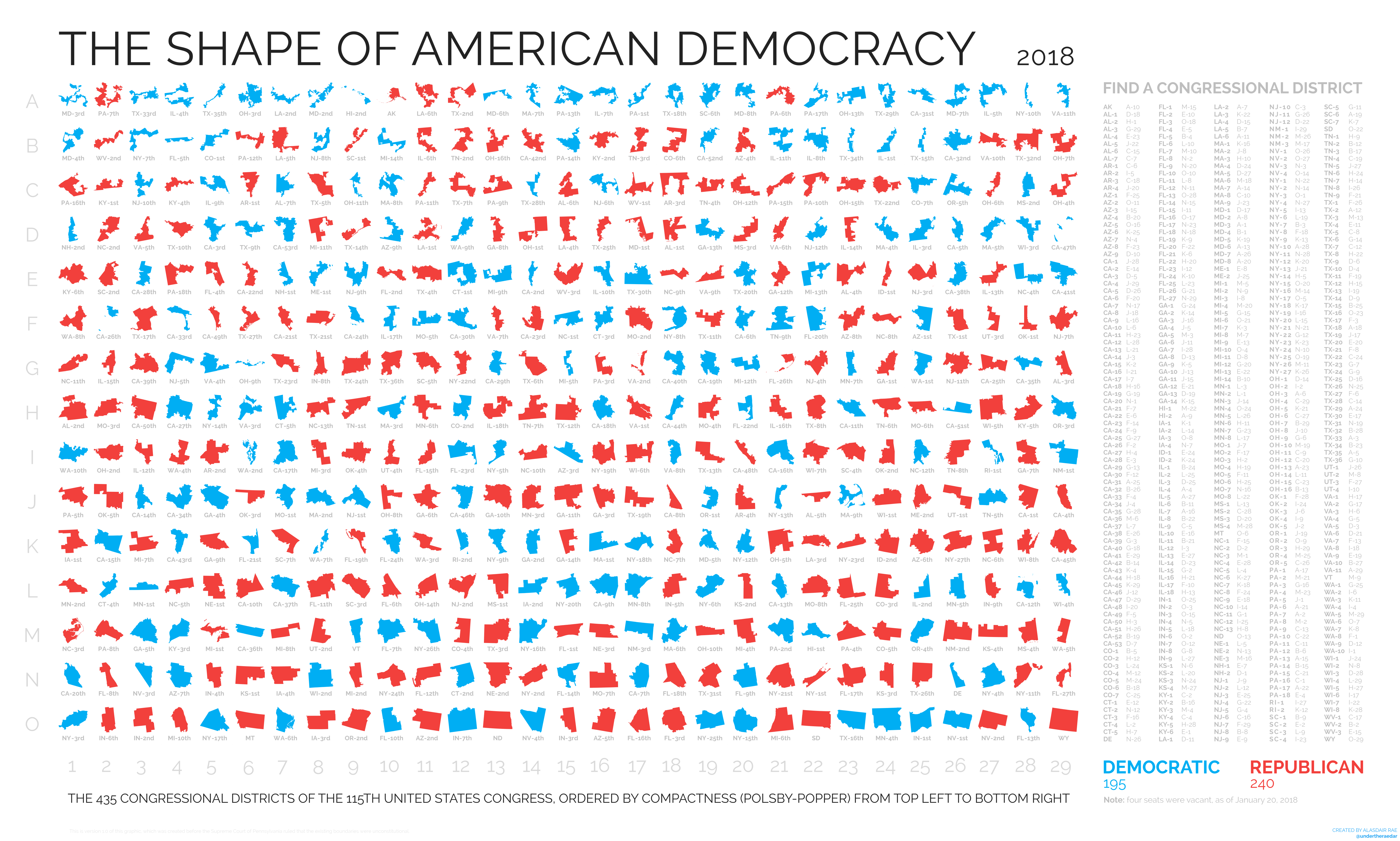
When Governor Elbridge Gerry took the map of Massachusetts in 1812 and redrew a State Senate district around Salem so that it would contain more voters loyal to his Democratic-Republican Party, outraged opponents published a cartoon of the district's outline forming the figure of a salamander. The new term, gerry-mander, stuck, and has been used ever since to describe the practice of drawing electoral maps for unfair partisan advantage. Electoral boundaries continue to be the subject of fierce political battles, and, as a chart of the 435 U.S. House of Representatives districts makes clear, there are still many “salamander”-shaped lines on the map. This chart ranks districts by the Polsby-Popper score, which compares the perimeter of a district's outline to its area, but there are many other ways of measuring a “good” and “bad” electoral map. Try your own hand at creating an electoral map with this interactive district creator created by a research center working on methods to create fairer electoral maps.
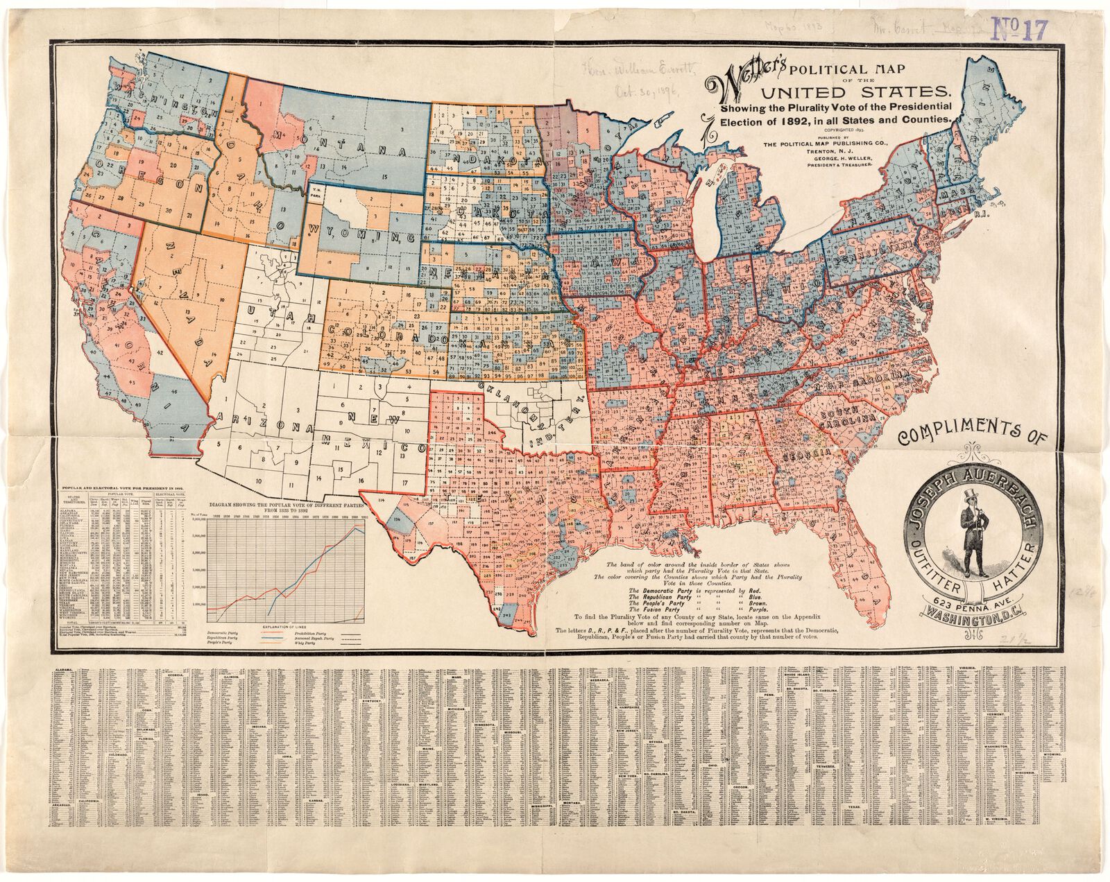
The terms “red states” and “blue states” refer to the familiar colors that have now become ubiquitous on election maps. Those standard symbols, however, are relatively recent: this map of the 1892 election used red for Democrats and blue for Republicans, and even as recently as 2000 different mapmakers would use different colors for the two parties. This map also breaks down results at the county level, suggesting another challenge of electoral mapping: how best to show the results of small, highly-populated areas in comparison to large, thinly-populated ones?
This interactive gallery of maps, created by Kenneth Field for ESRI, shows 32 different ways of visualizing the 2016 election. Each of the maps takes a different approach to visualizing the complicated, layer distribution of Republican and Democratic voters throughout both thickly and thinly populated parts of the country. The different visualization choices lead to different ways of conceptualizing the breakdown of partisan geography in the United States.
In this section
words