Figures of Facts
To understand the cartographic language of data and statistics, we need to pay close attention to the relationship between how quantitative information is measured and how it's portrayed in visual diagrams. Even if the underlying numbers are correct, and even if the mapmaker wasn't deliberately trying to introduce confusion, a map can still easily lead to spurious conclusions or misleading comparisons if the reader doesn't look with a critical eye. Maps can be particularly tricky communicative objects because they oftentimes combine a representation of the real geography of the world and the abstract statistical values of data tables. We know that a line graph or a scatterplot is a constructed symbol that stands in for something else—but when we see data plotted onto the surface of the earth itself, it can seem deceivingly like an absolute truth.
Cartograms
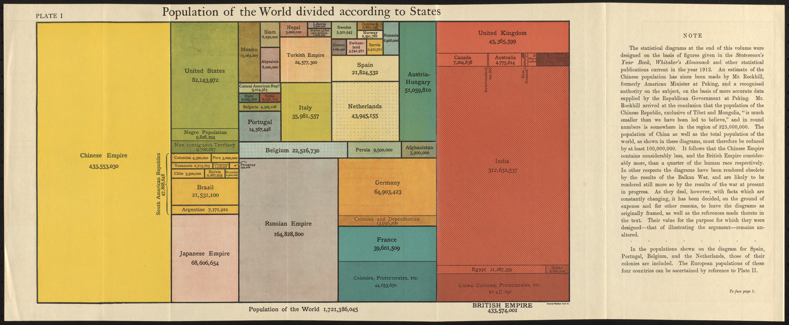
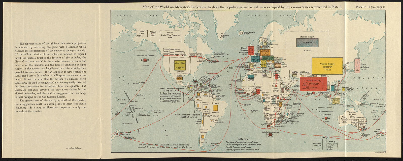
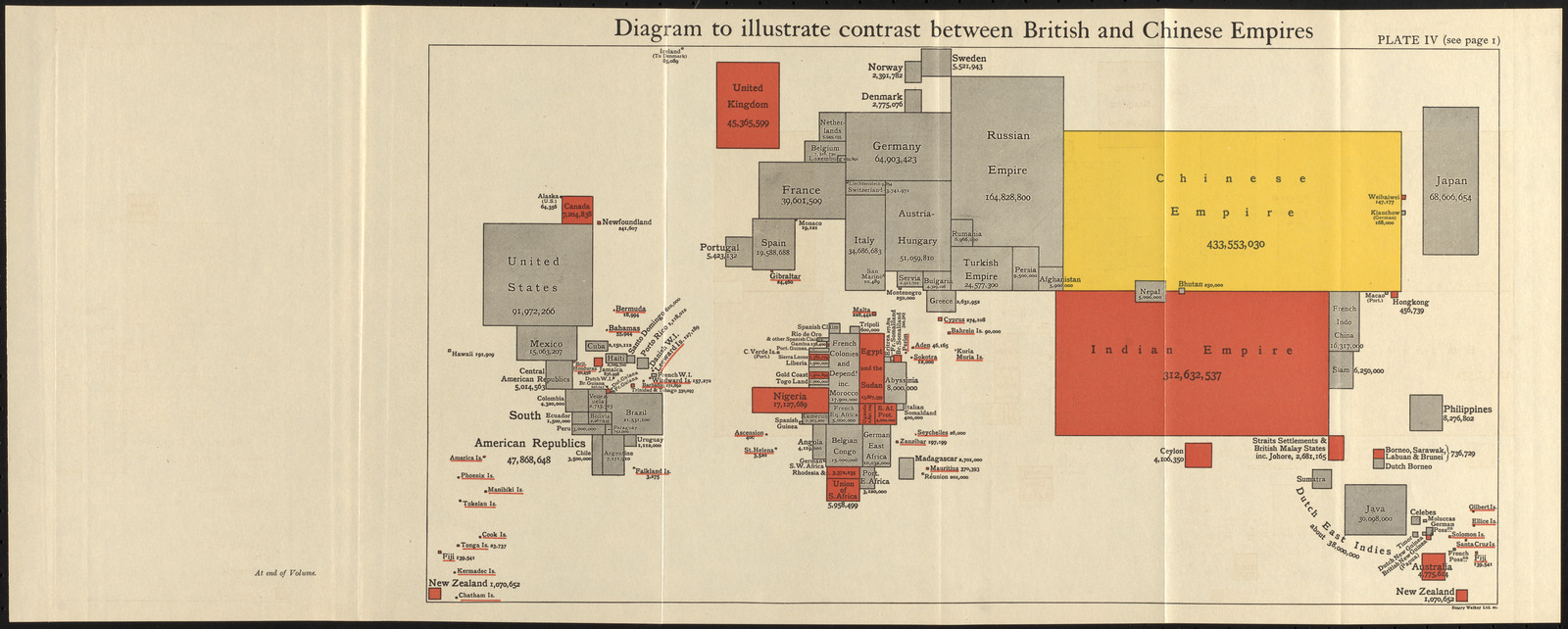
Maps that distort territorial size in order to show the magnitude of some other distribution are called cartograms. One of the major limitations of choropleth maps is that places with large areas appear important, even if they aren't actually heavily weighted in a data set that is being shown. For example, on a choropleth map of counties in the United States, Garfield County, Montana, would take up more than 90 times as much ink on the page as the Bronx, New York, even though the Bronx has more than 1,100 times as many people! A cartogram corrects this problem, but it introduces new challenges, since distorting territory can make it difficult to identify what places are being represented. These three diagrams from a 1916 book show an early use of cartograms to represent the population of the world from the perspective of the British Empire.
The modifiable areal unit problem
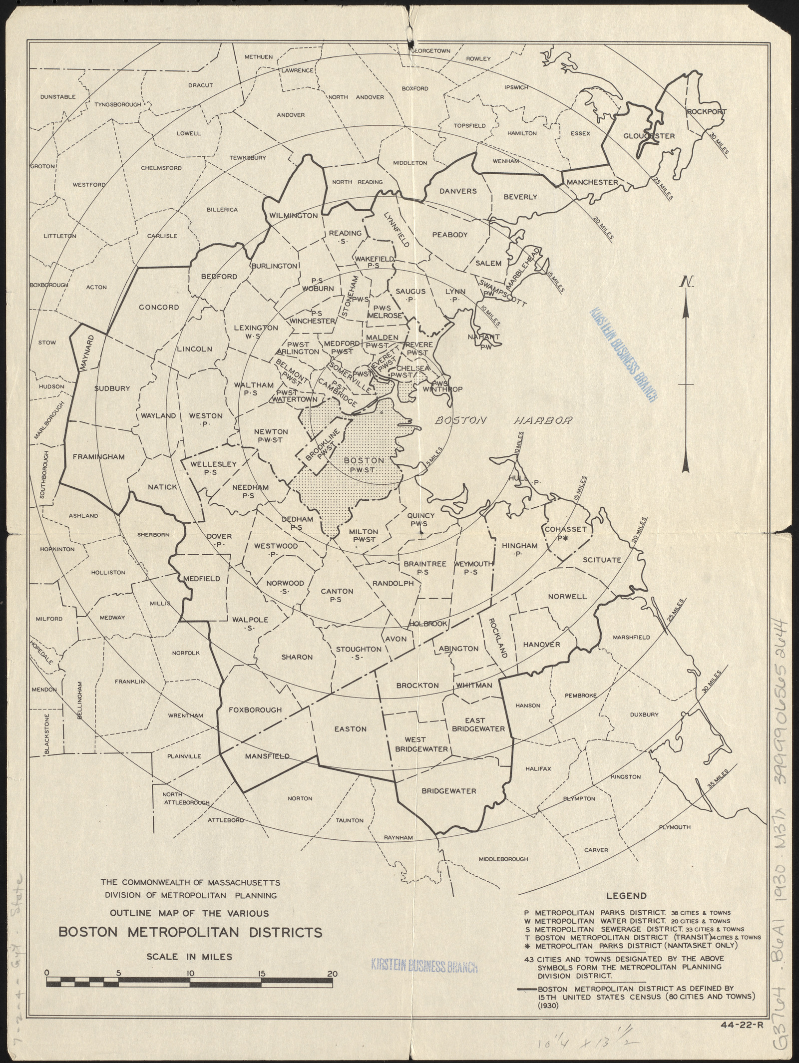
How many people live in Boston? That might seem like an easy question to answer, until you ask a follow-up: what do we mean by Boston? We could use the municipal lines of the City of Boston, but that would exclude everybody who lives in the nearby towns that are closely tied to Boston's economy and social life. It would also make a misleading comparison between cities—some cities include large swathes of their suburban neighbors within their municipal boundaries. Counting by municipal population alone, Boston ranked lower in the 2010 Census than El Paso, Memphis, or Charlotte.
Geographers refer to this as the modifiable areal unit problem: when we modify the area of the unit in which we're counting statistics, we can get wildly different results—and not just about population. Measures of diversity, income, density, and almost everything else depend on what we count together in the same unit. This 1930 map shows different ways of defining Boston's metropolitan borders.
Slicing up statistics
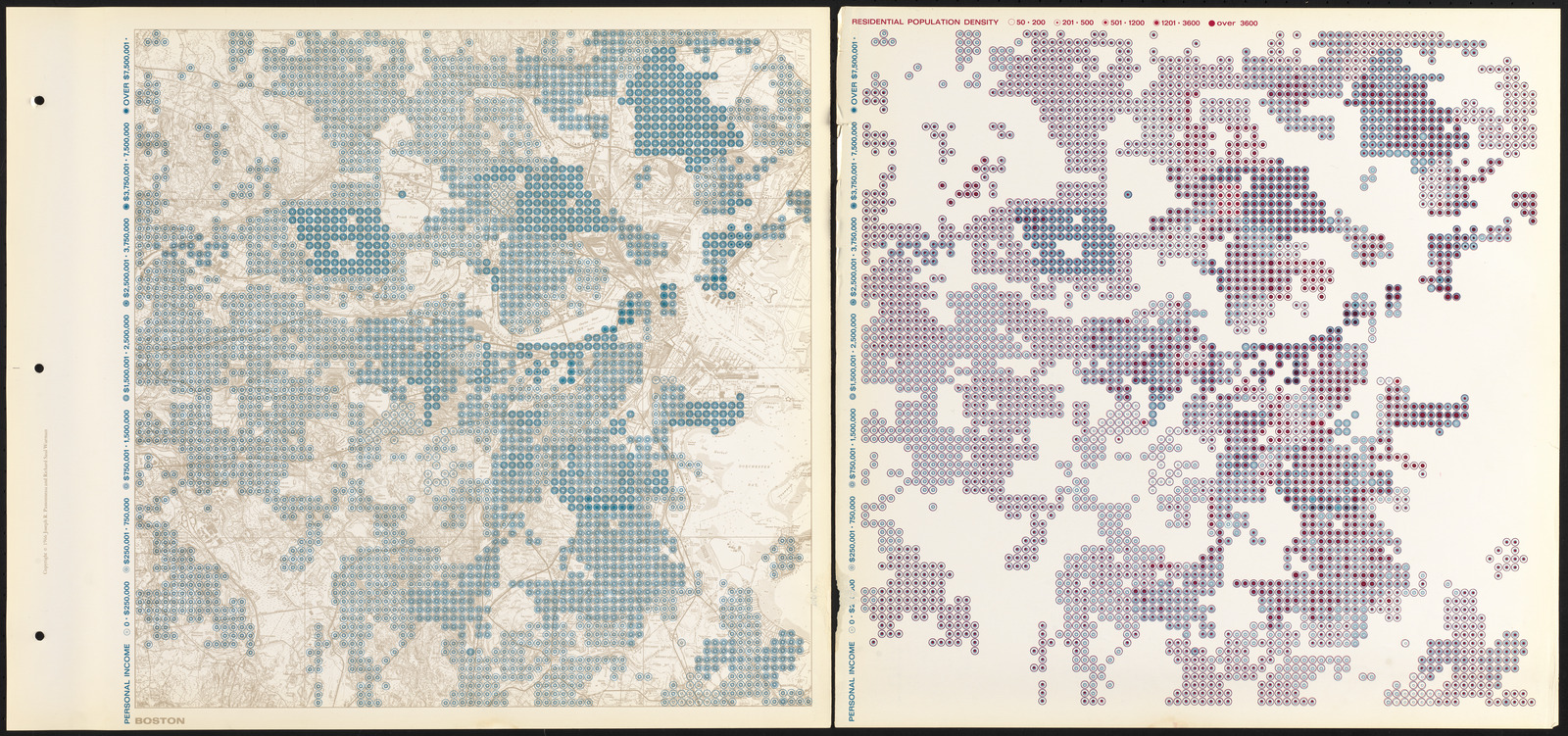
One method for dealing with the modifiable areal unit problem is to divide space into a regular gridded pattern, so that the area covered by each cell is the same. However, these cells don't usually match with the areas in which statistics are tabulating, which means mathematical models are needed to determine the value in each cell. This Boston sheet from a pioneering 1966 atlas shows income and population data using colored circles. In the twentieth century, statistics about urban demography became ever more important for government, administration, economic planning, and welfare. Maps like this one became part of an early wave of geographic information modeling that led directly into today's era of “big data.”
In this section
words