Commercial Competition
Companies from railroads to rubber manufacturers seek to gain customers and burnish their reputations by making it look like they're all over the map. By warping land area to push out their competitors, or dotting an otherwise ordinary map with their own offerings, companies can use cartographic trickery to exaggerate their own importance.
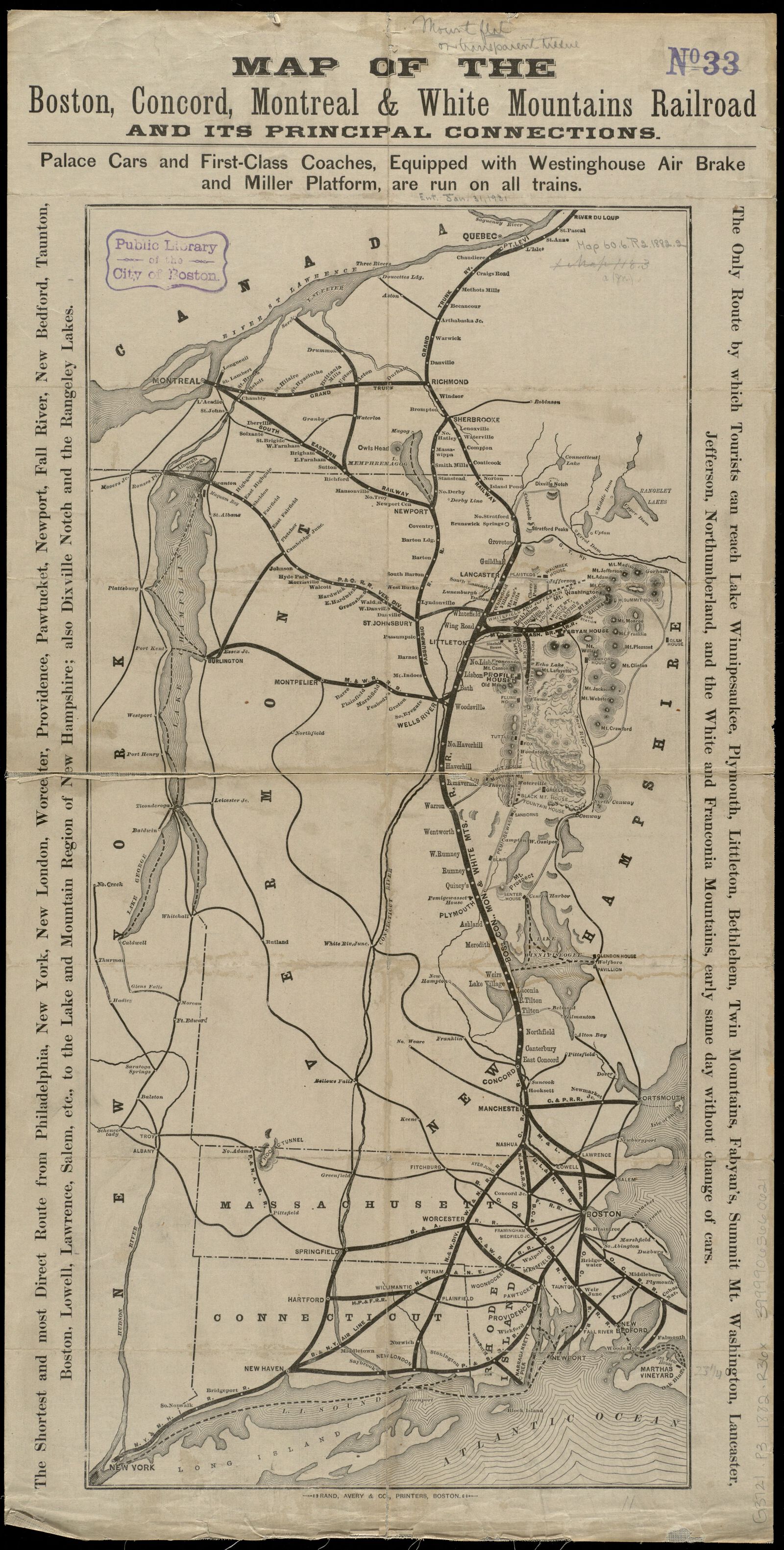
The first two maps in the section show railroad companies who literally bent their lines in order to overstate the prominence of their own routes and shrink the territory of competing rail companies into insignificance. Both were eager to capitalize on the burgeoning market of tourists seeking outdoor recreation that began in the late nineteenth century. The Boston, Concord, Montreal & White Mountains Railroad's 1882 route map explodes the size of the Lakes Region and White Mountains of New Hampshire in order to emphasize its route through these scenic areas, with prime cartographic placement given to the hotels and tourist attractions in which the railroad had a business interest.
P.J. Mode Collection, Cornell University
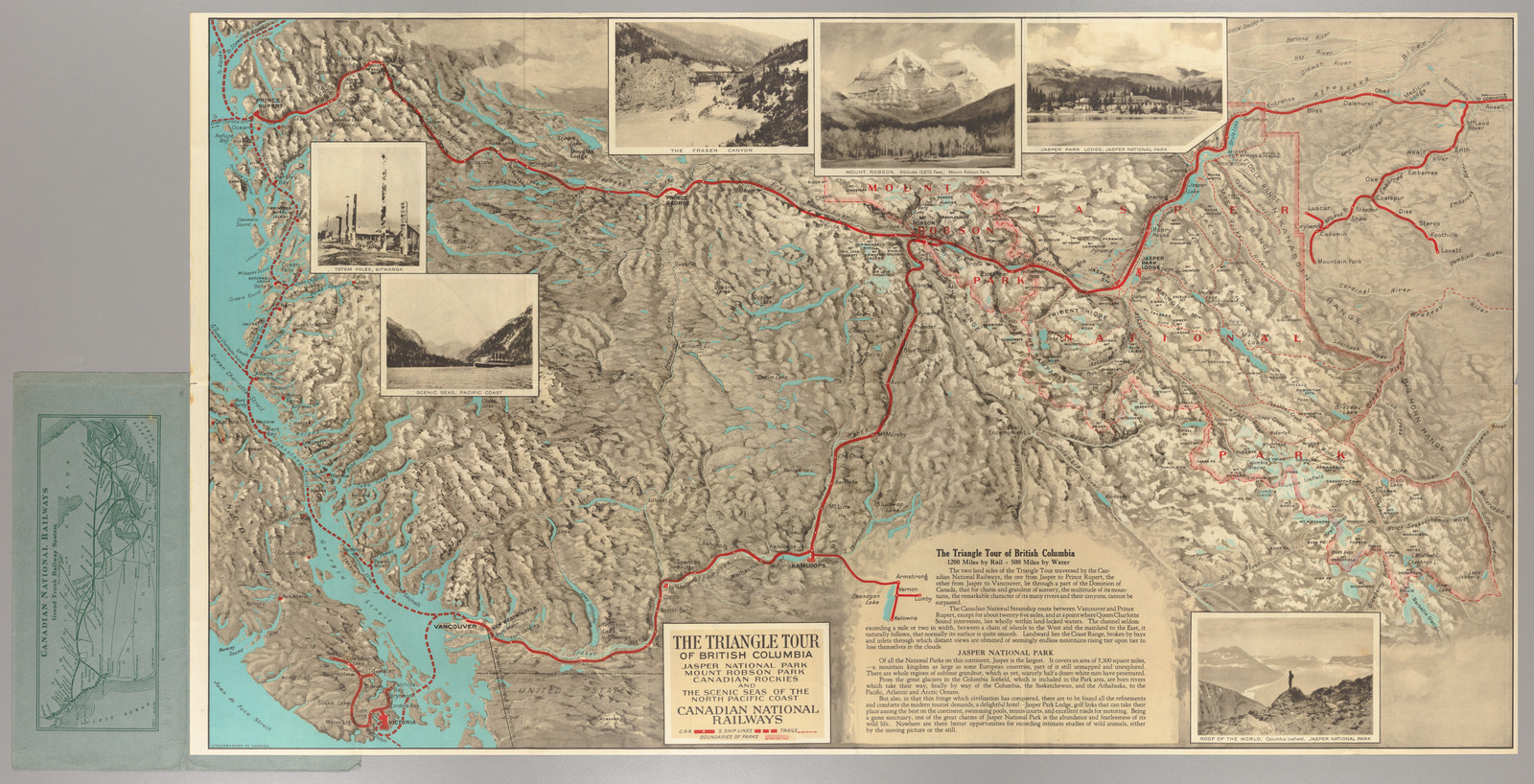
The Canadian National Railways took an even more deceptive approach to its 1927 route map through the Rockies, shifting the scale as the map moves from west to east, in order to squeeze out the competing route of the Canadian Pacific Railway. This map could easily be mistaken for an accurate reference map of Western Canada, with the scale shift totally unmarked—making it seem like the sections of the Canadian Rockies served by the CN's lines comprised the entire geographic scope of this mountain landscape.
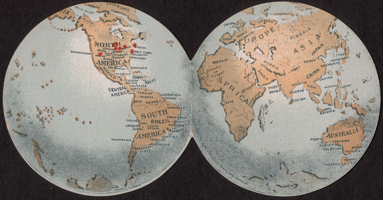
Red symbols and labels on this section's next two maps draw the reader's attention to commercial offerings. Despite the fact that all of its locations were in the United States, the American Radiator Company nevertheless chose to promote itself with global pretensions on this marketing trade card. By handing out this eye-catching map souvenir at events like the World's Fair, the company could add a visual mnemonic to its sloganeering: they sold, according to the card's reverse side, the “best radiators in the world.”
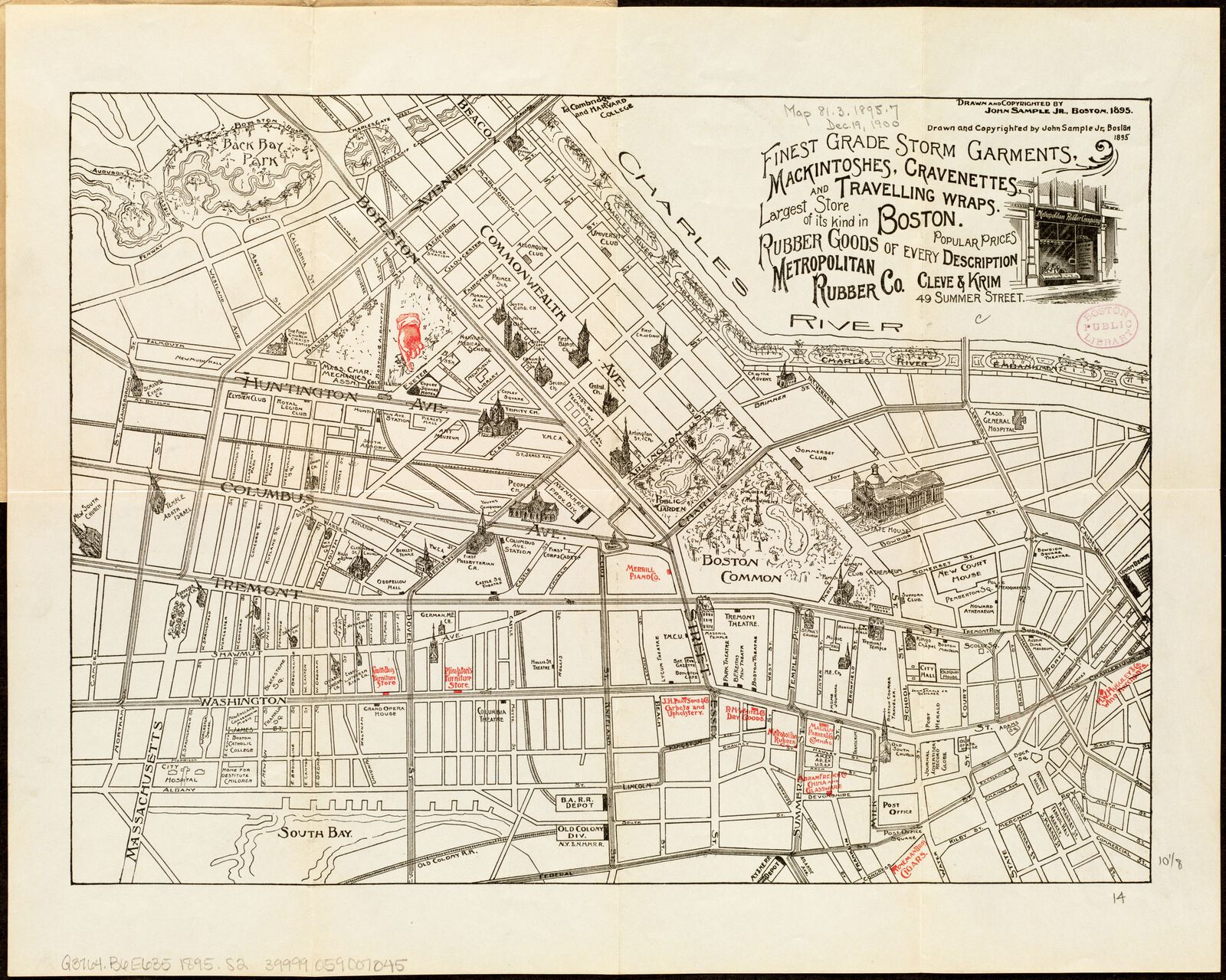
The second map would have been offered to guests of Boston's Copley Square Hotel as a useful reference guide to points of interest as they walked around the city, like the “New Public Library” just around the corner. But the map hardly takes an impartial view regarding what else the reader might like to visit while in the city. A bright red overprint spotlights the locations of the map's sponsors, like the Merrill Piano Co. and R. H. White & Co. Dry Goods—while an advertisement for the Metropolitan Rubber Company takes the place of a legend.