Authority and Authoritativeness
Shaping the truth and controlling the narrative are fundamental tools of political power. With their ability to spin facts and weave stories, then, maps can act as figures of authority, advancing skewed perspectives while hiding behind a seeming objectivity. This authority makes maps attractive objects for manipulation by people and institutions in power—but also a potential site for advancing arguments that work counter to dominant narratives.
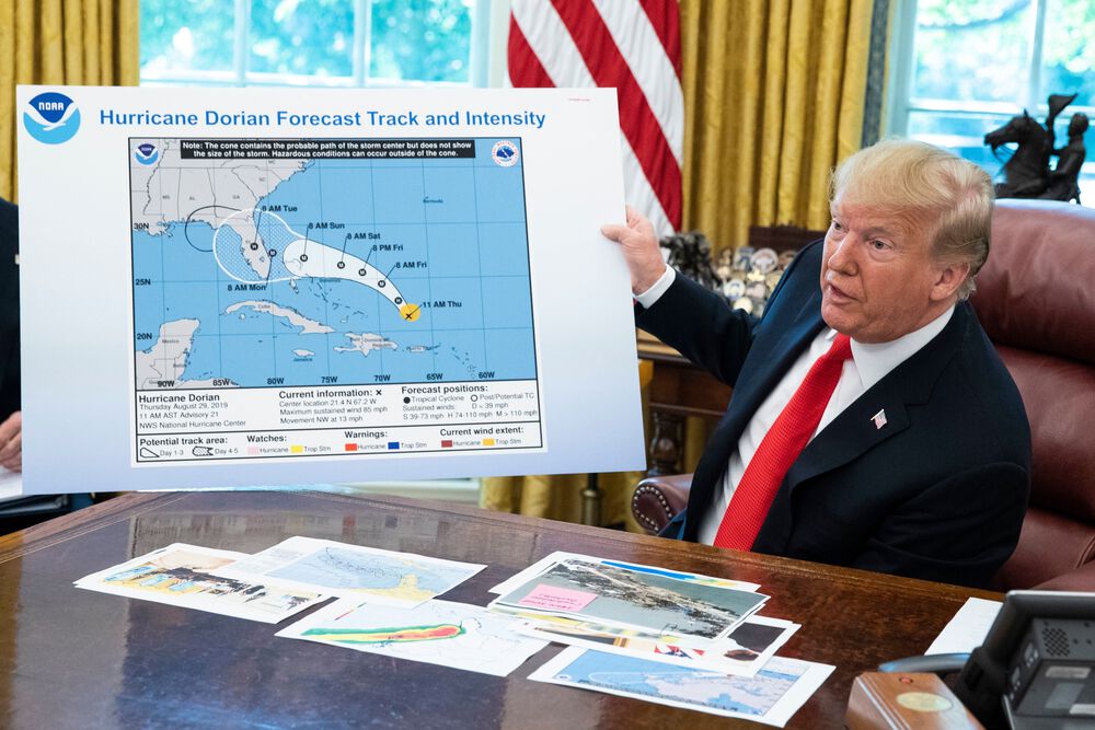
On September 1, 2019, Donald Trump tweeted a warning about the approach of Hurricane Dorian, including Alabama amongst the list of states that needed to take caution. But the National Weather Service had already forecast that Alabama would be clear of the hurricane's path, leading fact-checkers to call Trump's tweet false. Three days later, the president displayed a hurricane-tracking map showing Alabama inside of the risk zone—but it was clear that the final section over the Gulf Coast had been hastily appended with a marker. In the ensuing “Sharpiegate,” accusations flew between the White House, the Weather Service, meteorologists, and the press over the veracity of the map and the forecast. Reacting to the attempted doctoring of scientific evidence, the New York Times columnist Charles Blow penned an article entitled “Maps Don't Lie.”
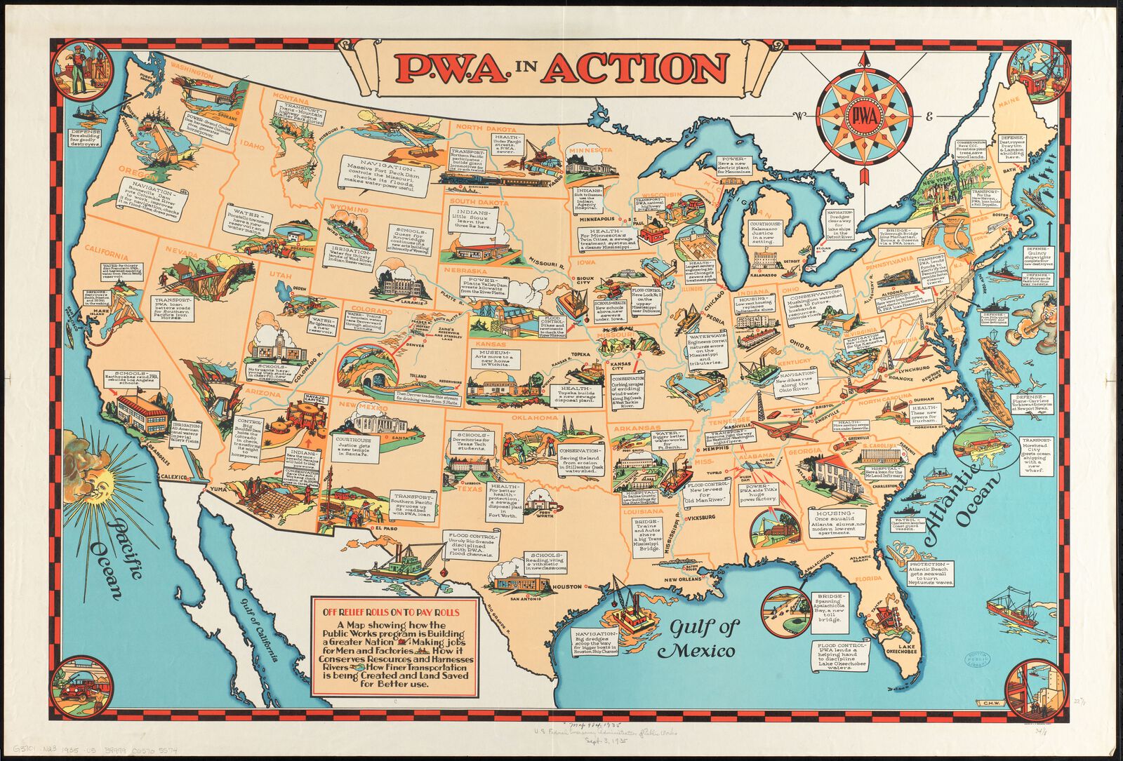
But Trump's Sharpie-adjusted weather map was hardly the first case of a politician using maps to tell their favored version of the truth. During the New Deal, the Roosevelt administration was eager to show its dramatic interventions in the U.S. economy and landscape had improved people's lives. This 1935 map from the Public Works Administration showed off New Deal-funded projects in every state of the nation, and boasted that its illustrations and labels demonstrated how “the public works program is building a greater nation.”
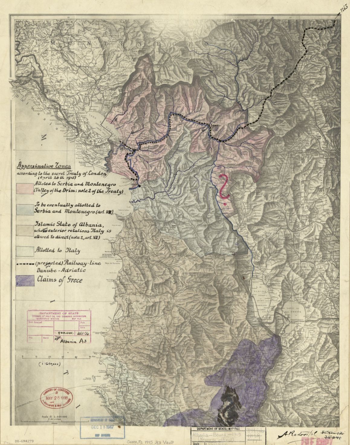
Maps can be used in the hands of the powerful to make decisions on high that affect the lives of vast numbers of people. This 1915 map of Albania was used at a secret treaty negotiating conference in London, where the European powers fighting World War I laid in place a program to divide the country, which had only been independent for three years, and give control to Italy as a prize to lure the Italian government onto the British and French side of the war. No Albanians were invited to participate in the exercise of carving up the map, and a giant red question mark, drawn over the area surrounding the city of Peshkopi, provides a lurid symbol for the way that powerful map-drawers took the fate of distant countries and peoples into their own hands.
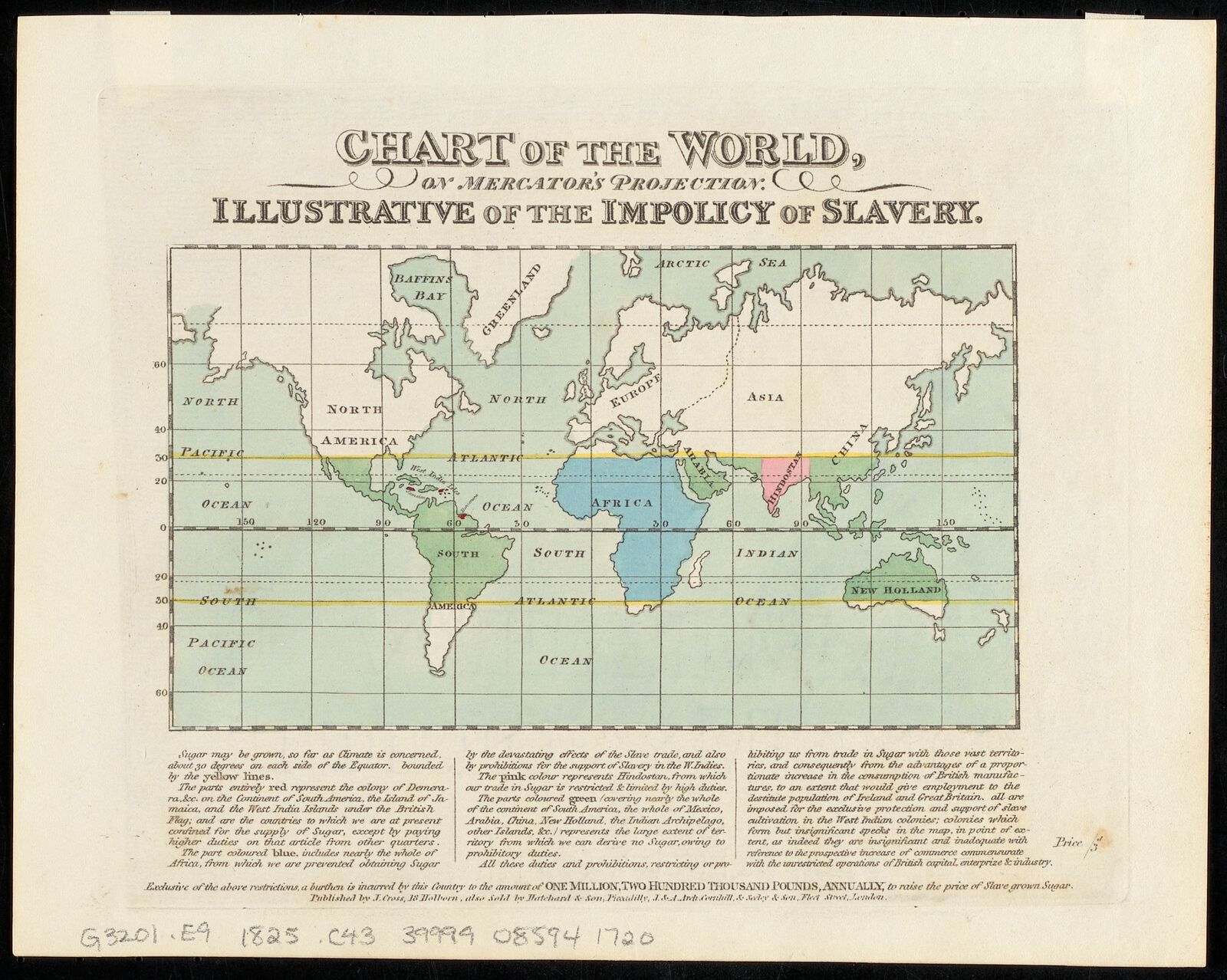
Although maps are often found in the hands of those already in power, they can also be used to fight for the marginalized and give voice to protest against injustice and oppression. This 1820s map by a British abolitionist was meant to raise a rally cry against slavery. It shows the British Empire's sugar production limited to a few sites of brutally concentrated plantation agriculture, a tiny fraction of the potential range of sugar. The diagram was meant to make an economic argument for abolition, labeling it an “impolicy” which undermined British commerce.

Printed more than a hundred years later, this 1967 map from the Indiana Civil Rights Commission rallies a cry against another injustice that followed in the wake of enslavement—residential segregation in American cities. Dramatically marking out the parts of Indianapolis which had been turned into ghettos by racist urban policy, the map makes a bold, matter-of-fact argument: “It's Time to Desegregate.”
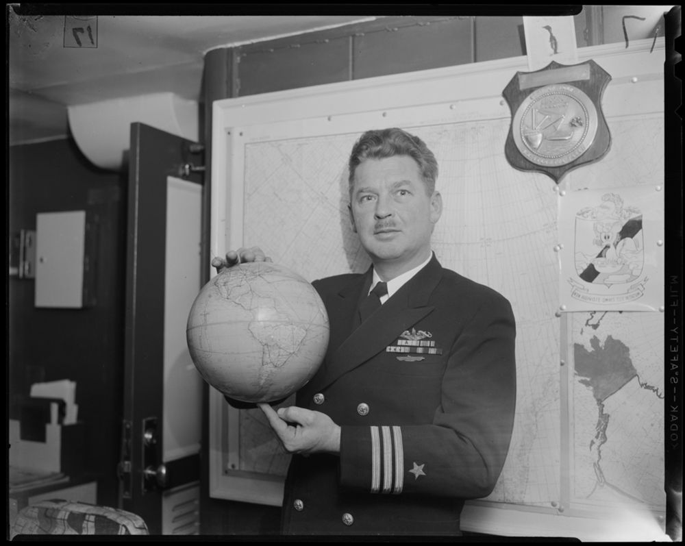
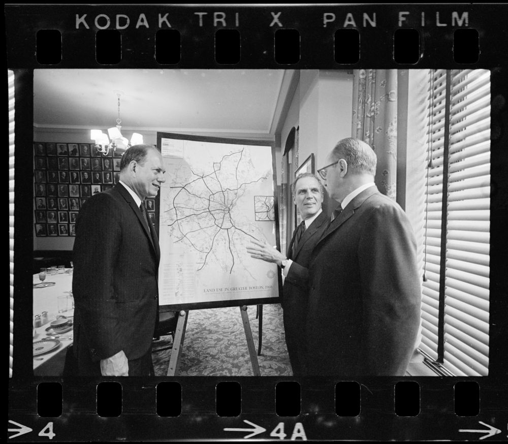
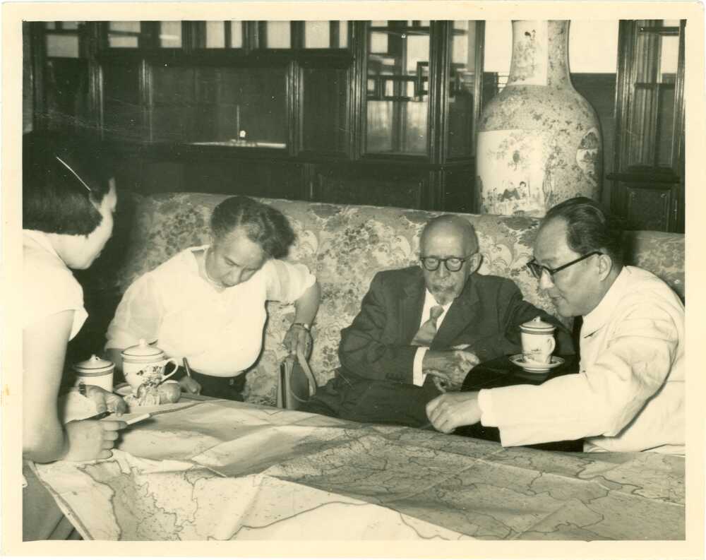
As these three photographs show, pointing at a map confers a special kind of power—whether in the hands of a military officer (left), a reforming mayor like Boston's Kevin White (center), or a crusader for social justice like W. E. B. Du Bois (right). Maps are sometimes used by those in charge, and sometimes by those who seek to overthrow those in charge, but in every case the maps exert a special kind of authority and authoritativeness.