Mapping Ourselves
The line of communication between the people who make maps and the people who read maps does not need to be one-directional. Although mapmaking can require expert knowledge and familiarity with specialized techniques—whether the drafting tables of classical cartography or the spatial databases of today's computer maps—mapmaking can also be a tool for ordinary people to define their own geography. Instead of treating maps as stuffy reference objects, frozen in place by distant authorities, we can see maps as part of a dialogue in which citizens tell stories about themselves, their lives, and their communities. Maps play an influential role in telling us where we are and who we are—so we must “map or be mapped,” in the words of one cartographer. ()
What's in a name
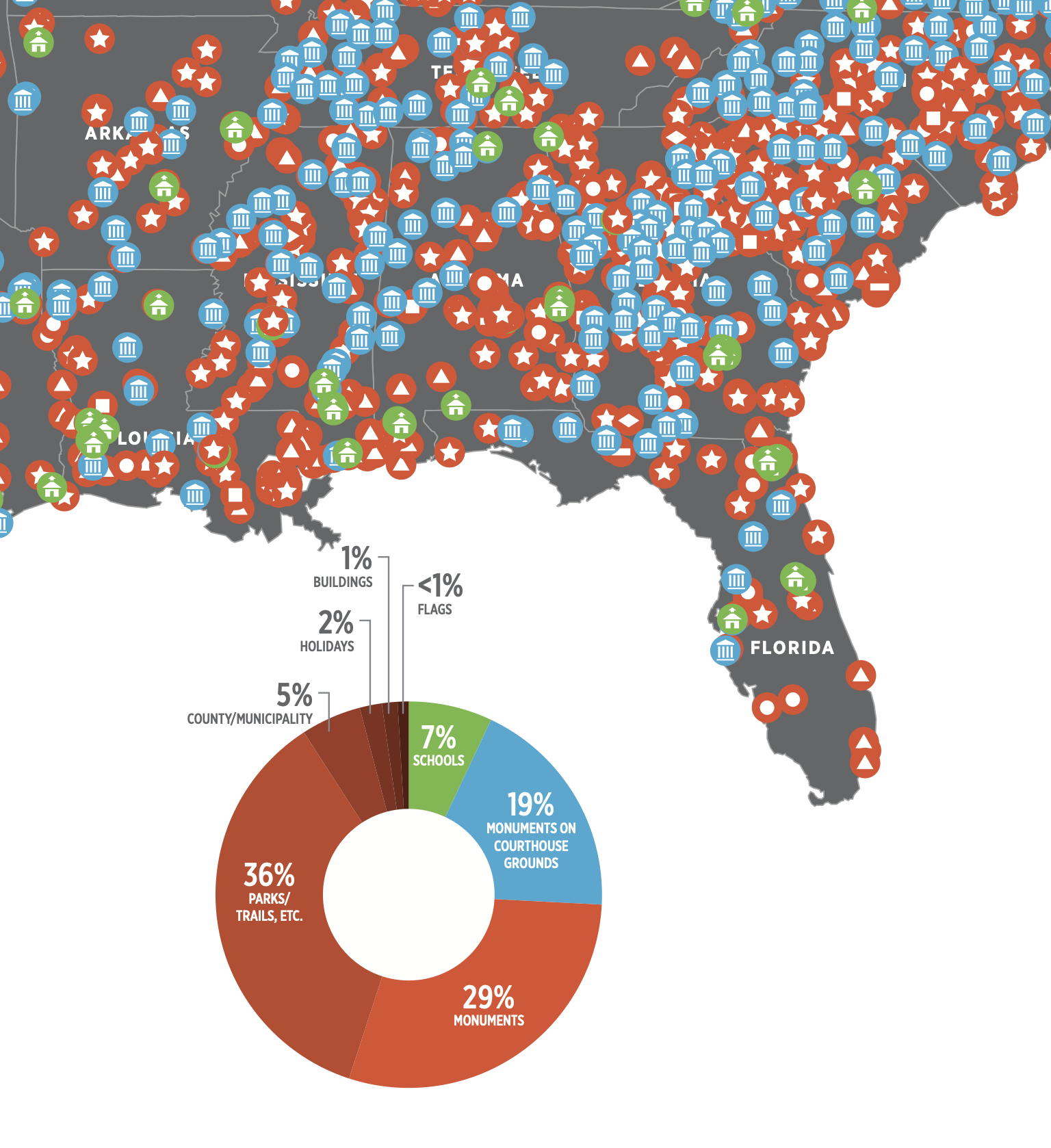
Southern Poverty Law Center
After the end of the U.S. Civil War, states on both sides of the conflict rushed to name public spaces after military leaders and politicians. But the Confederacy was, in its ultimate purpose, a government set up to preserve the institution of slavery, and the inscription of Confederate names on the landscape of the postbellum South was as much about reminding freed slaves of their position in the racial hierarchy as it was about commemorating the fighters of a bitter war. These names didn't just appear on statue plaques and courthouse friezes, but also on maps. Since the labels on a map seem to mark the “true” name of a place, they become closely fused to a place's identity. This map and timeline produced by the Southern Poverty Law Center shows the vast extent of Confederate naming on the map of the United States. As activists struggle to advance racial justice by removing symbols of hate like statues and flags, mapmaking will also be a part of this fight.
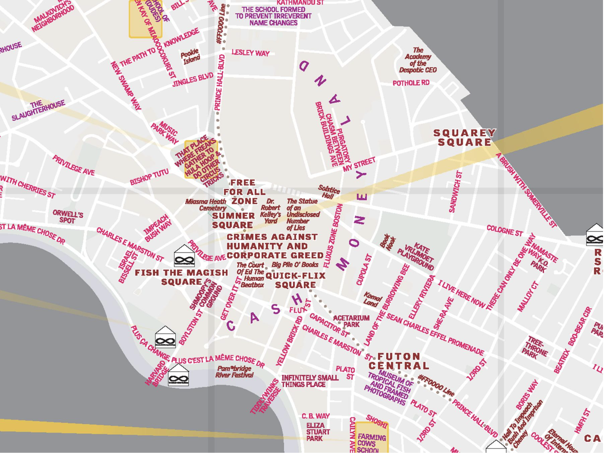
The Institute for Infinitely Small Things
Unsurprisingly, few Confederate names made their way onto maps of Massachusetts. But the streets, squares, and parks of the New England states have hardly been representative of the region's people, historically as well as in the present. The vast majority of place names in New England are associated with people from majority backgrounds—especially white men. A group of cartographers in Cambridge created this alternative map of the city's place names by hosting “renaming events” in public spaces, where people suggested new names with reasons ranging from the personal (a park renamed to Monkey Park by a five-year-old who liked monkeys) to the political (the neighborhood around Harvard University renamed to Cash Money Land).
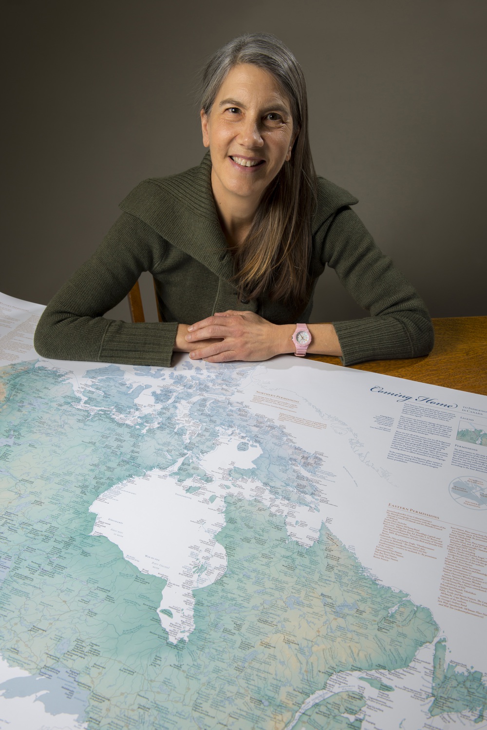
Because the names that appear on a map are so intimately connected with cultural identities of place and community, rewriting labels is much more than just an exercise in cartographic editing. In this map of Canada, the cartographer Margaret Pearce worked with hundreds of indigenous groups to document the place names used by communities before European settlers plastered the map with names from English, French, and other languages. (See the object page for information on how to access a digital version of this map.) Though the violence of colonialism pushed indigenous names off of official maps, the names themselves were not extinguished, as they remained an important part of how native people shaped their relationship to land and community. This map gives voice to those names and provides an alternative argument for the “true” names of these places.
At the heart of it all
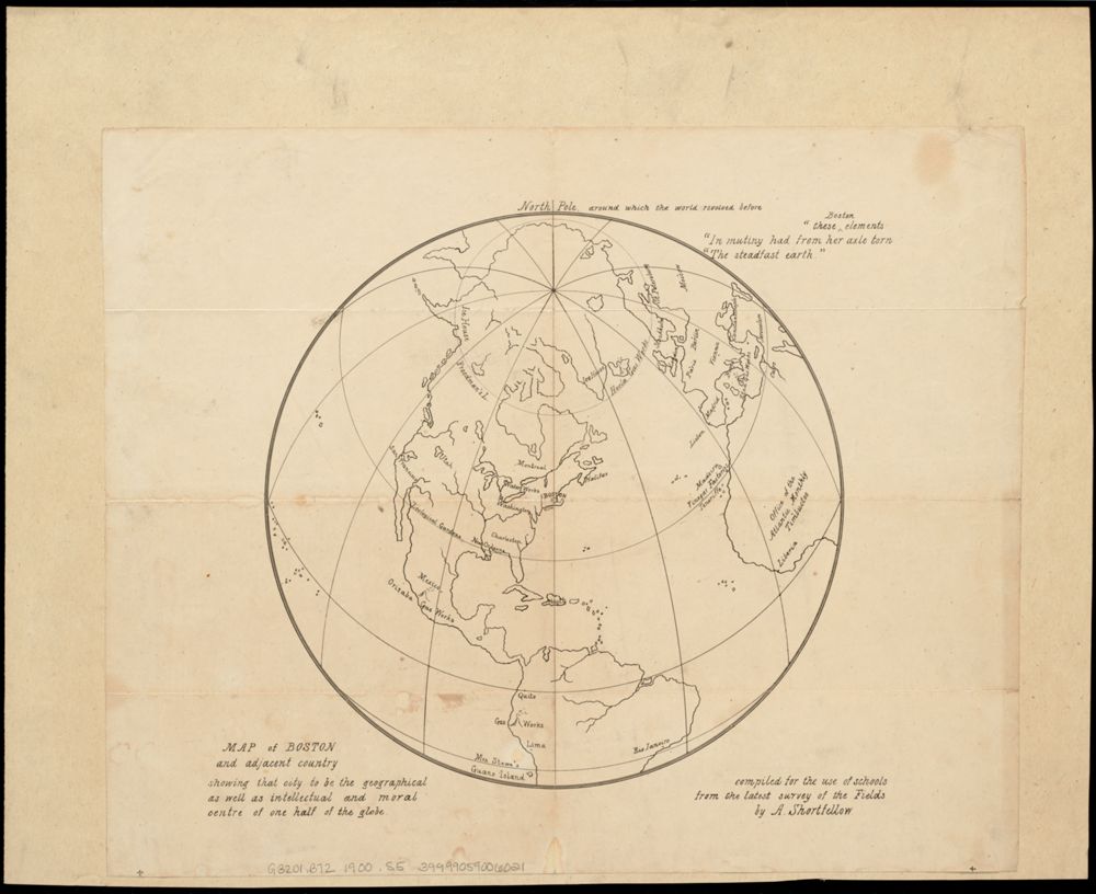
A map's view and projection can center on wherever a mapmaker chooses—and putting something “front and center” is an obvious way to make it seem important. This tongue-in-cheek map from the 1870s uses an azimuthal projection to make Boston look like the world's focal point. Instead of Earth, the new name for what we see here is “Boston and adjacent country,” and the wry label states that the map shows that Boston is “the geographical as well as intellectual and moral centre of one half of the globe.” At the top of the map is the North Pole, whose position as the axis of the world has been usurped by a city famous for its self-importance. Perhaps the creator of this map had taken to heart Oliver Wendell Holmes's 1858 remark in the Atlantic Monthly that the Massachusetts State House marked “the hub of the solar system.” It's clear that what the mapmaker thought of the Atlantic: the office of the notoriously pretentious Boston-based magazine is located on this map in “Timbuctoo.”
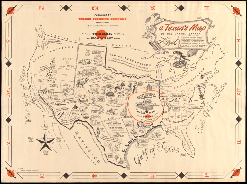
By contrast, this humorous map produced for a Texas wood floor manufacturer paints a very different picture of what's at the center of the world. As a “Texan's map” showing “the United States [of Texas],” this map is full of Lone Star-centrism, from the Atlantic Ocean—now known as the “East Gulf of Texas”—to a sign planted on the California coast marking the “City Limits of Dallas.” Even the scale admits to its distortion, noting that 1 “Texas Inch” is equal to 1,000 miles. Within the state itself, a large orange heart spotlights the town of Crockett, a town which had fewer than 6,000 people at the time this map was made, but marked the home of the map's publisher, the Texoak company.

While both of these maps are almost laughing at themselves with their gaudily inflated arguments about regional superiority, there's no question that maps can form a powerful symbol for personal identity and the places we care about. Have you ever seen a bumper sticker with the outline of Massachusetts with a heart in it, or a necklace in the shape of the Great Lakes? Simple outline maps like these certainly aren't useful for geographical reference or statistical information. Instead, they're meant to make a statement about personal geography—this map shows who I am!
In this section
Bibliography
- Stone 1998
- M. Stone, “Map or Be Mapped,” Whole Earth Review (Fall 1998): 54–57.