Squashing the Globe
One of the original challenges facing mapmakers—and one of the unavoidable sources of distortion in cartography—is the problem of taking a round globe and turning it into a flat map. Round doesn't even capture the true level of the difficulty: the Earth isn't actually a perfect sphere, but an irregular shape known as a geoid, and its surface is a complex three-dimensional shape with mountains, valleys, and ocean trenches.
The process of converting between curved and flat representations of the earth is called projection. That's because some of the earliest projections could be created by literally projecting onto a screen. Imagine a globe with a flashlight on the inside, with the oceans transparent and the continents opaque. If you were to hold this globe near a wall, the continents would form shadows, and, depending on the position of the light, the globe, and wall, and the shape of these shadows would change.
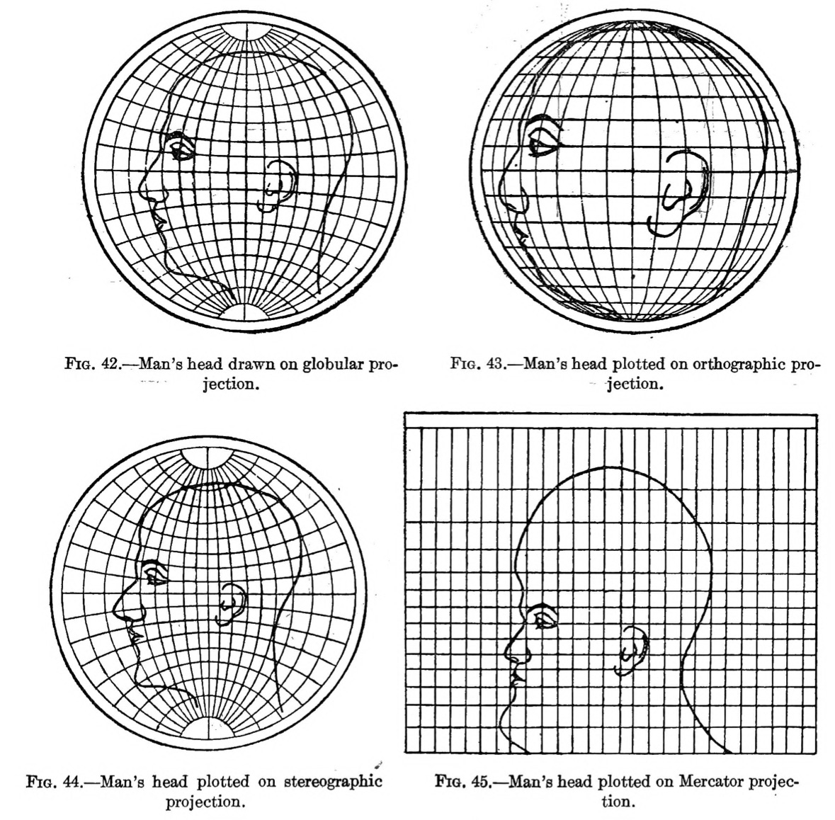
Every projection distorts the original geometry of the curved, three-dimensional earth in some way. Since we're so used to seeing projected maps of the globe, those distortions no longer look strange to us. But this famous illustration from a 1921 manual published by the U.S. Coast and Geodetic Survey makes the warped shapes more striking by showing how bizarre it would look if we projected a human head. (You can read this book online, or get an original copy at the Map Center.)
Try out different projections in this interactive. How does the size and shape of the person's head change with different projections?
There are many different choices of projection that a cartographer can choose from. Projections can distort area, distance, or shape; a single projection can preserve one of these qualities, but not all three. Some projections are called compromise projections because they distort all three, but compromise so that no one of these three qualities is severely warped. And while every map is projected in some way, the choice of projections is more significant for maps that show large areas than small ones—a map of a single neighborhood likely won't look very different from one projection to another.
One way of visualizing a projection's distortion is through a cartographic figure called Tissot's indicatrix. The indicatrices are a set of circles spaced at regular intervals across the globe. In the real world, each of these circles is exactly the same size, and exactly a perfect circle. In the projection, though, the circles’ sizes and shapes are distorted in exactly the same way as the geometry of the earth at that point. Try switching the interactive map below to the Mercator projection. Do you see how all of the circles remain circular, but their sizes are much larger at the poles than at the Equator? That's because the Mercator is a conformal projection: it preserves shapes, but, to do so, it severely distorts area. Now try the Mollweide projection, which is equal-area. Here, each of the circles are the same area, but their shapes warp towards the poles. Finally, try the Kavrayskiy VII projection. This is a compromise projection—the circles don't stay the same size or shape, but the shape distortion isn't as bad as it is for Mollweide, and the size distortion isn't as bad as it is for Mercator.
Choosing a projection isn't just about geometry. It's also about what the mapmaker wants to emphasize and what parts of the world should be front-and-center. Because we're much more likely to see projected maps than round globes, the shapes and sizes of the projected world become more “real” to us than reality itself. The Mercator projection, for instance, is very useful for navigation because of the way that it preserve angles of bearing. But because it's so widely used in reference maps, we might begin to think that Greenland really is as large as Africa, when in fact it's only a fraction of the size.
In the 1970s, the historian Arno Peters began arguing that the Mercator projection deliberately diminished the importance of countries closer to the Equator, thereby promoting the dominance of Europe, the Soviet Union, and the United States. He proposed a new world map which compressed the Mercator's distortion at the poles, using a similar method to a nineteenth-century projection known as the Gall stereographic. Peters's claims that his projection was the only one to truly represent the world became controversial amongst cartographers, many of whom pointed out that the Peters projection—like all projections—also involved distortion.
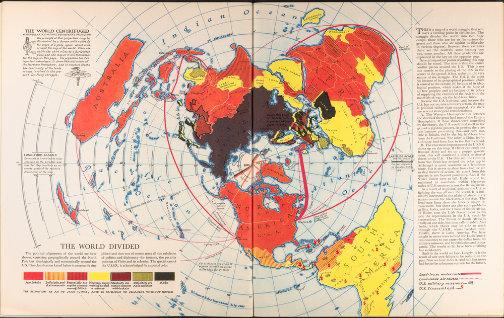
By showing a specific perspective on the globe, projections make it possible to think about geographic relationships in different ways. This map using a polar projection, created by Richard Edes Harrison for Fortune magazine during World War II, was meant to show how close the different theaters of a global war really were to one another. Many conventional maps simply end at the poles, which hides the fact that North America and Asia are not very far from one another when traveling over the North Pole. By 1941, when this map was published, airplanes and long-distance supply routes had transformed warfare, reworking the geography of both threats and alliances. Polar projections became one of the key symbols of the new “globalized” world that emerged from the war, with the United Nations choosing a polar projected map for its emblem and flag.