The war next door
| Title | The World Divided, in Fortune, August 1941 |
| Creator | Richard Edes Harrison |
| Year | 1941 |
| Dimensions | 36 × 46 cm |
| Location | P.J. Mode Collection, Cornell University Library |
From airplanes and ocean-crossing battleships to radios and even early rockets, World War II completely changed the face of modern warfare. It wasn't just that the war was extraordinarily violent and deadly. The geography of conflict had a broader reach than ever, marking first truly worldwide war, spanning across hemispheres.
Wander across the exhibition →
No cartographer was more closely associated with the U.S. view of global war than Richard Edes Harrison. (; ) Harrison was trained as an architectural draftsperson, not as a cartographer, and his illustrator's sensibility would become a key characteristic in his richly-designed maps. Hired by the magazine Fortune during the early years of the New Deal, Harrison gave the magazine a distinctive visual perspective on the conflict that began to spread throughout the world in the 1930s.
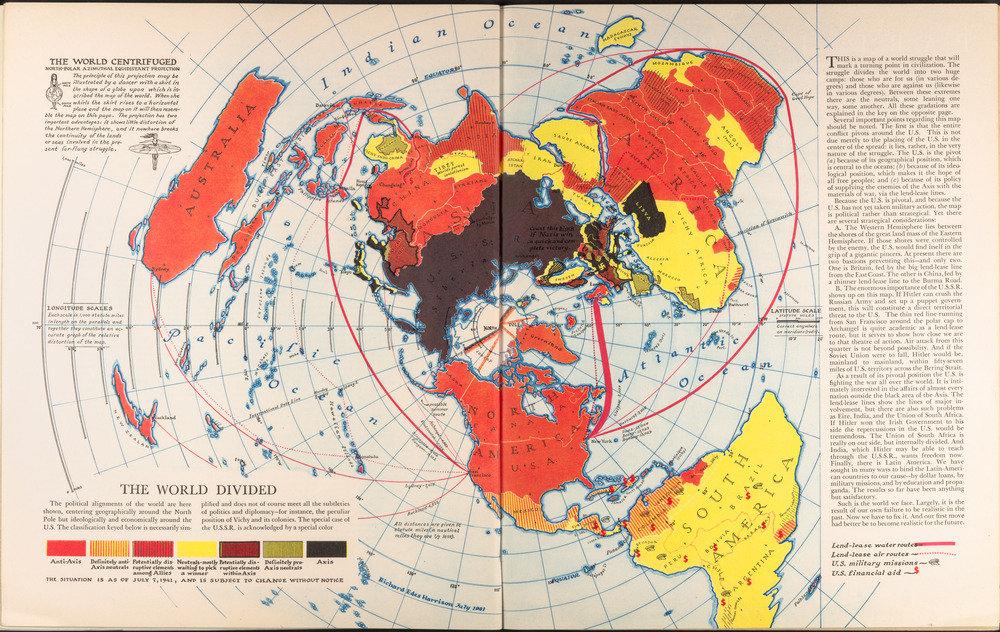
One of Harrison's key interventions was to set aside rectangular projections like the Mercator in favor of projections like this azimuthal equidistant projection that allowed for a more sensible comparison of the geographic relationships between the various theaters of war. In a caption on the upper left of this map, using the metaphorical figure of a dancer with a globe-shaped skirt flattening outwards as she twirls around, Harrison writes that:
The projection has two important advantages: it shows little distortion of the Northern Hemisphere, and it nowhere breaks the continuity of the lands or seas involved in the present far-flung struggle.
This map was published in the August 1941 edition of Fortune; it wasn't until December of that year, with the attack on Pearl Harbor, that the United States would enter the war. In fact, at the time this map was published, many Americans rejected the idea of entering the war, believing that the conflict was too far away to concern the United States. Harrison's map makes the argument that the war was not as distant as it first appeared. “The entire conflict pivots around the U.S.,” reads the accompanying text.

The polar projection became the preeminent cartographic symbol for both the war as well as the U.S.-led global order that emerged from the defeat of the Axis powers. This projection made it possible to easily visualize the supply lines, landing strips, and troop outposts that connected superpowers together into a global balance of power. () The polar projection became part of the emblem and logo of the United Nations. It also became symbolic for another frightening form of globalization: nuclear warfare. In recognition of the fact that missiles and bombers could easily fly over the poles between the United States and the Soviet Union, polar maps like these became the basis for a new kind of military strategy and world conflict.
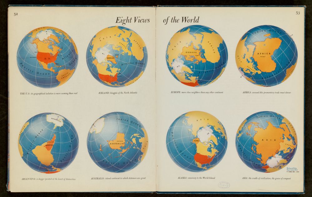
What’s Azimuthal?
No map can express everything that is true about a place. There's just too much information! And people don't even always agree on what is true. Since maps are made by people, we have to be careful map readers. This exhibition asks you to look carefully at what maps are telling you and how they are telling it so you can ask good questions and decide for yourself what story the mapmaker is presenting and how trustworthy it is.
Let's start with the WHOLE world.
A globe is the most accurate way to show the world.
The process of showing a round globe on a flat surface is called a projection.
Have you ever tried to flatten out an orange peel? You have to squish and tear and move all the pieces around. You won't have a new flat orange, but something that looks very different.
The map projection you see here has a funny sounding name: azimuthal. This word means “bearing” or “direction”. On this map, the direction in a straight line from the point in the middle (the North Pole) to every other point is accurate. You can also measure distance from the North Pole to many places and get an accurate measurement. However, the further away you get from the North Pole the more distortion you will have. When we say something is distorted on a map, it means it is not accurate like on the globe. What else do you see that is distorted?
Can you find Australia on this map? Does it look like you think it should?
Interested in learning more? Check out our lesson where you can compare lots of different projections.
Bibliography
- Immerwahr 2019
- Daniel Immerwahr, How to Hide an Empire: a History of the Greater United States (Farrar, Straus, and Giroux, 2019). oclc:1149461690
- Schulten 1997
- Susan Schulten, “Richard Edes Harrison and the Challenge to American Cartography,” Imago Mundi 50, no. 1 (2008): 174–188. doi:10.2307/3706998.
- Barney 2012
- Timothy Barney, “Richard Edes Harrison and the Cartographic Perspective of Modern Internationalism,” Rhetoric & Public Affairs 15, no. 3 (2012): 397–433.