Cartographic Techniques
Once they've chosen a projection, a cartographer still has numerous other tools at their disposal to bend reality towards a certain perspective. These aren't necessarily misleading or deceitful, because making choices about how to simplify and represent the complexity of the world is central to the art and science of creating maps. These items showcase some of the methods and techniques that cartographers use in deciding what a map shows and what it hides. Elements of cartographic language direct and shape the reader's attention, drawing them to particular conclusions and obscuring other possible observations.
Words and rhetoric
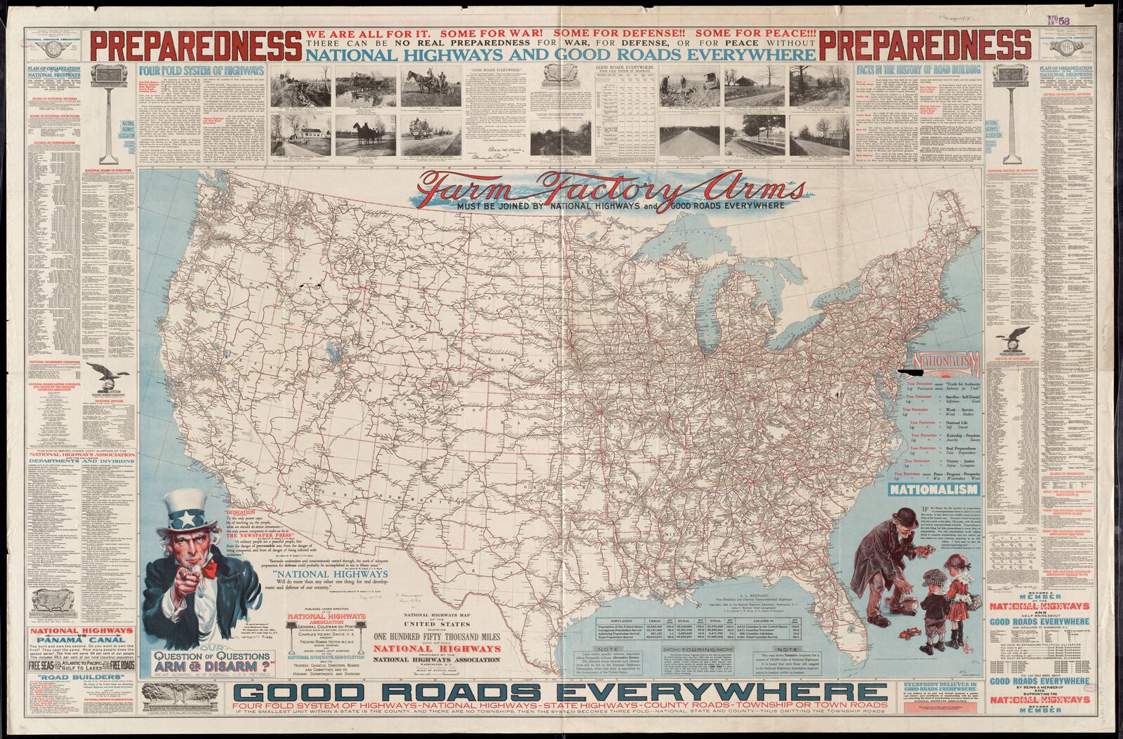
One of the most obvious ways for a cartographer to instruct a reader how they should be interpreting a map is by telling them, explicitly, with words. The vast majority of maps use written language in some form or another, whether in a bombastic title like this 1918 map promoting highway construction as part of a patriotic military effort, or in an innocuous-seeming legend. Words, of course, rely on the reader's ability to make sense of the language: in this map, the bold text urging “preparedness” would carry little meaning to someone who doesn't speak English. But because written language is so rich with nuance and connotation, words are a powerful method for stirring emotion and action. And when it's used in a matter-of-fact, technical register, written language can also help a cartographer insist on a map's accuracy and objectivity.
Quantities and magnitudes
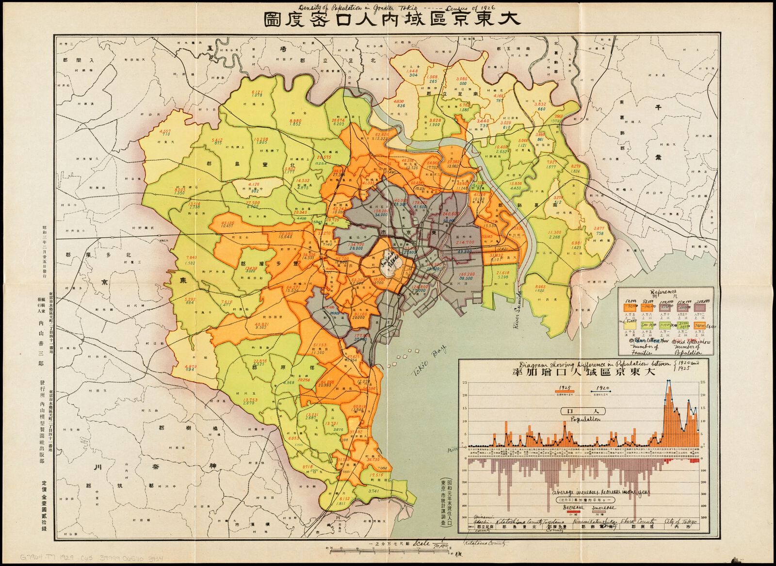
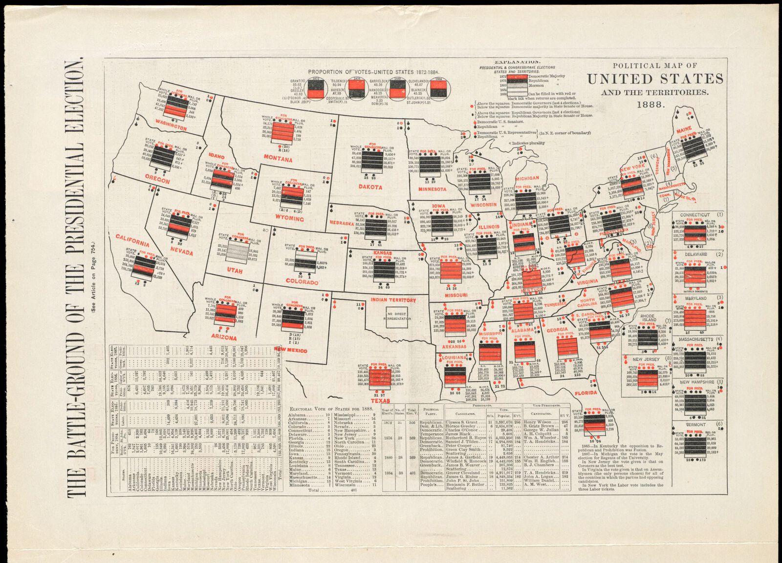
Many maps show quantitative information, like demographic statistics or election results. But how do you “show” a number or a magnitude? Cartographers have many different symbolic techniques for representing quantitative data, and, while these techniques seem self-evident once we have seen them thousands of times, they are actually the expressions of a carefully-constructed visual language. One of the most popular methods for showing quantities is the choropleth map, which uses colored or shaded areas to show the numerical value inside of a unit geography, as in this population map of Tokyo from 1928. The choropleth map, however, makes larger areas appear more important, even if size is irrelevant to the phenomenon being measured. An alternative technique is to show counts as symbols. This political map from 1888 uses rectangular boxes and numerical counts to report the results for five sequential presidential elections.
Generalization
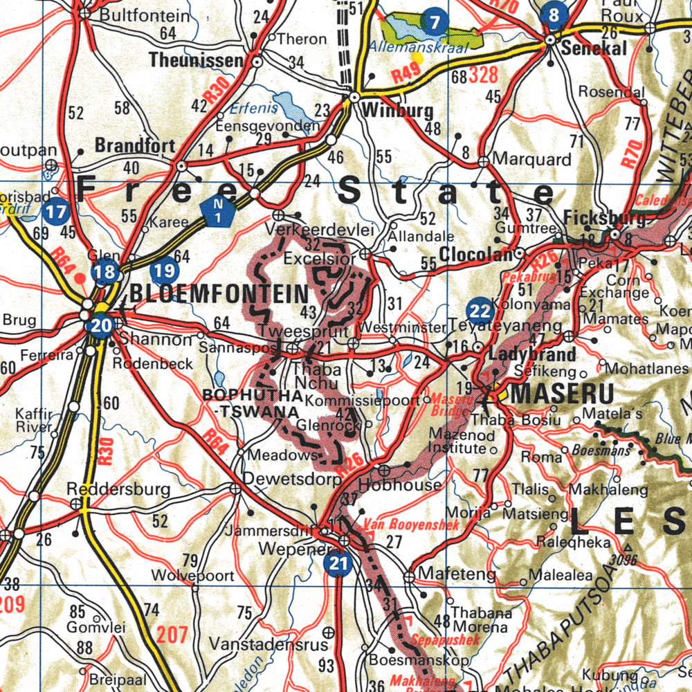
The only diagram which shows everything is the actual one-to-one reality of the world itself. Every other representation requires selectively leaving certain details off in order to preserve the most important information. The process of reducing down detail is called generalization. But how does a cartographer decide what is most “important”? Sometimes it's possible to follow a rule, like omitting smaller cities in favor of larger ones. Even a seemingly-straightforward rule can be subject to interpretation, however, as this 1978 tourist guide to South Africa makes strikingly clear. Published by the apartheid government, this map leaves out black settlements in favor of white cities, even when the black townships have a larger population. For instance, the white city of Bloemfontein had far fewer residents than the black township of Botshabelo just to its east—but, looking at this map, it is Bloemfontein which receives cartographic emphasis.
Iconography
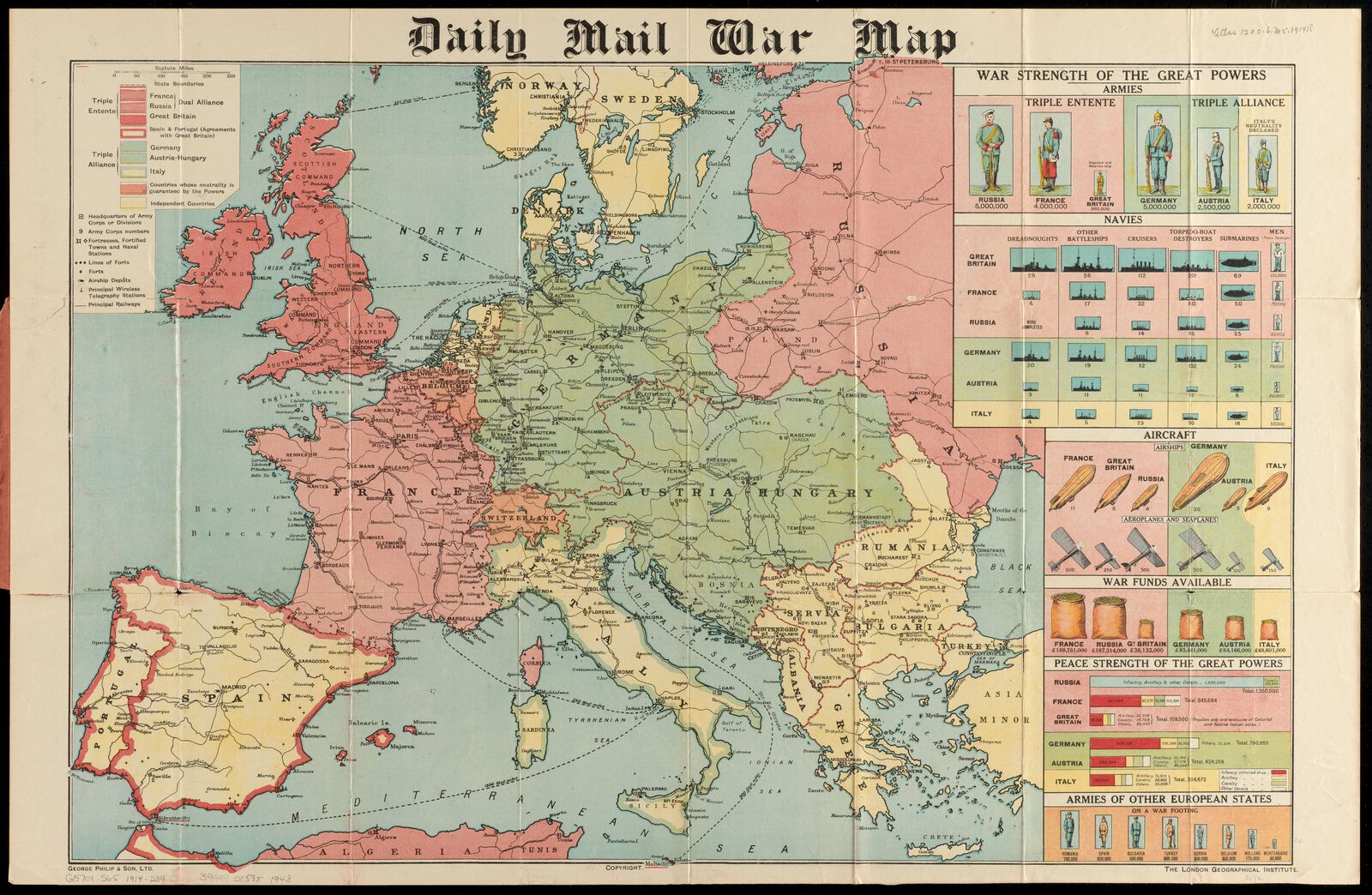
While many maps choose to rely on abstract symbols, such as geometric shapes, to represent information, others deliberately use more recognizable symbols, with illustrative figures and icons, to show information. Because our eyes and brains are quick to process familiar images, these kinds of symbolization can be more easily understood at a glance. But they also risk triggering the viewer's biases. This World War I map from the Daily Mail uses icons like soldiers, airplanes, and bags of gold to show the relative strengths of the war's European combatants. We use the term “iconic” to refer to something which perfectly symbolizes a concept or category, and, in the same way, icon symbols on a map often seem even more real than the thing they are symbolizing.
words