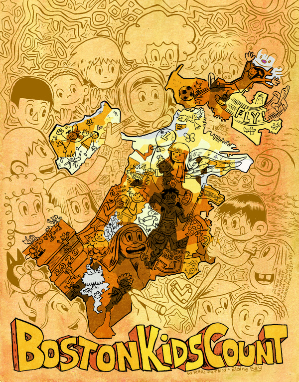
Kids Count!: Mapping Children in Boston
Students, we’re talking to you!
If you haven't already, take our Education Tour of the Bending Lines exhibition to start thinking about some of the topics explored in this lesson. Then come back to this page to get started!
Data About People
click on bold words to visit a glossary of map terms
When cartographers want to show information about people on maps, they have to start with data (information), specifically geospatial data (information linked to a place). For example, if we want to make a map of where kids live in Boston, we need geospatial data about the number of kids connected to where they live. So how do we get it?
One source of information mapmakers use when making maps about numbers of people is the United States Census. The Constitution of the United States, the highest law in the country, requires that the government count all people living in the United States every ten years. It needs that information to figure out how many people should represent each state in the House of Representatives in Washington D.C. and to decide things like how much of people’s tax money should go to each state to help build housing or how many post offices we need and where they should go.
So every ten years, like 2020, the government sends out forms and knocks on doors to try and count all of us. One thing it wants to know when counting is how old people are. It also does smaller counts in between those ten year counts to estimate how the numbers change over time and to gather other kinds of information. The Census Bureau has to do some estimating for different reasons: some people die after they are counted, some babies are born, some people go to live in another country, some migrate here, some people don’t have homes for a census worker to visit, some people are afraid to answer questions. Sometimes the estimates are pretty good and sometimes they aren’t very close to the facts! That's why it’s important to investigate where mapmakers get their information from and how close they think any estimates are if you are going to decide how trustworthy their maps are.
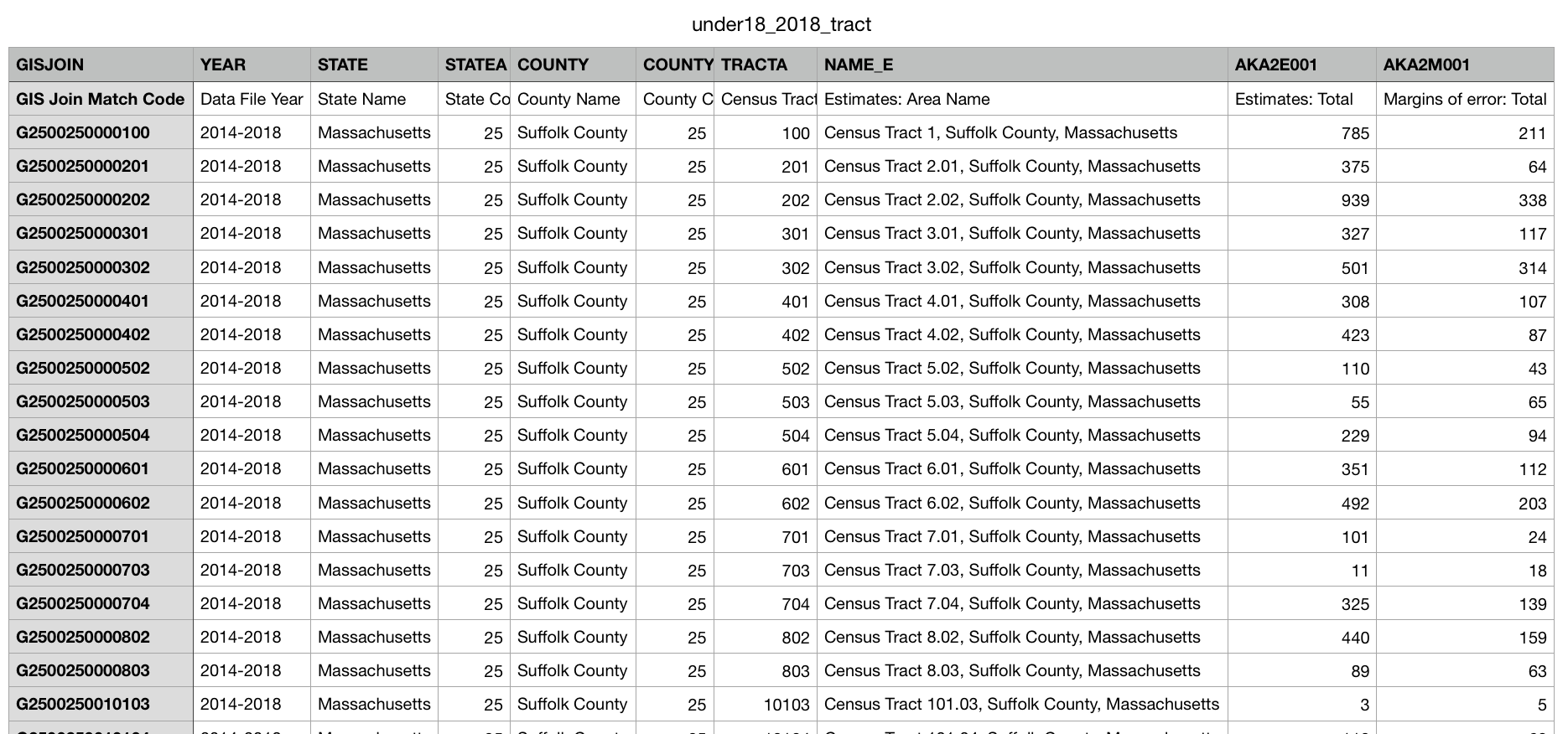
Here's an example of what a table of geospatial data about kids in Boston looks like before it is turned into a map:
Find Your Purpose!
A cartographer who makes a map from geospatial data does it for a purpose. Maybe she wants to show where there are very few hospitals in order to convince a city to spend money on opening medical clinics in those places. Maybe they want to show where a lot of Spanish-speaking people live in order to argue that street signs in those places should be in two languages. Maybe he wants to produce a map for a report that shows housing decision-makers how much money people spend on rent in different parts of a city.
In this lesson, we’re going to explore mapping kids in Boston. What purposes can you think of for knowing how many kids live in different parts of Boston? List as many ideas as you can think of.
Did you think of any of these?
- to figure out where to put playgrounds or libraries
- where to build schools
- how to give out money for afterschool programs
- planning the route for an ice cream truck
- deciding where to open a toy store
Did you come up with any others?
Lots of Ways to Show Info
As you can see in the education tour of Bending Lines, there are many different ways to show information, even the same information. It all depends on the mapmaker's purpose.
To explore some different ways someone might show the same information, we’d like you to try it yourself. You’ll need a piece of paper and something to draw and write with (markers, a pencil, a crayon, anything that writes is fine!).
Draw as many ways as you can think of to show or represent 100 kids. How will you do it? Will you use symbols or colors or words or drawings? Try to come up with at least five different ways.
What is one way to represent 100 kids you drew that you hadn’t thought of before? Do you draw any that would be especially good for a particular purpose?
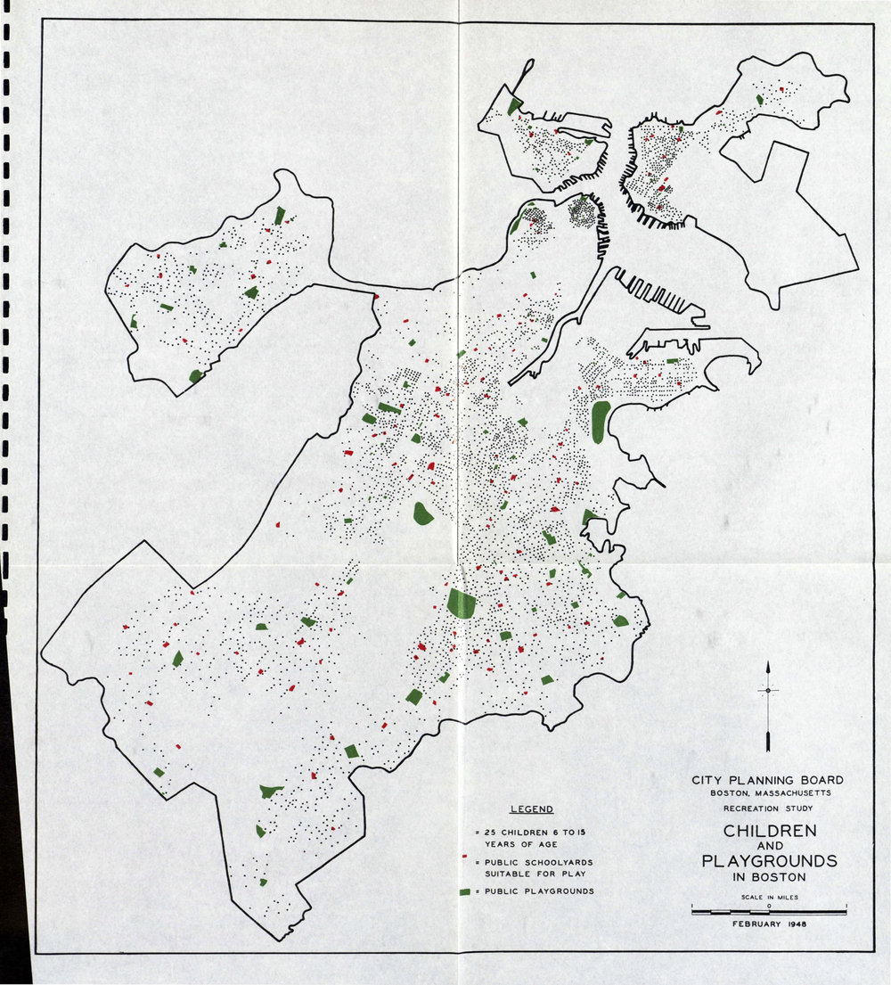
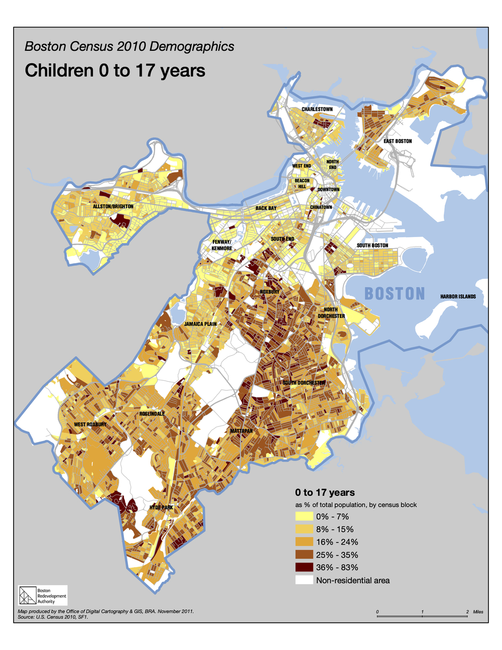
Three Maps
Here are links to three different maps that show information about how many children there are in Boston and where they live. Each map uses a different approach.
Read the information and questions on each map. Try to figure out what the map is showing, who made it and why, what it doesn’t show that might be important to know, and what strategies the cartographer used to show the information.
Making Your Own Data Map
All three of the maps in this lesson are based on data about where children live in the city of Boston and how many of them there are—or were, depending on when the map was made.
Now that you've seen many ways that different mapmakers show information, it's time for you to collect your own data and make your own data-based map. Instead of using GIS, you will be able to draw your map with markers, pencils, pens, crayons, paint. You can use a large paper bag to draw on. Or a sheet of notebook paper. Or you might use chalk and make it on a driveway or on a sidewalk.
First, collect your data. You need to identify something to count and decide how you will define the areas you will put on your map.
- Maybe you will make a long skinny map of your street, counting all the parked cars on each block. Or maybe only green cars. Or maybe only the cars you like. Or maybe only cars with license plates from outside of your state.
- Maybe you will find a patch of grass in a nearby park or in your yard, drawing the shape of the area and counting the number of dandelions to show where they are the most and least concentrated.
- You might even make a map of your house and count the number of electrical outlets in each room or the number of windows.
After you've done your counting, you will have to decide how you will represent your data. Are you going to use symbols of different sizes to represent different numbers of whatever you are counting, or maybe you will make a choropleth map, with areas with the most objects being the darkest color.
The best maps will have a purpose behind them, even if it's imaginary. For example, a map of parked cars on the street might be used to argue for making an underground parking lot so the road is safer for kids on bikes. A purpose can help you decide what strategies you will use for your map.
When you are done with your map, take a picture of it and share it with us by email. We'll post our favorites on the website as examples for other young cartographers!