Lesson: From Round to Flat: Map Projections
Introduction
click on bold words to visit a glossary of map terms
Maps are one way of making sense of our world. But they can never be an exact replica of our planet and they can never show us every single detail.
This is especially true with world maps. We can think of world maps as different VIEWS of the globe.
A globe is the most accurate way to show the world. However, we can’t have a lot of detail on a globe unless we make it very, very big!
The process of showing a round globe on a flat surface is called a projection.
Think about this:
Have you ever tried to flatten out an orange peel? What happens when you try to make the pieces line up perfectly to make them flat? You will have to squish and tear and move all the pieces around. You won’t have a new flat orange, but something that looks very different.
The maps in this exhibition have some funny sounding names: Azimuthal, Polyconic??
These are kinds of projections. Mapmakers have many projections to choose from when they want to show the earth on a flat map. It all depends on what the map is for, or its purpose.
Every map projection has some qualities that it shows really well and others that it doesn’t. These are: shape, size, direction & distance. Depending on the projection a cartographer uses, any one of these qualities can be distorted.
Every mapmaker has to decide which projection will work best for what they want their map to do. For example, if the mapmaker is trying to show where airplanes fly, they might choose one kind of map that shows accurate distance. However, if you just need a map to learn about continents of the world, you might just want one that preserves the shape of continents all around the world.
Key questions for this lesson:
- What are the differences between maps and globes?
- What are map projections?
- How do map projections show the round earth in different ways?
- Why might we choose different projections for different purposes?
Step 1
First, let’s take a look at a globe:
Spin the virtual globe around in all directions.
Find:
- Africa
- Greenland
- and Australia
Pay attention to sizes and how these places relate to each other on the earth.
Now go to Google Earth. When you launch it you will be able to look at a another view of a virtual globe. Zoom in a little, turn it around. Flip the globe to look at Antarctica, the North Pole or wherever you want to explore a little more.
Pick two more continents or land masses to explore. As you are zooming around, pay attention to the shape of the land and how big they appear on the globe compared to one another.
Now, pick a location to zoom into. You are able to see more details about that place the closer you get. The closer you zoom in, the more you can see, from buildings to roads, landmarks, etc.
Head like a Globe
If we want to see the entire globe on a flat surface so we can see all the continents at once, we will need a map projection to do this.
Every map projection has some qualities that it shows really well and others that it doesn’t. Any one of these qualities can be distorted or not accurate compared to the real world.
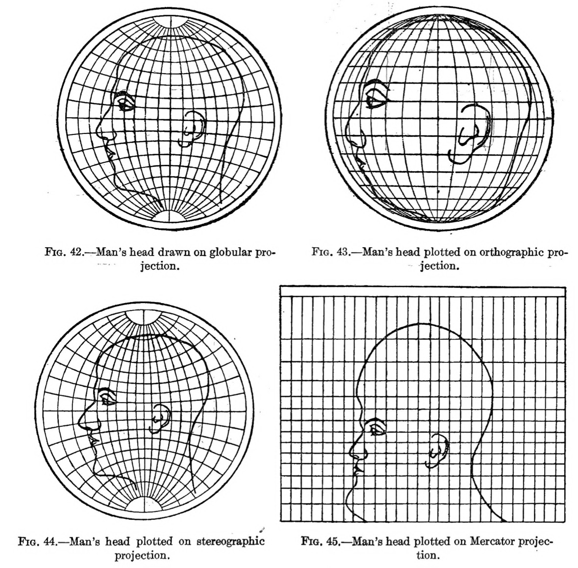
This tool lets you see what happens if we see a human head flattened, or projected, in different ways.
Let’s pick one projection you might have heard of: Use the drop down to find the Mercator projection.
- Which part of the head looks the most accurate? Which part looks the most incorrect (has the most distortion?)
Pick two other projections to explore:
- How do these differ from the Mercator?
- Where does the head look most accurate?
- Where does it have the most distortion?
Step 2
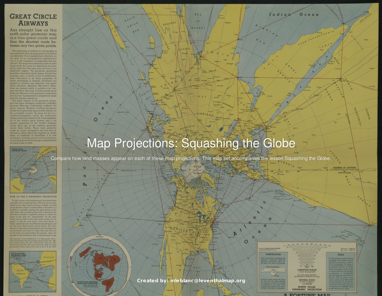
Here are more maps to explore and a challenge for you to compare maps. Open up this map set to find the maps and the worksheet that goes with them. You can do this on your own or as a group to compare maps.
Step 3
Now that you have compared all of the map projections:
- What did you notice about the size of land masses/continents across the maps?
- Is there one map you thought did a fairly good job of maintaining all of the qualities (shape, size, direction & distance)?
Now that you have compared them all, look up the actual area (size) of each of the land masses/continents on the worksheet.
- Which one is actually the largest? Which one is the smallest?
Now, let’s imagine what you might want to use these projections for:
- Which one would you pick if you were trying to show someone how they might sail around the world in a ship?
- Which one would you pick to show how airplanes might fly around the world?
- Which one do you think is the most accurate to teach someone about the size and shape of the continents?
Wrap up and Take Away
You have looked at many different kinds of map projections. Many teachers who educate kids (and adults) use map projections of the world to challenge them to think bigger than just their small place on the earth.
- What are some thoughts you have now about how you understand the world through maps?
Share your thoughts with us by email. We'll post our favorite ideas on the website as examples for other young cartographers!