The Geography of Youth
There are a lot of decisions that go into making a map. A map usually begins with a purpose in mind. Is this map designed to help us get from one place to another? Or will it help us make a big decision about where to build a new school or bus stop?
In this section we’re going to look at maps that show us information about where and how many children live in the City of Boston. Each of these maps uses different approaches to tell their story. To uncover stories, we need to look closely. Do you trust the information on the map? Is one better to help you make a decision than the other? What additional information do you need?
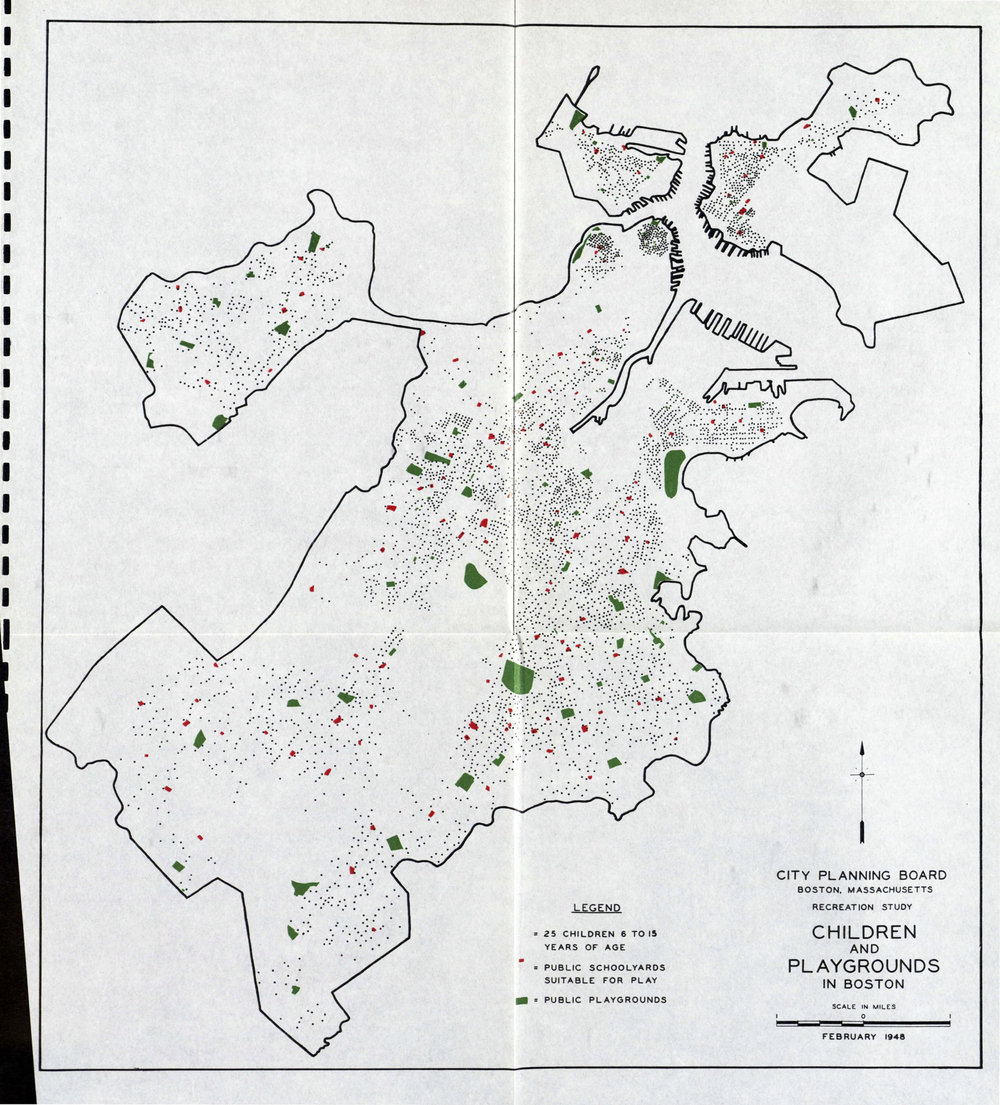
This map was part of a study from 1948 about children's playgrounds in Boston. Look closely at the legend. There are dots on this map as well as larger areas that are red and green. What do each of these represent? What do you notice about where the red and green areas are and the black dots? If the city planners were trying to decide where to add more playgrounds, what would be your advice?
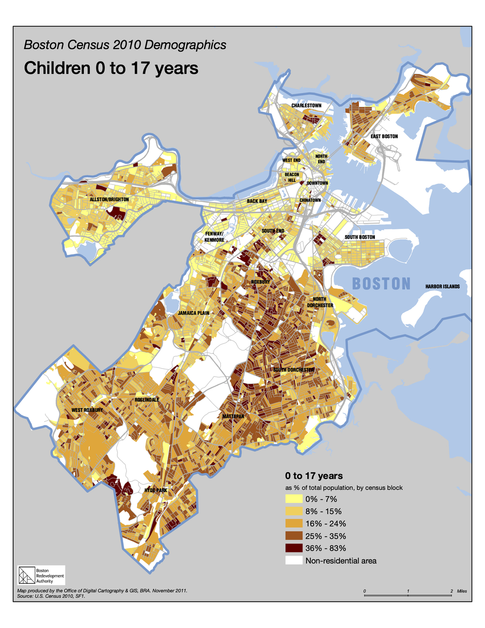
This map from the Boston Planning and Development Agency is called a choropleth map. It shows information about where there is more or less of something by using a range of colors in different areas.
Look closely at the map’s title and legend. The word “demographics” (literally drawing or writing the population) means information about people. What group of people is being explored on this map? What do you think the white areas might be?
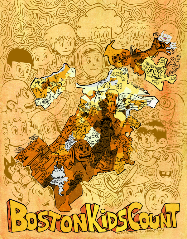
Illustrator Raúl the Third and artist Elaine Bay created this caricature map for the Map Center in 2020: Boston Kids Count. Unlike other kinds of maps, caricature maps are less concerned with showing precise locations and detailed information, and more interested in telling a story about something. Though Raúl and Elaine's map is based on geospatial data, they have interpreted that information to create a map that appeals to our sense of fun with an important message.
What information can you get from this map? When might this map be more useful than one without illustrations?