Maps in the Media
Even more than in atlases, textbooks, or tourists guides, one of the places where we're most likely to see a map is in the media. Whether a map flashes briefly on the screen as a cable news station cuts between segments, or a newspaper's investigative desk prints an in-depth exploration of demographic trends, journalists and media producers are constantly creating maps that reach millions of viewers. The media is one of the most heated sites of public conflict and dispute over different versions of the truth, and maps can advance narratives that become the tinder for political battles and protest movements. Although our current moment marks a particularly fraught time for trust and reliability in the news, throughout history the media has used maps for purposes ranging from outright trickery to accidental obfuscation.
The maps in this section are ephemeral. Produced to accompany newspapers or to be passed out in pamphlets, these maps represent only a few of the many thousands of maps designed to illustrate current events. In contrast to the kinds of maps which were painstakingly rendered according to scientific techniques and printed in limited edition, these maps were mass-circulation objects, oftentimes cobbled together by commercial illustrators or photo editors, drawing from stock basemaps and always seeking to grab their readers’ attention. The very ephemerality of these maps holds one of the keys to their power—rather than appearing as stuffy, formal objects dressed in the visual language of science, these maps were meant to be viewed quickly and to become part of the reader's own narrative of the reality surrounding them. In their ubiquity and their casual production, these media maps serve as a reminder of the flood of cartographic information which comes our way every day.
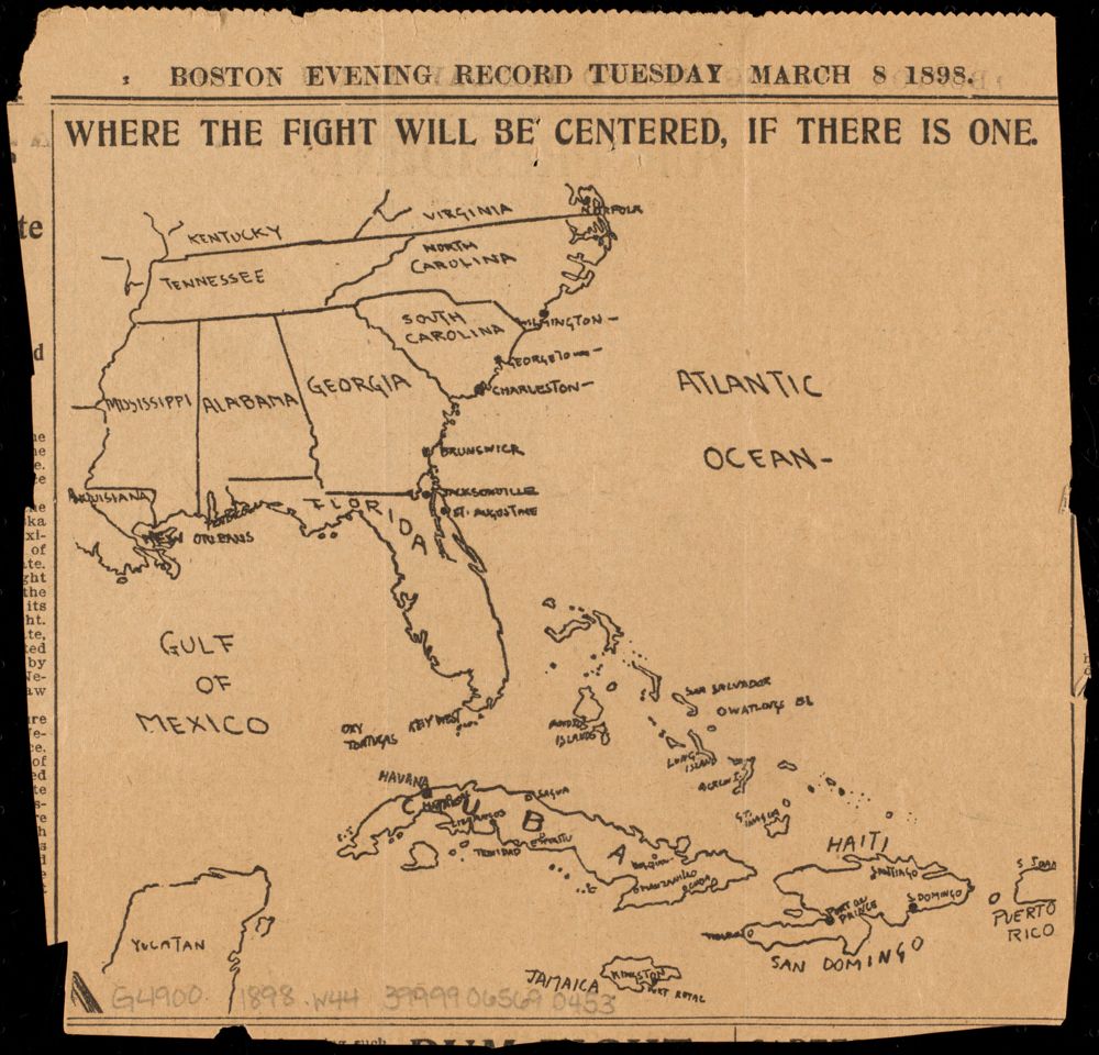
For instance, the Spanish-American War of 1898 coincided with the rise of mass-market, profit-seeking newspapers in the United States that were willing to make wild claims if those exaggerations led to better sales. The so-called “yellow press” became a major force in whipping up a war drive amongst the American public. Because the war took place in places that were unfamiliar to many Americans, in the far-flung Spanish Empire, maps were important tools for telling the public where, exactly, the battles were taking place. This March 1898 map from the Boston Evening Record, published in the tense period between the explosion of the U.S.S. Maine in Havana and the U.S. declaration of war on April 21, introduced readers to the Caribbean islands where the clouds of war were gathering.
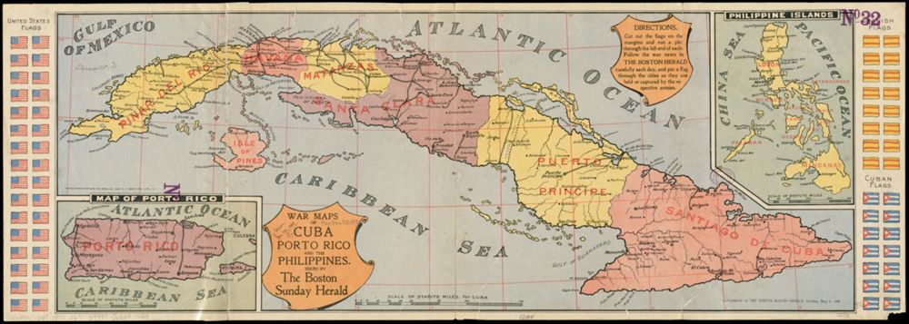
By May 1898, when this map of Cuba, Puerto Rico, and the Philippines was published in the Boston Sunday Herald, the U.S. had dispatched ships and troops to parts of the world whose names had been unknown to many Americans just a few months before. Because the war moved so quickly, newspapers realized that frequent updates about campaigns and battles was a market opportunity. This map was presented as a game for tracking the war: a reader could cut out the flags of the different belligerents, “follow the war news in the Boston Herald carefully each day,” and then move the flags around the map to keep up with events. Maps like these gave readers the sense that they were participating in the imperial project, helping to build the case in favor of an overseas adventure that many critics saw as a militaristic folly.
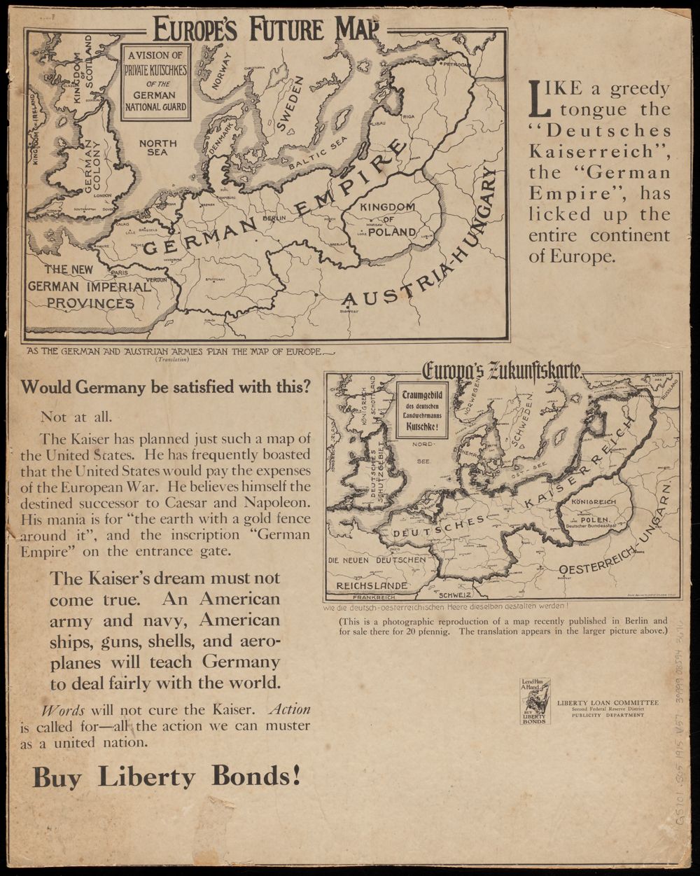
Because of the media's role in shaping public opinion, these kinds of maps can be fertile ground for propaganda and competing perspectives. This 1917 map of Europe was part of an advertisement for the Liberty Loan Committee, a branch of the Federal Reserve which was set up to fund military efforts in World War I by selling bonds. The advertisement reproduces a map “recently published in Berlin” which was meant to stir up a patriotic fervor for Germans. In it, the “German Empire” stretches from Havre to Petrograd (Saint Petersburg), with France a “New German Imperial Province” and England a “German Colony.” Such a map, the advertisement argues, offered proof of the Kaiser's lust for territorial conquest. What could an ordinary American do to stop it? The answer is set in bold type: “Buy Liberty Bonds.”
P.J. Mode Collection, Cornell University
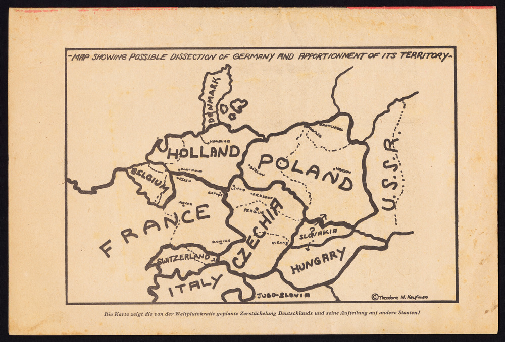
This map from the World War II tells almost the exact opposite story, with Germany the victim rather than the perpetrator of territorial aggression. The Nazi government discovered a book published by an obscure Jewish-American, titled Germany Must Perish!, which argued for the total destruction of the German state and advocated for sterilizing all German youth. This, of course, was exactly what the Nazis were doing at the time to European Jews, but in the hands of Nazi propagandists, the book seemingly proved the existence of an American and Jewish conspiracy to commit genocide against the Germans. They circulated this map as evidence for “the planned dismemberment of Germany by the world plutocracy”—the latter term soaked in antisemitic connotations—and the master propagandist Joseph Goebbels said that he would reprint the original pamphlet “in the millions” to inflame German anger.
How can we read maps in the media with a critical eye without writing off all news as disreputable? Maps in the media are rarely created by academic cartographers. Information like a legend and a list of sources can help a reader understand what information was used to create a map. Contextual information, like titles and dates, helps situate the map in a broader narrative. A good information designer will give information about how and why the map was created. Institutional markers of trust, like the logo of a respected news channel, can also shape our willingness to believe a map. Try out our interactive feature, Do You Trust This Map?, to explore and evaluate maps from the present day.