This Cartography Challenge has closed. View the winning map from Thomas Coughlin in LMEC's digital collections, and check back soon for more information about the next Cartography Challenge.
Topic: Immigration in Greater Boston
Your mission is simple: create a static map that creatively visualizes immigration patterns in the Greater Boston area. "Greater Boston" can be interpreted flexibly, but at minimum your map should include all of Boston proper and its neighborhoods. At maximum, you may represent all towns and cities within the Metropolitan Area Planning Council's Inner Core Committee. We suspect it would be difficult to meet the requirements of the challenge while including all these communities, but we won't stop you from trying!
In addition to an award of $200 and exhibition in the Leventhal Center's digital collections, the winning submission from this challenge will be used during K-12 educational visits and programs at the Leventhal Center. Therefore, submissions should be appealing to a wide range of learners, especially grade-school children.
Challenge: No Choropleth, No Problem
The Center has relatively few maps that depict immigration in the Greater Boston region, and most of them are simple choropleth maps that show value using colors or shading by area. We need a break from them, so for now, we're putting an embargo on the choropleth. (Before you ask: yes, this embargo extends to bivariate maps, too.)
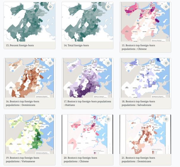
Our digital collections portal is bursting at the seams with choropleth maps about immigration—help us!
In our inaugural Cartography Challenge, we're looking for submissions that go beyond the choropleth map. While useful for visualizing differences across space, choropleth maps can be especially misleading when it comes to data representation. In this challenge, we're excited to see submissions that move beyond the choropleth map, creatively and elegantly visualizing Boston's immigration patterns in unexpected ways.
The BPDA's "word cloud" map of immigration across Boston's neighborhoods is a great example of a non-choropleth map that meets a lot of our criteria: it contains detailed and easy-to-read information, vibrant colors, and a graph providing further context.
Data: 2020 American Community Survey (ACS): 5-year, 2016-2020
To compete in this Cartography Challenge, you must submit a map that uses foreign-born population data at the Census tract level from the ACS's 5-year estimates, 2016-2020. After downloading this data from NHGIS, we did some light processing to standardize field names and data types. Otherwise, it's been unchanged.
Applicants need not limit their submission to only this dataset---submissions are welcome to include additional data such as other Census tables or user-generated data. At minimum, though, submissions must include a representation of the 2016-2020 ACS 5-year estimates for foreign-born population.
In addition to the foreign-born population dataset, submissions should include a representation of Boston's neighborhoods. To get started with the data, download it for free from our Data Portal:
Evaluation
Submissions will be evaluated according to these five criteria:
Topicality: Does the submission creatively engage with the topic?
Data integrity: Does the submission use the correct dataset and include other appropriate information? Has the data been appropriately represented within the confines of the story that the map is telling?
Challenge creativity: How has the submission responded to the Challenge prompt?
Cartographic design: Does the submission follow reasonable design principles, or perhaps break with them in generative, exciting ways? Does the submission follow best practices in accessible design (e.g., colorblind readability)?
Educational capacity: Is the submission visually engaging for a wide range of learners from grade-school children to adults? Can it be effectively used in teaching and public education, especially for K-12 students?
An application consists of the following material submitted by Monday, December 19, 2022 at 10pm ET:
One map that appropriately responds to the present submission cycle's topic, data, and challenge themes, including information about Boston's neighborhoods
The work should have a resolution of at least 300 dpi, and its print dimensions should be no smaller than 11 inches on the shorter side, and no larger than 30 inches on the longer side (uploads or URLs in TIFF format)
If not already present in the map, a single document including 1) a technical statement of not more than 300 words describing the workflow used to create the map and 2) a data bibliography (.doc, .pdf, or Markdown format)
An indication of whether you would like your submission to be considered for accession into the LMEC's Digital Collections and licensed under a Creative Commons CC-0 or CC-BY 4.0 copyright (the LMEC reserves the right to request changes to submissions before they are accessioned into collections)
Don't hesitate to reach out to us if you have any questions about the submission process. Applicants will be notified with results by January 19, 2023.