On September 19, we hosted From The Vault — Unconventional World Views.
So… what if we told you the world map you’re used to seeing isn’t actually “the most accurate” depiction of the world we inhabit?
The Mercator projection, introduced in 1569 by Gerardus Mercator, has long been considered a “default” world map, especially amongst audiences in the Western Hemisphere. Every type of projection distorts the original geometry of the curved, three-dimensional earth in some way, but because we’re so used to seeing projected maps of the globe, those distortions no longer look strange to us. Could different map perspectives help us refresh our view to see things a little differently?
Take a closer look at maps from the Leventhal Center’s collection as we answer these questions!
Ernest Dudley Chase, Mercator map of the world united : a pictorial history of transport and communications and paths to permanent peace (1944)

This world map is done using the Mercator Projection. For many, this is a familiar view of the globe, as this type of world projection has been popularly used by Western powers for nearly 500 years. Made popular through its usefulness to sailors and merchants, the Mercator Projection allowed them to plot their journey in a straight line without having to adjust their compasses. During the age of colonialism, this was an incredible asset, as ocean-based trade routes were crucial to global commerce.
However, while the Mercator map preserves the shapes of the landmasses, the continents' actual size can be heavily distorted. For instance, on this map Africa and North America appear to be of similar size, when in reality Africa is approximately 20% larger. This map has a specific focus on “paths to permanent peace” and emphasizes the importance of communication and accessible travel across the world.
Heinrich Bünting, Die gantze Welt in ein Kleberblat, welches in der Stadt Hannover, meines lieben Vaterlandes Wapen (1581)

Depicting the world as a cloverleaf, this cartographic curiosity reflects the European Medieval world view of three continents. Since it was published in the late-16th century long after the New World discoveries had gained wide acceptance, its primary appeal would have been to readers who cherished the past. It was one of several whimsical diagrams included in a book, which was essentially the Bible rewritten as an illustrated travel book.
The author, a professor of theology, used the trefoil or cloverleaf arms of his native city to represent the world, making this map more a statement of civic pride than a serious attempt at cartography. Each of the three leaves represents one of the continents -- Asia, Europe, and Africa. At the intersection of the leaves, Jerusalem is clearly marked. In recognition of the New World discoveries, America is shown almost as an afterthought in the lower left hand corner.
Franciscus Verhaer, Geographica restituta per globi trientes (1618)

Displaying the known world of the early 17th century as a triptych, with the map divided into three segments or gores, was very uncommon during the Golden Age of Dutch cartography. However, such a format was commonly used in altarpieces and would have been familiar to a Christian audience. Dividing the world into three parts was also reminiscent of the world diagrams drawn in the Medieval Christian tradition, especially Heinrich Bünting's cloverleaf map also on display.
While this three-part projection reduced the amount of distortion for the respective geographic areas, it was also a logical presentation of classical and medieval geographical tradition in the context of the new geographical knowledge gleaned from Europeans' 15th- and 16th-century explorations. The map's author was a theologian and classical historian and his other works included several small globes and maps of a historical-religious nature. In addition, the inset views portray biblical themes, including the flood and Noah's ark on the lower right. Some scholars have suggested that this relatively rare map may have been prepared as an illustration for a Bible or similar tome.
Arno Peters, Peters World map (2006)
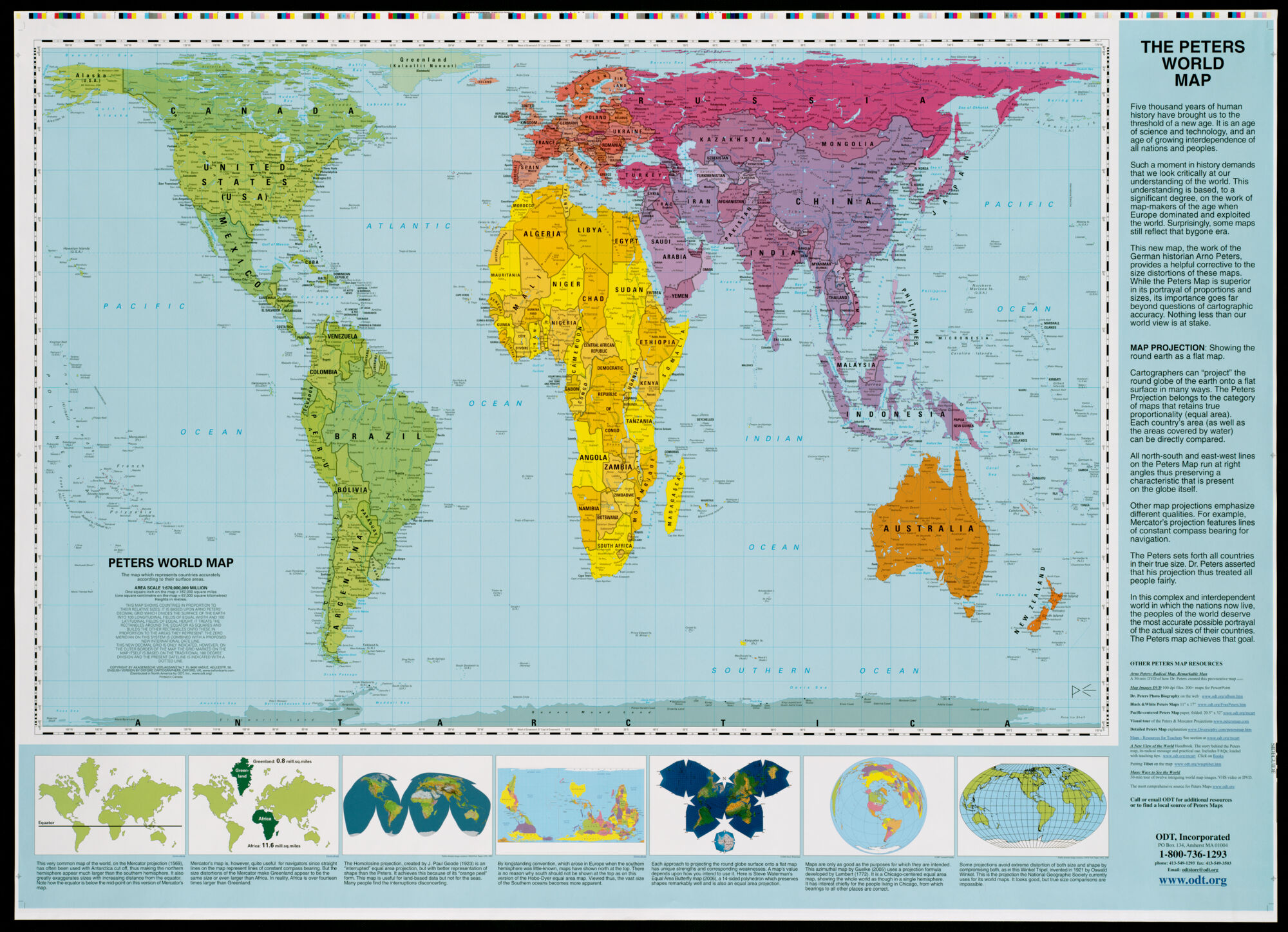
This is a world map based on the Peters Projection. This projection was popularized by Arno Peters, a 20th-century German historian, who was dissatisfied with the Mercator projection. Western powers have used the Mercator map for nearly 500 years. The Mercator projection allowed sailors to plot their journey in a straight line without having to adjust their compasses. During the age of colonialism, this was an incredible asset, as ocean-based trade routes were crucial to global commerce.
However, while the Mercator map preserves the shapes of the landmasses, the continents' actual size can be heavily distorted. For instance, Africa and Greenland appear to be of similar size on the Mercator projection, when in reality Africa is approximately 14 times larger. In place of the Mercator projection, Peters advocated the use of a projection that is known technically as the Gall equal-area projection, but is now popularly known by his name. This projection preserves relative area or size throughout the entire map, but in doing so, distorts the shapes of continents and countries.
The English edition of this projection is subtitled, "The map which represents countries accurately according to their surface areas" and it was adopted by a number of social agencies such as the World Council of Churches, UNESCO, and UNICEF to graphically present a more equitable distribution of social and demographic data. In the marginal text, the publishers further explain that the Peters projection is "superior in its portrayal of proportions and sizes" and "its importance goes far beyond questions of cartographic accuracy. No less than our world view is at stake."
National Survey Company, The official map of the world : showing the four quarters of the globe on the quarter-spherical or orange peel projection (1919)

“It is manifestibly impossible to show the entire surface of the world on a flat sheet of paper without some distortion,” so begins the explanation of this “orange peal” projection. With some common critiques of the most recognizable map projection, the Mercator Projection, this map touts that it “makes every country of the Globe appear in practically its true size, relative to every other country.” Though less useful for land or maritime navigation, a map of this sort can be helpful in understanding the scale of a region and the true breadth of a country’s land.
A. Shortfellow, Map of Boston and adjacent country showing that city to be the geographical as well as intellectual and moral centre of one half of the globe [ca. 1871]

This tongue-in-cheek map from the 1870s uses an “Azimuthal Projection” to make Boston look like the focal point of the world. The benefit of the Azimuthal Projection is that all points on the map are at proportionally correct distances from the center point, and that all points on the map are the correct azimuth (direction) from the center point.
This kind of map projection may be helpful when observing what’s within a certain range of the focal point, like this map does with Boston. Instead of Earth, the new name is “Boston and adjacent country,” and the label states that Boston is “the geographical as well as intellectual and moral centre of one half of the globe.”
Mick Dyer, The world turned upside down (2005)

Oriented with the South at the top, this “upside-down” world map jostles expectations, but clearly conveys a message that unconventional world views can be meaningful. This map is particularly thought provoking because “up or down” as they refer to a general direction have no inherent attachment to “North or South” when we think of the whole Earth as a planet floating in the vast emptiness of outer space.
Prepared for an organization that reports on global poverty and inequality, the map helps to teach “people to see the world from a broader, more inclusive perspective.” Traditional, North-oriented world maps emphasize Europe and North America, implying that other continents are less important. This contrary perspective places Africa and South America in the center, suggesting that the southern hemisphere’s developing countries are equally important.
Our articles are always free
You’ll never hit a paywall or be asked to subscribe to read our free articles. No matter who you are, our articles are free to read—in class, at home, on the train, or wherever you like. In fact, you can even reuse them under a Creative Commons CC BY-ND 2.0 license.