Using tax assessor data included in the City of Boston's digital maps, it would be easy to find estimates of a given building's date of construction. You could do it for ten buildings, or even 100 if you had to—but what if you wanted to easily visualize the date of construction for every single structure in the City of Boston? What would it take—where would you even start?
In the Netherlands and New York City, cartographers like Bert Spaan, Brandon Liu, and Thomas Rhiel have answered this question. We wanted to replicate this in Boston, so we turned to the City of Boston’s “Boston Buildings Inventory” (BBI) dataset, which includes information for the year built of over 120,000 structures across the city. We mapped the oldest buildings in red, the newest buildings in blue, and everything in between through a range of oranges, yellows, and greens. Check it out below (and note that you can toggle the layers on and off by clicking in the legend of the map):
Maps like these can help depict the ages of Boston’s neighborhoods, and they can also trace the neighborhoods forward in time to illuminate contemporary economic or cultural patterns in Boston's geography. For instance, we can connect stretches of rapid construction to periods of mass immigration, the expansion of urban sprawl, or displacements through urban renewal. These spatial histories aren’t immediately visible in the colors on the map, of course—but the map is a good starting point.
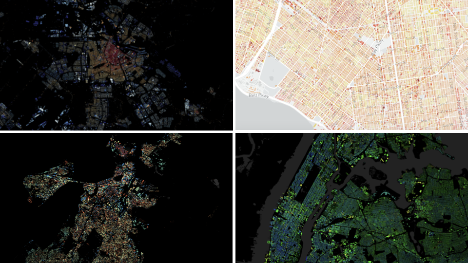
Different maps visualizing building age across the Netherlands, New York City, and Boston
How do you know when a building was built?
In Boston, many centuries of construction and demolition have produced a uniquely varied landscape of buildings, especially compared to other cities in the U.S. Resources like John Bonner’s detailed street map of Boston list churches from 1722 that still stand today, while entire neighborhoods like the West End have been wiped out to make way for new construction. That variance makes Boston an ideal city for teasing spatial stories from the heterogeneity of urban landscapes created over many centuries of change.
The information in our map derives primarily from the tax assessor database. A building’s date of construction is an important element of a tax record, but figuring out when a building was constructed takes a lot of work. For example, when tax assessors try to determine a building’s construction date, they rely on documents like aerial photographs, deed records, and permits. The American Housing Survey (AHS) and the American Community Survey (ACS), which provide information on when housing was built nationally, use personal responses to assess when a building was constructed, and then they impute the missing information with property tax data. Tax assessors often inspect property multiple times, and when they aren't able to enter a building directly, they will often make an estimation based on other buildings surrounding it.
The Boston Building Inventory (BBI) contains 107 different fields. Because we wanted to visualize the date of construction, we were most interested in the year_built field—but before we mapped it, we needed more context about why this dataset was even created in the first place.
“It looks to me like this was a dataset crafted early on in the process of rolling out BERDO,” said Jeff Kaplan, Senior Geospatial Data Analyst at the City of Boston, when we asked him about the BBI. Data from public data portals like Analyze Boston are often created for particular policy contexts and goals like these. When searching for data, it is essential to consider that every dataset contains some sort of bias or perspective. This does not mean the data is wrong, but rather that data must always be understood within its original social context.
Tracking down metadata—like this spreadsheet, which documents data sources for the BBI—can help to clarify the original context of data. “It looks like this was a one-off, complicated undertaking to pull together a lot of data sources,” Kaplan explained. “As far as I know, no one at the City has tried to duplicate this work or reproduce it on an annual basis since.”
Like any dataset, the BBI is impartial and imperfect. For instance, the data depicts the Central Library in Copley Square as a single structure with one construction date in 1899. Not only was the Library actually built one year earlier, in 1898, but it's also two distinct buildings: the original McKim building, and the newer Boylston Street Building, which was completed in 1972.
These kinds of small-scale errors are quite common in the BBI dataset and in the published map. Thus, the data and the map are highly scale dependent: it works best at the neighborhood or city scale to reveal general, aggregated patterns in Boston's historical geography, rather than verifying the exact details of specific buildings.
Cleaning the data
The BBI data included unique identifiers (UIDs) for each structure, making it possible to link descriptive information about the date of construction with spatial data showing the actual building footprints. The process of linking two different datasets based on a common ID is commonly known as a table join, and it makes a lot of other GIS operations possible.

A table join, visualized by Tess McCann for Making Sense of Maps and Data (2021)
We joined our two datasets using a parcel UID. Parcels of land are legally defined pieces of property used by tax assessors to keep track of buildings and properties. Because multiple buildings can share a parcel, the IDs didn’t always join successfully. Some IDs were missing, while others had a single digit difference in the ID from their parcel counterparts. To fix this, we processed the data in a Python notebook—which you can view on Kaggle—removing duplicate structures, dropping empty geometry fields, and converting all data to a common projection. Finally, we spatially joined "null" buildings, or buildings with no UID, based on the parcel they occupied.
While the process of cleaning and imputing data from multiple sources yielded construction dates for over half of the originally undated buildings, about 14 percent of buildings in the map are still missing information. This also increased the amount of duplicate IDs, meaning that in places like large housing complexes, several structures share the same parcel or different structures share the same ID. We assigned dates as though all such buildings were constructed in the same year, which may not be the case in reality. In the map, a diagonal line fill indicates our uncertainty for these structures.
Because the processed data contains too many features to efficiently display in GeoJSON format, we processed the data using Tippecanoe and rendered the final map as an MBTiles file hosted on MapTiler. We manually classified the data into nine roughly equal categories and published it as a Svelte app, using MapTiler’s SDK to display the map online.
Data processing puzzles
While processing the data, we noticed an odd pattern: a large spike of buildings constructed in 1900. Approximately 12,000 buildings, or 11 percent of all buildings with dates, were listed as constructed in 1900. Of course, it's unlikely that 11 percent of all buildings in the city were constructed in this year (if a tenth of all Boston’s buildings were built in one year, it would be a well-documented historical event).

An aerial photograph of Old Harbor Village in 1936 (from the Boston Public Library Arts Department)
This raises the question: what's this artifact doing in the data?
Our best guess is that when the true year is unknown, but the building seems relatively old, 1899 or 1900 may be used as a placeholder value. For example, the first public housing project in Boston (Old Harbor Village, now named McCormack Homes) was constructed in 1936. However, the BBI—and by extension, our map—dates the housing complex between 1890 and 1900. Although the historical record shows that isn't the case, this error still highlights the piecemeal nature of constructing large datasets from many different sources.
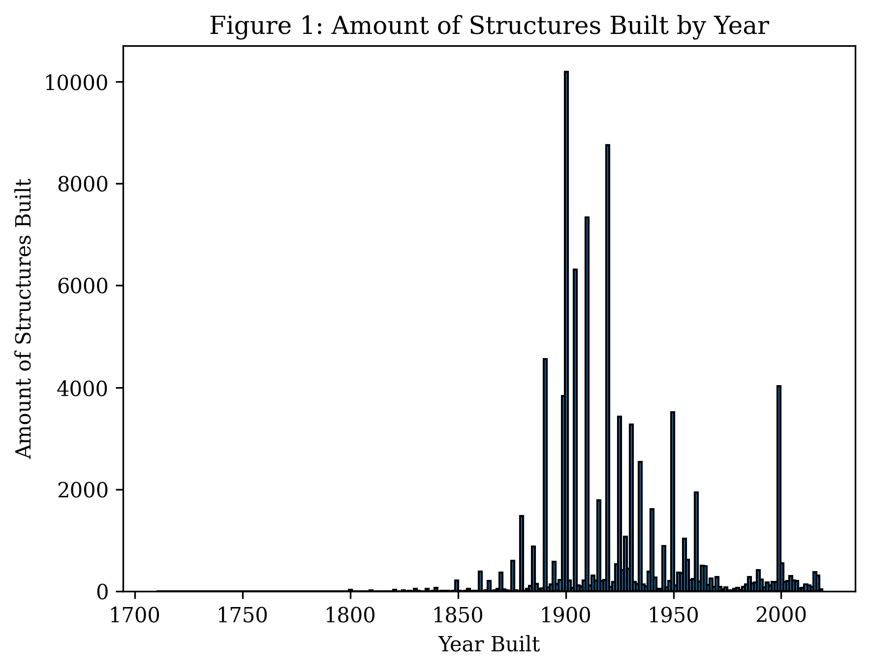
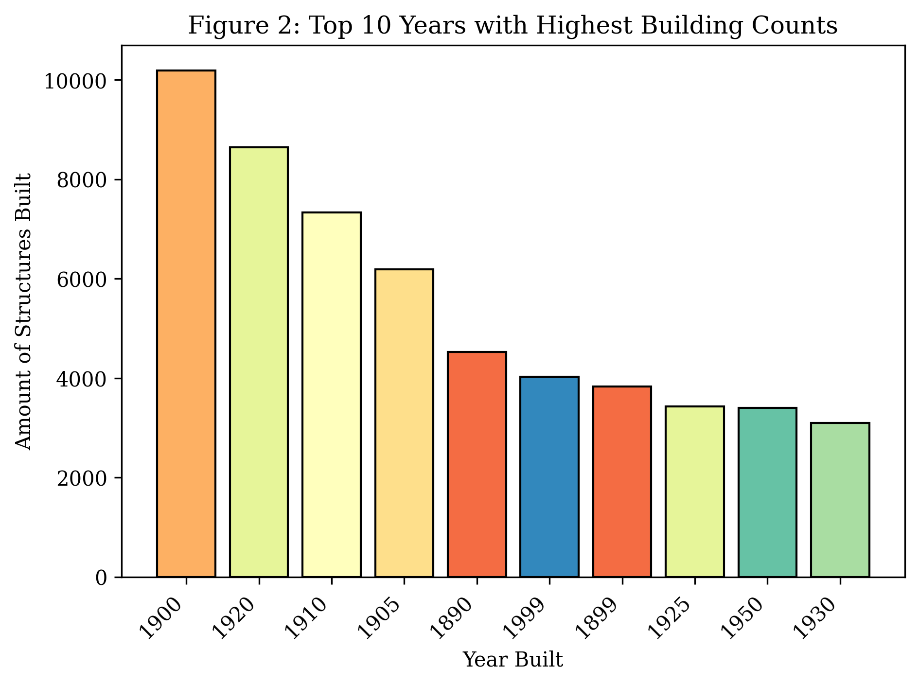
Sometimes, understanding patterns in spatial data requires looking at more than maps. The first histogram below (Figure 1) represents the distribution of construction over time. It’s not very evenly distributed and has large spikes in round-numbered years, like each decade. The second histogram shows the top 10 most populated years in which buildings were constructed throughout the data set. Patterns here most likely represent a general idea of when a structure was built, rather than precise knowledge of an exact date.
With that knowledge in mind, what can this dataset teach us about historical geography at the neighborhood scale?
Neighborhood age and historical geography
Although the BBI data has plenty of limitations, it still provides an instructive starting point for engaging with broad patterns in historical geography. Neighborhoods like the South End, Back Bay, and Beacon Hill show stark contrasts of blues and reds; here, old and new buildings cluster in close proximity to one another, where renovation, development, and preservation intermingle. Other neighborhoods, further from the city center, exhibit high concentrations of yellow buildings, which represent houses built in the early to mid-1900s during early waves of suburbanization.
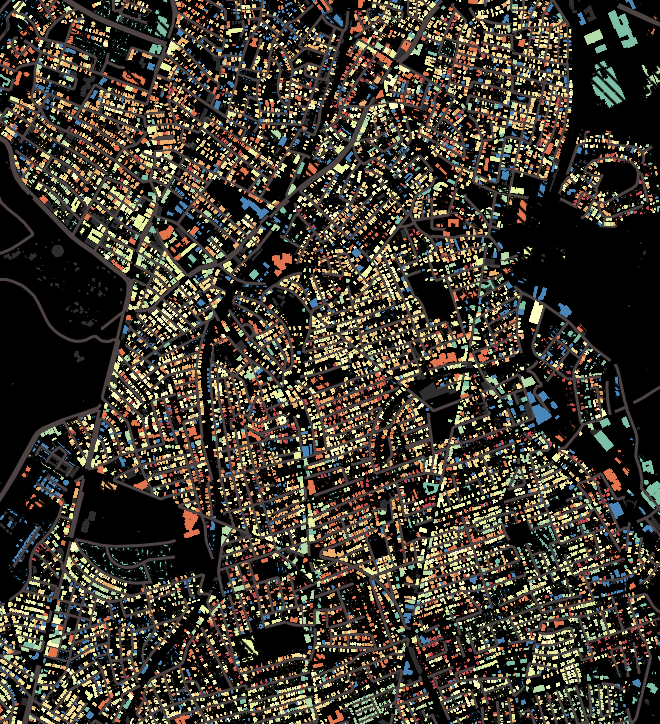
These spatial patterns in building age reflect changing demographics in Boston’s historical geography. American cities grew considerably between 1880 and 1920, especially Boston, which was the second most popular port for arriving immigrants. After immigration to Boston peaked in 1910, new development and settlement patterns emerged across neighborhoods outside of the colonial and industrial core. Dorchester and Roslindale, for instance, experienced a significant construction boom in the period between 1900 and 1920. These areas on this map are speckled predominantly with yellows and greens.
Starting in the 1930s, the Home Owners' Loan Corporation (HOLC) traveled around the country to assign grades on mortgage lending risk. Across the HOLC project, the two most important factors influencing neighborhood grades were the "average age" of buildings in the neighborhoods, and the race of a neighborhood's inhabitants. Roxbury earned a "D" grade, which translated to "high risk"—a designation that reflected the implicit and explicit racism of the real estate industry.
In this sense, the age of buildings can proxy disinvestment and destruction. In Boston, urban renewal projects transformed the West End between the 1950s and the 1980s. Before the 1950s, as the West End Museum notes, the West End of Boston was a diverse immigrant community packed with culture, busy tenements, and crowded streets. However, at the time, real estate surveyors defined it as a slum, due to what they viewed as a "tough" reputation. During its survey, the HOLC described the West End with terms like, “Highly congested. Foreign concentration. Narrow streets. Low-wage class. Scattered taverns.”
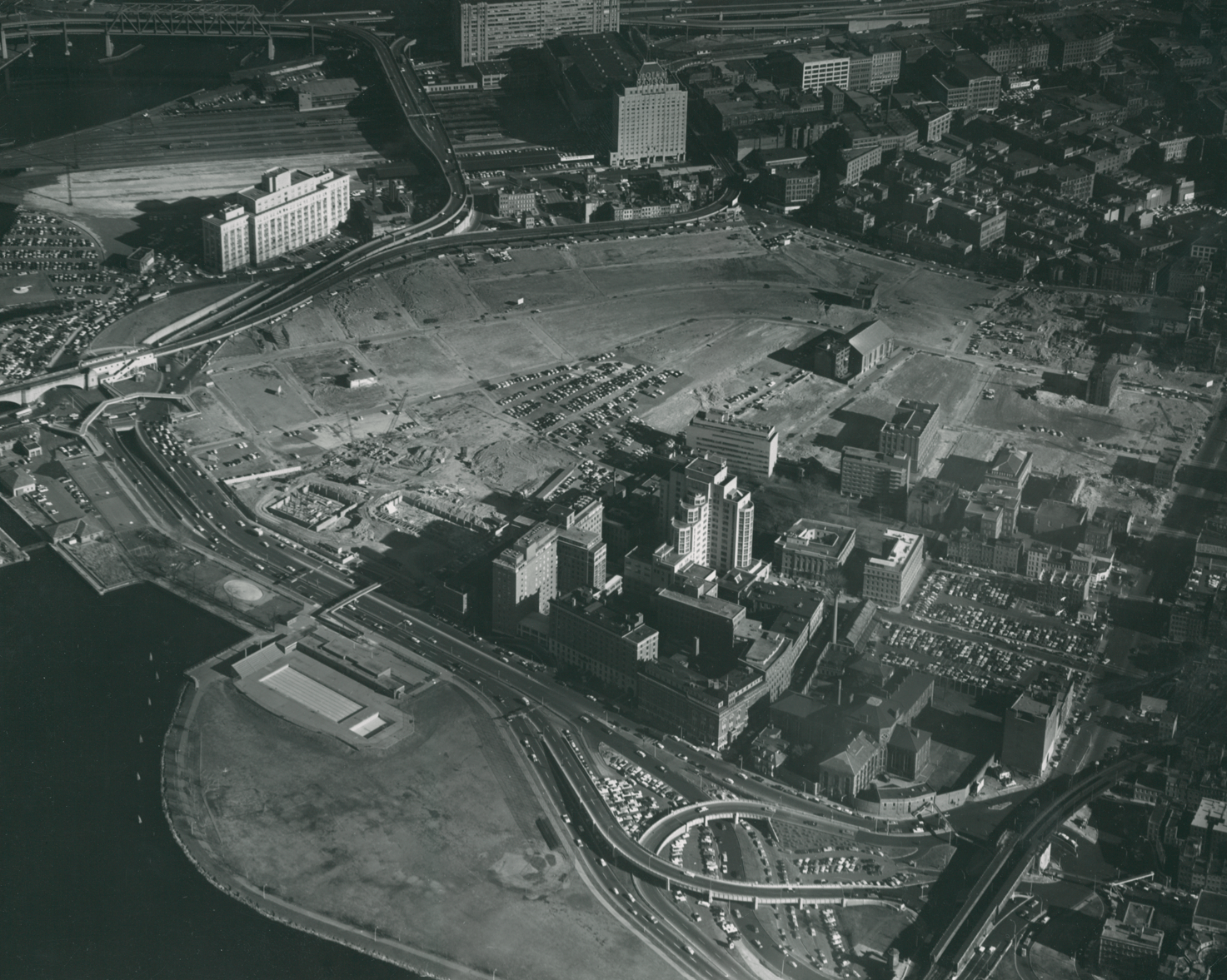
Aerial photo of the West End, c. 1959 (Boston Housing Authority)
By the 1950s, urban renewal was in full swing. Planners took a bulldozer to the West End, displacing the Jewish, Irish, and Polish immigrants who lived there. Today, the neighborhood contains hospital infrastructure, new-build apartments, hotels, and corporate work buildings that were generally constructed after 1950. We might compare those bulldozed tenements in the West End to nearby neighborhoods like the South End, Back Bay, or Beacon Hill, where the presence of old homes can be a valuable asset today.
In an increasingly data-driven world, where large datasets (like this one) may inform policy decisions, it is easy to forget the complexity of data collection and the hidden errors that can lead to false conclusions. It is, in other words, always important to get to know your data. Questions about how a data attribute like building age corresponds with economic value always depend on geographic site and situation.
Kate Lautenbach (she/her) is interested in natural/environmental history, libraries, and interactions and relationships between humans and technological systems. She is currently studying Data Science and International Affairs at Northeastern University.
Our articles are always free
You’ll never hit a paywall or be asked to subscribe to read our free articles. No matter who you are, our articles are free to read—in class, at home, on the train, or wherever you like. In fact, you can even reuse them under a Creative Commons CC BY-ND 2.0 license.