Many in the United States observe the month of February as Black History Month to celebrate the “the importance of Black history in the drama of the American story.” To recognize Black History Month and acknowledge our commitment to share Black histories year round, we're focusing on some materials that reflect on historical figures, geographies, and cartographies that document these stories. From difficult stories about oppression to portraits of liberation, maps can lead us into many different ways of commemorating Black culture and history in the United States.
Geographies of exclusion
In the autobiographical writings of To Be Young, Gifted and Black, Lorraine Hansberry recollects her childhood experiences growing up in Chicago’s Washington Park—specifically the violence endured by her family at the hands of their white neighbors. Hansberry’s father purchased their Washington Park home through a white intermediary and soon became the subject of a lawsuit by a resident intent on preserving the racial integrity of his neighborhood.
This seemingly-cheerful 1931 pictorial map of Chicago by Charles Turzak and Henry Chapman includes racist imagery of Black and Asian residents as it boasts of the city's youthful vigor and industriousness. These visual representations accompany the racial divisions orchestrated by the banking and real estate industries as Black Americans poured into Chicago from the South during the Great Migration and reflect the ideas that provoked the violence faced by those families, like Hansberry's, that risked crossing the lines.
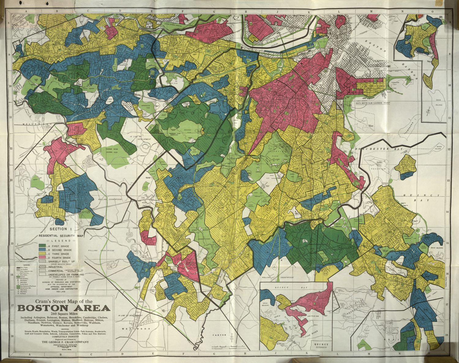
Assistant Curator Ian Spangler interviewed Scott Markley about HOLC map data as part of our Get To Know Your Data series. View the full set of residential security maps here.
The same logics that fueled racial and spatial segregation are deeply rooted in U.S. property and loan practices. Last month, LMEC Assistant Curator Ian Spangler sat down with PhD candidate Scott Markley to discuss these histories and legacies within Homeowners Loan Corporation (HOLC) “redlining” maps, commonly referenced today to demonstrate the histories and geographies of racial discrimination in U.S. cities.
HOLC maps were created to evaluate investment risk for mortgage assistance and loans in urban areas based on factors like Black population percentage, “foreign-born” population percentage and group, family income, occupation class, average building age, home repair status, and mortgage availability. The resulting maps often produced implicit claims about the relationship between value and race in cities: if Black residents were moving into a white neighborhood, it would be considered by neighborhood appraisers as “in decline” because Black residential presence was thought to speed up the neighborhood "degradation" process, in the eyes of racist property speculators.
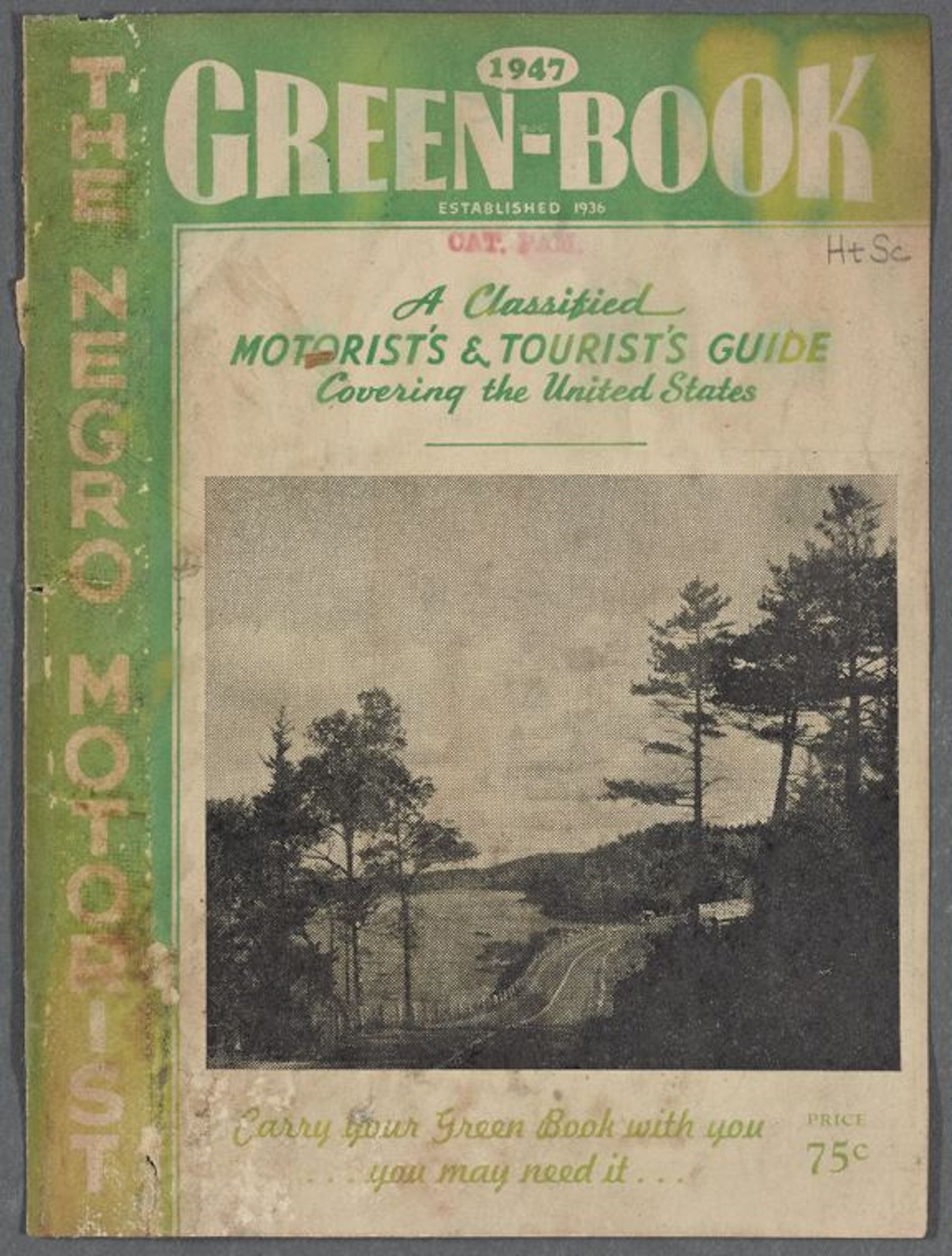
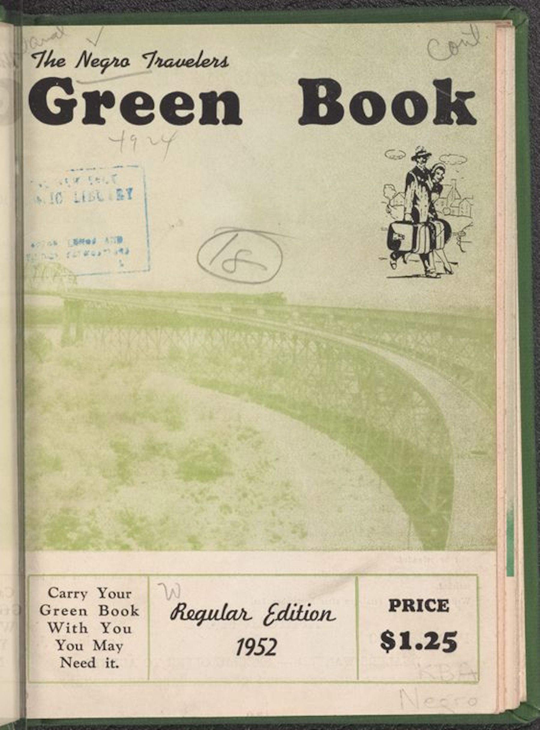
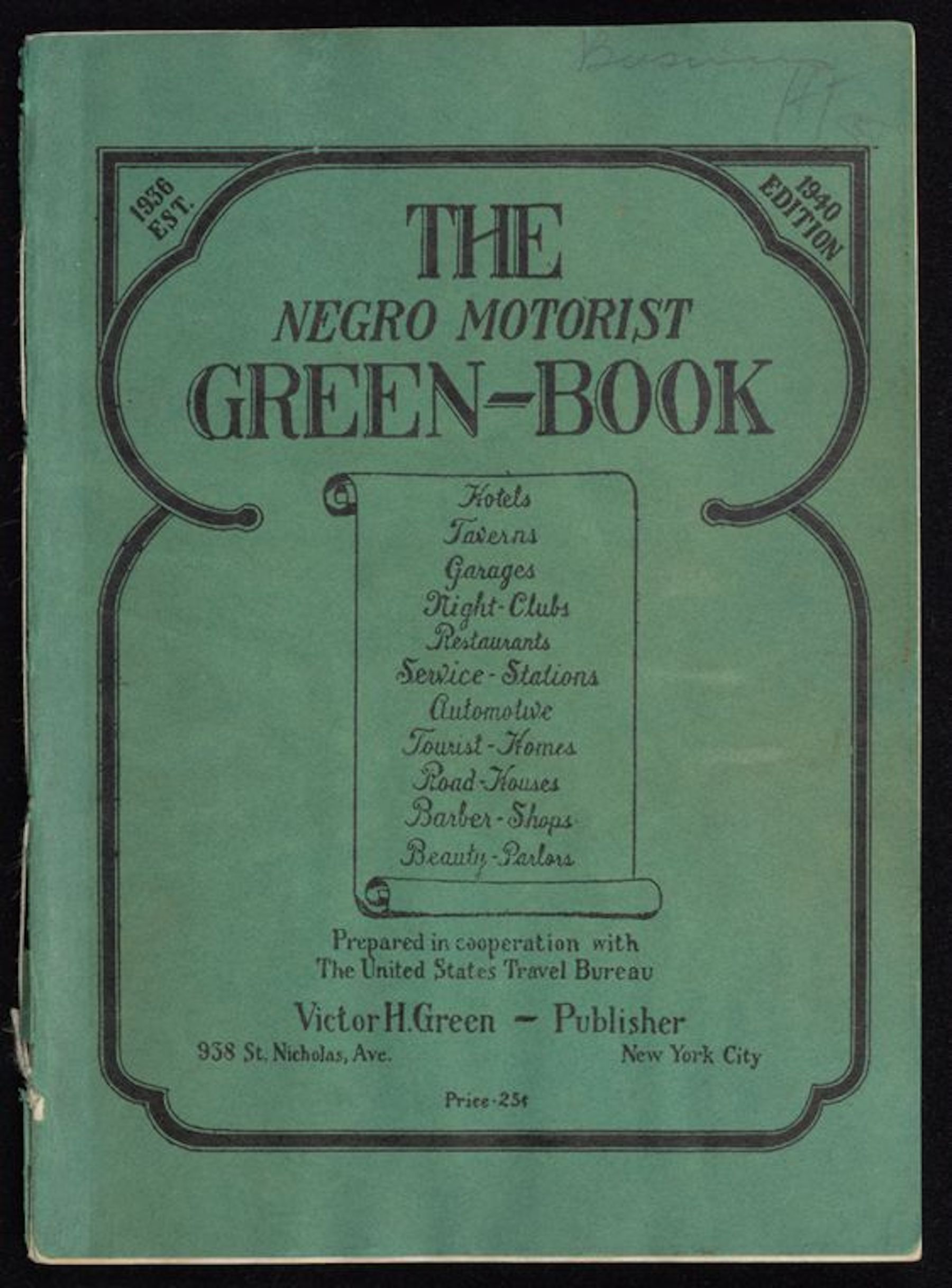
Confronted with the dangers and exclusions of such geographic practices, a Black “tool of resistance” emerged in the mid-twentieth century “to spatially subvert white supremacy.” Between 1936 and 1966, over 30 editions of The Green Book were published as safe travel guides for Black travelers when passing through “hostile areas” of the country. Organized state by state, each edition lists hotels, tourist homes, garages, restaurants, service stations, beauty parlors, barber shops, and night clubs. Today, the guidebooks offer an insight into the understudied geographic spaces and behaviors of Black travelers during the Jim Crow era.
Mapping racial inequality
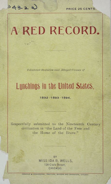
Ida B. Wells' A Red Record was the first statistical analysis of nationwide lynchings.
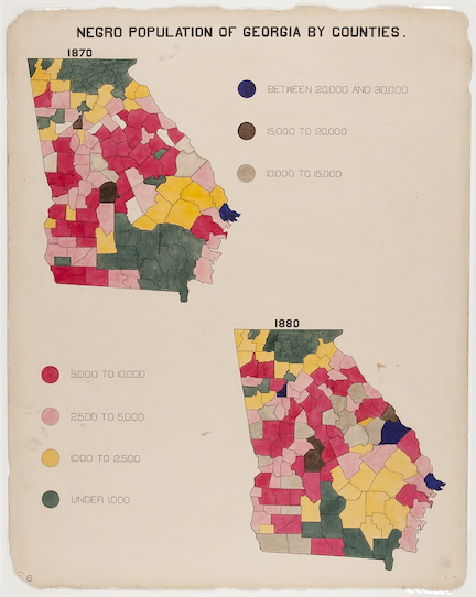
In addition to navigating the racially-unequal spaces of cities and states across America, many Black activists drew on their own geographic analyses and visualizations as a mode to communicate racial injustices.
One such study came from Ida B. Wells, a journalist and activist born into slavery in 1862 Holly Springs, Mississippi. In the late-nineteenth century, Wells began tracking lynching statistics from newspaper records by alleged offense, date, name of individual (if known), and relative location. In 1895, she published the resulting report, a 100-page pamphlet titled A Red Record, drawing on “geographically rectified data” to detail over 10,000 cases of lynching in the United States from 1864 to 1894. This comprehensive study presented a geographic distribution of lynchings and thus introduced the possibility of visually translating such data in map form.
On February 12, 1909, Ida B. Wells joined an interracial group of activists—including W.E.B Du Bois, Mary Church Terrell, Archibald Grimke, Mary White Ovington, Oswald Garrison Villard, William English Walling, and Dr. Henry Moscowitz—to form the National Association of Colored People (NAACP). The group’s formation came as a response to race riots and disturbing trends of lynching during and following the Civil War and Reconstruction era.
In 1919, the NAACP published one of their most influential works, Thirty Years of Lynching in the United States, to present a comprehensive study of lynching in response to anti-Black violence, racial inequalities, and regional differences during the period of time from 1889 to 1918. Similar to Wells’ Red Record, the NAACP’s publication tracks geographic distribution of lynching from 1909 to 1918, but presents the data visually on this map using a discernible scale of hatching, striping, and shading.
We've just acquired a map and its accompanying report that shows the same phenomenon a little over a decade later. Published in 1931 by the Southern Commission on the Study of Lynching, Lynchings and What They Mean uses statistics and cartographic argumentation to portray the catastrophic scale of lynchings. Like all of the maps in our collection, you can make a research appointment if you'd like to see it in our reading room.
Celebrations of community, art, and culture
While certain maps were used to visualize injustices, others were created to celebrate history, art, and joy within Black communities—communities which have proven resilient for centuries and given the United States some of its most timeless cultural traditions.
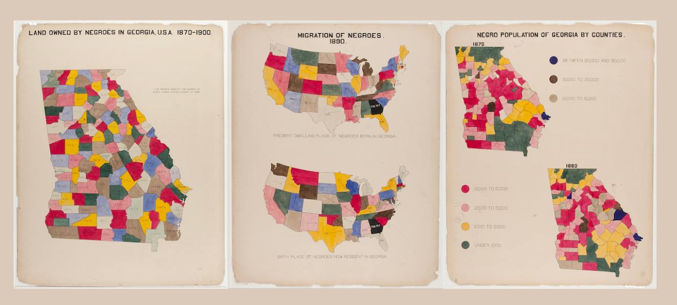
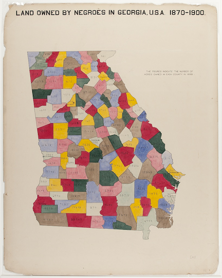
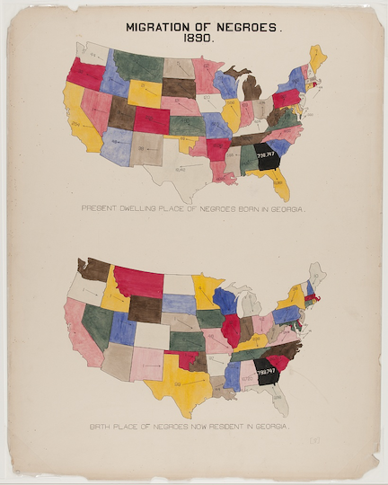
In 1900, NAACP member W.E.B Du Bois and a group of Atlanta University graduate students contributed over 30 statistical charts and visualizations for the Exhibit of American Negroes as part of the Exposition Universelle in Paris. Highlighting Black ownership of land, migration, and population distribution, these maps aimed to display “a wide spectrum of Black experience” and inform the international community about the gains Black communities had made in “since slavery and in face of continuing racism.”
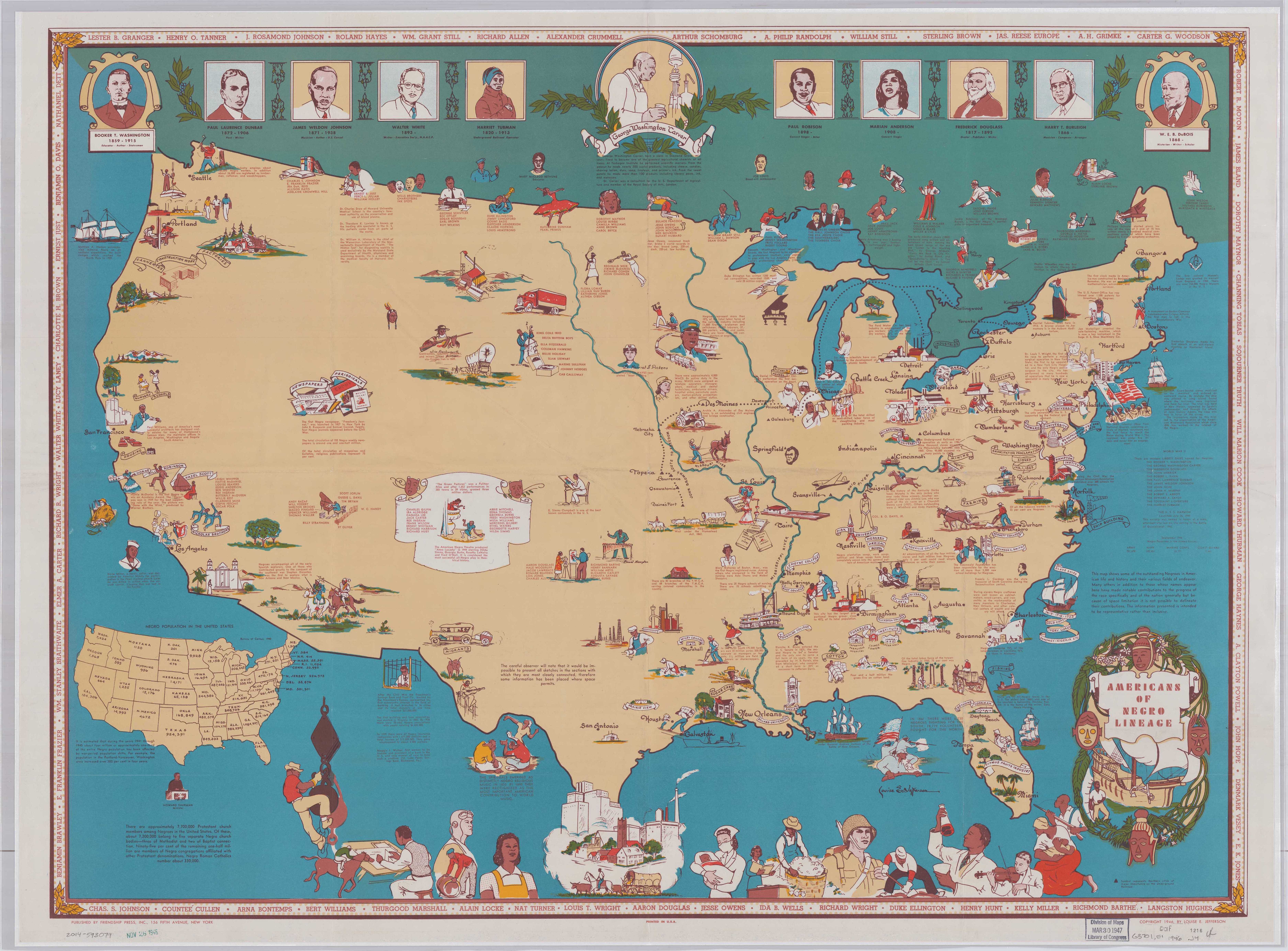
Jefferson's Americans of Negro lineage map is just one from a series highlighting marginalized communities in the United States.
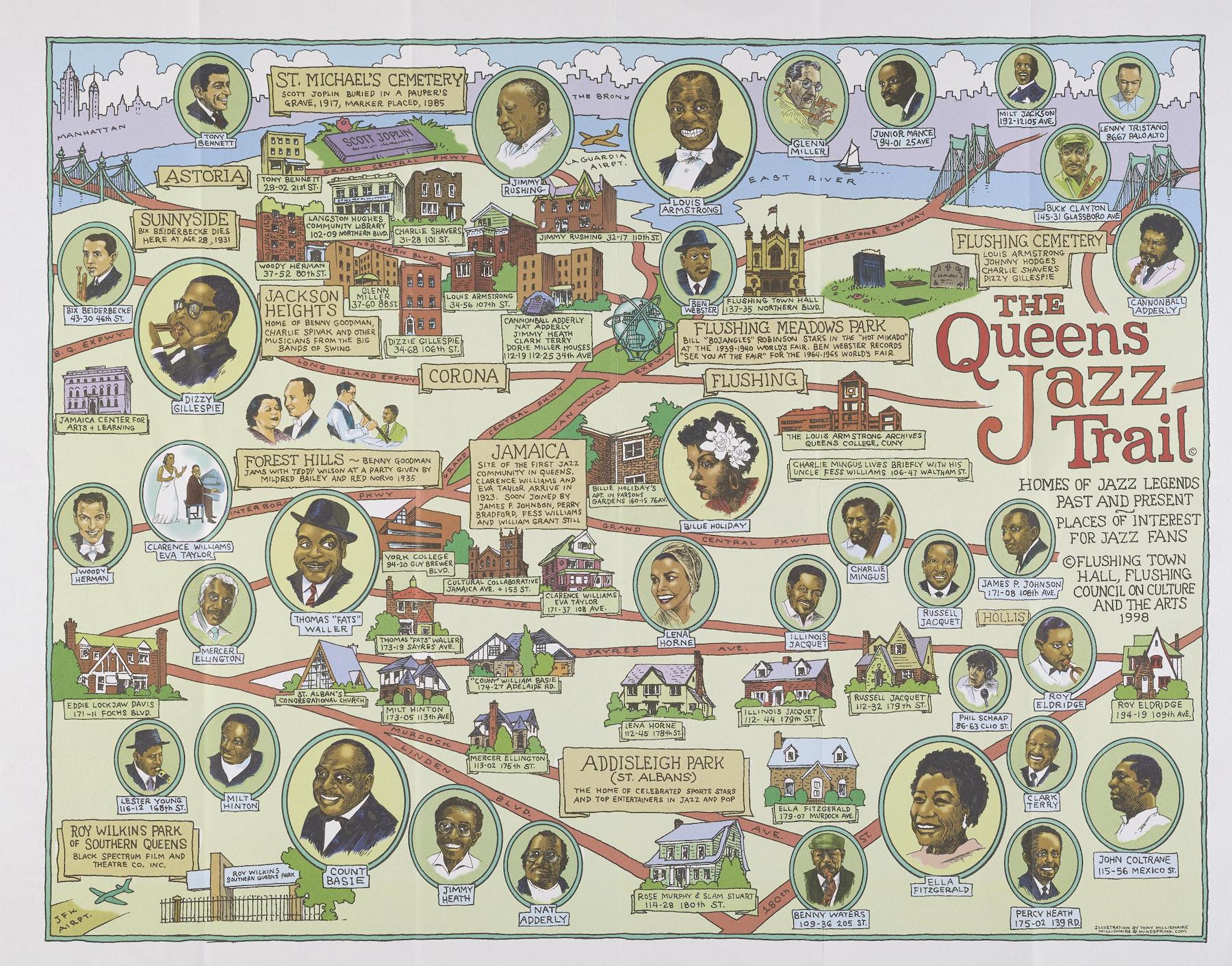
The Jazz Age produced and popularized new styles of music and dance.
Later in the twentieth century, illustrator Louise E. Jefferson created a series of maps representing the histories and cultures of marginalized groups in the United States. This 1946 map, created to reflect on the Harlem Renaissance of the 1920s and 1930s, scatters pictorial representations of people and places important to Black culture across the United States and southern Canada. She recognizes Benjamin Banneker as the maker of the first clock in the United States, Hattie McDaniel for her Academy award win, and Dr. Charles Drew of Howard University Medical School for his work on blood plasma use and preservation, to name just a few.
With its explosion of creativity in the arts, the Harlem Renaissance also produced the Jazz Age, celebrated in this 1998 map of Queens. Made by cartoonist Tony Millionaire, the pictorial map celebrates “jazz legends past and present” and “places of interest for jazz fans.” Cartoon portraits of figures such as Ella Fitzgerald, Louis Armstrong, and Dizzy Gillespie are placed along a route of venues and homes of other artists.
A host of other entertainment venues, restaurants, and speakeasy facilities are pictured on this 1933 map of Harlem by visual artist Elmer Simms Campbell. The map includes pictorial representations and labels of places such as the Savoy Ballroom, Lafayette Theatre, and Club Hot-Cha; it also references piano player Garland Wilson, tap dancer Bill “Bojangles” Robinson, and musician Gladys Bentley.
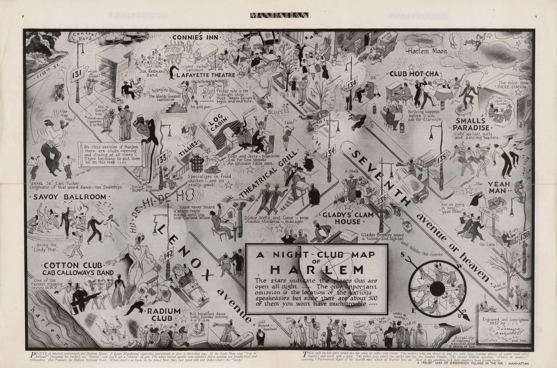
According to this night-club map, there are clubs opening and closing at all times in Harlem.
Our articles are always free
You’ll never hit a paywall or be asked to subscribe to read our free articles. No matter who you are, our articles are free to read—in class, at home, on the train, or wherever you like. In fact, you can even reuse them under a Creative Commons CC BY-ND 2.0 license.