This article is a part of the Get to Know Your Data series, where we talk to the people and institutions that create, store, and share geospatial data. In this installment, we talk to Scott Markley, a PhD candidate in the Department of Geography at the University of Georgia, about the creation of redlining maps, and what those maps fail to tell us about race and space in US cities.
What is a "redlining" map?
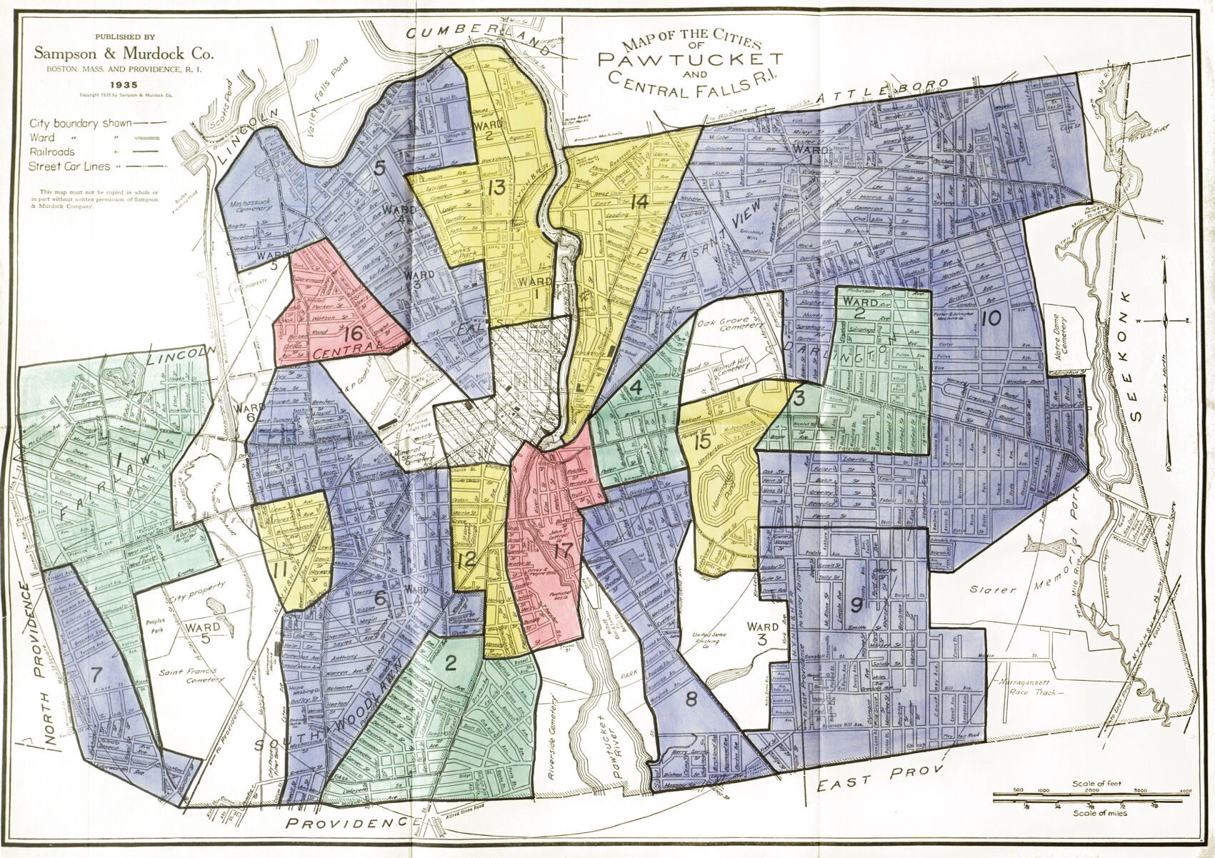
At the Leventhal Map & Education Center, we've always been fascinated by Homeowners Loan Corporation (HOLC) maps, more commonly known as "redlining" maps. We've written about them, we've taught about them, and we even have a dedicated digital collection for them, based on images scanned by the Digital Scholarship Lab at the University of Richmond.
The Mapping Inequality project offers digital access to thousands of redlining maps
HOLC was a federal agency established in 1933 to provide mortgage assistance to homeowners or would-be homeowners through loans or refinancing mortgages. To determine where to make loans, HOLC evaluated urban areas based on multiple factors. HOLC maps have become widely used in recent years thanks to the efforts of the Mapping Inequality project.
The term "redlining" comes from the fact that the agency marked areas that were risky for investment using red ink. These red areas were very often the places where nonwhite people lived, though HOLC field agents also recorded many other factors in area description sheets, including building age, household income, and immigrant population.
We sat down to talk with geographer Scott Markley, who created a user-friendly geospatial dataset from the DSL's data by parsing eight of the most important factors captured by HOLC into distinct fields. Visit our Data Portal to download the data itself, or read on to learn more about its creation---and its limitations---from our interview with Scott.
Interview
The text of this interview was edited for length and clarity.
HOLC data, past and present
Ian Spangler: Scott, thanks for joining me today to discuss your work with this dataset. First, could you describe what your dataset is, and how it's different from the spatial data available through the Mapping Inequality project?
Scott Markley: Researchers at Mapping Inequality have made HOLC neighborhood grade data publicly available in Shapefile and GeoJSON format. However, the field notes used to assign risk grades---available as scanned documents for most cities in their “area description” sheets on Mapping Inequality’s website---remain virtually unusable for statistical analysis.
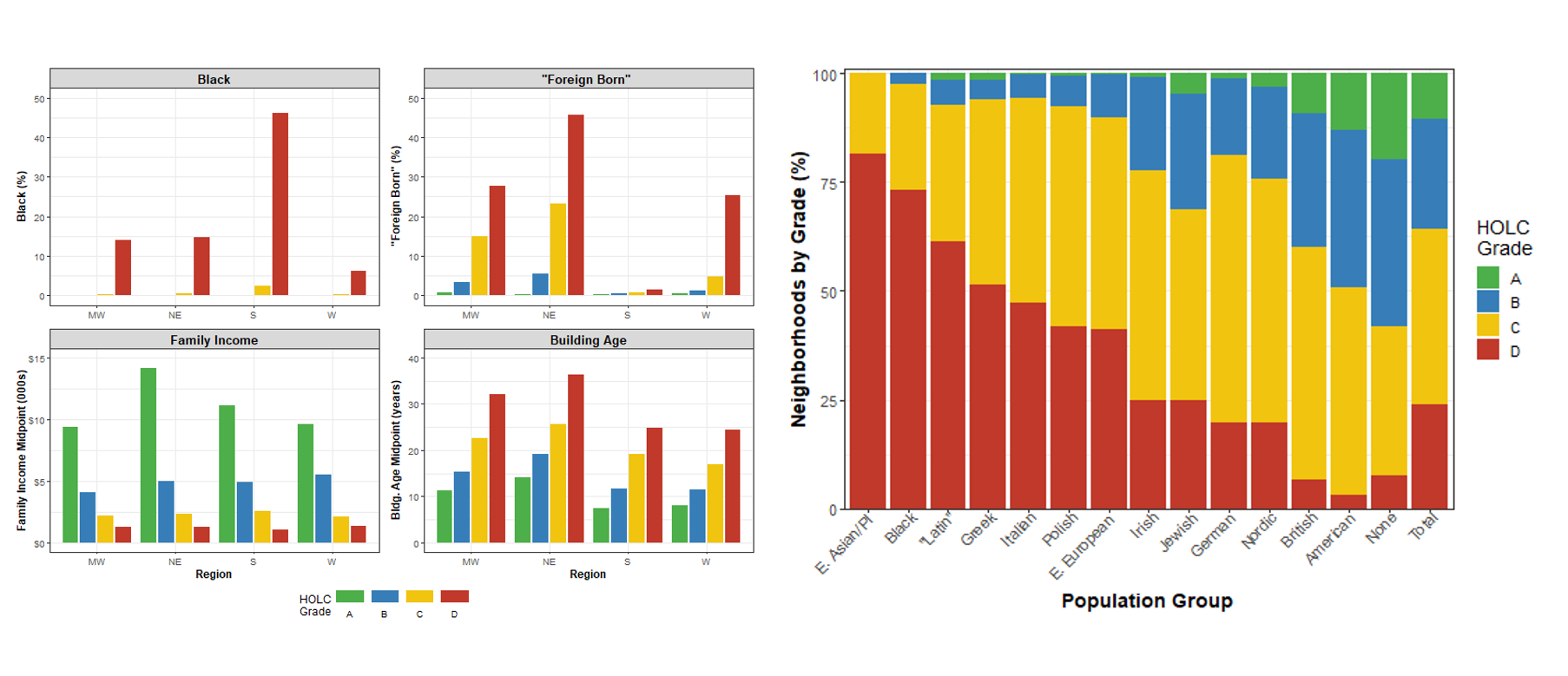
I converted eight of the most consequential variables from 129 cities into an accessible and analyzable tabular format. These include the Black population percentage, “foreign-born” population percentage and group, family income, occupation class, average building age, home repair status, and mortgage availability.
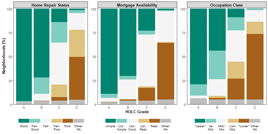
Bar graph analyzing neighborhood grades by area description variables from redlining maps. Courtesy of Scott Markley.
IS: What made you interested in HOLC maps, redlining, and working with those in a geographic information system (GIS)?
SM: As a geographer, a lot of my interests are about integrating GIS and spatial analysis with critiques of racial capitalism. That was really my interest coming into grad school, and GIS was kind of a secondary thing. I think what brought me to maps, really, was teaching about the legacies of racism, how they shape these geographies of segregation, and what that means for how we think about racial wealth inequality.
Maps are just such a useful tool for teaching. You can use them to link these very concrete, historical examples of forced residential segregation and state-sanctioned discrimination to contemporary racial inequalities. That was a very useful teaching strategy, and it brought me to the Richmond website a couple years back.
There's a ton of useful data at that website that dovetail nicely with my doctoral research. What really got me on this project was seeing the description sheets, and wanting to use that in some of the analyses that I was starting to build up as part of my dissertation.
IS: How so, exactly?
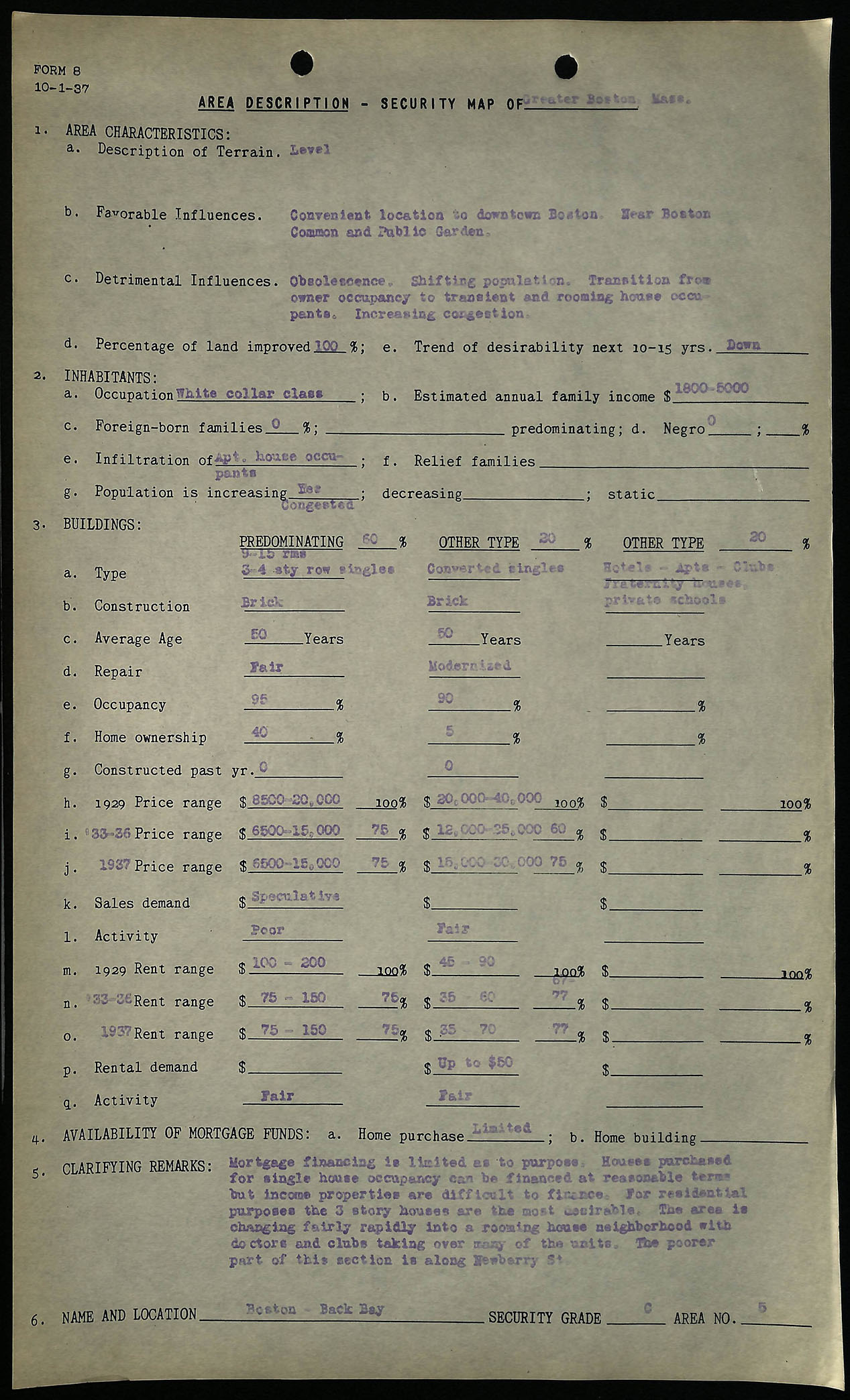
Area description sheet for Boston's Back Bay neighborhood, courtesy of Mapping Inequality
SM: Well, this project really got me thinking about how the HOLC mapping in the 1930s was a GIS project in itself. The maps were produced by professional cartographers who were hired by a State Agency in partnership with the lending and real-estate industries to map a version of urban space for their use. In that regard, HOLC maps illustrate the real estate industry's imagination of how these places were changing at the time---and how they could use that information to guide their investment decisions.
IS: That's a great segue into talking about the Home Owners Loan Corporation itself, and the histories of racism that these maps capture. Could you describe why the HOLC made these maps?
SM: These maps were created with the interests of banks and other lending institutions and property investors in mind, who would steer their investment activities based on social variables in a particular neighborhood. Now, there's debate among people who look into these maps about the extent to which they were actually put into into practice by these institutions---but for me, the more interesting thing is that these maps depict how the public-private real estate nexus viewed the relationship between value and race in cities. To me that's the more fascinating thing about them.
Around this time (the 1930s), you've got a revolution in how appraisal values of homes were being carried out, with a growing emphasis placed on more “scientific” approaches. Relatedly, government agencies and the private sector were collaborating to better incorporate data analytics into how they made their financial decisions. All these forces come together---the HOLC’s previously established contacts in the cities, people who work in the real estate and lending industries, local understandings of where money can be made and property should be purchased or sold---these forces come together to create these elaborate maps with detailed notes all about, essentially, where they think profitable investments can be made. With these maps and notes, you've got this powerful visual representation tied to incredibly detailed quantitative and qualitative information about urban neighborhoods that vividly depicts the governing ideology of the real estate industry of the time, and how they think about the temporal geographies of value.
IS: You're saying that we can look back on these maps from the 1930's, and get a glimpse in time---both of how real estate industry representatives and federal agencies saw space, but also how they envisioned it would be in the future.
... the dataset provides an opportunity to break down the neighborhood grades altogether.
SM: Yeah. That's the thing I think is missed a lot. People think of HOLC maps as this sort of static spatial representation, but they're as much indicators of space in time. The grades themselves are informed by this idea that neighborhoods are inevitably going to deteriorate---that's sort of the dominant theory of the day---and so these maps also arrange city space by time. The C grade is called "Definitely declining," so it's projecting further decline through time, whereas B neighborhoods are called "Still desirable," which also refers to time. Redlined areas represent many older parts of the city thought to have already done their declining. But there's also an important racial component to this conception of time; if black folks were moving into a white neighborhood, it would be considered by neighborhood appraisers as "in decline" because black residential presence was thought to speed up the neighborhood aging process, so to speak.
IS: Redlining maps have been catapulted into the public consciousness in recent years, largely through the Mapping Inequality project. Most commonly, they're used to demonstrate the histories and geographies of racial discrimination in US cities. As you've alluded to, there were lots of interlocking factors impacting why a neighborhood was graded a D, or redlined. Your dataset starts to help us visualize the relationships between variables like race, class, housing structure and building age. How does this perspective give us a better understanding of how those decisions were being made by HOLC, and what their implications are today?
SM: You could, for example, run a regression to get an idea of which variables---race, nationality, building age, family income, occupational class, repair status, and so on--- contributed to the neighborhood grade assignment in different regions. That's one way you could think about it. Perhaps more interestingly, for me, the dataset provides an opportunity to break down the neighborhood grades altogether. With HOLC maps and redlining, so much attention is just given to the A through D grades, but there's a lot of intra-grade variability.
For example, I think there might be a categorical difference between redlined areas that didn't have Black residents and redlined areas that did have Black residents. We know that if an area was really poor, and it was all white, it would probably get a D grade. Now, if it was not that poor, but had a sizable black population, it would still get a D grade. This data provides a potential for digging into some of that variability.
Making the dataset
IS: Could you walk me through your workflow in putting this dataset together? Perhaps in plain terms first, and then in terms that highlight technical parts like processing choices and programming languages?
SM: The first thing is on the Mapping Inequality website, you can download the spatial data, which are shapefiles and GeoJSON files. The latter is a little friendlier for most data processing software programs. I was surprised that they have scanned all of the area description sheets. You can see them on the website, they've been run through an OCR process so they're all machine readable. That made my work possible.
So you bring that GeoJSON into a GIS, but it's all globbed up: the area descriptions are in one single cell. You can imagine bringing that into Excel and having one cell with all of the text in an area description sheet squeezed together inside. Not very useful.
But studying that, you can see patterns. The records have description sheet numbers: 1A, 1B, 2A, 2B, 2C, and those are associated with different variables. You can see---when you bring it into R, for example---that you've got those numbers, a colon, and then the text that corresponds with what's on the scanned sheet. Really what you need is just to identify what variable those numbers represent, like, foreign-born or Black population, or income, or whatever they're associated with. Then, you can separate those out into different columns. For the technical people, I used R, and relied primarily on the stringr package, which is part of Tidyverse.
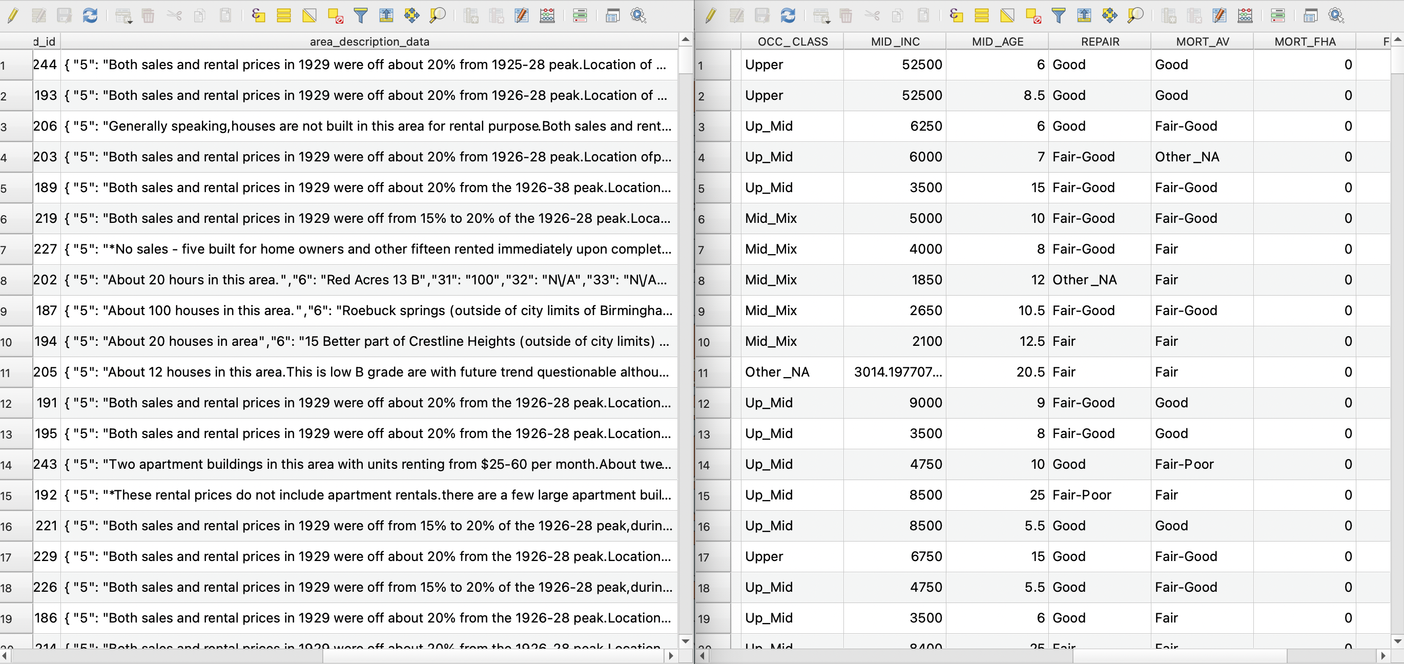
A comparison of QGIS attribute tables between DSL's one-field area description sheets (left) and Scott's tabulated dataset (right).
That's all pretty straightforward, but the first speed bump you run into is that there's multiple formats that HOLC did their notes on. When you see a 1B, for example, those are not the same variable in every city. What you need is to identify which cities does "1B" mean one thing, and which cities does "1B" mean another thing. I just went city by city on the Richmond site and recorded what format each city’s notes were in.
After that, it was a matter of cleaning up the form. The actual field agents who wrote down all the notes were kind of all over the place. I started off doing the easy ones that I can just convert to numbers right away. For example, if I saw notes where an agent wrote "none" for the foreign-born population, I can easily convert that to zero. But some others put "a few," and it's like, alright: "few" is more than "zero", but it's not as many as “several,” so you know, I have to do some estimation.
IS: What sorts of limitations exists in the dataset itself, both from your processing as well as from the original source material?
SM: If you plot any of the numerical values---percent black, percent foreign born, for example---in the dataset I’ve created, you'll notice pretty quickly that the field agents were ball-parking it. There's a lot of 5%, 10%, 15% and not much in-between those intervals. In other words, this was not a detailed census. Some of the field agents might have looked at city records or knocked on doors, but there's not a good way to tell, as far as I know, how reliable each of the records are. With this dataset, you have to keep in mind that it's not a census: it's probably a guy who just worked in real estate, maybe putting some effort into it to get accurate numbers, but maybe not.
Bar graphs analyzing neighborhood grades by area description variables from redlining maps. Courtesy of Scott Markley.
When I get into some of the other variables like income and age of buildings, they're also all over the place. In some cases, the sheets asked for "average" and the field agent just put a single number: "average age is 20 years old." Others would do a range: "Oh, between 1 and 100 years old." The same goes for income. Some people make $2,000 a year, some people make $10,000 a year so what I had to do was simply just take the midpoint of these values since there’s not usually information on distribution. In the case of income, almost a quarter of field agents didn't put any income because of the sheet formatting, so I had to impute those missing values using other variables.
I mean, this is the same with all data. I think a good lesson is in data processing, there's a million little decisions that I make, and if it was someone else they might make them differently. Or if I had revisited this six months after I did it and I was in a different mood, I might have made a different decision!
... there's a million little decisions that I make, and if it was someone else they might make them differently.
That said, I think overall you can still use the data to get at some interesting questions---but there's always that giant grain of salt.
IS: Is there anything, whether during the data creation process or afterwards, that struck you as particularly surprising or unexpected?
SM: What's gotten my interest now is breaking up the HOLC grades by racial composition. A lot of times when you look at these neighborhoods in the 1930s, you can look forward and say, "Okay, the Black population in redlined areas is higher than yellow which is higher than blue, which is higher than green," and so on. But if you break that down, you'll see that the postwar Black population increase in many places was not actually in redlined areas as a whole, but in redlined areas that already had Black residents. For example, a lot of people forget that these maps are drawn in northern cities before the bulk of the Great Migration. Milwaukee is one city I've looked at in particular. There were only one or two neighborhoods in the entire city that had any Black population at all in the 1930s according to the description sheets---the vast majority of the Black population in Milwaukee arrived after World War Two. So where did Black residents move within the city when they moved to Milwaukee then? Primarily not redlined areas as a whole, as some have suggested, but the specific redlined areas that already had Black residents, as well as their adjacent neighborhoods.

HOLC map of Milwaukee Co., courtesy of University of Milwaukee-Wisconsin Libraries.
So one story these description sheet data can help tell is that it's primarily in redlined areas that already had a Black population where you'll find an increase in the Black population during the Second Great Migration. Just looking at those four grades misses that and probably a lot of other things as well.
IS: Last question: who you hope will benefit from this data, and where do you see it going in the next over its lifecycle?
SM: In the immediate term, this data can be used by researchers or in classrooms---anyone that's looking into the HOLC maps or has an interest in them. These data can also potentially be used to supplement other historical datasets. I've talked to some classes at the University of Georgia about using this data, and the upcoming workshop at the LMEC will be a good example of using it too.
Want to learn more about how you can use this dataset? Stay tuned for an upcoming workshop, hosted by Ian and Scott, where they take a deep dive into the dataset, and show you how to work with it in a GIS!
Read more about Scott's work at his website, and check out a preprint of his forthcoming paper here.
Our articles are always free
You’ll never hit a paywall or be asked to subscribe to read our free articles. No matter who you are, our articles are free to read—in class, at home, on the train, or wherever you like. In fact, you can even reuse them under a Creative Commons CC BY-ND 2.0 license.