What is it to be “American”? This question, itself, is loaded: residents of the United States have co-opted a term that logically should refer to all inhabitants of the “Americas.” Moreover, centuries of conflict have often led to the displacement and silencing of Indigenous peoples who have deep claims on what it means to live in what is now the United States. To ask who is American, or what Americans are, is an invitation to consider the geographical, historical, demographic, and cultural threads of the stories that Americans have told about themselves. Three pictorial maps from our collections---Mary Ronin's The United States: the Land and its People, William Gropper's America, its Folkore, and Louise E. Jefferson's Uprooted People of the U.S.A.---provide exactly that.
While the history of pictorial maps stretches back all the way to the beginnings of cartography itself, the “golden age” of pictorial maps in the United States took place from the 1920s to the 1960s. Rather than being intended as a tool for navigation, these pictorial maps are works of art, though they also have information contained in them.
In the postwar world, the United States had taken its place as a global superpower, and sought to parade its greatness to the nations of the globe. These maps prominently emphasize the many populations of immigrants who make up the American population, in order to push an image of a welcoming, cosmopolitan United States. Of course, some groups are excluded, and even many groups who are included are not favorably depicted. These maps also display the power of American industry, picturing agriculture, mining, and manufacturing locations across the country. Many of these, like the 1958 Mary Ronin map, are intended for a global audience, and were commissioned for World’s Fairs or State Department campaigns. As the Cold War picked up momentum, the U.S. had to prove to the world that the West was on the favorable side of world geopolitics, and so an image of America that was economically strong and welcoming to people of all backgrounds became a common propaganda element. However, this also has a sinister undertone: in New Mexico, the mention of“Atomic Research” in one pictorial map hints at the nuclear firepower of the United States.
Mary Ronin: The United States: the Land and the People (1958)
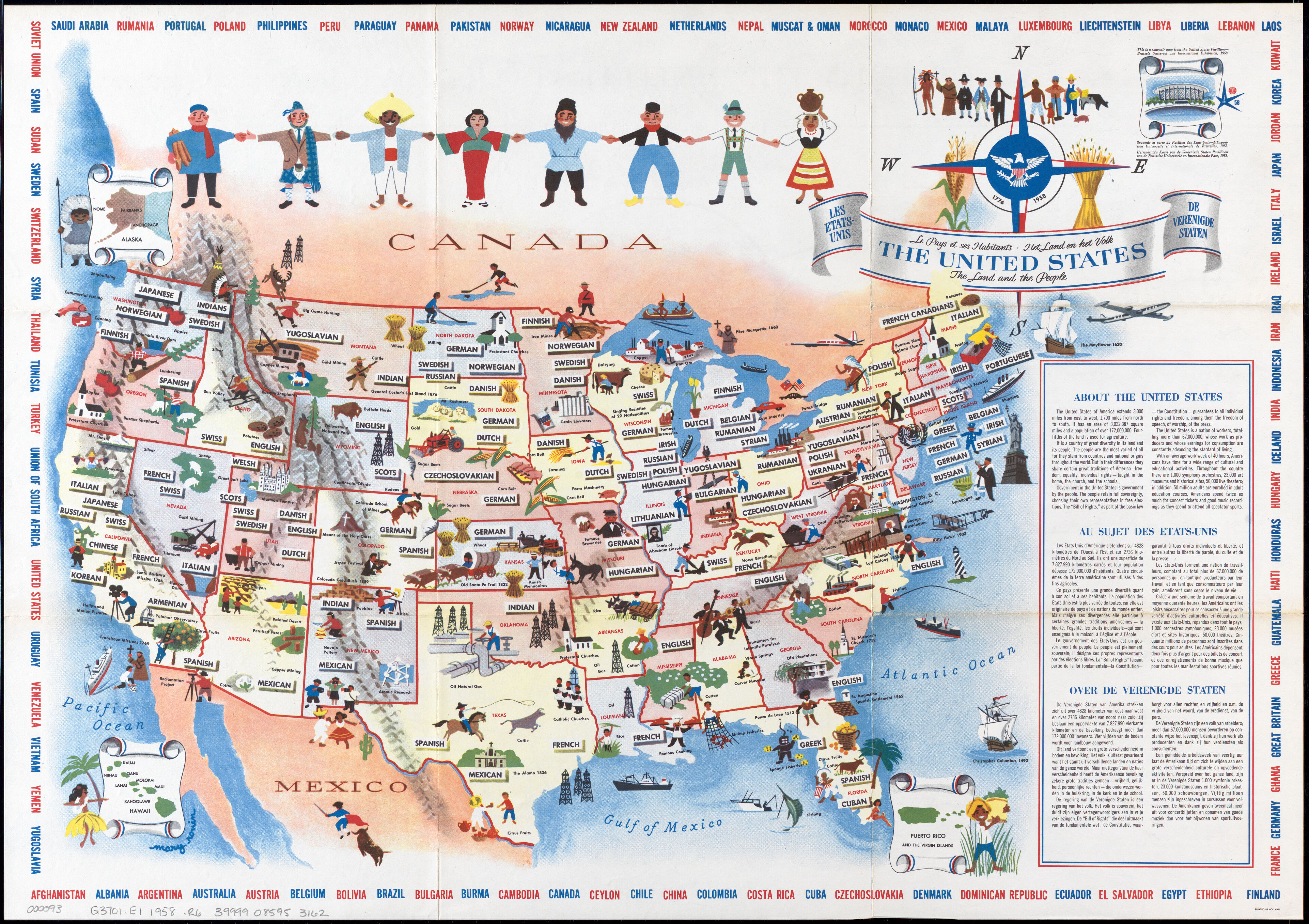
This map of diversity of national origins within the United States created by Mary Ronin as a souvenir for the 1958 World’s Fair in Brussels is full of intriguing details. The map is entitled “The United States: the Land and the People,” and translated into French and Dutch (the major languages of Belgium). Interestingly, the French translations reads “Le Pays et ses Habitants”, implying “people” in the plural sense of “many persons”; however, the Dutch translation reads “Het Land en het Volk”, where “Volk” means a people in the sense of a singular group. The original English leaves the two indistinguishable.
Does (and should) the map represent many people, or a people? This question is crucial to conversations about the United States and its diversity: the historical idea of the U.S. as a “melting pot” wherein many different cultural groups are blended together into a whole enriched by all of them has more recently been challenged by some who suggest that a “salad bowl” metaphor may be more apt. They argue that American society should permit immigrant communities to retain their own cultural identities, not force them to assimilate to a single mainstream. Through a single difference in translation, this map evokes enormous questions about national identity.
The states are shown with labels of the national origins found there, but this nomenclature isn’t always consistent. While each European and Asian group is labeled with its country of origin (French, Polish, Japanese, etc.), in several places the map refers to the generic term “Indian”, wrongly implying that indigenous people in the US are a monolith. The depictions of Native people in this map are multifold, though problematic. Custer’s Last Stand is labeled alongside a rifle-toting soldier, suggesting that Native people may not be as welcome as suggested.
Examining how Black Americans are depicted serves as another example of misguided representation. In Alabama Black musicians can be seen performing, and the Carver museum is labeled, both attesting to achievements in Black culture and science. However, directly next to them are Black workers shown picking cotton, and “Old Plantations” are listed as a site in Georgia: the horrific legacy of slavery remains a deep-seated part of American culture and industry.
This association between ethnic groups and types of labor is an important element of the map. While industries and businesses were certainly organized along ethnic lines in the mid-twentieth century, mapping them as such presents the associations as a natural fixture of geography, like a river or mountain, rather than subject to the highly dynamic and diverse movements of people. Defining groups of people by association to the work they do can build a positive identity, but it can also be limiting and foment stereotypes.
Mary Ronin’s map of the U.S. presents smiling, hand-holding figures in stereotypical costume. It shows off that “the people are the most varied of all…”, but it’s important to recognize that Ronin’s lens is the one through which we visualize their stories. Without other cartographic voices, it’s impossible to get a fuller understanding of the U.S.’s “land and people”.
William Gropper: America, its Folklore (1946)
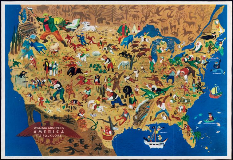
A 1946 map by William Gropper illustrates various characters from American folklore, some of them genuinely historical, others literary, but all of them part of the mythos of the United States. Understanding this map requires some historical context: Gropper, a left-leaning writer and artist (though not a card-carrying Communist Party member), was investigated by attorney Roy Cohn during Sen. Joseph McCarthy’s campaign against the supposed threat of secret Communists plotting against the United States. Due to Gropper’s left-wing activism and contributions to Communist publications, he and his map were blacklisted, and over a thousand copies of the once-popular map were deliberately destroyed by the State Department. Ironically, in the minds of the government, William Gropper’s map fell into the exact opposite space of the pro-American messaging it contained: once Gropper’s own political leanings were discovered, they became sure that there was subversive Communist messaging lurking within his art.
While not outwardly subversive, the content of the map, which was drawn by Gropper as a commission for the State Department’s Overseas Library Program, holds a deeper image of America than red-white-and-blue patriotism. Many of the characters, likeFebold Feboldson, are described as “fakelore”, a term coined by American folklorist Richard M. Dorson: they did not originate in genuine folkloric traditions but literary works only given the appearance of an oral history. Others are outright literary characters, like Washington Irving’s Rip van Winkle, or real historic people, like Davy Crockett, John Brown, and Juan Ponce de Leon, who became figures of folklore and legend. This is reflective of one of the many complications of “Americana”: the symbols and cultural conception of American life are often different from the genuine experiences lived by many actual Americans. The real-lifeDavy Crockett probably never wrestled an alligator, but the symbolic, folkloric version of Davy Crockett certainly did.
The map of folklore also illustrates the processes of cultural syncretism. Folk heroes adopted from or influenced by foreign traditions, like the IrishFinn Mac Coolor the CroatianJoe Magarac. In the absence of a singular American cultural tradition, a more complex and varied one grew out of the amalgamation of foreign cultures, historical heroes, and literary characters.
This American mythos was not the same everywhere: each regional population has its own traditions, and only through weaving all of these together can we find (or perhaps, create) an “American” narrative. Gropper’s left-wing politics may seem to contrast with his participation in a seemingly nationalistic project, but in a sense folklore and folk culture are a celebration of working-class art and tradition. Rather than bourgeois fine art and literature, and its many associations with the trappings of wealth and capitalist modes of production, folk art seems more humble, authentic, and aligned with Gropper’s views on society. As we live in an increasingly connected and modernized age, Gropper's celebration of regionalism remains a valuable piece of art, history, and culture.
Louise E. Jefferson: Uprooted People of the U.S.A. (1945)
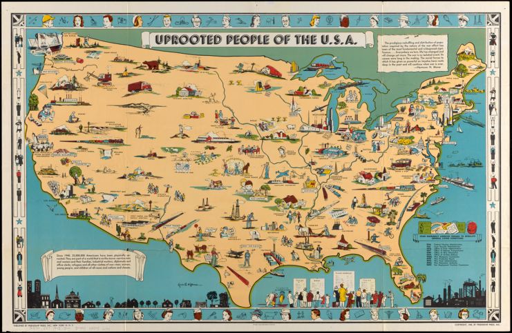
The question of whose identities are represented and how they are portrayed is highly dependent on a map’s authorship. This pictorial map in the collections featuring various populations of the U.S. was drawn by Black cartographer Louise E. Jefferson. Uprooted People of the U.S.A. depicts the interaction between migrations of people, capital, and technology in service of the war effort. The map, with some exceptions, does not directly depict the migrations of people, but rather shows the depopulated places they were displaced from, and the urban industrial areas where they moved. Trains crisscross the U.S. landscape, some of them labeled (“Hospital Trains”, “Troop Trains”), and others unlabeled, simply showing the speed and energy of so many people traversing such a vast country. The prominence of train travel (in contrast to cars, which there are much fewer of on the map) may evoke working-class, communal transportation, rather than individual travel by car. In keeping with the map’s emphasis on cooperation, trains involve a sense of community in going to the same place. While trains are efficient, communal, and generally work-centered, taking road trips by car suggests decadence and leisure. The one form of car travel that does take up space on the map is ride-sharing, which manages to capture the same spirit of shared, working-class transit. Ships carrying freight and troops also surround the coasts, symbolic of the projection of American power abroad. Within the country, factories, mines, and farms portray a nation hard at work.

An excerpt from Jacob Lawrence's Great Migration series.
The map illustrates “Negro Migration” to New York and California (part of the Second Great Migration, as wartime urban industry pulled many black Americans toward the cities), as well as “Mexican Migration” to California. It also depicts abandoned homes, businesses, and towns—all examples of the displacement that accompanied the economic transformations of the war. In a more sinister vein, Japanese Relocation Centers remind of a dark history of displacement, and “Refugees” and “Prisoners of War” show that the U.S. is not insulated from the overseas conflicts and the displacement of bodies that is attached to it.
All in all, the map evokes a spirit of a united America casting aside its internal differences in service of a national war effort. It highlights the efforts of ordinary people, whether by planting Victory Gardens, sharing rides, or collecting waste paper, to support the country. However, it also shows the misgivings and difficulties of war, like the Japanese internment camps, abandoned communities, and refugees.
Picturing America, past and present
All three of these mid-twentieth-century pictorial maps depict the United States through different lenses, and were created for an international audience. They are far more than novelties: in fact, in many ways these maps are pieces of postwar American propaganda. Their parading of the United States as a liberal superpower implicitly invites other nations of the world to align with it, as with the Cold War brewing, American influence abroad became immensely important. Moreover, their synthesis of the vast array of American diversity into one nation provides a piercing insight into the ways these cartographers conceived of the United States, and how we might conceive of it now.
Kyler Hoogendoorn-Ecker is a rising senior at the Boston Latin School who is joining the LMEC this summer as part of the Seevak Fellowship Program.
Our articles are always free
You’ll never hit a paywall or be asked to subscribe to read our free articles. No matter who you are, our articles are free to read—in class, at home, on the train, or wherever you like. In fact, you can even reuse them under a Creative Commons CC BY-ND 2.0 license.