This year marks the inauguration of the Designer-in-Residence fellowship a new program at the Leventhal Center aimed at supporting creative work in cartography, growing our original collections, and providing opportunities for the public to learn more about how maps are made in the present day. Our first Designer-in-Residence is the multi-talented Andy Woodruff. You might already be familiar with Andy from the maps he contributed to our 2022 exhibition Bending Lines, or from the legendary Boston mapping blog Bostonography. Andy will be in residence at the Leventhal Center from April 10 through May 5. During his fellowship period, we'll be posting more about his work in progress.
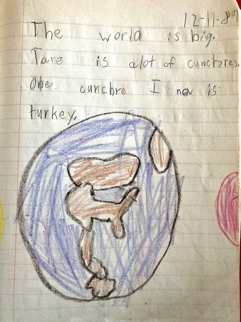
How many "cunchres" can you name? Image courtesy of Andy Woodruff
What’s the first map you ever made growing up? How young were you when you began to know that you wanted to pursue a career in mapmaking and visual design?
Not that I remember making it, but thanks to all the childhood stuff my parents saved, it looks like I drew a map of world "cunchres" [countries] just shy of age 7. I had the childhood privilege of a family that went on a lot of summer road trip vacations, and I was that kid who stared at the maps (paper in those days) in the back seat, fascinated by understanding the places we were going and imagining the other places on the map where we weren't going. But I don't think it was until high school or so that I developed a real interest in pursuing a study of geography, which then became an interest in mapmaking specifically.
You’re one of the co-founders of the blog Bostonography. Tell us a little bit about that project. How did it get started? Do you have any particular Bostonography pieces that are favorites?
Tim Wallace and I started the Bostonography blog in 2010, two or so years after I first moved to Cambridge. This was during my heyday of cartographic blogging, when I always seemed to have energy and inspiration for new mapping projects and experiments. I already had some fascination with Boston after repeated visits to my mother's friends and family (I'm not from here, but she is). Now that the area was my new home I spent a lot of time exploring and getting to know the place, more and more of my maps focused on Boston and environs, so I thought it would be fun to devote an entire project to Greater Boston. I'd only known Tim, who is from the area, for a short time at that point, but knew he'd share my interest.
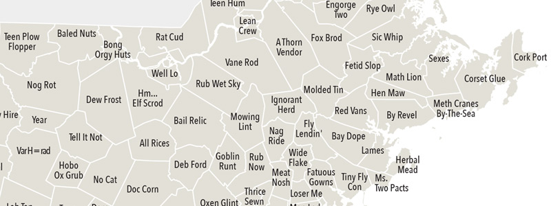
Massachusetts town name anagrams, from the 2016 Bostonography post "Much Sass State"
Our projects have leaned toward fun and frivolous, not really using the full power of maps to make an impact on people's lives, but I think they've inspired some people to take a closer look at their surroundings from a geographic point of view. My all-around favorite project is probably our best known: crowdsourced neighborhood maps. But closer to my heart are a few that are simply fun an interesting: town name anagrams (funny but also rude), and our earliest projects like Tim's Radio Rivalry and my map of photo colors in Boston, both of which had been featured in the Boston Globe's Ideas section.
You've now spent just a little bit of time immersed in the fire insurance atlases, which are the overarching theme of this year’s residency. What are you intrigued by in looking at them so far?
The most intriguing things about fire insurance atlases are the stories they can tell about a past version of a place and population, as featured in the Building Blocks exhibition. I mean not only the real historical stories of the actual people and building shown on the maps, but also the speculative and imagined stories made possible by the collective details of these maps. You can study a map or two of a neighborhood and see, for example, that here was a house with two flats, that a trolley ran along the street, that on the corner was a building with a shoe repair business, that it had a boiler in the basement and a skylight on the second floor, and so on. These details have a power to create an image of daily life that I think is rare in singular maps, until the modern age of 3D, data-rich immersive maps.
What are some of your favorite maps created by other living cartographers? Are there any styles or visual techniques that you find particularly exciting for the future of cartography?
My favorite maps probably change every week as I see new ones! I've spent so long working with digital, interactive maps that it's "classic" cartography, rather than bleeding edge stuff, that I find novel and exciting. One cartographer who consistently produces maps among my favorites is Sarah Bell, who tends to have a style that's somehow both bold and subtle, and who has done some inspiring work with pre-digital style hand-drawn shaded relief. As for digital maps, a surprisingly favorite map is by the team at Apple Maps, who have quietly built exceptionally strong cartography into a product where map design usually seems of secondary importance. They've got some of the best cartographers out there, who I think are leading the way toward a future where good visual design enhances and complements a mountain of data on top.
If you could make a map in a media or technique that you’ve never worked in before, what would it be?
If I had the tools and any of the necessary skill, which I don't, I'd love to make a carved wooden map. One of my favorite maps of all time is large chiseled wood map at the Vasa museum in Stockholm, credited to Richard Carr and depicting Scandinavia in 1628, the year the ship sailed and immediately sank. I haven't been able to track down much information about the map or artist (maybe the LMEC Family can help?), but I think of the map frequently and would be thrilled to make and have such a thing.
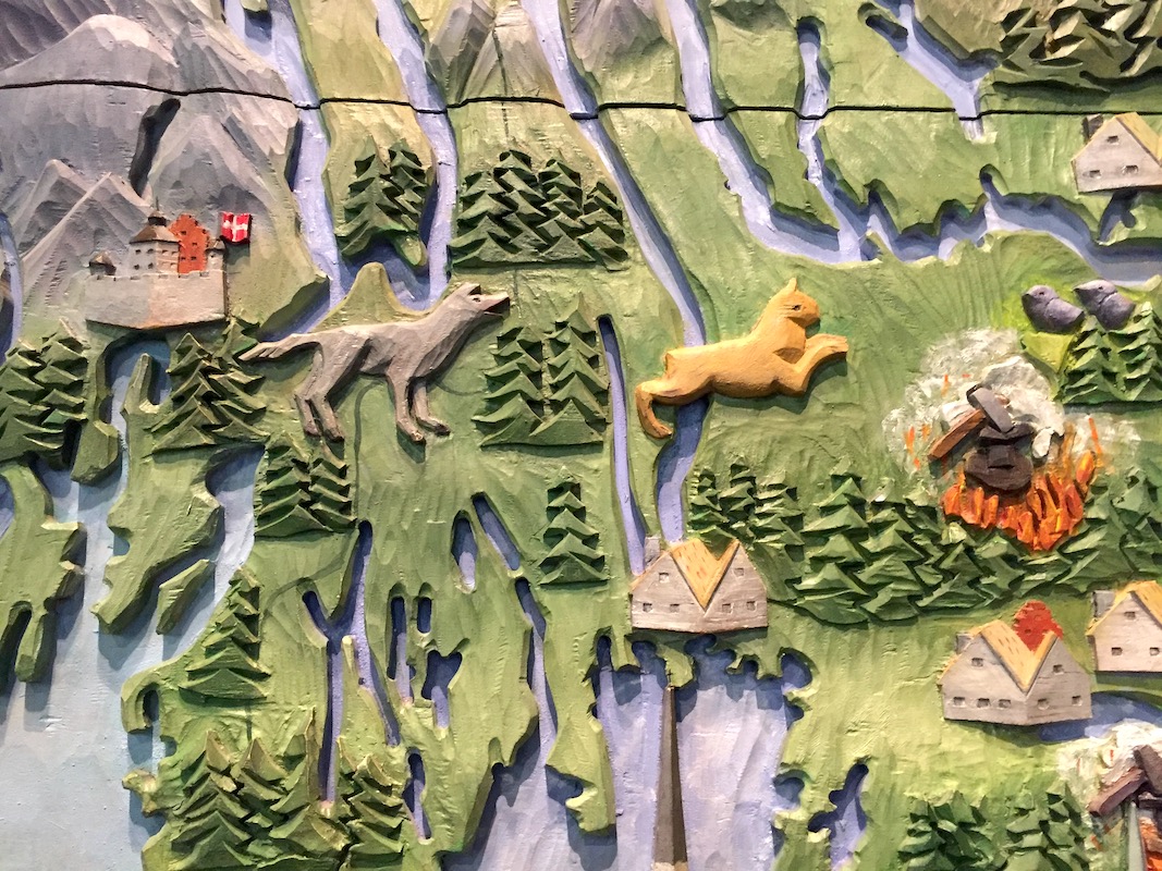
Detail of Richard Carr's wood map of Scandinavia
Thinking about the field of cartography generally, how can institutions like the Leventhal Center help support the work of people who are making creative and critical maps?
I'm impressed by the breadth of what the Leventhal Center has been doing in connecting curation and expertise in historical maps with modern-day creative and critical mapping—it's much more than just a collection of old maps. So the short answer is keep doing what you're doing! The simple inclusion of, and even commissioning of new work from, modern cartographers in the Leventhal Center's exhibits and collections has been a good way to support creative and critical mapping. It's also been great to see new digital tools and work made by the staff. The Center's educational activities, I hope, can inspire and train new cartographers of all different stripes, be they people who already dabble in maps, or young students with some cartography in their future. And I'm excited for the Designer-in-Residence position, not just for myself but hopefully for new cartographers in the future!
For more about Andy's work, see his website at https://andywoodruff.com.
Our articles are always free
You’ll never hit a paywall or be asked to subscribe to read our free articles. No matter who you are, our articles are free to read—in class, at home, on the train, or wherever you like. In fact, you can even reuse them under a Creative Commons CC BY-ND 2.0 license.