In September 2023, we’ll open our newest exhibition, Getting Around Town: Four Centuries of Mapping Boston in Transit. It will feature an extraordinary collection of transit maps and invite questions about how people have moved around the city in the past, present, and future. The guest curator for the exhibition is Steven Beaucher, the author of Boston in Transit. In this article, we talk with Steven about how he became immersed in transit mapping, and what he thinks will be most intriguing about the upcoming exhibition. Getting Around Town opens on September 9 and will be free to the public at the Leventhal Center gallery at the Central Library in Copley Square.
The text of this interview has been lightly edited for clarity.
How did you get interested in transportation, maps, and the history of the transit system in Boston?
I’ve been a lifelong rail fan and transit fan since I was a kid—since I was a baby in the backseat of the car!— always loving trains. If a train stopped traffic and we had to wait for it, I mean, I was yelling with excitement.
As I grew up, I always used public transportation. I relied upon it. It was my gateway to the city from the suburbs. It’s how I got to know Boston, since I grew up in the Merrimack Valley. So it was more than just “I like trains.” It was a functional vehicle for me to connect with urbanity, which I fell in love with as I trained as an architect, and my minor is urban geography. As I grew, I tried all the different modes, and I really relied on it, always more so than a car.
I practiced as an architect here in Boston for a decade or so, and, at the same time, I started collecting maps with my wife and my brother. We ended up collecting too many antique maps. We also collected things that had to do with transit and trains. But as our collection of maps became too large, we decided to start a business where we reproduced some of the maps so we could earn money to buy more antique maps.
We also would sell off antique maps we didn’t want. We ended up starting WardMaps, our antique map business. Over time, my brother got me into collecting more transit artifacts, actual signs and pieces of trains and trolleys. That’s when I really also started becoming an expert in transit history, beyond just being an antique map dealer. I was able to eventually win public bid contracts with the MBTA to run their MBTA merchandise program, store, and sell antique artifacts that the T was getting rid of.
That all culminates with my need to write my book, Boston in Transit. I needed to educate myself on all this transit and railroad history that I thought I knew about, but I didn’t. Now I know about it!
I get to deal with trains, maps, the city, the T, all these things that are important to me, not just as money making sources, but also things that I truly love.
Are there any transit maps that loom large in your own memory of growing up riding trains, coming to the city? Like, if you think back, was there a map that really made you realize, this is something that I really care about?
The first year or two that I would take the commuter rail in, I was in Boy Scouts, and I’d go with one of the older boys because I was too young. My mom would drive me to the train station in Lowell. We’d go into the city and walk around, and I remember we’d get off at North Station.
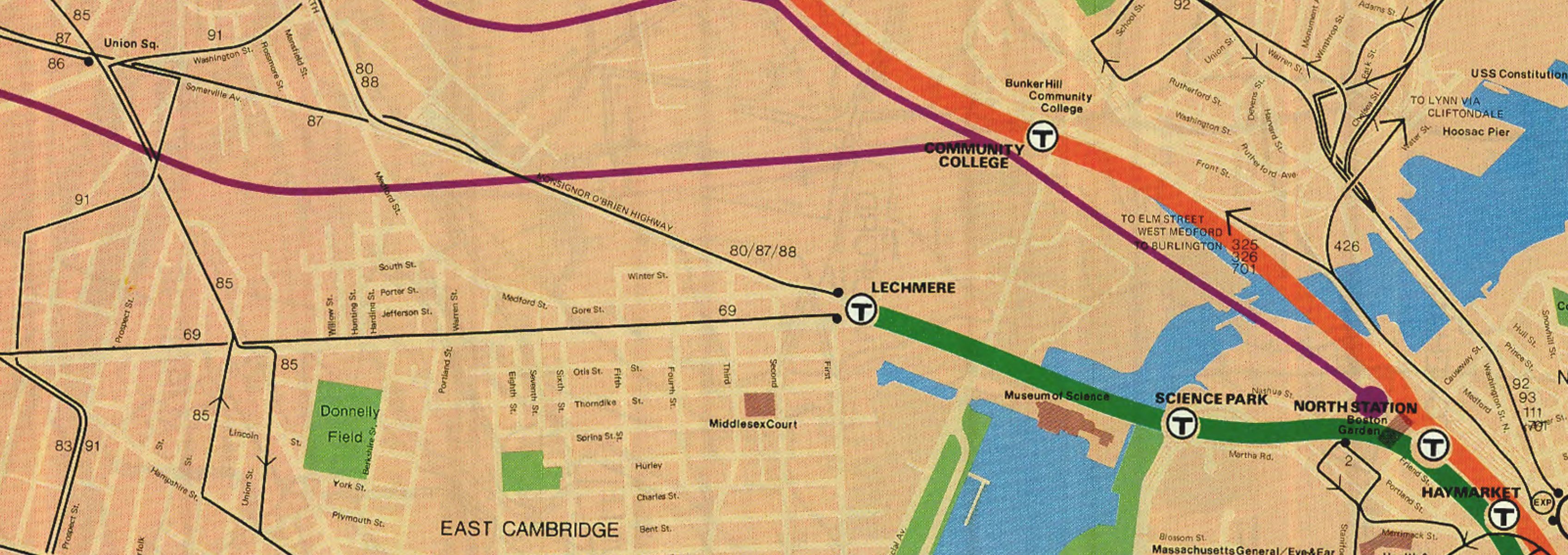
A detail of the North Station area from a 1977 MBTA map.
We’d go upstairs on Causeway Street and get on the Green Line. And no matter what station we went to, there was always a map that was out of date. And I didn’t know they were out of date. I just thought they were wrong. I was like, what’s this station in Charlestown that doesn’t exist? What’s this little line that used to go here? As a teenager, my mind was totally engaged with a map that was erroneous but also still there. Now I know the history of why those physical artifacts were there, but also what they represent, what those lines were, which is an amazing history.
So I still remember all those, and even to this day, whenever I’m traveling in the world, I’m always looking for maps like that that show me cartographic ghosts, where there’s a piece of history that’s still represented, and you’re just waiting for the next map to cover it up. That is forever ingrained in me as something that engaged me.

A tourist map of Paris from the American Geographical Society collections.
There’s a huge overlap between people who love cities and people who love transportation and people who love maps. Why do you think that those categories so often overlap with one another?
There’s a few reasons. One is there’s a functional level. In order to navigate complex urban environments, you need tools and devices. So you start to use maps and you become familiar with them. Ideally, you come to like them—out of necessity. But also you might like one map over another because it’s prettier, or easier to read.
And then there’s sort of a tourist aspect. If you go to another urban environment, you got to know it, and you take back a memory of it. It could be a postcard, but it could also be the transit map. So, for example, you went to Paris, you rode the Metro, you took a transit map back.
Our memories of urbanity and cartography, for many people, are closely intertwined for functional and memorial reasons.
What are some of the things that you think people will learn when they visit the exhibition, beyond the general observation that transportation has changed over time, technologies have changed, and the city has grown? When people look at these maps and they use the maps as a way into questions about changing transportation networks in Boston, what are some insights that will come out of that?
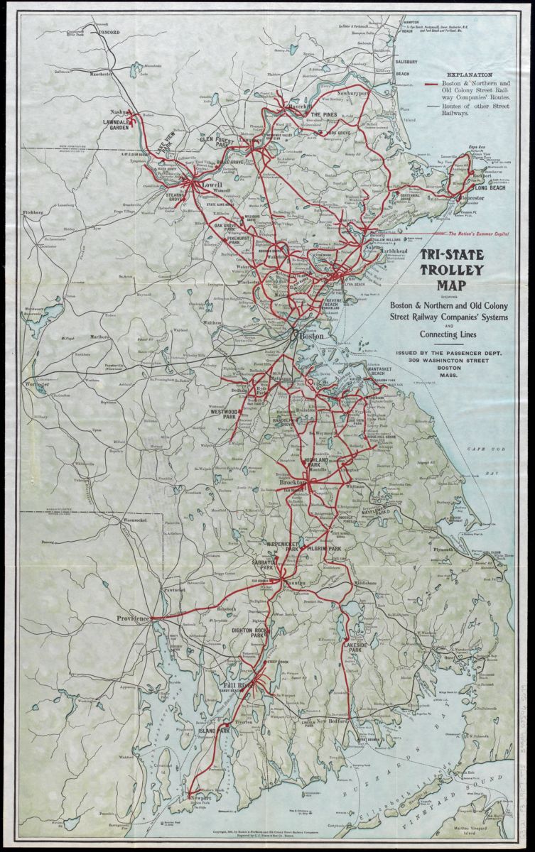
A 1907 trolley map showing routes in the Greater Boston region.
I was thinking about this on the train here. In my mind there are three reasons for putting up the exhibition.
One, it’s a celebration of cartographic representation of infrastructure. Second, it’s a celebration of that infrastructure. And then thirdly, it’s a celebration of how we as people interacted with that infrastructure over the last nearly 400 years.
So you put those together, and my hope is that people will have interactions in the exhibition where they will say, oh, my, this is how someone in 1850 navigated a steam railroad network. Oh, my, this is how somebody figured out where to get a stage coach in 1750. And then they’re holding their phone, and they’re looking at the next train outside at Copley to get on the Green Line. I really hope people engage in that sort of relational history.
But also, there’s a lot of beauty in the cartography that we’re representing, which is no longer really made. Everything’s on your phone, the app updates whenever, and it’s all optimized for phone use. All these cartographic devices and objects and artifacts that we’re putting on exhibition show people the skill, craft, thought, and editing that went into the question of how do you navigate a system—one that in many ways was even more complex even than the MBTA of today?
I also want people to know what we had, so we can know what we’re missing. So, as we think about the future, we can be like, it might be a good idea to have a train to go between North and South Station. We actually used to have that train.

Detail showing the elevated railway line that once ran from North to South Stations, from an 1899 system map.
When you think about a map of Boston, can you give some anecdotes of interesting and odd pieces of transit infrastructure that might still be in the landscape today but which people might not think about as often as the famous sites like Park Street or Government Center? What are some hidden parts of Boston that interest you, and that you think people might notice in this exhibition?
I think you’re going to see a large quantity of expired lines, extinct lines, extinct routes. So many of those things have been erased or covered. And even since I have grown up, in the last decades, so many of those little moments are becoming harder and harder to find. I think what is interesting to see is how these maps will reveal a lot of places where there used to be a piece of transit infrastructure but now it’s been overlaid with a newer piece of infrastructure.
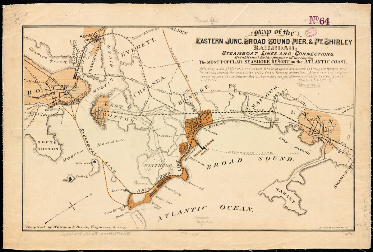
The Boston, Revere Beach, and Lynn Railroad is marked as a ‘narrow gauge’ route on this tourist map from the 1890s.
For instance, let’s take the Blue Line running through Revere and East Boston. A lot of that runs on the old route of a narrow gauge steam line, the Boston, Revere Beach, and Lynn Railroad. There are little bits and pieces all around. There’s a few stones left from the Haymarket Incline. If you go in the Bulfinch Triangle neighborhood, there’s a few pieces of granite left where streetcars and elevated railway cars used to go up in the air above Causeway Street. We just took down one of the last little bits of elevated railroad over by Lechmere. The East Cambridge viaduct has been restored, so now you can ride over something that was built in 1912.
You go through Newton, there are train stations that used to be part of our commuter rail, suburban commuter rail network way before the T. A lot of those are now private businesses. There are whole areas of the city that used to be dedicated to passenger and commuter rail service. We’re next door to the Prudential Center: that used to be the Boston and Albany coach yard for all the passenger train coaches.
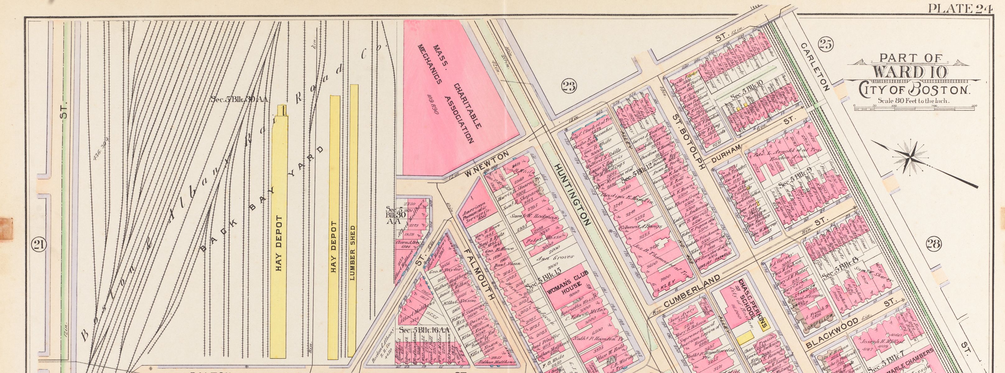
The Boston and Albany yards just west of Copley Square can be seen in this 1902 urban atlas.
Maps are a great way to reveal these layers that may be there for their historic uses. You can tie that into the Building Blocks exhibit that is up right now.
Most of what we’ll see in the exhibition is a historical look at how the transit network evolved over time: how it was built, and how it was, in some cases, demolished or removed. But encoded into those maps are dreams about the future: what could be built as plans, as designs, as speculations. How do you think maps help us think about today’s transit system and, perhaps, tomorrow’s transit system?
There’s a lot of ways that, for envisioning the future of transit, these maps, the ones in the exhibit, are critical. One is there’s just a functional planning perspective. Where does this thing go? How much will it cost? How much track will it use, et cetera.
Then there’s a marketing perspective. You can use these maps to sell it to politicians, who get the funding for public transit. You can use these maps to generate public interest.
And then there is also sort of a legacy perspective, where you may over-plan knowing that you’re not going to do this in the next generation, but in the future somebody could take this plan out and say, hey, look, somebody did some really good work on that. A prime example is the Green Line Extension. There were plans going back earlier than the 1940s, but it really only became serious with the Big Dig in the 1990s, and we only just completed it in the early 2020s.
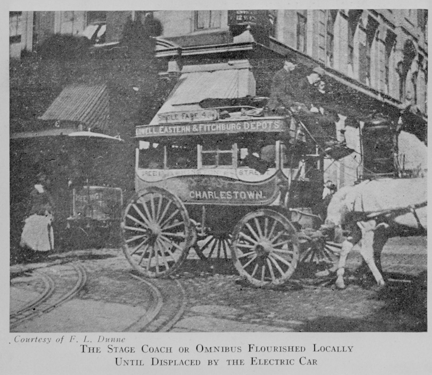
An image of a Charlestown stage coach, from the Boston Public Library
Your book Boston in Transit is full of other visual materials: photographs, postcards, illustrations, diagrams, and so on. Can you tell us some ways that other visual aids help us understand the history of places, the history of Boston, the history of transit systems?
Beyond the maps, as I featured in the book (and hope to feature in the exhibit), it’s good to know what a lot of these things looked like, just on a basic level. What did a stage coach look like, what did an omnibus look like? What did a steam train in 1830 look like versus a steam train in 1930? That’s a way to really allow you to transport yourself in history visually. Everyone can relate to a photograph very clearly. Not everyone relates to maps initially. So if we’re showing a map of the Eastern Railroad in the middle of the 19th century, it’s good to have an image of a steam train.
It’s even better to have a schedule that somebody would have held while riding that train. You can engage with the picture and then you show them the map in the schedule. So what I did in my book, and we’re going to try to do in the exhibit, though the exhibit is cartographic heavy, is to allow these complementary artifacts to all feed on each other.
In the exhibition I hope visitors can actually build in their mind in a whole experience. What map did I use? Where was I going? Oh, I live in Revere. Now, what would I have taken to Revere back in the day? I would have used the Eastern Railroad, or I would have used the Boston, Revere Beach, and Lynn. Oh, look, that’s what a map or a schedule looked like. That’s what the train looked like going down the track. Now I can compare that to riding the Blue Line. Now I can compare that to taking the commuter rail through the East Boston marshes. A primary goal, I think, for a historian is to engage people with the past through artifacts, through history, through research.
But I have always put the visuals first. You can give good history, good research, textual content, but I love visuals. I love the artifacts.
I’m going to put you on the spot. Of the objects that we’ve picked for the show so far, which one do you think is the most visually compelling, and which one do you think is the most oddball, weird one that people will see and scratch their chins?
Visually compelling is probably going to be either the plan of South Station, which is from my personal collection, and it just reveals the massive amount of infrastructure that South Station had.
A second choice for me, but it’s more of a technical thing that I’m technically fascinated by and want people to really check out, is the System Route Map No. 1 by the Boston Elevated Railway Company in 1936. It’s a two-page cartographic masterpiece of navigational lucidity that folded into your pocket and has more information than most phone apps do today.

The 1945 Metropolitan Transit Recess Commission map, from Internet Archive.
For an oddball? Okay, this could be a winner for both oddball and most visually engaging. There’s a 1945 map by the Metropolitan Transit Recess Commission. It looks like a big spider of all these existing and proposed rapid transit lines coming out of downtown Boston. As you look at it and zoom in, existing and proposed stations are drawn in little 3D cartoons. Tunnels and station platforms are drawn. This map, from 1945, right before the MTA takes over, planned lines that we are still thinking of today. It does show the Green Line going out, like kind of the route of the GLX, so we did build some of that, but there’s lines in here that go out to Reading, to Needham. Those are things that are still dreams.
That map is cartoony, but it’s visionary and it shows planning hubris, so I think that could win for both.
This upcoming exhibition, Getting Around Town: Four Centuries of Mapping Boston in Transit, is supported by a grant from the Barr Foundation.
Our articles are always free
You’ll never hit a paywall or be asked to subscribe to read our free articles. No matter who you are, our articles are free to read—in class, at home, on the train, or wherever you like. In fact, you can even reuse them under a Creative Commons CC BY-ND 2.0 license.