When I’m making a map, I’m intimately aware of the power that I have over the final image. I get to decide what data layers, colors, symbols, and labels make their way into the frame. I make choices about what is “in” focus, so to speak, and what fades into the background (or what doesn’t appear at all).
It’s a concept we covered in depth in our previous exhibition, Bending Lines, where we examined the technical choices that cartographers regularly make in the process of producing a map. To shatter the idea that “data” is somehow objective, we commissioned map pairs from five cartographers that used the exact same datasets but attempted to make maps with opposing messages. We interrogated the “authority” that maps are perceived to have and, in turn, the authority given to the cartographer.
Being cognizant of all these dynamics is so important if you are trained to make maps or visualize data, especially if your visualizations will be consumed in physical or digital “public” spaces. As someone who tries to be highly aware of this in my work, I was admittedly very nervous when I was tasked with making a floor map for our exhibition More or Less in Common. In my short time at the Leventhal Center, I’ve come to learn that large vinyl floor maps are always important parts of our exhibitions because 1) their size makes them great for teaching groups and 2) they tend to make the map feel more accessible and legible than something very old that’s behind glass.
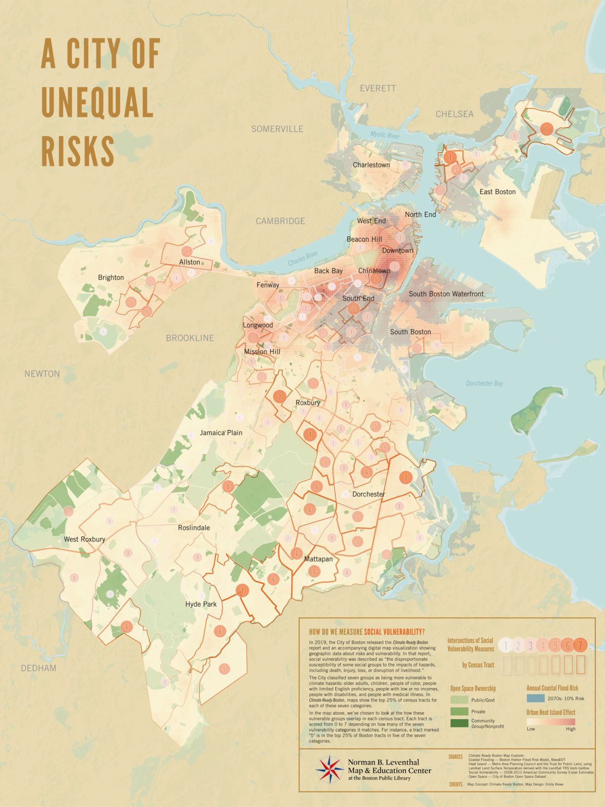
The finalized map that lives on the floor of our gallery at the Central Library at Copley Square
The task was this: make a floor map that reinterprets the data used in the City of Boston’s 2016 Climate Ready Boston report and digital interactive. It felt like a big task for someone who had moved to Boston all of six months earlier. Who was I to be the one to make this map? Exhibitions, however, are a lot like theater: the show must go on and that meant we needed a map for the exhibition in a few weeks time.
The report stretches to almost 400 pages and has dozens of individual maps that clearly focus on a single subject, scenario, or variable. For a floor map, I needed to somehow synthesize the points that many of these individual maps were making into a single map. On the other hand, the digital interactive map did provide some level of synthesis in that it allowed people to selectively “turn on” visibility for the 23 layers of data used in the report. But in doing so, it was our team’s opinion that the resulting layered map was confusing for a viewer: there was no clear takeaway once you checked the boxes next to all those layers. In short: it was pretty to look at, but it didn’t tell you much. It was immediately obvious that the biggest challenge would be an editorial one: how could I get the important data layered onto the map without losing its legibility?
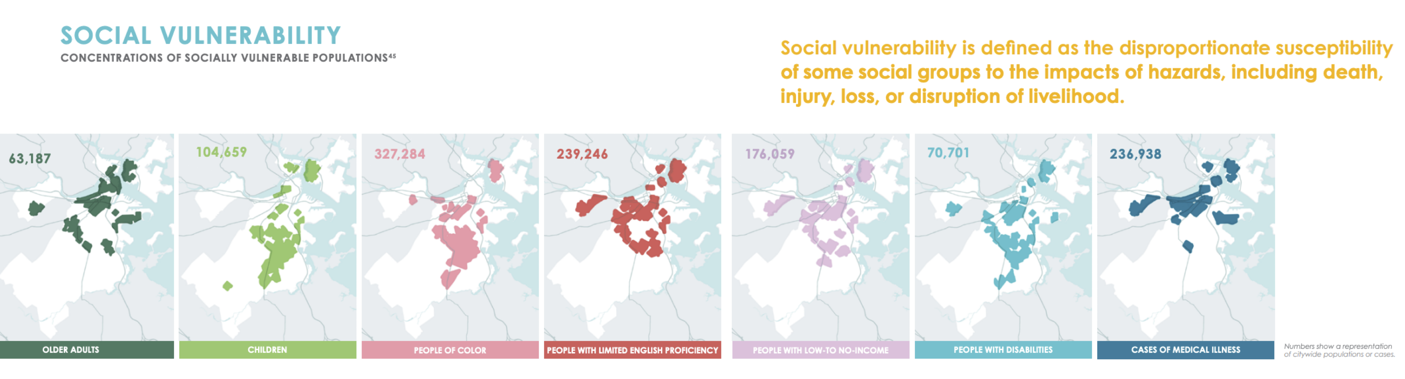
First, I started looking at the core datasets in both the report and the interactive. The report’s 90-page Methodology Appendix proved a great place to start, as it outlined the focus on three climate hazards (heat, stormwater flooding, and coastal flooding) and how they would impact property, people, and the economy. For the map, we wanted to focus on data related to people over property or the economy. I took a special look at the report’s use of a social vulnerability index developed in a 2015 study by Dr. S. Atyia Martin, formerly the Chief Resilience Officer for the City of Boston and director of the Office of Public Health Preparedness at the Boston Public Health Commission. The study found seven groups that are particularly vulnerable in the face of climate risks:
- Older adults (65+)
- Children
- People of color
- People with limited English proficiency
- People with low to no income
- People with disabilities
- People with chronic and acute medical illness
These seven groups are defined using data from the American Community Survey (which is sort of like the census) and the resulting maps in the report and interactive maps focused on the census tracts with the top 25% of each measure (sometimes referred to as the “top quartile”).
A screenshot from the Social Vulnerability section of the Climate Ready Boston report (pg. 30)
From there, we had some choices to make: how could we make the seven layers of census tracts legible at one time? Our team’s choice was to think about the intersections of these social vulnerability measures. Namely: for a single census tract, how many of the seven variables are in the top quartile? We were then able to get a single number from 0-7 for each tract that could represent the ways these things overlap. The other data layers (heat island effect and flood risk) are mostly unchanged from what’s used in the report and our editorial choices were about styling—how dark to make the reds of the heat risk and how see-through to make the flood risk layer. The final major editorial choice was the title: “A City of Unequal Risks.” It’s a title with a definitive point of view and is one way for us to be clear about what visual argument we are making with the map.
Now that the map has been on the floor for almost four months, I’ve had a chance to hear reactions, questions, and feedback from gallery visitors, students, and teachers about the map. It’s a rare privilege to hear what people think about a thing you made once it’s off your computer screen and existing physically in the world.
Much of the feedback has come through the work of our K-12 education team through a “close looking” exercise they do with students and teachers. Pulling chairs up in a circle around the map on the floor, our educators will walk the group through a discussion asking, “What do you notice about the map?” Each person shares something that they observe and then the next question is, “What do you think someone close to you (a parent, friend, mentor, etc) would notice in this map?” This question is a way of thinking about how different perspectives and life experiences shape what we get out of something as “objective” as a map.
Finally, the group turns to the questions I’ve been most interested in: What would make this map more understandable? What other data are you interested in seeing on the map? Folks have had some strong suggestions that I really wish I could implement with a snap of my fingers, but that’s not fabricated vinyl floor maps work. The biggest regret that I have is that I didn’t find some way to visualize which of the 7 social vulnerability variables play into a census tract’s social vulnerability score. People have been interested to see things like schools and transit data overlaid on the map, as well, so I wanted to try a little experiment.
I took the map that’s on the floor and moved the data and styling as closely as I could into a digital base map in Mapbox. From there, I’ve made an interactive map that allows people to “remix” the map in different ways by changing styling choices and what data layers show up. I’m hoping that visitors play with the interactive map and can see in real time how the visual choices they make can change what is emphasized in the map.
Our articles are always free
You’ll never hit a paywall or be asked to subscribe to read our free articles. No matter who you are, our articles are free to read—in class, at home, on the train, or wherever you like. In fact, you can even reuse them under a Creative Commons CC BY-ND 2.0 license.