The exam school invitation system in Boston Public Schools
In July 2021, the Boston School Committee voted to approve a new admissions policy for the city’s three exam schools. Under the new plan, applicants are evaluated from two angles: first, a composite score based on academic success, and second, the socioeconomic situation of their neighborhood. Students from a neighborhood with low levels of English proficiency and a high rate of poverty, for example, would be considered before one hailing from a high-income neighborhood of predominantly English-speaking, owner-occupied households.
The Boston Public Schools (BPS) panel assigned to overseeing the restructuring of this admissions system wanted to "create an admissions process that will support student enrollment at each of the exam schools such that rigor is maintained and the student body better reflects the racial, socioeconomic, and geographic diversity of all students (K-12) in the city of Boston.” Indeed, the Boston “exam school” system---encompassing the Boston Latin School, Boston Latin Academy, and John D. O’Bryant School of Mathematics and Science---has undergone a number of changes in its admissions policies throughout the past few years. Combining a reaction to the COVID-19 pandemic and efforts to make the demographically-skewed exam schools more representative of the overall BPS population, these policies have had a major effect on the exam school demographics in pursuit of a more equitable educational landscape.
Mapping exam school admissions
BPS publishes data sets on exam school invitations in tabular form. While these tables contain geographic information, like rates of student admission by zip code and neighborhood, it can be hard to draw conclusions about spatial patterns based on tables alone.
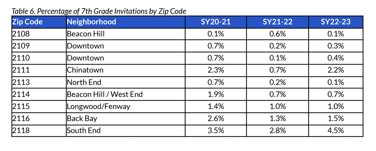
Tabular data on exam school invitations, published by BPS.
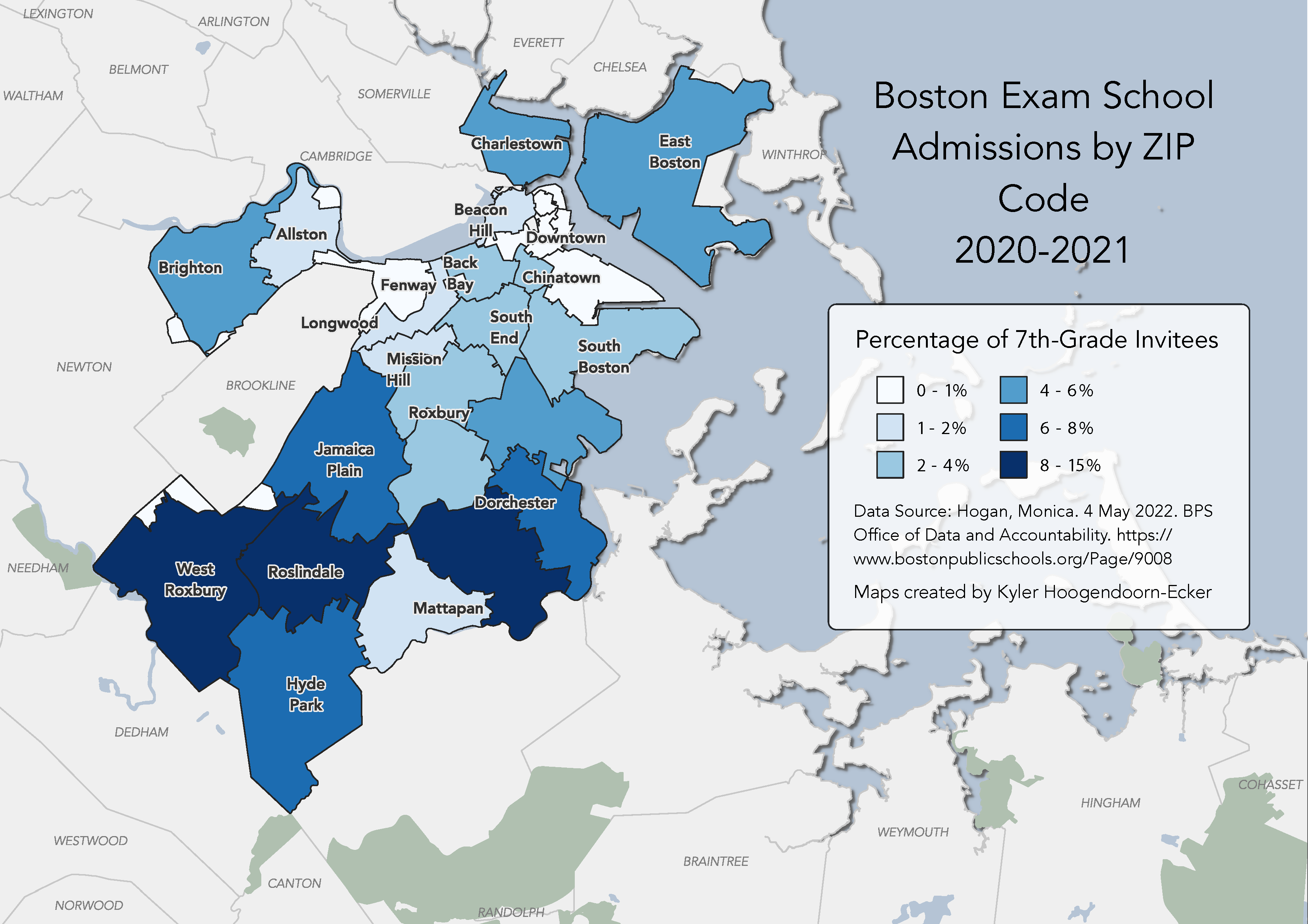
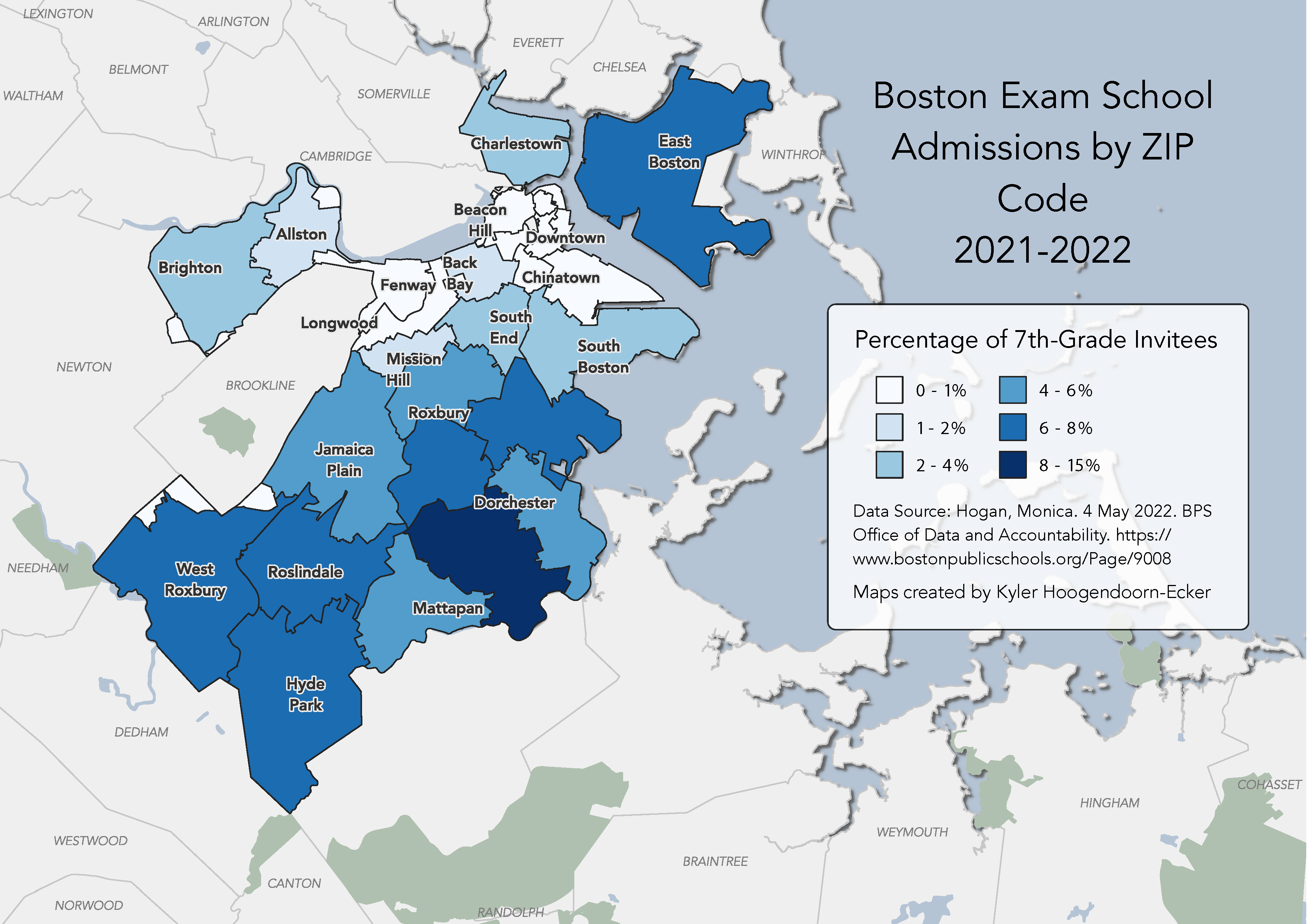
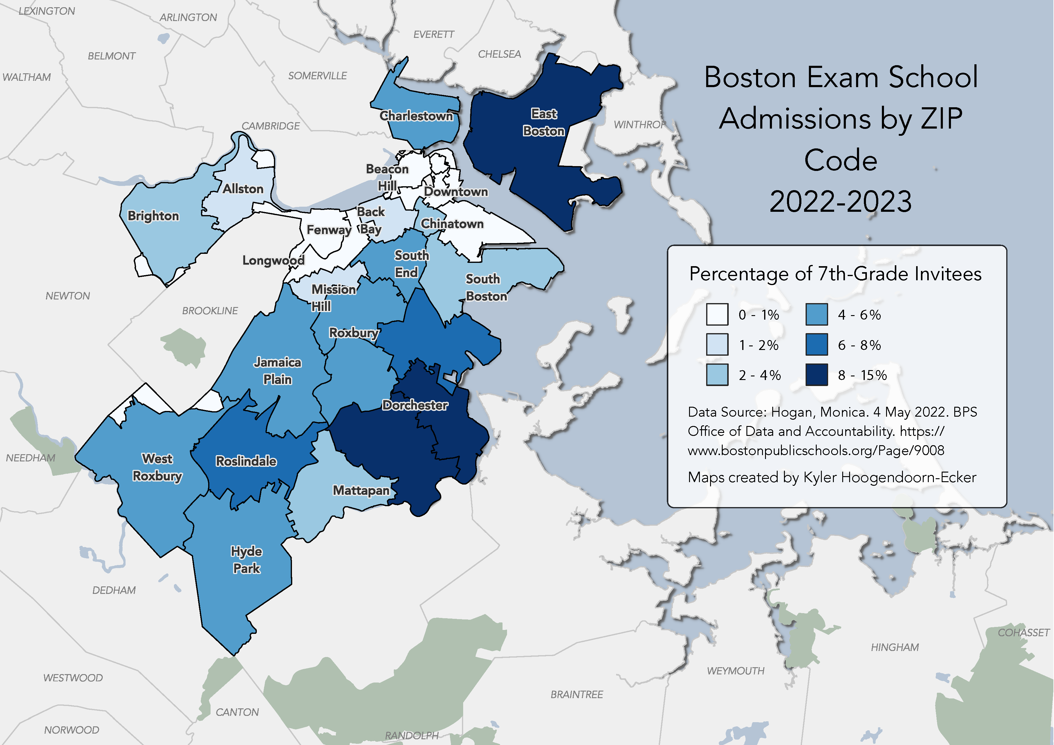
Translating roughly to "quantity by area" (from the Greek khṓra, meaning “location”, and plêthos for “a great number”), choropleth maps would better help us visualize how these attributes vary across space. Loading the BPS dataset into a geographic information system allows us to comprehend spatial differences far more easily than in tabular form.

Tabular data from BPS was transformed into spatial data using QGIS. Maps by Kyler Hoogendoorn-Ecker.
The maps suggest that the invitations to the three exam schools has been redistributed towards East Boston and Dorchester---some of the most populous neighborhoods of the city, especially in terms of students in the BPS---since the new policy took effect. While invitations to exam schools during 2020-21 were heavily concentrated in West Roxbury, Hyde Park, Roslindale, and Jamaica Plain, admissions for the 2022-23 school year include a greater representation of students from East Boston, Dorchester, and Roxbury.
This isn’t the first time efforts have been made to increase diversity in the exam schools. In 1976, Judge W. Arthur Garrity (well-known in Boston for his implementation of the school system’s “busing” plan) mandated that the exam schools set aside 35% of their seats for Black and Latino students as a part of the same desegregation plan. At the time, the school was around 90 percent white. Following a parent lawsuit, this affirmative action system was overturned in the mid-1990s and the unmodified test system persisted until these changes. More recently, in 2016 two students started the #BlackAtBLS movement to address racism among teachers and students at Boston Latin School.
To effectively discuss these policies, it’s essential to have an understanding of both their histories and their effects. Maps can help us make sense of the geographic impacts of such policies, for the sake of better informed public discourse and understanding.
Our articles are always free
You’ll never hit a paywall or be asked to subscribe to read our free articles. No matter who you are, our articles are free to read—in class, at home, on the train, or wherever you like. In fact, you can even reuse them under a Creative Commons CC BY-ND 2.0 license.