When we want to know how big something is that we’ve never seen before, it’s often helpful to compare the unknown thing to something more familiar. That’s why we often hear about how many football fields long something is, or how many Rhode Islands fit in a given territory. Last month, when the giant cargo ship Ever Given veered off course and ended up wedged diagonally in the Suez Canal, photos of tiny excavators pecking away at the bow of the comically oversized ship quickly became a social media phenomenon.
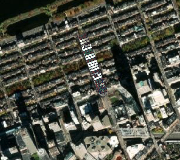
The Ever Given pulled up on Dartmouth Street in front of the BPL
As a distraction from a writing project I was working on, I quickly put together an interactive web map, Ever Given Ever Ywhere, which lets users move the stuck ship anywhere in the world. This joking little map went viral, and hundreds of thousands of people started comparing the size of this 400-meter ship to reference points in their own cities and neighborhoods. When Jenn Schiffer interviewed me for the Glitch blog about the app’s popularity, I argued that there is something inherently striking about the “collision between geographic scales.” Seeing something dragged across the map where it’s not supposed to be is both amusing and interesting.
The half-life of internet memes is very short, and it’s already become far less interesting to compare a cargo ship to different places on the map. But what if you could compare anything to scale on a web map? We already featured The True Size Of interactive in our Bending Lines digital exhibition to show how map projections can distort size. As Alan McConchie of Stamen noted on Twitter, though, we didn’t have any easy way of clipping out aerial imagery and dragging it around the map.
Both the Stamen team and I started working simultaneously on a tool that could make this happen. Stamen beat me to it with their wonderful “Scale-A-Tron,” but we at the LMEC now have our own scale-experimentation app called Insizeor. Insizeor picks up where Ever Given Ever Ywhere left off, letting you make geographic juxtapositions not only with the giant ship, but also with any image, including images clipped out of an aerial map.
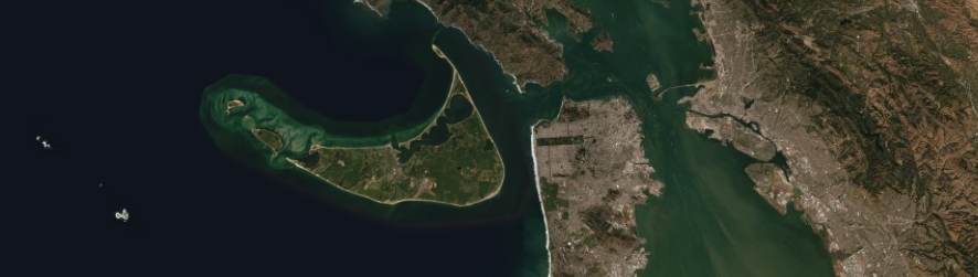
Nantucket off the coast of San Francisco
With Insizeor, you can pick an example to try out some scalar reference points—the Ever Given ship that started it all, as well as the Boston Public Library’s McKim Building, Fenway Park, and of course the standard international unit of size comparison, Rhode Island. You can also upload any image and set it to scale. Or you can draw a shape on an aerial map to “clip out” and compare to somewhere else.1
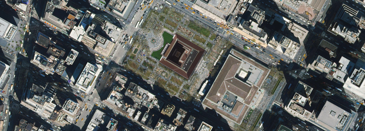
The BPL McKim Building in front of the NYPL
These kinds of comparisons can be interesting merely for answering questions about the relative size of one thing to another. For example, did you know that the BPL McKim Building would fit comfortably in Bryant Park next to our friends at the NYPL? Or that Puerto Rico is roughly the size of Long Island?
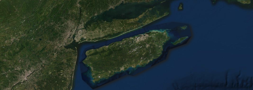
Puerto Rico lined up next to Long Island
But dragging things around on a map also prompts questions about how distance, proximity, and perception shape a popular understanding of how places relate to one another. If you’ve ever flown across the United States, you’ve probably seen the quilt-like pattern of center-pivot irrigation systems that dot the high plains. But if you’ve never worked on a farm, you probably don’t have much of a sense of how big they really are. Well, they’re pretty enormous, as this juxtaposition of fields next to Boston shows. And that should prompt some questions about how the many hungry mouths in a city are fed by massive plots of agricultural land that dwarf the size of the city itself.
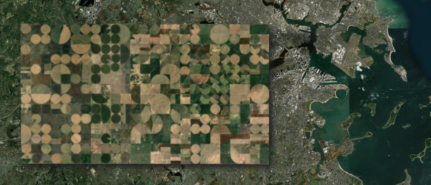
Center-pivot irrigation fields near Liberal, Kansas stretched out over Boston’s suburbs
There are countless intriguing scale juxtapositions like this which Insizeor invites you to consider. What kinds of mashups can you make that help us understand the world in new ways? Spend some time on Insizeor and then tag us @bplmaps on Twitter, Instagram, or Facebook to let us know what you found. Or, if you want to create your own scale-comparison tool, you can check out the Insizeor source code on GitHub.
-
As the Stamen team notes in their Medium post, there’s a bit of a technical caveat to these scale comparisons. The Mercator projection which is used in web maps has considerable distortion along the y-axis (latitude)—that’s why Greenland looks so enormous. Insizeor rescales the center point of the selected image to the correct scale at that latitude. But it doesn’t actually stretch the pixels of the image along the y-axis (doing so requires some more advanced image manipulation that can slow down a browser). That’s not much of a problem for images that are less than a few hundred kilometers “high” in their vertical dimension. But if you compare a place that crosses a lot of latitude lines (like Chile, for example), the vertical distortion won’t be fully corrected. ↩︎
Our articles are always free
You’ll never hit a paywall or be asked to subscribe to read our free articles. No matter who you are, our articles are free to read—in class, at home, on the train, or wherever you like. In fact, you can even reuse them under a Creative Commons CC BY-ND 2.0 license.