How would you go about counting all of the trees in Copley Square?
It’s not too hard to imagine doing this with a pen and paper. Between traversing Copley Square’s 2.4 acres and writing down every tree you find, it might take an hour or two. As part of a neighborhood tree evaluation project, cartographers from the Boston Redevelopment Authority actually did this in 1987.
But what if you were dealing with a bigger area, like the Arnold Arboretum? Clocking in around 281 acres today, counting trees in the Arboretum poses a larger information-management challenge. It still isn’t that hard to imagine how you’d accomplish this, but it’s a lot more work; you’d want to recruit and train some tree counting assistants, subdivide the area into manageable zones, and set aside a weekend or two for the actual work.
This is all well and good—but eventually, if you keep counting, you’ll arrive at a number that’s too big for humans to comprehend.
Even for a big team, counting all the trees in Boston would be a stretch. What about all the trees in Massachusetts, or the United States, or for that matter, all the trees in the world? At those geographic scales, people simply can’t process it all.
The computer, a cartographer
When data becomes too big for people to comprehend, we turn to computers for help. Mapping millions, billions, or even trillions of trees simply wouldn’t be possible without the ability to store and process that information somewhere other than our heads or paper notebooks. Because computers are so good at this, that’s how almost all maps are made today, such as the series of tree equity maps created by Speak For the Trees, Boston, which not only count trees but also visualize spatial relationships between tree canopy, urban heat, and other social and environmental factors.
And computers aren’t just good at counting large numbers—they also make all kinds of other cartographic tricks possible. Thanks to computers, we’re used to maps that move, maps that flow seamlessly and infinitely on a screen, and maps where users can add their own information. In fact, computer-based maps are now so familiar that we rarely stop to think: how did we get here? Just how, exactly, did the computer become a cartographer?
 (1987), from the Leventhal Center's collections. Numbered circles represent individual trees.](https://iiif.digitalcommonwealth.org/iiif/2/commonwealth:sx61h350t/4619,2257,2043,1352/full/0/default.jpg)
Part of a map of trees in Copley Square (1987), from the Leventhal Center’s collections. Numbered circles represent individual trees.
 ([1900]), from the Leventhal Center's collections.](https://iiif.digitalcommonwealth.org/iiif/2/commonwealth:9s161f604/full/1200,/0/color.jpg)
A census of trees and shrubs in Arnold Arboretum ([1900]), from the Leventhal Center’s collections.
 by American Forests.](/images/blog/tree-equity.png)
The national Tree Equity Map by American Forests.
September 2024 will kick off the Leventhal Center’s exhibition on the rise of digital mapping, Processing Place: How Computers and Cartographers Redrew our World. In Processing Place, we explore big changes in the social, political, and environmental landscapes of the twentieth century that were driven by tools for “computing space,” especially from the 1960s onward. While the history of cartography often focuses on more antiquarian materials, Processing Place shows that by pairing older maps with newer ones—and peeling apart interconnected questions about geographic information, analytical processing, and visual representation—we can get to a better explanation of how computer maps came to dominate our geographic imagination in the present day.
Redrawing the world
It’s hard to say exactly when people started making maps with computers, but by the 1960s, postwar experiments with new computing technologies had made it possible to create more maps, more efficiently and less expensively, than ever before. Some of the earliest experiments would be undertaken at Harvard’s Laboratory for Computer Graphics and Spatial Analysis (LCGSA), where graduate students keyed data into punch cards and produced maps using typewriters, sometimes for fun and other times for nationally-syndicated newspapers. Then, through the 1970s and 1980s, geospatial computation became a more urgent task for government agencies, as new waves of legislation demanded answers to questions that could not easily—and in many cases could not feasibly—be measured without the aid of digital computers.
The ability to recombine maps with spatial data—to perform calculations and tell spatial stories from them—began to distinguish computer-aided mapping from its analog predecessors. And although methods like typewriter mapping were cutting-edge at the time, they seem positively quaint compared to the wide range of dynamic, location-aware, and continuously connected geographic information systems (GIS, for short) that now span the full gamut of our everyday lives.
In part, Processing Place examines how handcraft and human decisions are just as essential to computer-drawn maps as they are of maps on parchment from centuries before. Take, for example, this digital map of additions to Boston’s shoreline between 1795 and 1995. Lacking a time machine, the mapmakers did not go out and survey the historic shoreline themselves. But they weren’t just making educated guesses to produce their map, either: they created the map by digitally tracing, among other objects, Osgood Carleton’s 1796 Plan of Boston.
The same goes for this 1988 map of Nantucket from the Applied Geographics, Inc. (AppGeo) Records at the Leventhal Center. In this case, the source material for digital land use data was not a historic map, but a series of aerial photographs, at least one of which can be found in UMass Amherst’s extensive aerial photography collections.
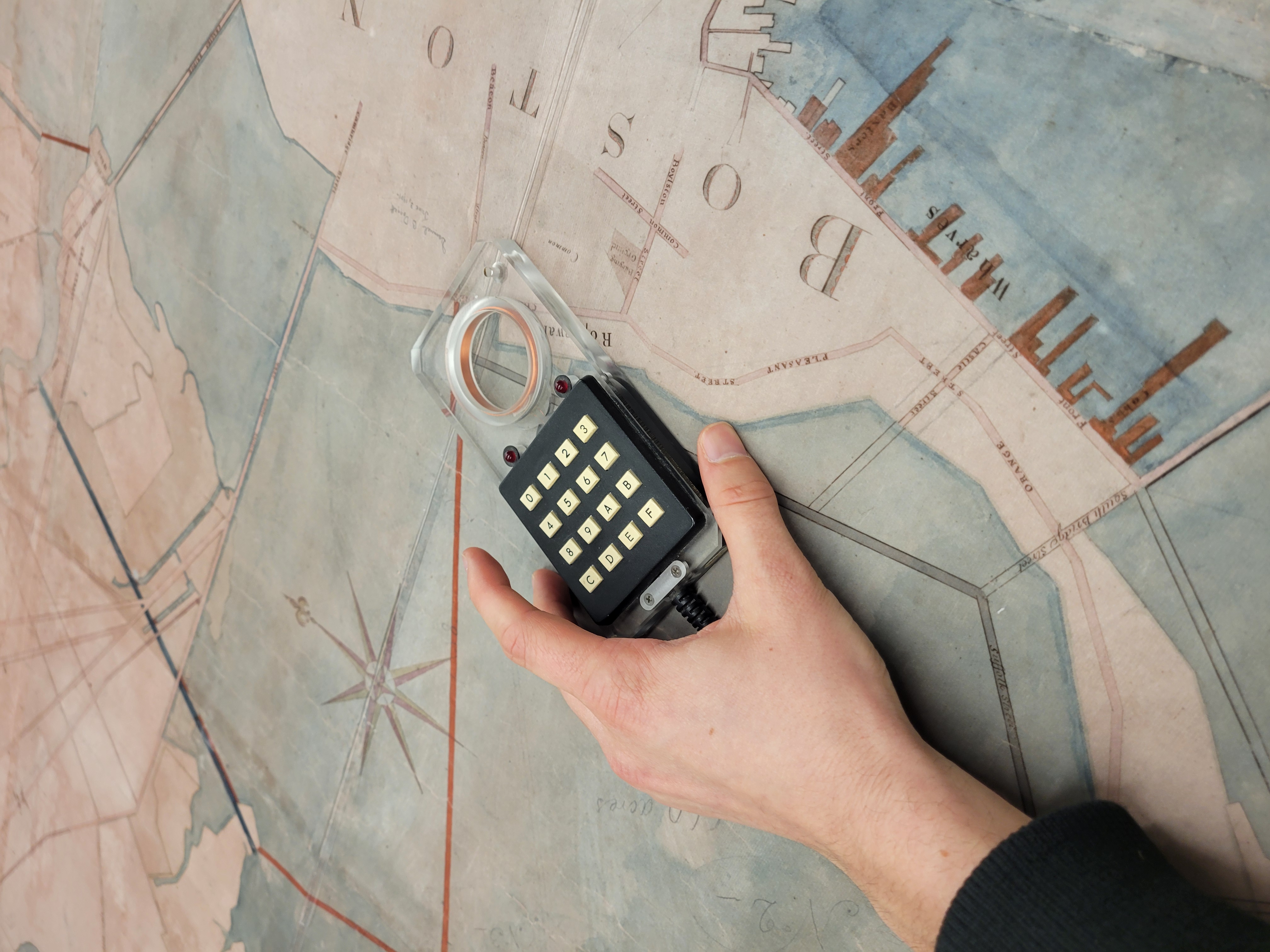
LMEC staff simulate how a digitizing puck from the Weaver Papers would be used to create spatial data from a paper map (in this case, a c. 1850 manuscript map of Boston’s mill dam).
In the 1980s and 1990s, paper maps were converted into digital data through the aid of tools like “digitizing pucks,” including the one shown here. To create spatial data, cartographers would trace these pucks over the features on paper maps—water bodies or roads, for example—and press a button to register each part in the computer’s memory.
Extracting data from historic maps in this fashion creates files that can be read by computer mapping software. Though these files are not maps themselves, the process of creating digital spatial data does open the door for making new maps that respond to new kinds of spatial questions: for example, what’s the economic value of made land within the City of Boston’s boundaries?
To hazard a guess, we combined spatial data of the 1630 shoreline (also traced from historic maps) with contemporary parcel data from the City of Boston and arrived at a figure exceeding $36 billion. Numbers like that can help put things in perspective regarding how valuable land gets used, who decides, and who benefits from capitalizing on it—and thereby employ a dataset processed by a computer to probe a deeply human problem.
Expanding the archive
In recent years, the Leventhal Center has made efforts to join a growing number of institutions—most notably, the Library of Congress—dedicated to expanding the “poorly developed archive”1 of computer cartography and GIS. With recent additions of the David Judkins Weaver Papers and the Applied Geographics, Inc. Records, we’re working to grow the publicly-available archival materials that help trace the history of computer-assisted mapmaking, and in doing so, tell the story of why it still matters today.
A 1988 map from the Weaver Papers highlights this well. Produced as part of an effort between the Executive Office of Environmental Affairs, future founding members of MassGIS and AppGeo, the map provides a risk assessment for select wetlands in advance of the 1992 Massachusetts Watershed Protection Act (WsPA). Focusing on the towns of Sterling and West Boylston, the authors use a buffer tool—a classic geoprocessing function—to determine the total area of both protected and unprotected open space within 200 and 400 feet buffer zones of Wachusett Reservoir tributaries.
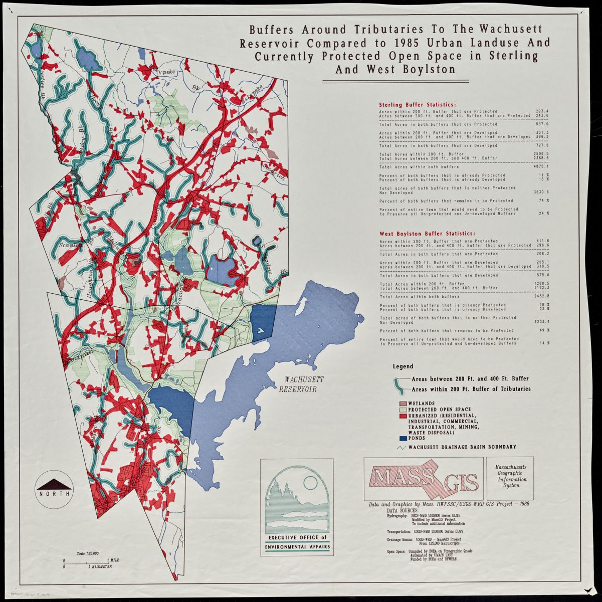
Wachusett reservoir buffers map from MassGIS (1988), from the Weaver Papers.
While the map gives us a snapshot in time of two Massachusetts towns and their land use practices, even with a legend, it’s not particularly easy to read. That doesn’t mean it’s bad; in fact, it might not even be a map that we’re meant to “read” at all. Indeed, what is particularly important about this cartographic object are the statistical summaries that accompany each town on the right-hand side: “Percent of both buffers that remains to be Protected.”
Those numbers—a set of values describing the percentage of land near tributaries that has yet to be designated as legally protected—provide the real takeaway here. The legal protections that the number helped inform are still enforced today, in the form of the Watershed Protection Act, which “regulates land use and activities to protect the drinking water supply of over 3 million people.”
For a long time, maps were regarded as databases in their own right. Urban tax and fire insurance atlases are a fine example of that: they stored precious information and provided instructions for how users could query it. Placed in its context, it’s clear that the buffer map of Wachusett tributaries is something different, less a database and more an artifact of spatial statistics. The map provides visual evidence that the calculated number is real.
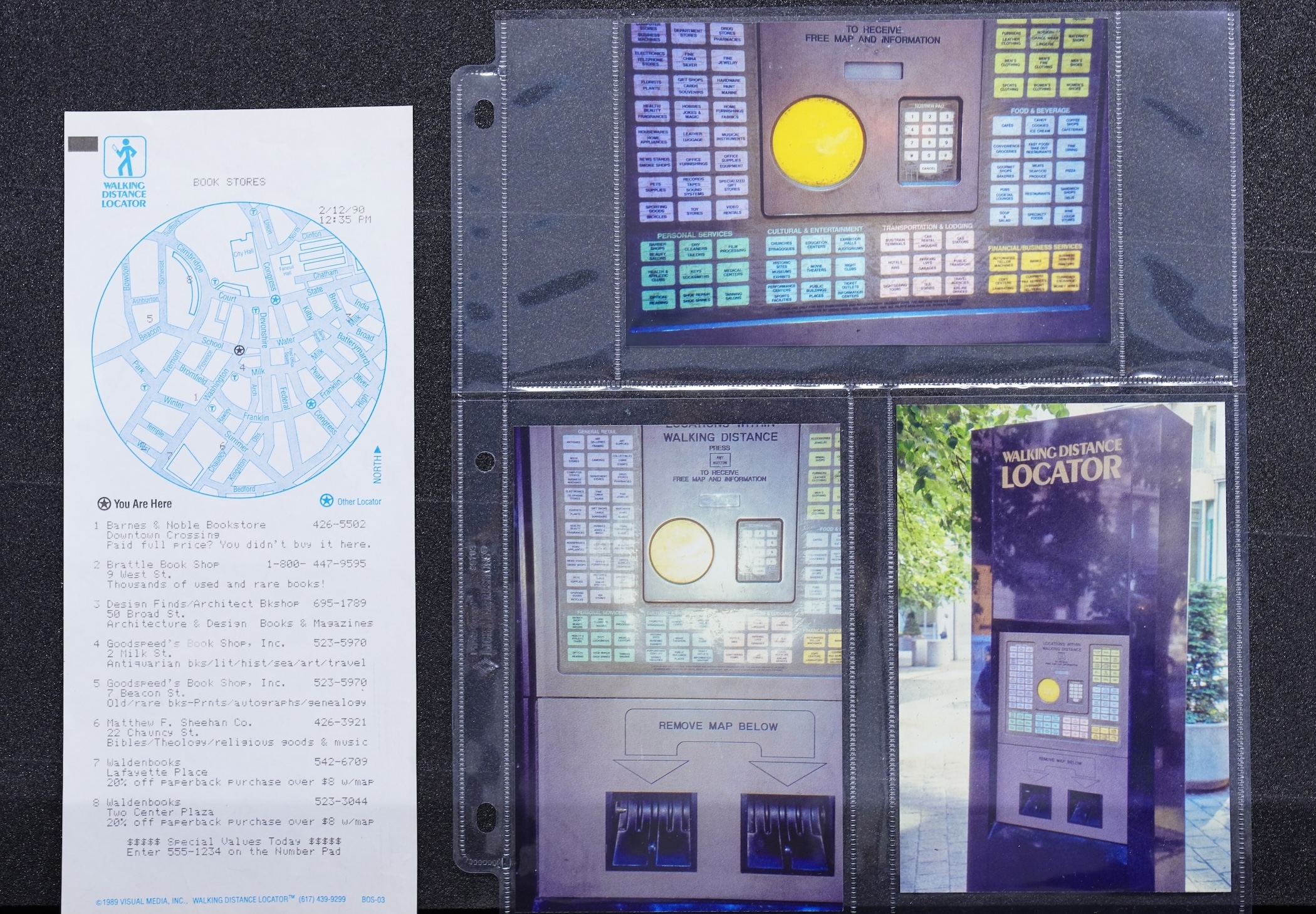
A printout from the Walking Distance Locator kiosk, alongside photos of the kiosk installed in the park at the corner of Washington and School Streets..
None of this should suggest that computers made spatial analysis possible in the first place, nor should it imply that GIS made maps obsolete as wayfinding objects. In 1989, the Boston-based company Visual Media Inc. installed three “Walking Distance Locator” kiosks in the Back Bay. Using the kiosks—themselves geographic information systems that had been installed as pieces of infrastructure in the landscape—people could print out physical locator maps that directed them towards local businesses based on a predefined category, such as “Book store.”
Although the Walking Distance Locator didn’t survive, it did foreshadow the economic model for how modern digital maps operate. The ubiquitous wayfinding platform Google Maps, reportedly an $11 billion dollar business, makes money just like the Walking Distance Locator: by advertising places to users based on their location. This sort of monetized spatial data circulates throughout our social lives in lots of ways: social media apps like Snapchat map users' video content, and TikTok uses “[Designated Market Area] geo-targeting” to provide “granular location targeting options” for businesses who advertise on the platform. When you read a digital map today, it’s often reading you too, trying to determine who you are based on where you are.
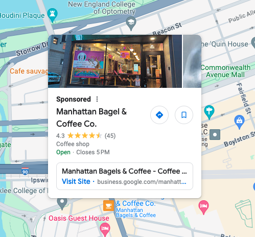
A targeted Google Maps advertisement for a bagel & coffee shop in the Back Bay, based on LMEC staff’s location at the nearby Central Library (and, presumably, the likelihood that this ad will appeal to them).
Like all technological developments, the analytic and economic benefits reaped by advancements in computer cartography would not be shared evenly throughout the twentieth century, nor into the twenty-first. Those advancements were consequences of a world that was becoming more anxious about geopolitics, more concerned over environmental management, and more attuned to structural disparities along the axes of ethnicity, race, and gender. However, while counter-mapping projects would not enjoy the benefits of computer cartography and GIS until quite a while after it emerged, these groups had long been processing the world in their own way.
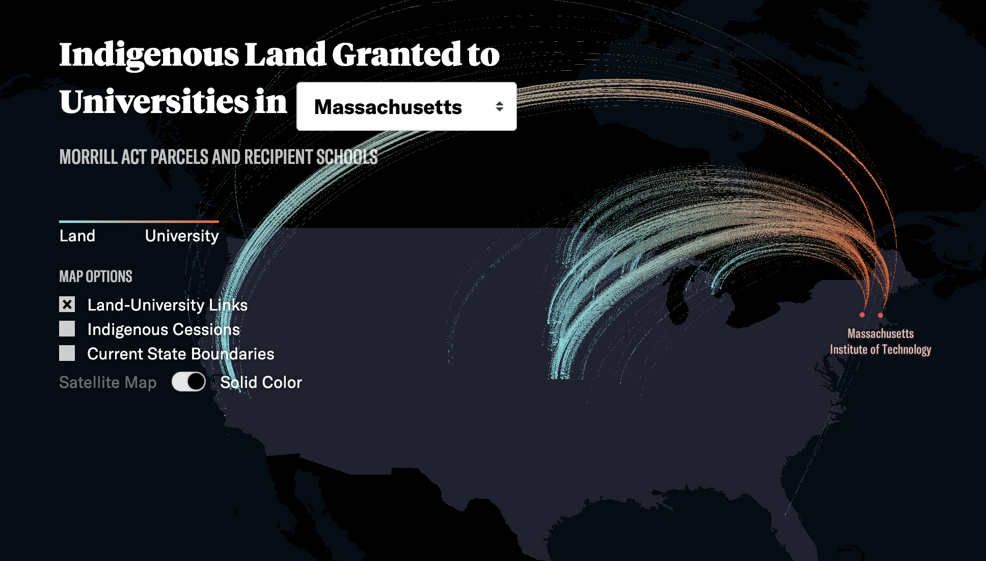
Decades before the dawn of the computer, W.E.B. Du Bois created stunning maps and complex data visualizations for the 1900 Exposition universelle in Paris, conveying the experiences of Black Americans—visualizations that continue to have resonance in geography and data science today. Later on, between the late 1960s and early 1970s, the Detroit Geographical Expedition and Institute (DGEI) harnessed complex methods of qualitative and quantitative cartography to make counter-maps that showed “Inequality Between Detroit City and Suburbs,” or even more provocatively, “Where Commuters Run Over Black Children.” These projects pushed back against prevailing ideas about who could map and who deserved to be mapped, and their legacy continues in digital mapping projects like Land-Grab Universities (2020), which meticulously documents the extent of indigenous land expropriation associated with the Morrill Act in 1862.
From wayfinding kiosks to Land Grab Universities, from counting trees to counting the value of made land in Boston’s boundaries, computers have clearly transformed how we create, analyze, and present spatial data. Perhaps most importantly, comparing those cartographic objects made with computers and those made without them reminds us that people have always been computational. Recording observations about the world, turning those observations into ideas, and using those ideas to make arguments suited to our individual or collective goals is an enormous part of what makes us human. By abstracting so much of our thinking and analysis into the memory of hard drives and cloud servers, it’s easy to think that computers have somehow made us less so, when precisely the opposite is true: they made us (and our maps) more human than ever before, with serious implications for environmental management, law and policy, navigation, national defense, social resistance… the list goes on. In Processing Place, we bring you these stories and more.
Mark your calendars
The show will open on September 13, 2024, and if you want to stay in touch and learn more about the upcoming exhibition, follow us on social media or consider joining our mailing list. And if you’re working on anything related to the histories and geographies of computer cartography, don’t hesitate to reach out—we’re excited to collaborate with individuals and institutions alike to support programming for this exhibition.
-
Pickles, John. 1995. “Representations in an Electronic Age: Geography, GIS, and Democracy.” Ground Truth, p. 638. ↩︎
Our articles are always free
You’ll never hit a paywall or be asked to subscribe to read our free articles. No matter who you are, our articles are free to read—in class, at home, on the train, or wherever you like. In fact, you can even reuse them under a Creative Commons CC BY-ND 2.0 license.