The next exhibition at the Leventhal Center, opening in May 2024, takes a close look at an extraordinary pair of maps from early nineteenth-century China. This exhibition, Heaven and Earth: The Blue Maps of China, will draw viewers into conversations about Chinese material culture, the circulation of printing techniques around the world, and the different perspectives on space and place that emerge from different intellectual traditions. In this interview, we spoke to Dr. Richard Pegg, the guest curator of Heaven and Earth.
The text of this interview has been lightly edited for clarity.
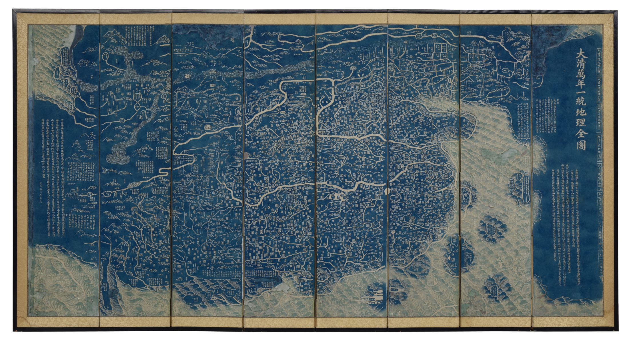
Heaven and Earth revolves around two large maps printed in China in the early nineteenth century—one portraying the terrestrial world of the Chinese empire and the other portraying the heavens. Tell us the backstory about your relationship with these two large maps.
I first encountered the terrestrial map when I acquired the MacLean Collection copy in 2005. I later published my preliminary findings in my book about some of the East Asian maps in the MacLean Collection in 2014. Soon after that, other curators and librarians began contacting me about blue maps in their own collections. I soon became known as the “blue map guy.” A couple of years later I realized there was a celestial mate, with an example in the Adler Planetarium’s collection.
The terrestrial map from the MacLean Collection
In 2018, Elke Papelitzky, my friend and colleague, was a MacLean Collection Map Fellow, during which time she began collecting images of other copies of the terrestrial map. She and I soon realized that there were multiple editions of both the terrestrial and celestial maps produced with a range of differences. With renewed interest, I began going to see other copies. In 2019, Elke and I were looking at a terrestrial copy in Leiden’s Werldmuseum collection and I asked her if she wanted to write a book on the topic. She enthusiastically said “yes.” And so began an active search for copies of both the terrestrial and celestial maps. Thus far we have found more than forty terrestrial and a dozen celestial maps all around the world. And our book will hopefully be published by the end of this year.
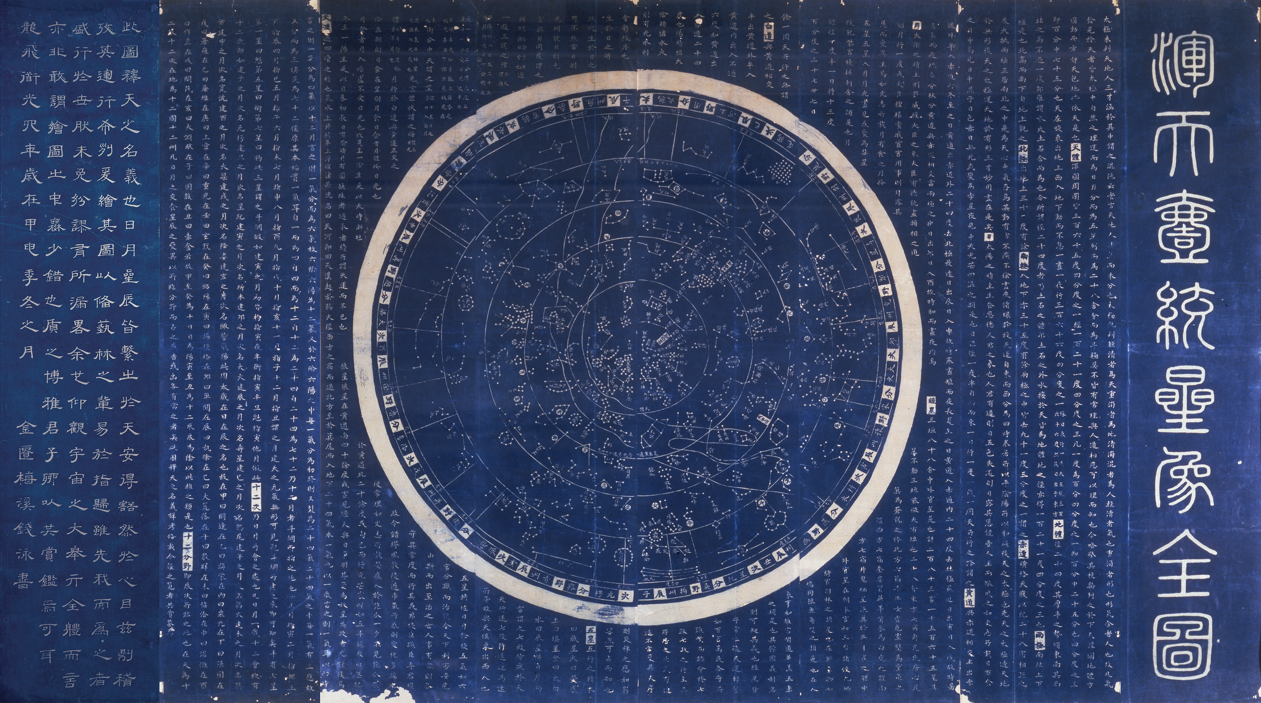
The star chart in the Adler Planetarium collection. This image features a digital edit to include the leftmost panel, which is not in this position in the original object.
And how did the exhibition project at the Leventhal Center play into this backstory?
Several years ago, I was asked to look at the LMEC’s East Asian maps collection. The Center has one important mid-ninetneeth century Chinese map in its collection. I began thinking about a small exhibition of Chinese maps from Boston-based collections. I later became a member of the Leventhal Center Board of Review, which helps advise the curatorial and collection teams. At the same time, institutionally, the MacLean Collection and the LMEC had been and continue to collaborate on a number of projects. It occurred to me that an exhibition that paired the two Chicago based blue maps from the MacLean and Adler collections into an exhibition that included the LMEC map and several Harvard maps was a win-win for all.
Give us a quick introduction to what we’re looking at on these maps, how they were made, and why they’re so powerful when paired together.
My first encounter with these maps I think will be similar to anyone’s. Wow! These are impressive and beautiful objects. Trained as an art historian, I wanted to understand what I was looking at and how they were made. I became really impressed at how many ways these maps were unusual just in terms of production, making something quite unique—not just unique in Chinese mapmaking practices but in world map making practices as well. I have not found any other maps, from any period, from anywhere else in the world that uses this stunning blue color at this scale.
Another unique quality is the “rubbing” printing method which is historically and typically associated with printing and collecting copies on paper of stone steles. Woodblock printing, which these blue maps use, typically creates a positive image from a negative carved block. The blue maps are a positive image printed from a positive woodblock, using the same process as that of rubbings. Rubbings also are typically produced using a bamboo-based paper (lianshi) while these are produced using a blue sandlewood-based paper (xuan), typically used for fine paintings and calligraphies.
Visually, when placed side by side, these two maps remind the viewer of the relationship between humankind, heaven, and earth. These are depictions of heaven and earth through the lens of human perception with the intention of human interpretation and use. We often forget about our relationships to the sky and earth around us in our everyday lives.
How did you first come to realize there was something interesting in these “blue maps” that historians hadn’t yet considered?
Aside from the unique production qualities, the contents of these maps are really interesting as well. First, I was surprised when I began doing research that no one, anywhere, had done anything more than cursory considerations of these maps. Second, their limited study had become polarized into two very distinct fields of research; the terrestrial map was historical and geographical while the celestial chart was astronomical and scientific. As a result, there was no consideration of them as a pair, so their original intended relationship had been completely overlooked.
What made East Asian concepts of geography and cosmography distinct from those of Europeans at the same time?
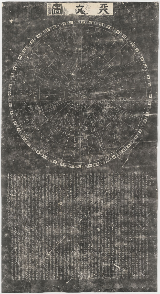
A rubbing from a stone stele, in the Harvard-Yenching Library
These two maps were inspired by a pair of maps first drawn in the 1190s and then because of their importance carved into stone in 1247 CE. Since that time rubbings from those stone steles, which still stand in Suzhou today, have been made and collected. This exhibition has copies of both. Conceptually, creating celestial and terrestrial maps that have equal weight visually had been common in Europe during the 17th and 18th centuries, particularly in the making of globes, but began to disappear in the 19th century. In China too, by the 19th century, maps might include both terrestrial and celestial information, but one type was always prioritized over another through the space allocated on any given map.
The blue maps, then, are unusual in a European as well as Chinese context, in that two large format maps, one terrestrial and one celestial, of essentially the same size, were produced as a set. The blue maps intentionally reference the stele maps of 1247 in an effort to activate, in a conversation over time, the reasons those maps were made five hundred years earlier.
These maps are physical objects with a very specific material history. Can you give us a short backstory of their life courses as objects? After they were made, who owned them over time, and how did they eventually come to collections outside of East Asia?
Two of the eight title slips on the edge of the terrestrial map
These maps were printed and designed to be mounted in China as hanging scrolls. This is confirmed by the line of eight title slips that are still left on the MacLean Collection terrestrial map along the far-right edge. But they seem to generally have been distributed after printing as eight loose sheets for both maps. After printing, they were immediately and enthusiastically imported in Japan. In Japan they were mounted into other formats like folding screens (byobu), sliding doors (fusuma), and as folded sheet maps.
The history of some of these maps as objects over time is quite amazing. The example in the Wereldmuseum in Leiden for example was acquired by a doctor working for a Dutch trading company in the mid-1820s and brought to the Netherlands in the late 1820s. The MacLean Collection map was probably remounted as a screen in Korea in the early 20th century and made its way to New York in the 1950s. Since my rediscovery and publication of these maps they have become popular and emerged at auction or with dealers all over the world.
One of the unique features of these maps is their use of Prussian blue pigment. Why is this so important, and how did you figure out that the maps are indeed colored with Prussian blue?
My first assumption when I saw these maps was that they were colored using indigo, a colorant used for paper since the eighth century in China, Korea and Japan. It was the terrestrial map in the British Library collection that made me think it was something else, like a mineral pigment. The blue on that map is so rich and saturated that I knew it could not be indigo, an organic colorant. I asked numerous institutions to conduct scientific testing on their maps. The first able to do it (in the midst of COVID lockdowns) was the Harvard-Yenching Library. They have access to the Weissman Preservation Center (WPC), which can conduct non-invasive spectral analysis. The staff at the WPC quickly and enthusiastically confirmed it was Prussian blue, as well as the rubbing method of printing and the type of paper used.
Prussian blue as a colorant was first created in Europe in the early 18th century. It was introduced and exported to Japan by the Dutch in the 1760s and into China by the British in the 1790s. By the second decade of the nineteenth century, it was obviously being manufactured in China in enough quantity to supply the needs of the blue map printers. The blue maps represent the first large scale use of Prussian blue in East Asia. While the large-scale local production of the colorant in China, as demonstrated by the popularity of the blue maps in Japan, likely launched the “blue revolution” of Japanese print artists, who sourced their Prussian blue from China, that began in the 1830s.
What’s one important detail on the blue maps that you think a casual visitor might easily miss?
I think there might be an assumption that because “everything” is in Chinese that the casual visitor might think these maps are not comprehensible to them. But there are many points of entry that can be understood and appreciated by anyone. If one looks at the terrestrial map one can easily identify the Yellow (north) and Yangzi (south) Rivers or the great wall. All the placenames are surrounded by shapes that identify the administrative types so once the nine shape/symbols are understood one can easily differentiate between cities, towns or prefectures. The planisphere of the celestial chart has the easily recognized Big Dipper in the center and anyone can appreciate the aesthetics of the three different types of script used on the chart. Even some native readers of Chinese cannot necessarily read the title or the final inscription that use script types from two thousand years ago, but they can appreciate the designs of their abstracted forms.
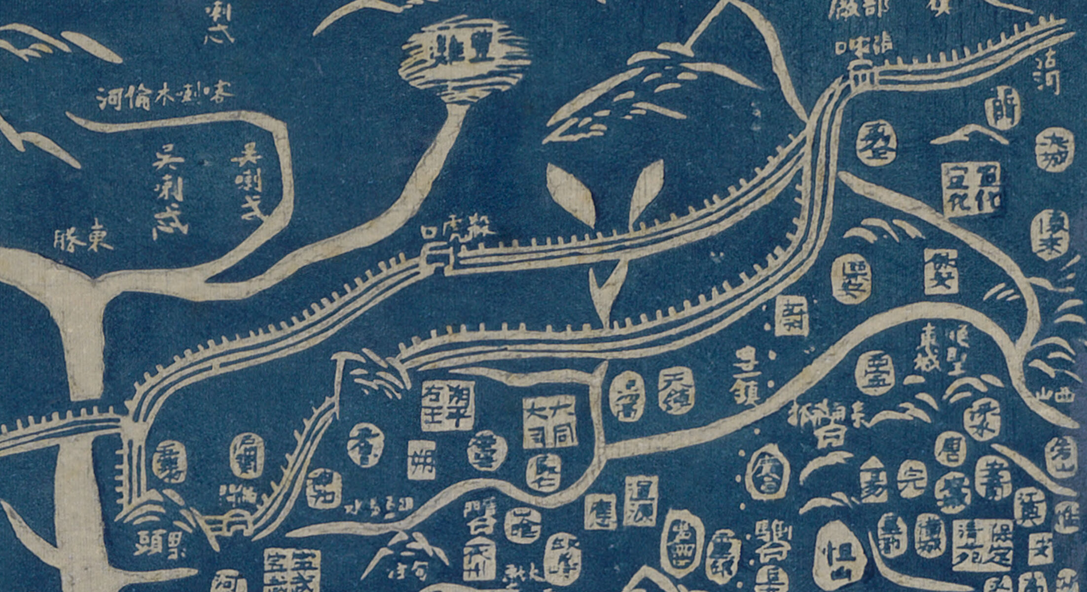
An excerpt of the terrestrial map showing the Great Wall alongside administrative names symbolized using different shapes
Heaven and Earth opens to the public on May 10, 2024. Subscribe to our mailing list for more updates.
Our articles are always free
You’ll never hit a paywall or be asked to subscribe to read our free articles. No matter who you are, our articles are free to read—in class, at home, on the train, or wherever you like. In fact, you can even reuse them under a Creative Commons CC BY-ND 2.0 license.