On September 5, we hosted From The Vault — The Best State Around: Historic, Promotional State Maps.
It’s not uncommon to be proud of the place you live… but these maps take it to another level!
In this From The Vault, we took a look at some promotional state maps from the 1890s to 1950s. Some maps use comedy to poke fun at the rest of the country, while others espouse the successes and deep history of their land to capture a potential visitor’s attention. Each state does things a little differently and we invite viewers to answer the question: “What truly is the best state around?"
Elizabeth Shurtleff and Helen F. McMillin, Map of the state of New Hampshire : looking over our whole country from east to west, let me ask if such a map was ever before presented to the eye - Daniel Webster (1926)

Designed and drawn by two female artists, this pictorial map includes humorous and historical drawings and references. In the margins, one can see color illustrations of various emblems of towns, organizations, local schools, and points of community interest. Some of these places are even illustrated on the map itself, telling us in more than words that although this map may seem serious from afar, hints of a simpler, sillier life can be found as well. Note the hordes of visitors (future residents?) driving in from different locations all around the state’s borders in a rush to reach the Granite State!
Ernest Dudley Chase, The United States as viewed by California (very unofficial) (1940)

Recognized for his whimsical pictorial maps, Chase created this highly distorted view of the United States as perceived by Californians. One-third the size of the rest of the country, the state is perpetually drenched by the sun. A bustling California is also depicted as a cornucopia of plenty, teaming with industry, agriculture, recreational activity, and natural wonders. The rest of the county is overshadowed by a dark cloud and a vast, depressing spider web. Other states are distorted or are omitted entirely. However, Chase’s native New England retains its shape and receives some sunlight for half of the year.
James Frank Oliver, A Texan’s map of the United States [of Texas] (1949)

This cartoon pictorial map shows Texas as occupying about half of the area of the United States, with comic place names like “EL Paso: Where the sun spends the winter”. As a “Texan’s map of the United States [of Texas],” this map is full of Lone Star-centrism, from the Atlantic Ocean—now known as the “East Gulf of Texas”—to a sign planted on the California coast marking the “City Limits of Dallas.” Even the scale admits to its distortion, noting that 1 “Texas Inch” is equal to 1,000 miles. Within the state itself, a large orange heart spotlights the town of Crockett, a town which had fewer than 6,000 people at the time this map was made, but marked the home of the map’s publisher, the Texoak company.
Daniel K. Wallingford, This map presents a Bostonian’s idea of the United States of America (1935)

This may be one of our most infamous maps in the gallery! A favorite amongst locals, this map highlights many of the most beloved areas and qualities of Boston and greater New England. Most noteworthy is perhaps the scale at which Boston and the cape of Massachusetts are shown, highlighting the economic and cultural importance of these areas (at least, from the perspective of a Bostonian).
Daniel K. Wallingford, A New Yorker’s idea of the United States of America (1936)

One of two Wallingford maps on display, this map takes a look at the USA “as a composite of the New Yorker’s ideas” concerning the rest of the country. Similar to the Bostonian’s View, the geographic size of New York City and the rest of the state has been blown out of proportion to a humorous degree.
One striking difference between the two Wallingford maps is that this one often emphasizes that New Yorkers have no sense of geographic knowledge. In this map, the Bronx is nearly next to Boston, Iowa, Nebraska, and South Dakota are listed as cities in other states, and Hollywood, California, and San Francisco are made into three entirely separate states! In a way, this lack of knowledge on other parts of the country solidifies the notion that New York City has everything anyone could ever want, leaving no reason to venture forth quite literally anywhere else in the country.
Grace Raymond Hebard and Paul M. Paine, Map of the history and romance of Wyoming (1928)

Perhaps more humble than some of the other maps on display, this pictorial map of Wyoming asserts itself to be just as prideful of the land it calls home. Poetry, folk tales, art, and state history can be found across every corner of the map. Other writing on the map appeals directly to visitors, calling Wyoming the “Last American Frontier" with “Broad, open spaces” and “The land of plenty”. Using this map, we can see that though less boastful than some others, this map was still very intentionally trying to piece together a favorable view of this rolling, open land.
Bob Fletcher and Irvin Shope, Frontier, Montana, pioneer : a one page history dedicated to the Old (1937)

Harkening back to the “Manifest Destiny” rhetoric of early settlers, this map was published by the newly formed Montana Highway Dept. as a way to entice other Americans to move to the state. “A one page history dedicated to the Old Timers”, this map includes text, illustrations of select sites, and a descriptive historical legend. In addition to the highly detailed map, the reverse side is full of evocative images of White, American pioneers and a “Tabloid History” of the early history of the state. Though heavily present throughout the history of the state, the Indigenous Peoples of the region are rarely mentioned in a positive tone, making it quite clear they were not the intended audience for this map.
Cody’s Ltd, Map of Canada : (as seen by a maritimer) [1955–1975?]
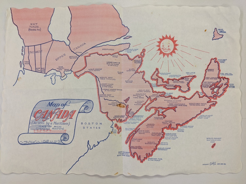
Though not a part of the United States, we had to spotlight this unique map of Canada, completed in a similar style to many of the more playful maps on display. This distorted map of Canada depicts the Atlantic Provinces normally while minimizing the rest of Canada. Taking a slightly sillier approach, places have been described by superlatives or historical notes instead of proper names.
Our articles are always free
You’ll never hit a paywall or be asked to subscribe to read our free articles. No matter who you are, our articles are free to read—in class, at home, on the train, or wherever you like. In fact, you can even reuse them under a Creative Commons CC BY-ND 2.0 license.