One of the key insights of human geography is the observation that people arrange space according to the economic, social, and political conditions in which they live, and one of the key insights of historical geography is the observation that almost every built landscape preserves the structuring forces of decades and centuries past. These two observations are fairly easy to spot in a place like Massachusetts, where our current geographical arrangements are very often an obvious fusion of both past and present economic, social, and political orders. A row of expensive condominiums in Charlestown documents both the contemporary desire of well-heeled professionals to live near urban cultural amenities as well as the neighborhood typology of a long-obsolete shipbuilding industry. The racial and income gap between Lawrence and Andover runs along a line established in 1847 to divide the landscape of smallholder agriculture from the urban economy of a booming textile industry, both of which have almost entirely vanished in the present day.
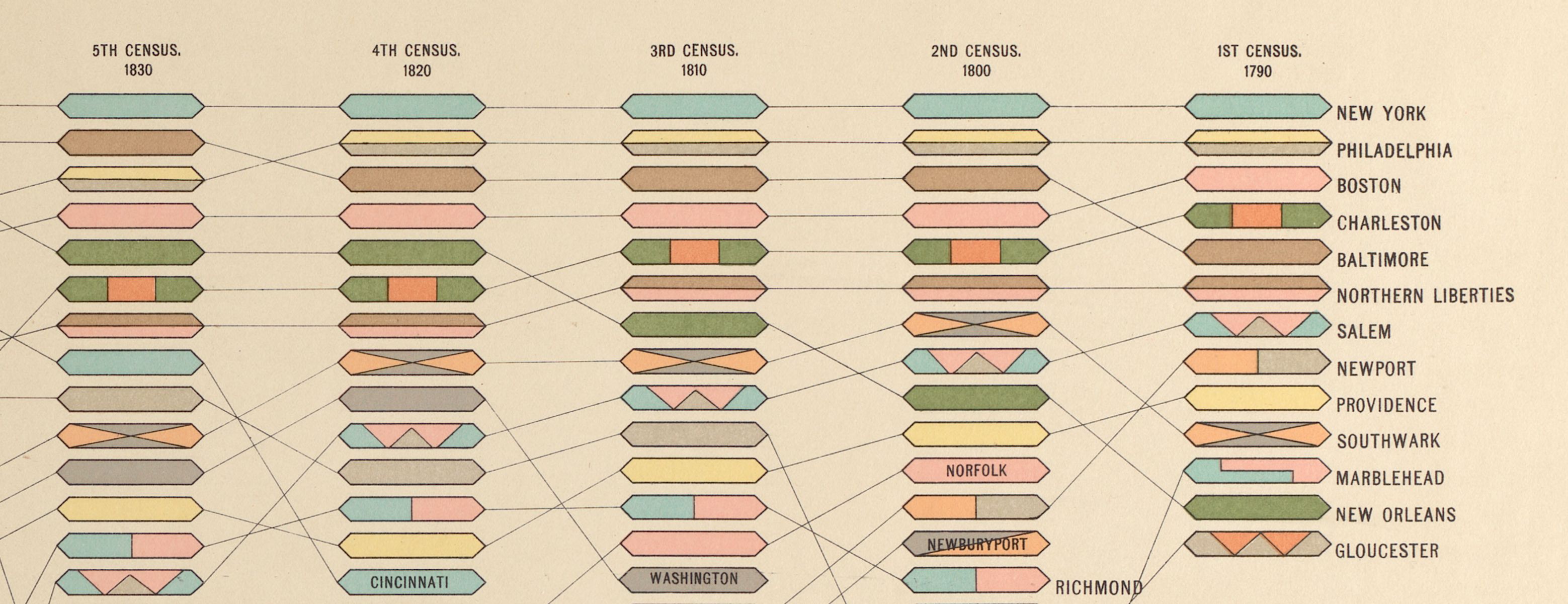
A visualization showing the largest cities in the U.S., from the Statistical Atlas of the Eleventh Census
The stirring-together of past and present geographic arrangements is on display not only at the scale of buildings, neighborhoods, and towns, but in the overall structure of the state of Massachusetts as well. One of my favorite bits of trivia is the fact that Salem, Marblehead, and Gloucester were among the 13 largest cities in the United States at the time of the first census in 1790, and Nantucket was the 15th largest city in the nation in 1800. Those rankings, which seem so absurd today, are more than just an odd bit of trivia. They’re also a historical document of the profound orientation of the economic geography of the early United States towards the Atlantic. Patterns of what geographers call “urban hierarchy”—the size and relationship of cities within a national or international network—are a very useful document for diagramming the shape of a larger spatial order. For instance, in our 2019–2020 exhibition America Transformed, this graphic from the statistical atlas of the Eleventh Census helped tell the story of how the rise of Midwestern cities like Chicago and St. Louis reshaped the United States in the late nineteenth century.
The historian and digital humanist Ben Schmidt made a map in 2017 that took advantage of data created by a Wikipedia editor who had transcribed town-level census data for essentially every municipality in the United States, going back to 1790. Schmidt’s map makes an intriguing choice about how to visualize 210 years of data. The map uses colors to show when each municipality in the data set reached its maximum population. It’s one of my favorite examples of a map that uses a fairly simple data set to open a window into arguments that would be difficult to make without the aid of the data visualization.
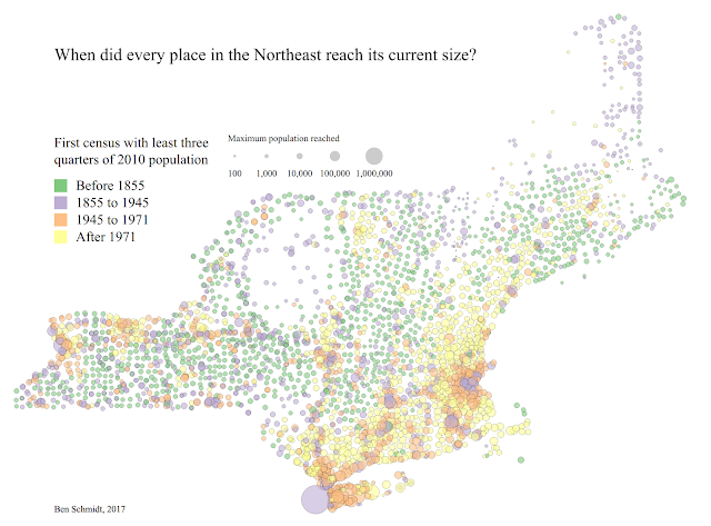
Ben Schmidt's 2017 map showing when each city and town in the Northeast reached its current size
What’s immediately striking about this map, as Schmidt notes, is that so many municipalities in the northeast are shadows of their former selves, with hundreds of towns that have been consistently shrinking since before 1855. But what perhaps is most interesting of all to me is the way that we can divide the history of New England’s economic geography into periods that are fairly well narrated by the clusters of colors on Schmidt’s map.
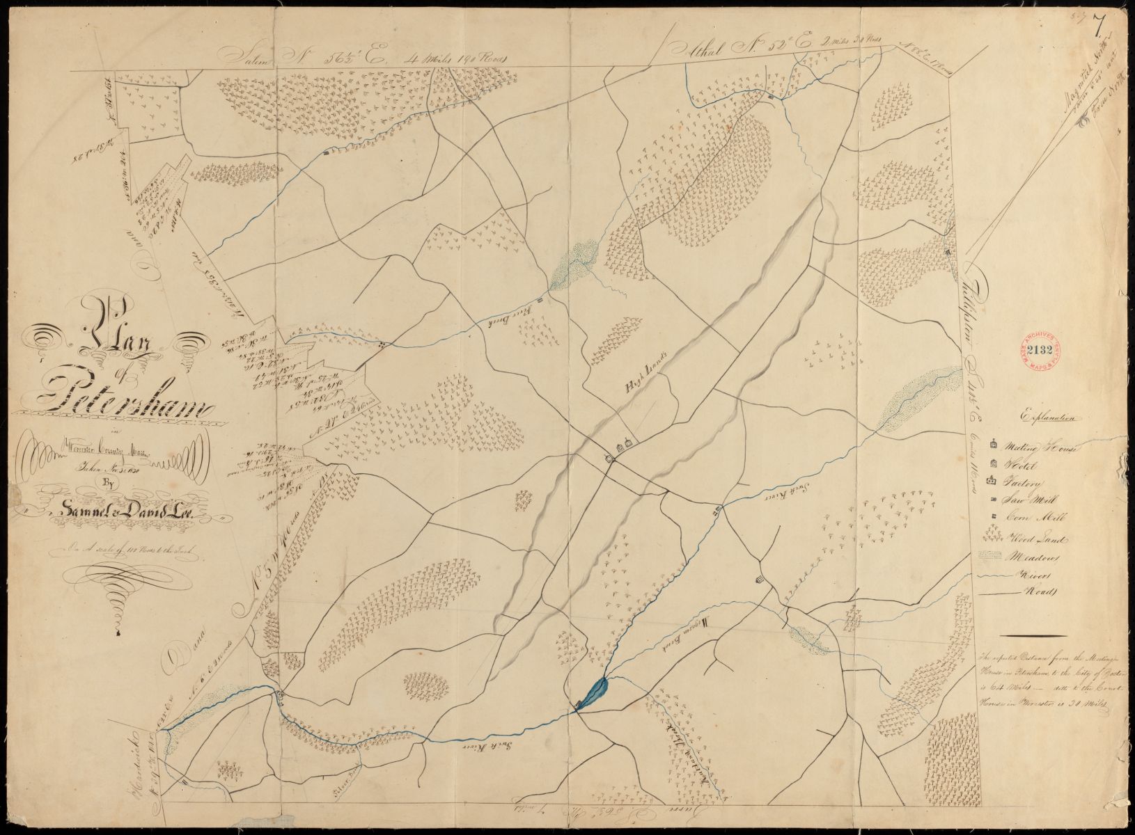
Petersham, shown here in an 1830 town plan, is typical of the "hill towns
The green towns on the map—the ones which reached their height of population before 1855—are the towns which flourished in the agricultural economy of the Early Republic, at a time when much of New England had a viable internal economy for food and primary products. At a time before railroads, when cities like Boston still had to source the inputs to their urban metabolism from areas close at hand, the small upland towns of central Massachusetts and the Connecticut River Valley grew on the basis of farming and cottage industries. With the opening of the Erie Canal in 1825, and then more dramatically with the coming of railroads in the 1840s and 50s, coastal cities began to source raw materials from the more favorable growing regions of the Midwest, and these towns went into permanent decline. Lyme, New Hampshire, which reached its peak population in 1820, was described in a classic study of rural economic geography as an example of a “town that has gone downhill”: as rural livelihoods became less and less profitable in New England throughout the nineteenth century, people abandoned the town, starting with the rocky uphill farmsteads and ultimately leaving only a few remaining settlements in the river valleys.
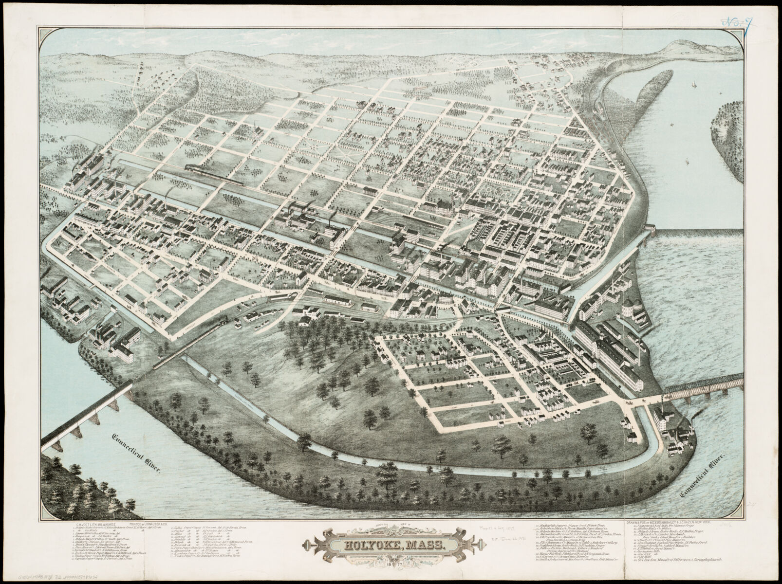
Holyoke, which reached its height of population in 1920, half a century years after this birds eye view was made, was an industrial boom town that exploded with the rise of factories
When people migrated out from the dying agricultural hill towns shown in green, many of them went to the towns shown in purple: the rising industrial cities that reached their height of population in the period 1855–1945. (You can actually trace out the Erie Canal running east-west through New York via a chain of purple towns). These places, like Bellows Falls, VT, which capped out between 1910 and 1920, were the icons of New England’s mill economy, the first great wave of regional industrialization in the United States. At a time when factories relied generally on water power to spin their turbines, on large armies of laborers who could walk (or later take trolleys) to work, and on centralized rail depots for shipping out finished products, these purple towns grew according to the centripetal force of industrial urbanism, reaching sizes and densities that had been impossible under earlier technological configurations.

Boston suburbs shown in a 1976 aerial photo
But by the time of the Great Depression, New England’s industrial towns were already starting to come apart, first due to industrial competition from the US South and then ultimately decimated by the rise of the automobile. The next two colors of towns on Schmidt’s map—orange for towns that reached their height of population from 1945 to 1971, and yellow for those reaching their height after 1971—essentially correspond with two waves of suburbanization in the postwar era. The orange towns are the midcentury suburbs, many of which followed existing rail and streetcar lines out of major cities, like in Connecticut’s Fairfield County and inside of Route 128 around Boston. These are the classic postwar boom towns, of the kind immortalized in The Crack in the Picture Window or Revolutionary Road. Here the new middle and upper classes of the postwar economy relocated into single-family houses, some in leafy élite neighborhoods and others in cheap-build tract developments, driven both by racist fears of the rapidly diversifying urban cores and by the promised affluence of a landscape of driveways and picket fences.
By the 1970s, many of these inner suburbs were already fully built out with single-family neighborhoods, and a combination of restrictive land-use practices, which obstructed the development of multifamily homes, and a demographic transition towards smaller families meant that their populations began to plateau at this time, even while their land values continued to climb—creating a new phenomenon of generational affluence in home values. Melrose, MA (where I live), is an excellent example of an orange town: it reached its maximum population in 1970, just as the Baby Boomers were filling up the bedrooms of their single-family homes with children. Since that time Melrose, together with the vast majority of Boston’s inner suburbs, have gradually transitioned into the pricey domain of two-earner households, with hardly any more housing units than they had 50 years ago, but relatively fewer numbers of people living in each home.
The yellow towns on Schmidt’s map are what we might otherwise call the exurbs: the places which were too far away from city centers to see much growth in the first waves of suburbanization but which, as land became scarcer and pricier in the inner core, and as people became more comfortable with long-distance commuting and telecommuting, started to see major new waves of development late in the twentieth century. These towns essentially filled in the last spaces of the “Megalopolis” urban corridor stretching from Boston to New York (and beyond to Washington). Whereas the canonical architecture of the older (orange) suburbs might look something like a ranch or cape house with a one-car garage, the yellow towns are what we might think of as McMansion country, full of much larger developments often in a scattered development pattern.
Schmidt’s map makes these eras of New England’s economic and urban geography jump out in a spatial pattern. But it’s also quite interesting to watch them emerge through time. To do that, I’ve taken the underlying data set (which Schmidt has been collecting as part of his Creating Data monograph) and animated it using what might be one of the most fun forms of historical data visualization: the bar chart race. Here’s what the top 25 municipalities in Massachusetts look like when animated as a "bar chart race" from 1790 to 2010:
I’ve annotated this visualization with a few notes that correspond roughly with some of the color categories on Schmidt’s map. Unlike in the map, we’re not looking at every town to see when its population maxed out, but instead we’re looking at which cities and towns made up the top of the ranking tables in Massachusetts from the 1790s onwards. Boston has always held the top slot in the rankings—a “primate city,” in the language of geographers. But the rest of the rankings, as they evolve over time, point to some changing structural forces in the evolution of Massachusetts’s urban hierarchy.
At the beginning, we see the dominance of the old colonial port towns—including the ones like Salem that ranked among the largest entire country in the 1790s census. Essex County, the heart of Massachusetts’s marine economy in the early Republic, dominates the top of the ranking at this time. By the early 1800s, those towns are joined by two more, Nantucket and New Bedford, whose strength reflected the power of an emergent marine industry: whaling.
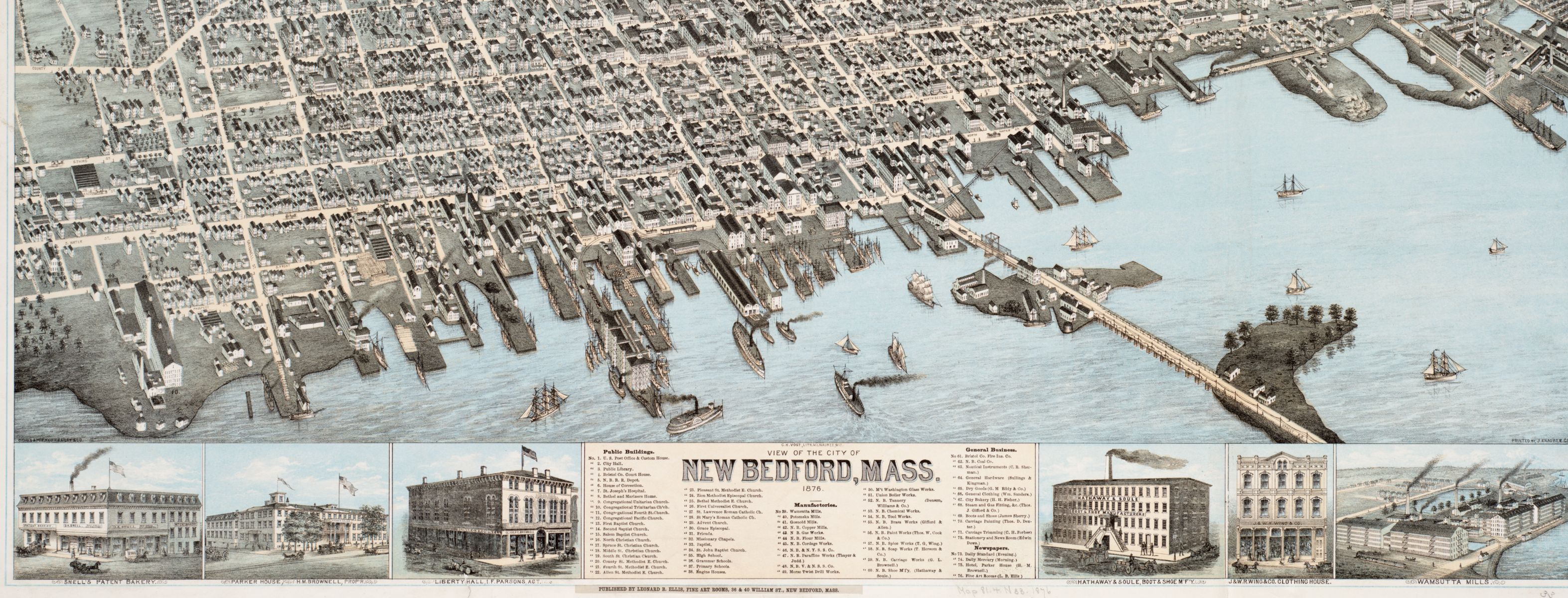
New Bedford, seen here in an 1876 bird's-eye view, took off in the early nineteenth century as a center for the whaling industry
For a few decades at the beginning of the nineteenth century, the rankings jump all over the place, as medium-sized towns continue to grow all over the state, including some of the “hill towns” like Westfield and Amherst that grew alongside the many green-colored agricultural communities on Schmidt’s map. But by the 1840s, the mark of industrialization is evident, notably with Lowell, which vaults up into second place in 1840, but also with other factory cities like Worcester, Fall River, and Lawrence. By the end of the nineteenth century, the rankings fall into a period of relative stability—at least until the 1940s and 50s, when the biggest cities (including Boston) hit a dramatic moment of crisis and begin to shrink.
The formerly sleepy towns around Route 128 became known as the "golden semicircle
After that point, we don’t see too many cities newly climbing into the top ranking, but it’s notable that the biggest cities essentially freeze and decline, all while the overall population of Massachusetts continues to grow, adding about 2.5 million people in the second half of the twentieth century. Many of these new people went into the orange and yellow towns on Schmidt’s map—towns which never individually became heavyweights but which collectively represented a massive shift of population away from cities into the suburbs. This was the era of the Route 128 “Golden Semicircle” —or, as one critic described it, in light of the de facto racial segregation of the suburbs, the “Great White Way.”
All of these statistics aren’t merely fodder for trivia guesses or demographic analyses. The way that people live—the way that their economic, social, and political interests crystallize into distinct formations—has the power to create powerful blocs. For instance, the coming-together of concentrated working-class populations in the industrial cities of the nineteenth century (the purple towns on Schmidt’s map) was one of the geographic forces that created the conditions for the labor movement, with places like Lawrence becoming important sites for unionization. Today, the same forces which led property values to drive a boom in affluence in suburbs have also spurred resistance to the state’s affordable housing initiatives.
Here's one final view of the same data set, an interactive map of the largest municipalities in Massachusetts shown as circles proportional to their population. Grab the slider to animate through the census years from 1790 to 2010. What patterns of past and present do you notice?
Our articles are always free
You’ll never hit a paywall or be asked to subscribe to read our free articles. No matter who you are, our articles are free to read—in class, at home, on the train, or wherever you like. In fact, you can even reuse them under a Creative Commons CC BY-ND 2.0 license.