On August 4, we hosted From The Vault: Map Projections! From The Vault is a biweekly event series showing collections objects selected by Leventhal Center staff. For this edition of the series, we looked at objects from our collections that show different kinds of map projections. If you loved our 2020-21 exhibition Bending Lines: Maps and Data From Distortion to Deception, this one's for you!
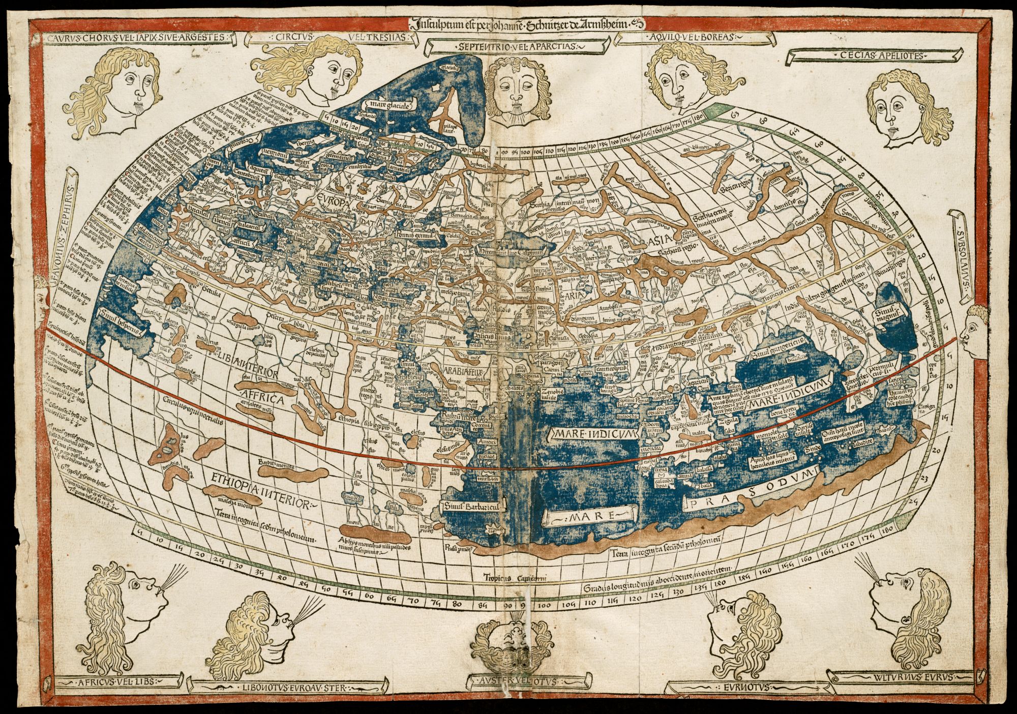
Ptolemy, The world (1482)
Being our oldest map in our collection, Ptolemy’s The World offers an interesting view of what studies of global geography looked like in the 1400s. This map illustrates the continents of Africa, Europe, and Asia, given that these continents were the entire world–at least to Ptolemy’s understanding. Ptolemy’s “cloak” projection features curvature of both latitude and longitude, making it much harder to use. Between the latin script, incorrect geographical illustrations, and infamous windheads that characterize wind directions, this map is a classic example of the beginning of the Age of Exploration.
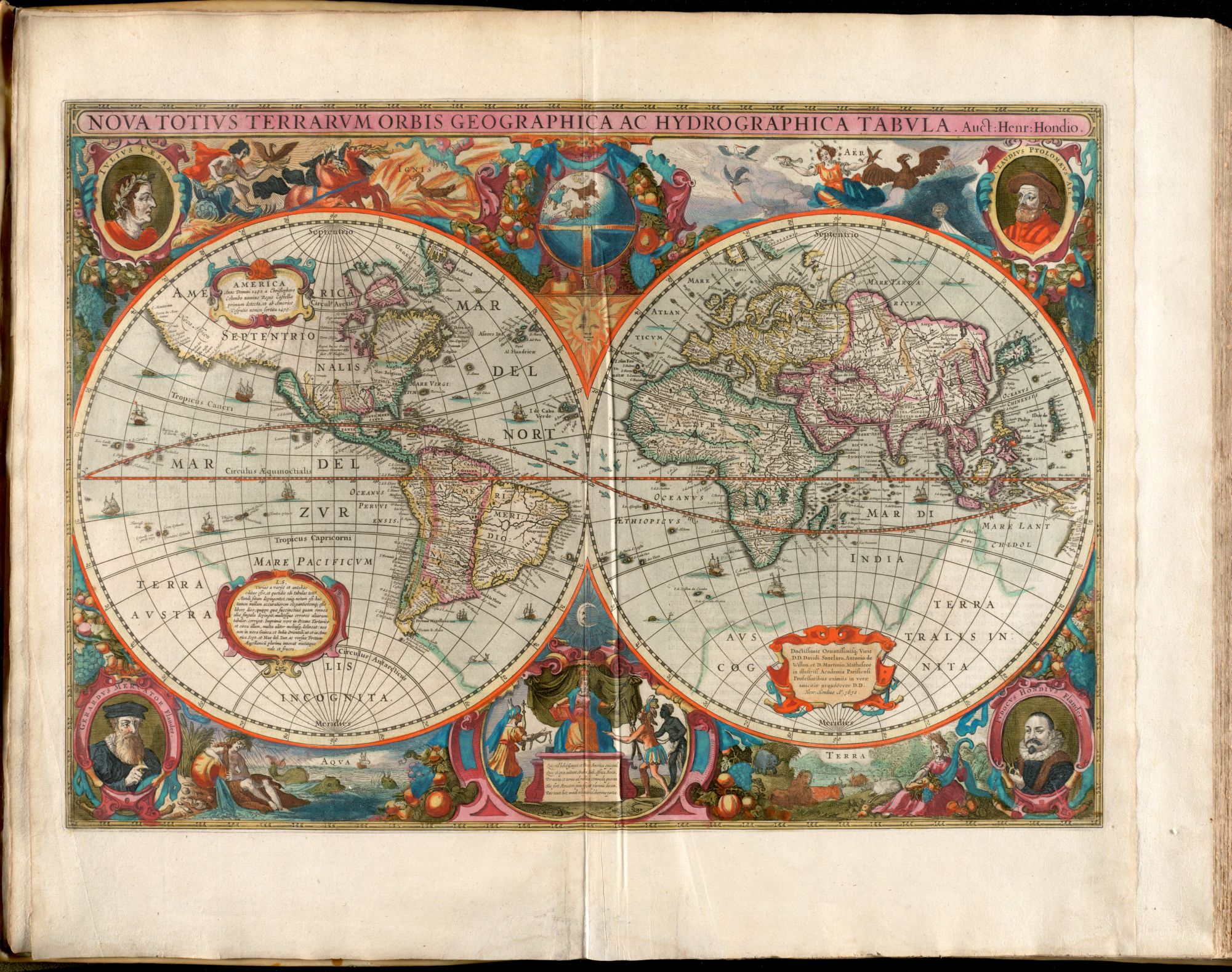
Hendrik Hondius, Nova totivs terrarvm orbis geographica ac hydrographica tabvla (1638)
This beautiful map highlights the baroque style of mapmaking that was favored during the Golden Age of Dutch cartography. The 1600s were the vital time period for the Nicolosi globular projection. Aside from its interesting format, the ornamentation around the spheres illustrate earth, water, fire, and air. The smaller inset map depicts the four known continents with Asia, America, and Africa personified and paying tribute to Europe.
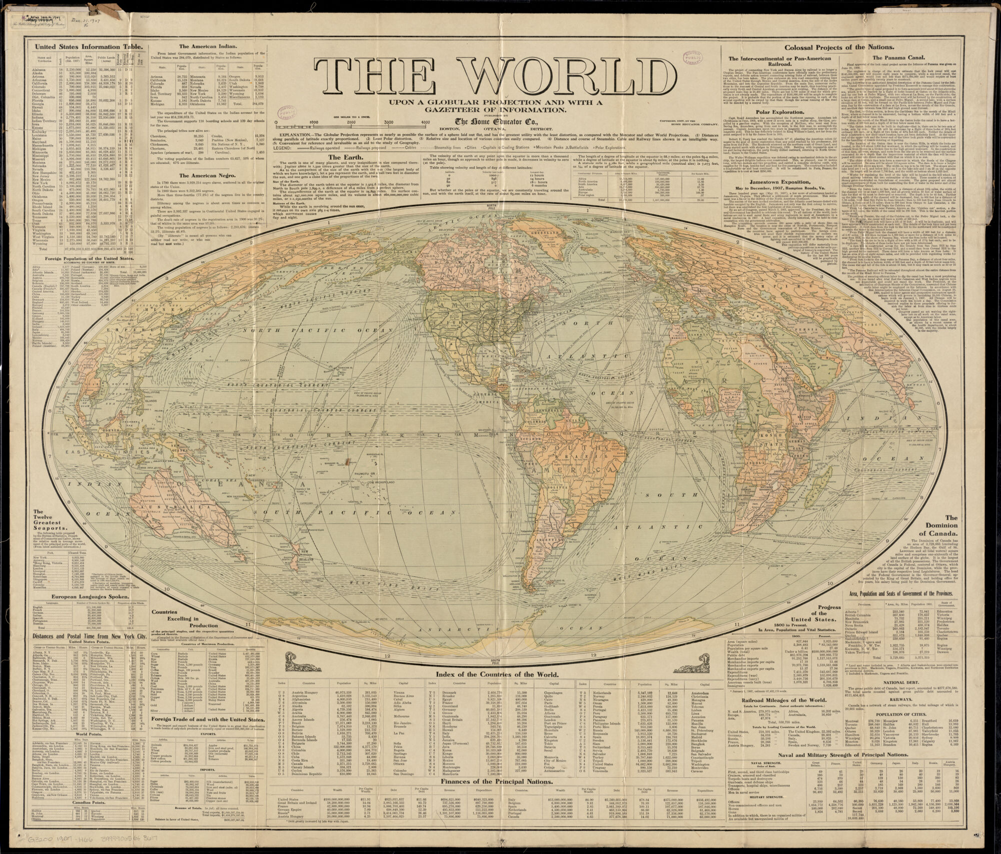
Home Educator Co., The world upon globular projection and with a gazetteer of information (1907)
The “globular projection” referred to in the map’s title is most likely the Mollweide projection. With all latitude lines running straight and longitude lines increasing in curvature as they distance from the prime meridian, shape becomes more distorted the further the map is from the center. The Mollweide projection depicts the planet as an ellipse, which is a better depiction of Earth’s sphere than most other maps. Its projection is one of the least interesting parts of this information-dense map.
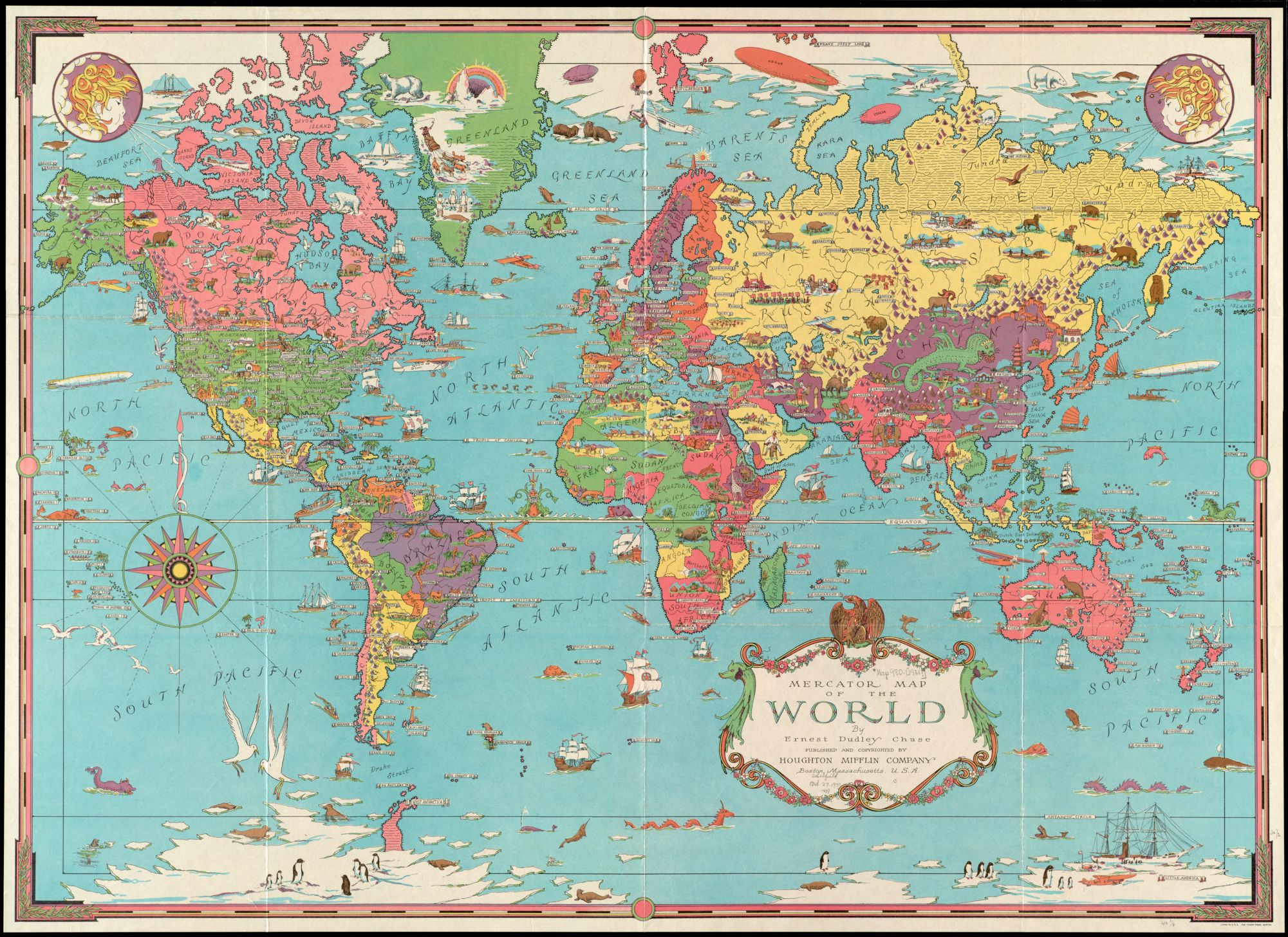
Ernest Dudley Chase, Mercator map of the world (1931)
The Mercator map projection is arguably the most used map projection in American classrooms. Although easy to understand, it is more inaccurate than other commonly used projections. This map immediately catches the eye with its range of colors and interesting illustrations. These illustrations become even more interesting when venturing off land, as there are a variety of different entities depicted. This map also uses a more modern depiction of windheads in the top two corners rather than circling the entire map.
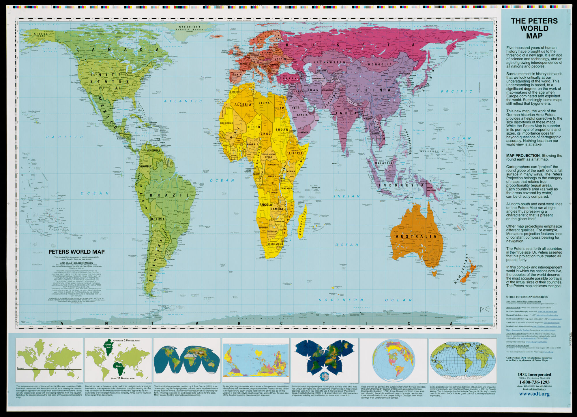
Arno Peters, Peters World Map (2006)
The Peters projection or the Gall equal-area projection focuses on accurately depicting the relative sizes of countries and continents. In doing so, the landmasses’ shapes are distorted and stretched. The Peters projection rejects the inaccurate exaggeration of northern regions that can be seen on more conventional maps like the Mercator map.
Our articles are always free
You’ll never hit a paywall or be asked to subscribe to read our free articles. No matter who you are, our articles are free to read—in class, at home, on the train, or wherever you like. In fact, you can even reuse them under a Creative Commons CC BY-ND 2.0 license.