The text below was originally written as an in-person lecture given by Laura Lee Schmidt at the January 2023 opening event for Building Blocks: Boston Stories from Urban Atlases.
An urban atlas, which is the type of map the show Building Blocks uses to present stories, is a very readable map. What does it mean for a map to be readable? To me it means it captures your imagination and you can gain competence in its methods of representation pretty quickly and therefore gather information and make connections for yourself. The selection of pieces in the show draws inspiration from the basic visual elements that make these maps intriguing: color, shapes, lines, and words all appeal to a fundamentally human curiosity.
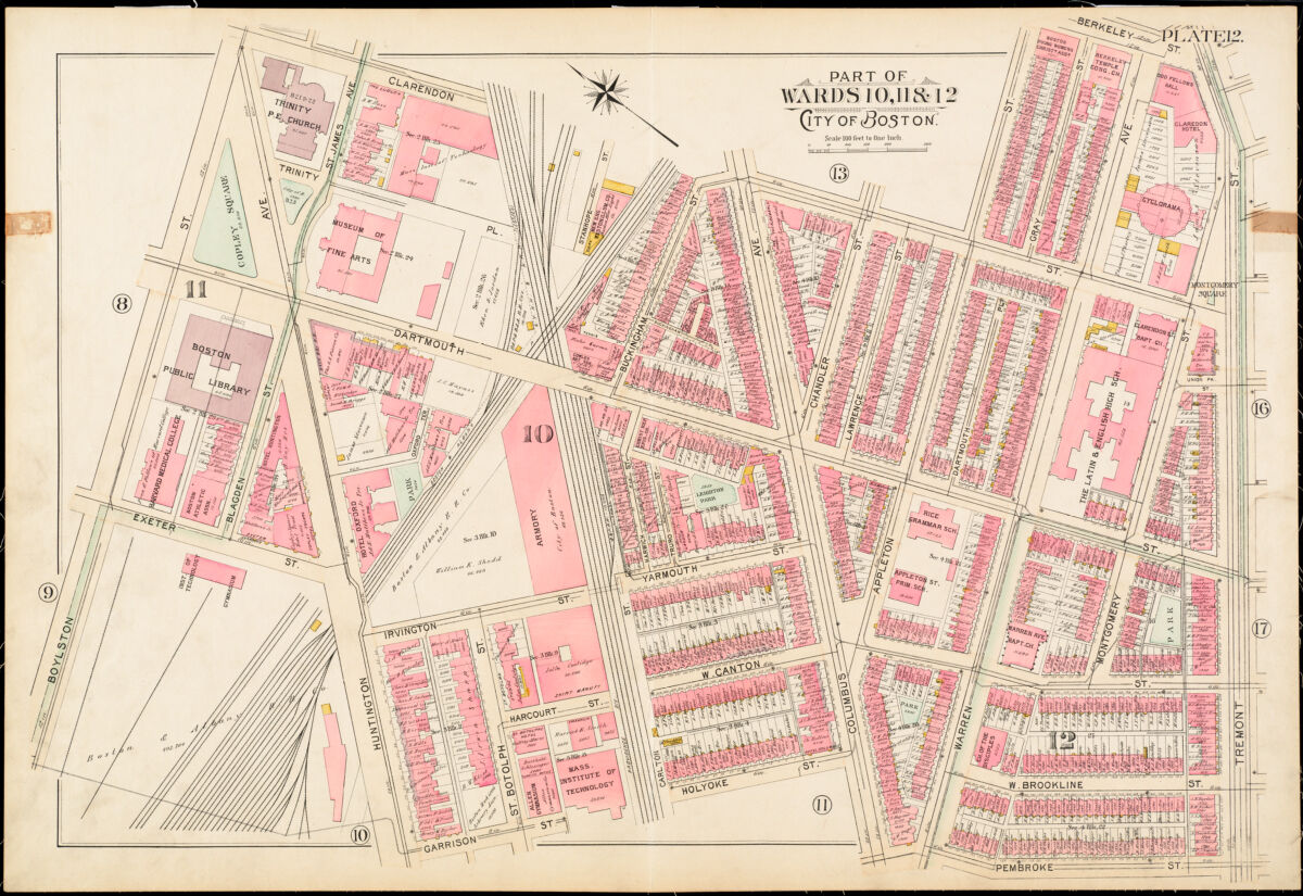
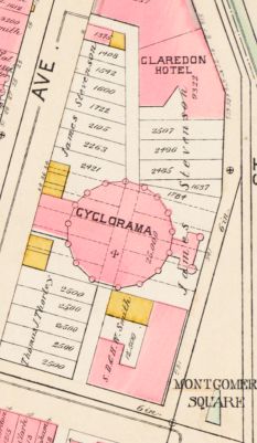
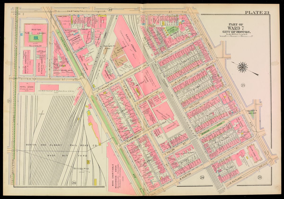
This atlas plate from an 1895 Bromley Atlas of the City of Boston shows the Boston Public Library and surrounding streets. What color patterns do you notice?
Looking at the above urban atlas plate from 1895, which shows the Boston Public Library and its courtyard as a purple-ish square on the left side of the page, this is recognizably a city block, but the plate stands on its own as an expressive image. The map’s composition of shapes and lines even spill over parts of the black framing box on the atlas page. The pastel shapes are mostly rectangles, but there are also triangular forms and even a circle in the upper righthand corner.
Their distribution is pleasantly asymmetrical, with denser clusters of shapes diagonally separated from areas of larger and fewer shapes, such as the upper lefthand corner. In the map, large rectangular and triangular blocks organize arrangements of smaller pink shapes in rows and clusters. Some of these masses are large, some are small, and there are labels of names and places. By valuing the basic images, we can be receptive to more complex things like the changes that took place in the area over time.
“…color, shapes, lines, and words all appeal to a fundamentally human curiosity.”
At least for me, there is a relationship between this imaginative allure of the visual elements and the representational composition of the map, which clearly conveys important spatial information at a certain scale. The scale is a crucial part of how these maps represent what it is that they’re representing. In this example, 100 feet is one inch: so it’s maybe five times the size of a room you might be in, you’re 1/5th of an inch on the map! It’s pretty cool, actually. And now, it’s a very human scale for an urban map.
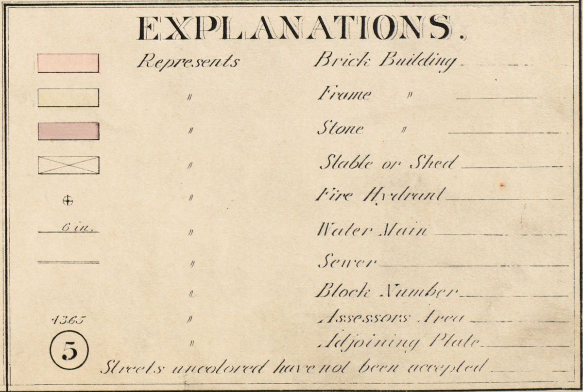
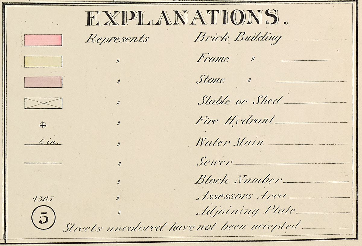
The key of the 1895 Bromley translates the map’s colors and markings into real world circumstances.
It is therefore conceivable to actually place one’s physical self in the realm of these lines and shapes. The scale helps us read: You can almost see yourself on the map, or you can appreciate in a spatial way. That’s an important part of the readability, and when you set that thought alongside a key showing the symbols the map uses, finding yourself on the map, suddenly, you can see if you are sitting in a stone, or brick, or wooden building. Which you might have already known, but the ease with which you can rediscover this by looking at the atlas makes the act of retracing that knowledge satisfying. This particular map is from more than 100 years ago, so by reading in this way, you can use your body to understand a time long since passed.
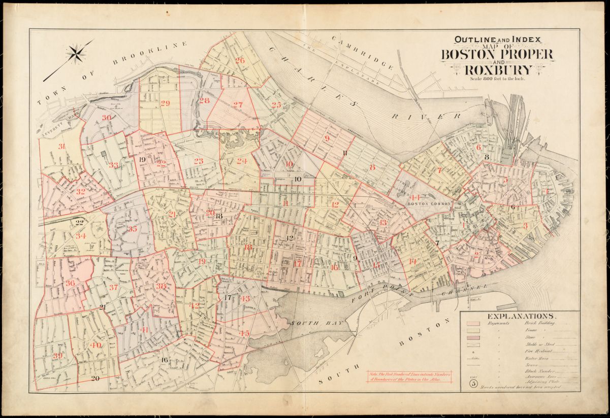
The outline and index page of the 1895 Bromley provides an immediately recognizable profile of Boston, which is nonetheless the outline of a city more than 100 years removed from the Boston of today.
Since you’ve been in this area, or if you find a map of somewhere else you’ve been or lived, perhaps you’ll agree that there is a certain excitement to searching a map over and recognizing familiar things. That feeling involves creative connection and manifests often in these maps. And yet, however familiar one might be with an area, a historic map necessarily depicts time along with space.
“It is therefore conceivable to actually place one’s physical self in the realm of these lines and shapes”
In the area around the Boston Public Library in 1895, there were more pink buildings—brick buildings—than yellow wooden-frame buildings. The pink ones are packed on streets, with some yellow ones adjoining, maybe residences, garages or storehouses. On this plate, north is not exactly pointing up, so it will take a little reorienting (this is often the case when looking at multiple maps of different neighborhoods as different maps are projected at different directions).
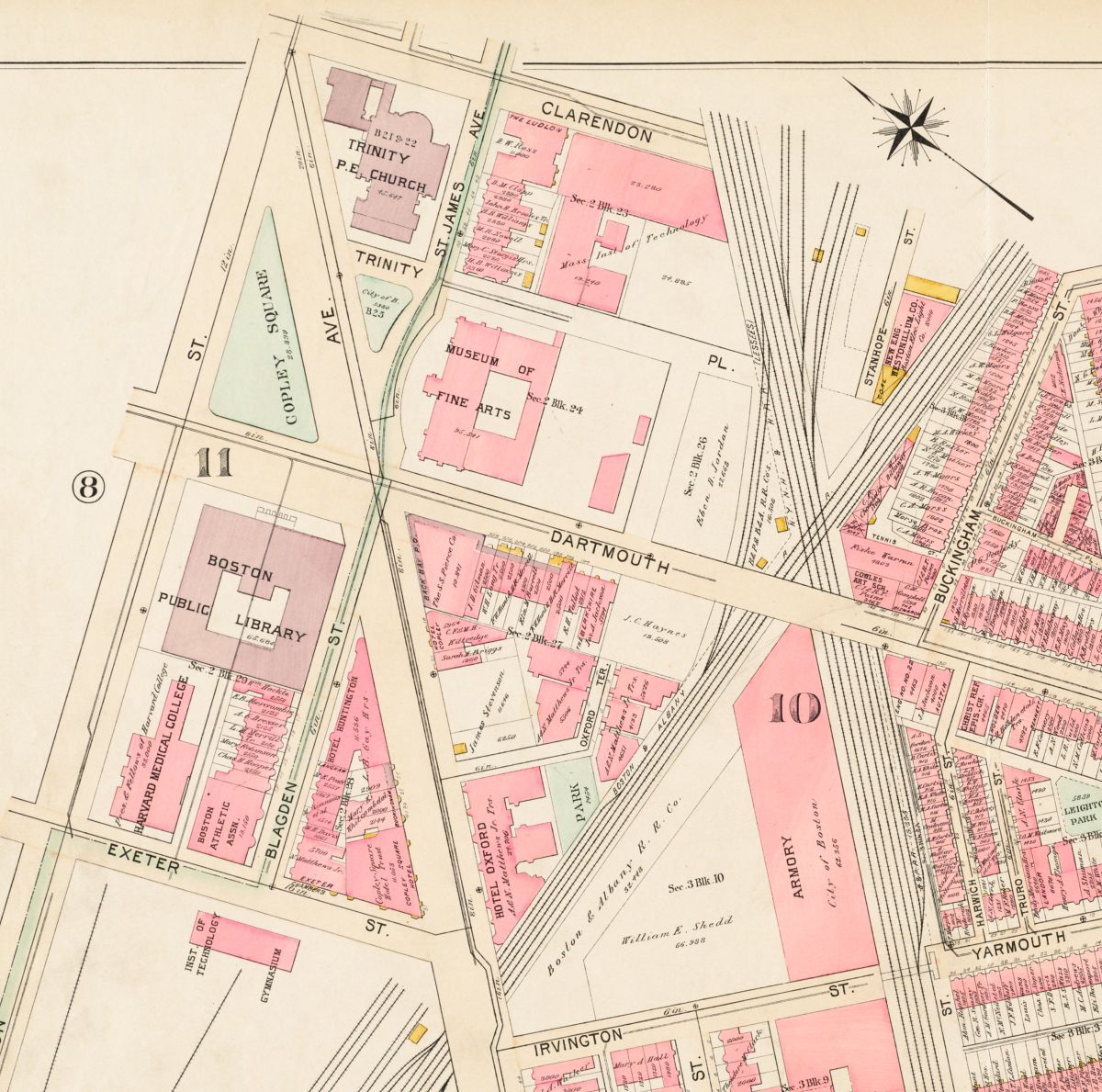
Using the Boston Public Library as an anchor, if you glance across the street from there, it’s apparent that in 1895, Huntington Avenue cut through Copley Square, and Copley Square was in fact a triangle. There are railroads intersecting densely on the page, which helped shape blocks. And to the west of the library (below it on the map), there is a rail yard which is most certainly not there today. There is also a large brick Armory, and apparently the Museum of Fine Arts used to be across from Copley Square. What’s the circle, and why so much brick? It’s common to understand a map as a reserve of information that has answers, but when time defamiliarizes some of what’s on it, the map itself takes form. By making connections while viewing it imaginatively and in an embodied way, you kind of take part in creating the map.
There were more than just straight lines and rectangles in Boston in 1895…
I have been thinking about this for some time now, and I wonder if it is too much to suggest that the lines on these maps can even articulate the connections and pathways we make with our memories and minds. This must be the case to some extent, because pathways made through family, history, and experiences are the building blocks of the stories that emerge when we move through space. And here is the theory that I nurse as to why these maps in particular are so evocative: there is something that happens in the process of reading them that allows you to feel like a part of the urban organism, this massive, abstract assembly of interconnected spaces and people. Their imaginative pull and representative methods bridge mundane daily life with the networked complexity of a city. And even without waxing philosophical about memories and the mind, this exhibition explores a common document that helps us understand something that’s challenging to comprehend.
There is some visual relief on the map plates determined randomly by the space around a chunk of city fitted to the page. But there are other types of blank spaces, too: where a piece of land has not yet been brought under a property regime, or on a parcel of property that is comparatively large, or not yet built upon. Through these moments of blankness, all you can see sometimes is a name of a property owner bounded in by the outline of the site. In such a way, lines become borders, shape become public or private enclosure, words become titles, and color becomes value. And from the sophisticated composition, meticulously designed and printed in living color, property and social relations appear all over this map. Just as soon as you feel like part of an urban organism, that is when you start to realize that in the human realm, there is also division, loss, dispute, and alienation. These are much trickier to get a grasp of, and there is no key for understanding them. This is where the insurance industry enters the picture.
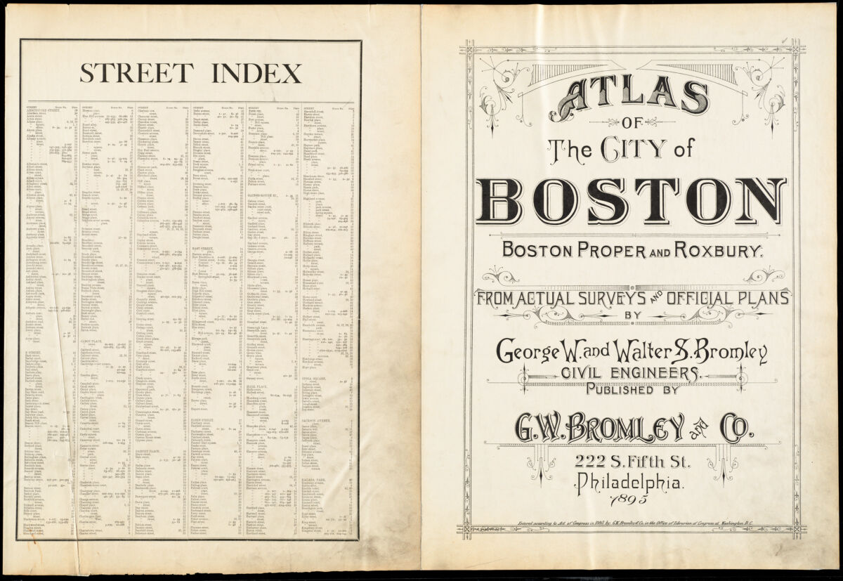
The title page of the aforementioned Atlas of the City of Boston, published by G.W. Bromley and Co. in 1895.
For as we know it happens that most of these urban atlases on display here at the Boston Public Library were designed for the use of insurance and real estate companies. Moreover, real estate and insurance were booming at the time the atlases were invented, after the Civil War, the first year of which, 1861, also marks the first fire insurance map of Boston published by Charles E. Pinney which is displayed in the show. (1938 is the latest year in the collection of urban atlases in Building Blocks.) Not all the urban atlas publishers on are exactly the same, but in the 1860s, mass-produced large-format books of lithographic atlases using color, annotations, and scaled shapes to display data including construction material and water mains were very useful for calculating fire insurance rates. These fire insurance maps are related to other kinds of urban atlases which mostly emphasized property ownership data (an example of which in this show would be a Hopkins atlas), although not all fire insurance maps portrayed property ownership information.
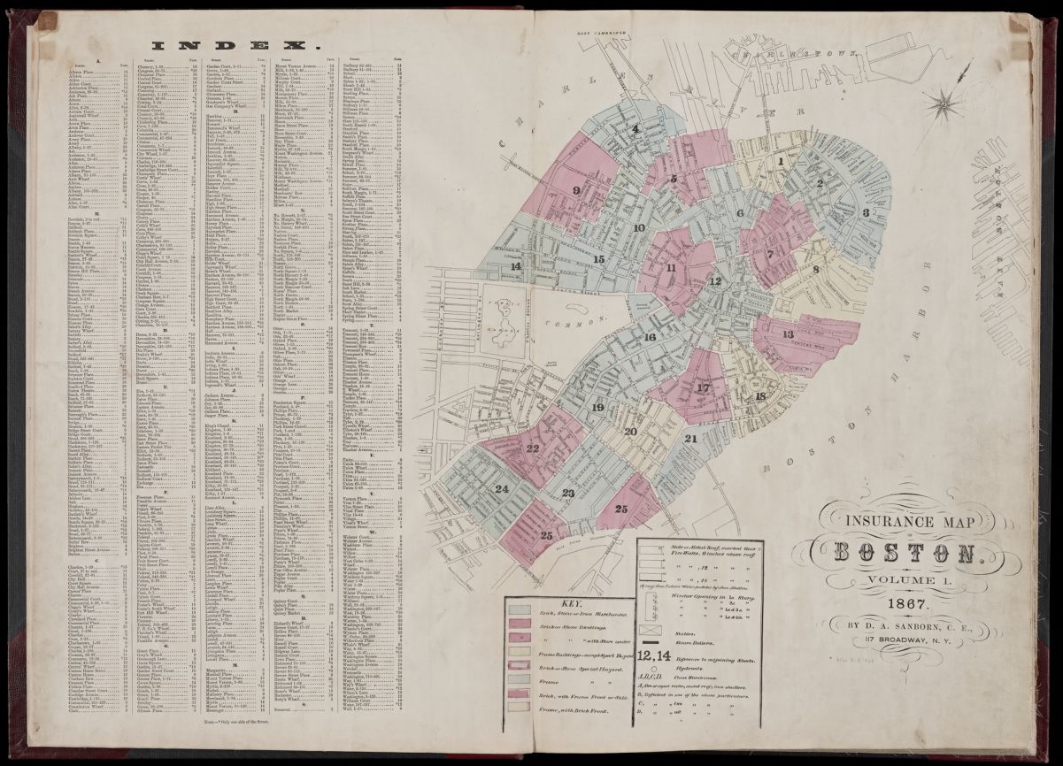
The title and index page of an 1867 Sanborn Insurance Map of Boston
Sometimes all these bound atlas volumes are generically referred to as “Sanborns” due to the national prominence of one fire insurance atlas publisher, Daniel Sanborn of Somerville Massachusetts. Indeed, actual Sanborns, a few of which are in the show, do employ the same visual qualities of color, lines, scale and writing that make urban atlases readable, though they don’t necessarily define the genre. In any event, it might be incidental, but it is not insignificant that these maps came out of the real estate property and insurance enterprises, because that is an important part of Boston’s built landscape and economy at the turn of the century.
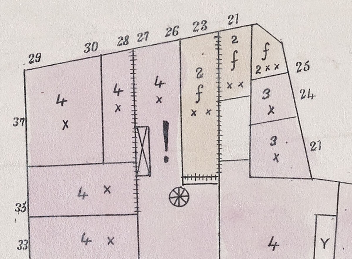
This detail from the 1861 Pinney Plan of the City of Boston depicts an exclamation point as a marker of high fire risk.
I think somewhere we intuitively sense that US cities got bigger and denser at some point, and if you think about it historically like I do, it was probably after the Civil War, which is the same time these atlases became mass produced. The growth of cities means more people, materials and buildings, which means denser, diversified networks of spaces, more wear and tear as well as physical risk. By coming up with novel ways of spatially conveying these risks, the maps, which were published each year, unwittingly portray a constant churning of the urban domain. But they’re not infographics or videos, and we have to read big changes into them, if so inclined.
The Civil War marked the legal end of American chattel slavery, under which rubric people of African descent were routinely assigned the status of property and denied property owning rights. Emancipation naturally brought about profound political-economic change. Considering that history, it is my own inclination to read the Civil War into the growth of cities, and thus, into the urban atlases.
“Just as soon as you feel like part of an urban organism, that is when you start to realize that in the human realm, there is also division, loss, dispute, and alienation”
Some of the economic changes war brought include the proliferation of cash within daily transactions, an expanded federal governmental presence, the enormous expansion of railroads and mining, and later, telecommunications, electricity, and real estate development symbolized by tall buildings. Therefore, many of these themes make their appearance in the show. Even in the North, daily life must have changed dramatically, as the ways people met household needs adapted to new technologies and social situations. The city by nature reflects that and the maps by design represent it.
This plate from an 1873 Hopkins Atlas depicts the Muddy River as a sprawling waterway which is nonetheless already marked with planned roadways and projected property lines (note that Beacon St and the Boston & Albany Railroad cross over the water and predate this landfill process).
These changes molded Boston too, where, in the 1870s, the land the Boston Public Library is currently resting upon as you may know was in the process of being filled in from the watery mudflats that made up the Back Bay. By the turn of the century, this area was a well-appointed grid of high-end residences cradled by green spaces like the Fens and just offset from the financial center. There are many instances of water disappearing from Boston as brooks were culverted and basins were drained.
Water is significant in Boston: Boston’s revolutionary-era mercantilist economy thrived on its location on the ocean, which, historians have suggested, gave it a large measure of political and economic autonomy that it could not maintain after the Civil War. As it filled in, the materialization of dry land suited efforts to look inward at city infrastructure—electricity-powered streetcars, elevated rail and subways became crucial for connecting bustling neighborhoods in places like Roxbury and Dorchester to downtown while massive sewage and water systems improved quality of life.
This plate from a 1917 Bromley depicts the effect of the Back Bay Fens redevelopment project, which drained and redirected the Muddy River to allow for the Back Bay as it is today.
Sometimes, it is enough to look abstractly at shapes on the map and consider how slippery the form of this city is. Using the knowledge you acquire as to reading urban atlases, you can see in the show several instances of a stream of water becoming a dashed line, and then, sometimes, becoming solid again as a property boundary or road. And then there are the cases of those railroads which became highways, and rail yards which became buildings, such as the Prudential Center.
Historic fire insurance maps are ubiquitous today in the professions of architecture and planning and contain practical information for these and other fields. Yet I’ve been describing a process of reading which enjoys the abstract appearance of the map, embraces the act of defamiliarizing a place, and lets the insurance map become a rather whimsical assembly of lines and shapes. Attending to the blank spaces and acknowledging social complexity brings out worthy historical challenges rooted in acknowledging change.
In this process, change itself refers not only to the form of the city, but also in how people adapt to them through. The basic elements never go away, but a viewer might have a new set of questions that come from connections formed through this process. These questions provoke further inquiry, which results in stories, which Building Blocks organizes under some of the broader themes of the turn of the century that I have been mentioning.
Across the show, there is continuity in the representational methods employed by insurance atlases, but the style of individual publishers didn’t change drastically over time. The stylistic evolutions of the atlases do, however, reflect the influence of a mounting presence as well as consolidation of news and advertising during the Progressive Era, which occurred alongside growth in manufacture and mass-produced household goods purchased with wages. The rising focus on consumers accorded with personal automotive culture, hints of which show up in twentieth century fire insurance atlases, although it does take sustained effort to follow all those lines around on the map.
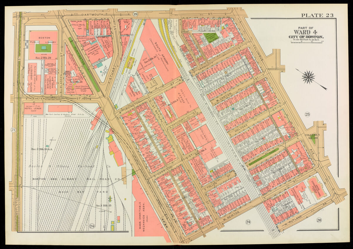
Returning to the Bromley maps which show the area around the Boston Public Library, Huntington Avenue looks like a boulevard with a green strip through it as it cuts across the page of the 1917 version, while in the 1938 version, part of the greenery has been removed, subway lines take up that space, and the general appearance of the streets has been darkened for emphasis. Remembering that historic fire insurance atlases depict time as much as space, the key becomes interesting again.
The key to the 1895 Bromley Atlas
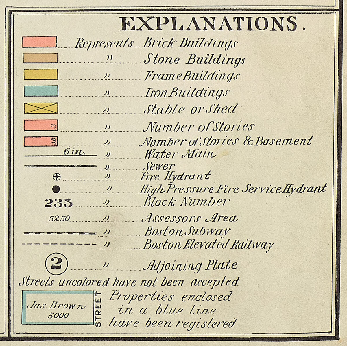
The key to the 1938 Bromley Atlas
Comparing the two keys of the 1895 and 1938 Bromleys, for instance, the one from 1938 includes a new building material, iron (in addition to brick, frame, and stone) as well as symbols for high pressure fire hydrants, elevated cars, and subways. Having considered on the imaginative dimension of reading these maps, one wonders whether the increasing complexity of the city calls for a less artistic viewing process than what I have emphasized. Do the maps become less whimsical, or at least more comfortable with the realism of daily life in cities?
Actually, we have come full circle on the matter of imagination. Whereas I have suggested that enjoying is an initial moment in apprehending the basic visual elements of the urban atlas, as we’ve traveled in time and history itself has changed, places of amusement, far from being abstract shapes, become yet another building on the map. Reading the map as a strictly useful item suits the hard-headed modernism of the 1930s, which as I’ve mentioned is the upper range of the library’s collection of atlases.
The Progressive Era onward also saw the implementation of nationwide compulsory education and an increase in literacy, so there really seems to be something significant about reading these changes. Separating out business from recreation, it’s no wonder that culture and entertainment came to take up a large part of the social sphere at this time, and it can be enjoyable to consider the physical role of those things in the built landscape.
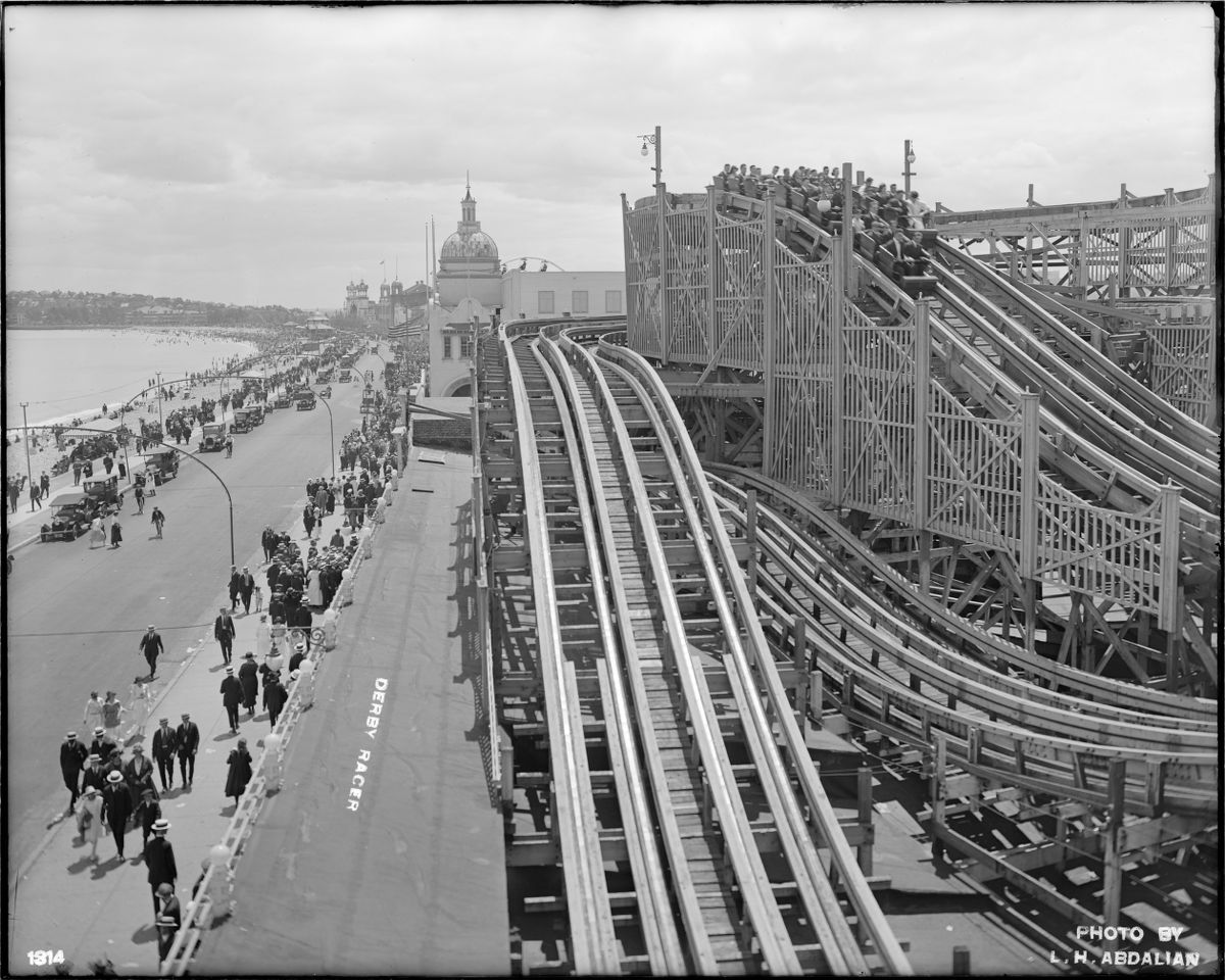
This photograph from 1920 depicts a bustling Revere Beach, with the Derby Racer roller coaster in the midst of delighting its users.
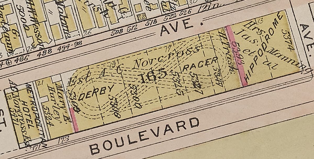
The Derby Racer roller coaster depicted as curves and spirals in this otherwise very straight and rigid 1914 Bromley Atlas of Chealsea, Revere, and Winthrop.
As connections form while looking at the maps, is it possible to retrace an enjoyable outing at a cinema, or the thrill of a roller coaster when they are visible on the map? Heightened demand for diversion, spurred on by advertising, created a flood of words and images into so many spheres of life, public and private. The rise of enjoyable commercialism, which made use of popular literacy, provokes what is for me a sense of looking at everything in the same way. Looking at everything in the same way can pose challenges for reading these mass-produced atlases. When there are so many words and images, there can be an ahistorical quality to looking at anything.
I still insist that when you look at these maps from whatever year, you can project yourself into the whole urban conglomeration, whether it’s through a neighborhood, street or building. But awareness of those historical changes also acknowledges the reality of moments of isolation or separation from society when society itself seemingly gets more complicated. As we consider these changes on the map, the approach to reading the maps changes too. Maybe it grows up a little.
How do imagining, scale, information and forming connections—how does reading an urban atlas—help us understand our own changes? Urban atlas stories from 1861 to 1938 occasion the collaboration of an imaginative viewer and the evolving form of the city shaped by historical changes. Rather than being clean slates that got filled up with inert facts, the design of the maps makes it possible to learn and tune into what is there to understand historical relationships. This embodied act of reading helps us find something to connect to in a state of flux. And the show would like to encourage this rich form of engagement with kind of map that is easy to read.
Our articles are always free
You’ll never hit a paywall or be asked to subscribe to read our free articles. No matter who you are, our articles are free to read—in class, at home, on the train, or wherever you like. In fact, you can even reuse them under a Creative Commons CC BY-ND 2.0 license.