Despite the closures and challenges of an ongoing pandemic, 2021 was still a busy year for collections at the Leventhal Center! While we temporarily slowed our acquisitions during the library’s closure, we still brought 121 new items into our collections.
These new acquisitions span from 1548 to 2020 and range from early depictions of New England to original maps created by underrepresented cartographers in the twentieth century. Our active acquisition program allows us to diversify the voices in our collection, support researchers’ interests, and enhance our exhibition and teaching programs. And sometimes, we acquire maps simply out of curiosity and whim, bringing in maps that we find striking for one reason or another.
You can always take a look at our new acquisitions page to see what we’ve recently added. And while there are plenty of themes to explore, some of the maps that we acquired echo with themes that are familiar to this year. Let’s take a closer look at a few. Which is your favorite?
Excavating the history of Back Bay Park
As we move into 2022, we are looking forward to the March opening of our next exhibition More or Less in Common, a show that will explore the geographic relationship between environmental management and historic patterns of injustice.
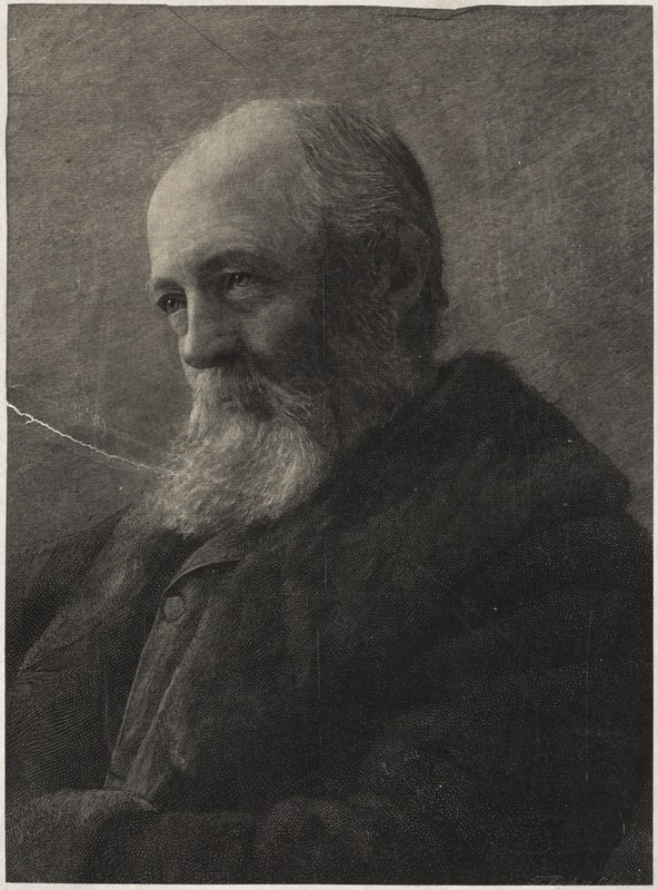
Frederick Law Olmsted, from the Brookline Photograph Collection.
The exhibition is timed to coincide with the bicentennial anniversary of one of Boston’s most influential environmental planners, the landscape architect Frederick Law Olmsted. Olmsted’s famous Emerald Necklace is one of the region’s most beautiful parks systems. But in some places, it also forms the dividing line between communities that are amongst the richest in the country and others that are languishing in poverty.
As Boston’s Back Bay developed in the late nineteenth century, residents complained of “sewage outfalls,” a “stagnant saltwater marsh that flooded and threatened public health,” and “a foul-smelling tidal creek and swamp.” In 1878, Olmsted proposed a plan to address these concerns, maintain the “character” of the terrain, and meet the needs of the surrounding community through dual sanitation and recreation solutions.
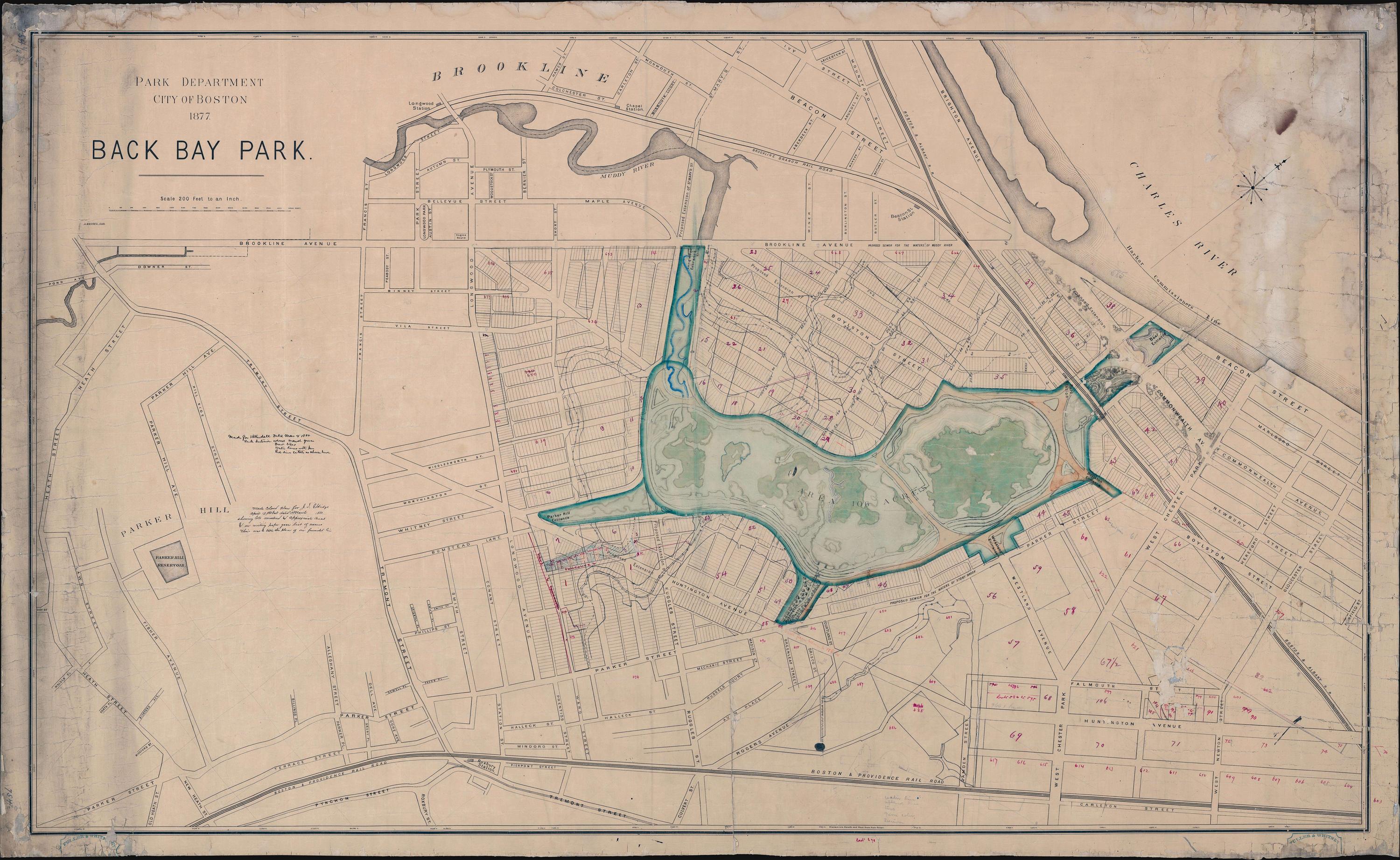
This 1880 planning map of Back Bay Park shows landscape designs that don’t appear on any other maps of this period.
This 1880 map was published by the Boston Park Department. It’s drawn on top of a map published by the Park Department in 1877, which formed a key document for Olmsted’s 1878 plan of Back Bay Park. This particular manuscript copy of the map shows details and annotations that don’t appear on any other map. It was probably used during the layout and construction of the park, as city engineers worked to implement Olmsted’s plans in the shifting, complicated flats where the Muddy River met the Charles River. Although the park was modified by 1910 construction of the Charles River Dam, Back Bay Fens includes an “eclectic mix of formal and community gardens, ball fields, memorials and historic structures.”
A global health emergency
During recent years, public health has maintained a foregrounded position in global media, conversations within households, and space in mental real estate. This pictorial map from 1944 contextualizes a series of public health crises from a more distant past.
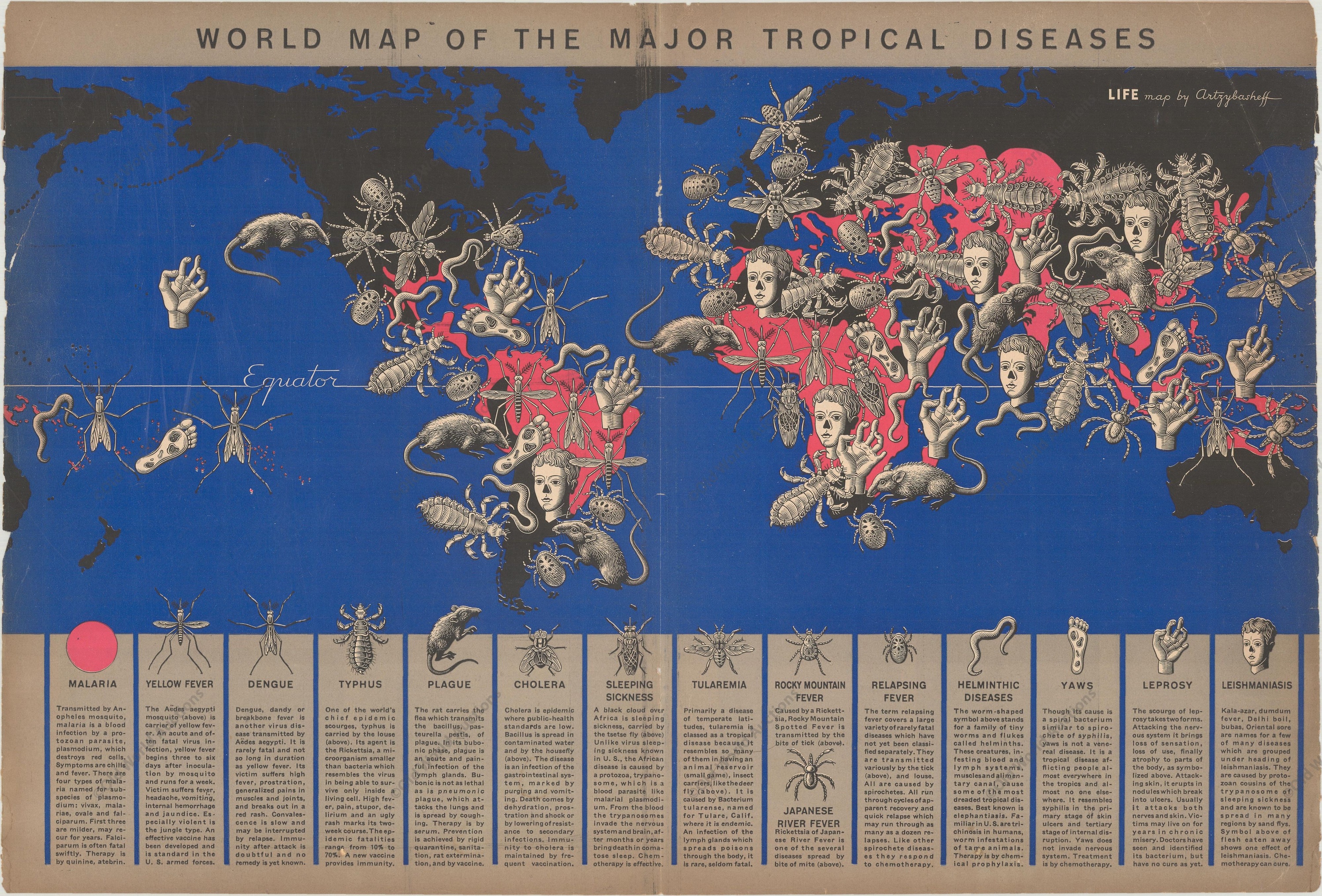
Boris Artzybasheff’s eclectic illustrations show tropical diseases in this 1944 map.
The base of the map includes brief descriptions of 15 diseases, including malaria, yellow fever, dengue, typhus, plague, cholera, sleeping sickness, tularemia, Rocky Mountain fever, Japanese river fever, relapsing fever, helminthic disease, yaws, leprosy, and leishmaniasis, each accompanied by a pictorial form of their respective vector.
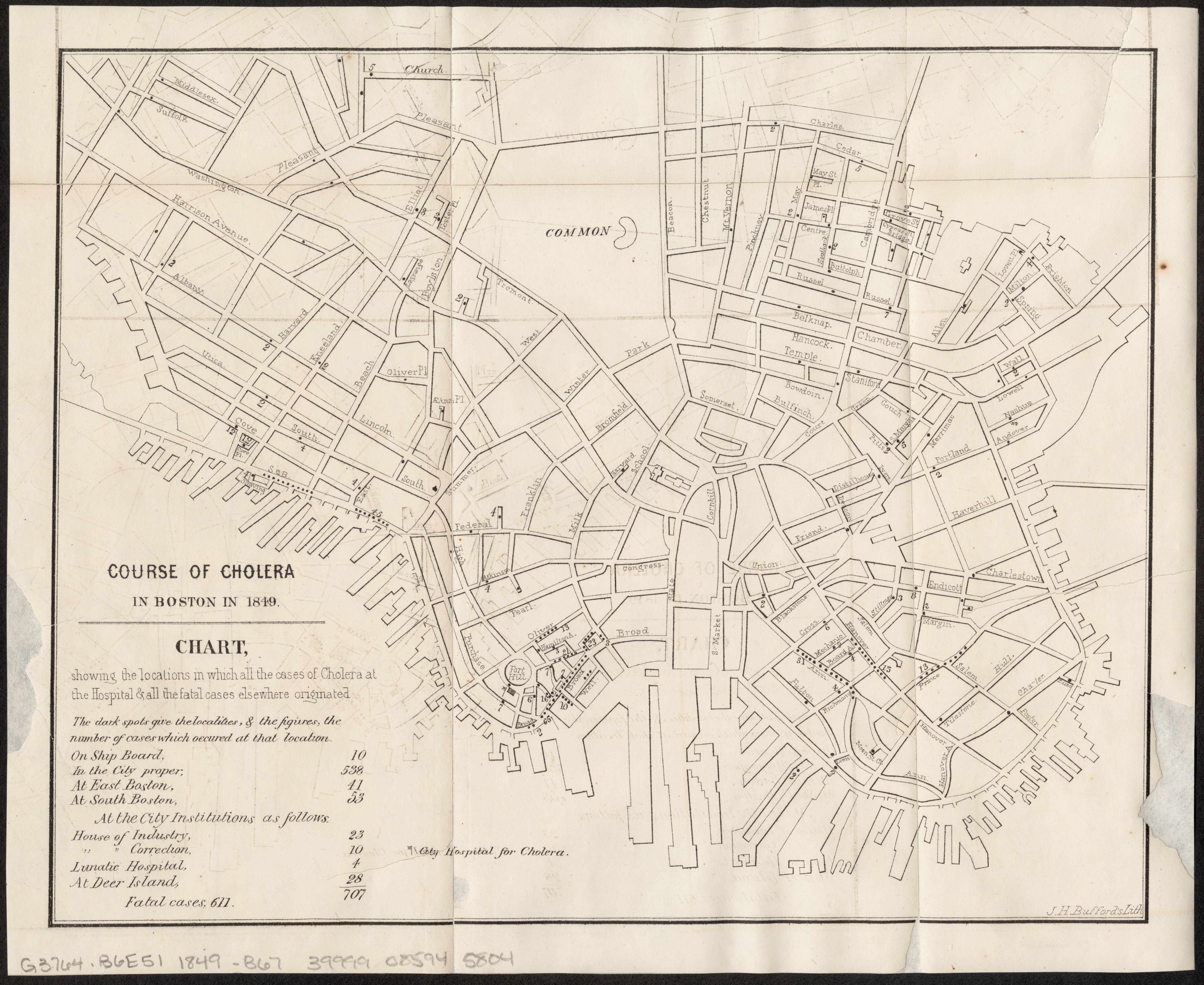
The Committee on Internal Health published this map to track the origins of cholera cases treated at the Cholera Hospital in Boston’s Fort Hill neighborhood in 1849. Notice the difference in aesthetic styles.
The aesthetic choice of such gruesome iconography—to spread countless “insects, pests, and deformed humans” across the global landscape—forms a visual message of alarm and urgency. As discussed in our Bending Lines exhibition, “these kinds of symbolization can be more easily understood at a glance” and while the accompanying text is useful, it is by no means necessary to understand the map’s message. You can read more about Artzybasheff and his visual techniques in this 2019 article by John Krygier.
Folklore (Gropper’s version)
Taylor Swift’s Folklore was one of the biggest albums of 2020, and William Gropper’s “America, Its Folklore” is one of our favorite finds from 2021. Like Swift’s album, Gropper’s map has tricky history of trust, betrayal, and misunderstanding.
During World War II, Gropper worked with the U.S. Treasury Department and the White House’s Office of War Information to present “specific war information objectives” in pictorial form on propaganda materials. Gropper was recognized and praised for his contributions, and his work was included in the State Department’s Overseas Library Program from 1946 to 1953. As part of this program, over 1,700 copies of his 1946 map were distributed to libraries across the globe.
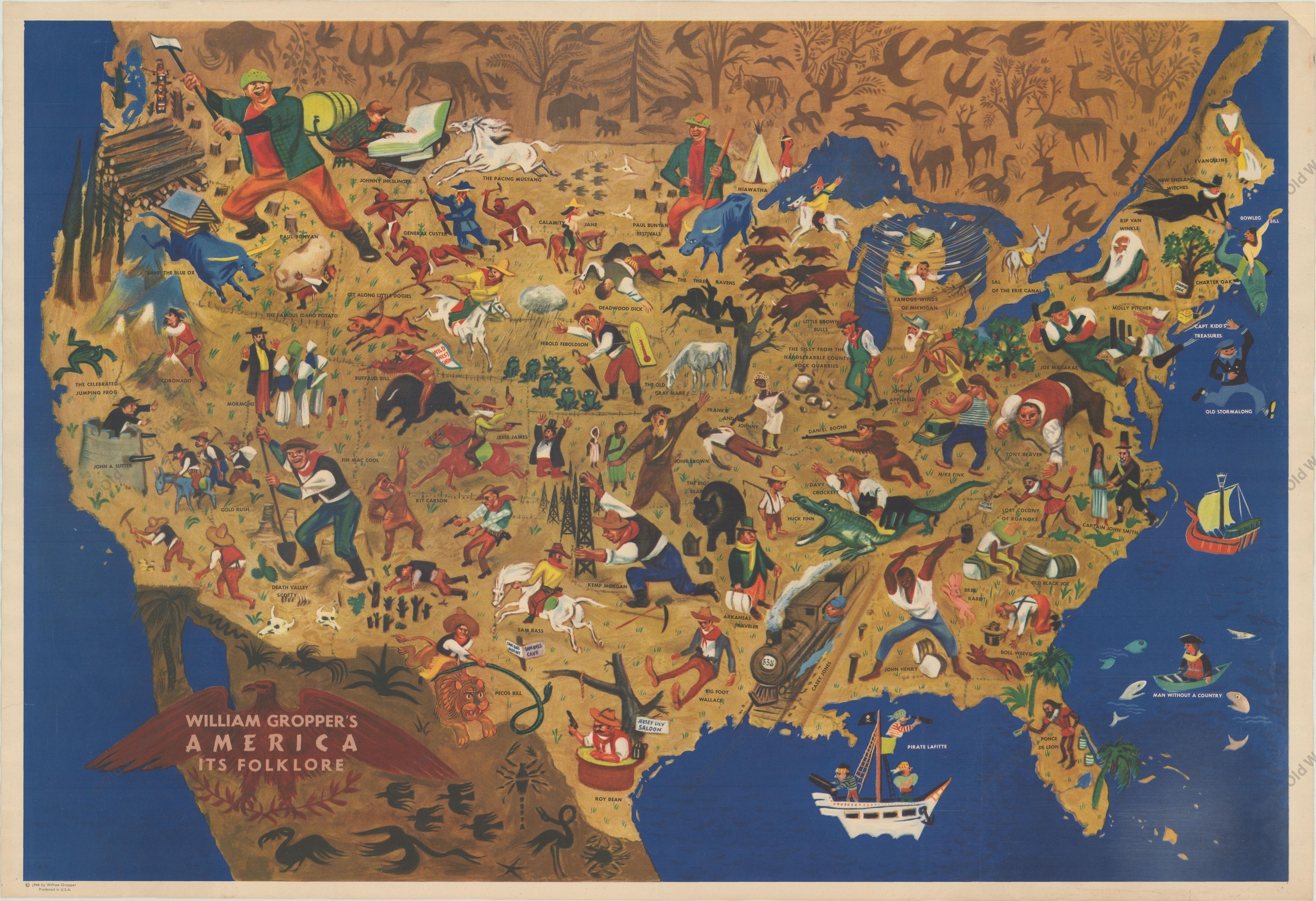
William Gropper, William Gropper’s America, its folklore, 1946.
Upon first glance, the map paints a whimsical portrayal of American folklore, highlighting the figures of Paul Bunyan, Johnny Appleseed, Daniel Boone, Davy Crockett, Huck Finn, and many, many more. Within these figures, the State Department saw an opportunity to promote the United States as a “fun-loving, welcoming, and, most important, free land.”
During the early 1950s, Roy Cohn—the chief counsel to Senator Joseph McCarthy—visited many libraries included in the Overseas Library Program and identified Gropper as a left-wing sympathizer and his work as “Communist-directed.” Although Gropper was not actually a Communist, his map was declared “un-American” and consequently destroyed. Just a few surviving copies remain today.
An interesting world in an interesting time
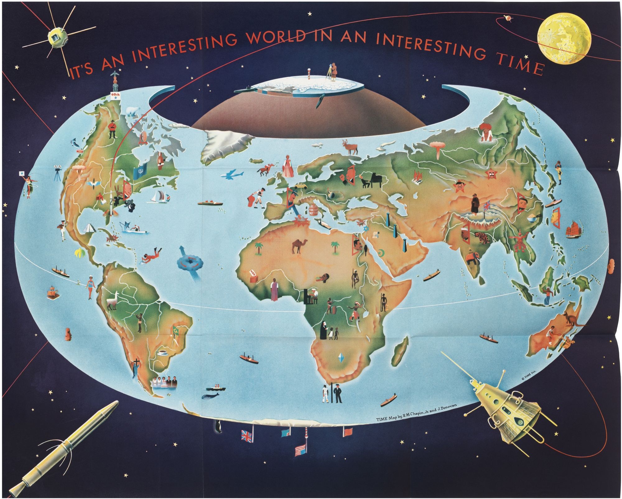
Subscribers to Time Magazine would have received this map in 1959.
May you live in an interesting world in an interesting time!
This cartoon-like poster was distributed to subscribers as part of a 1959 edition of Time Magazine. Although the map’s aesthetic style suggests a sense of lightheartedness, the graphics depict some quite frightening developments of the Cold War and Space Race; we see Khrushchev raising a fist toward Europe, various political leaders facing off, references to atomic explosions in parts of Russia and the United States, and oversized space crafts circling the globe.
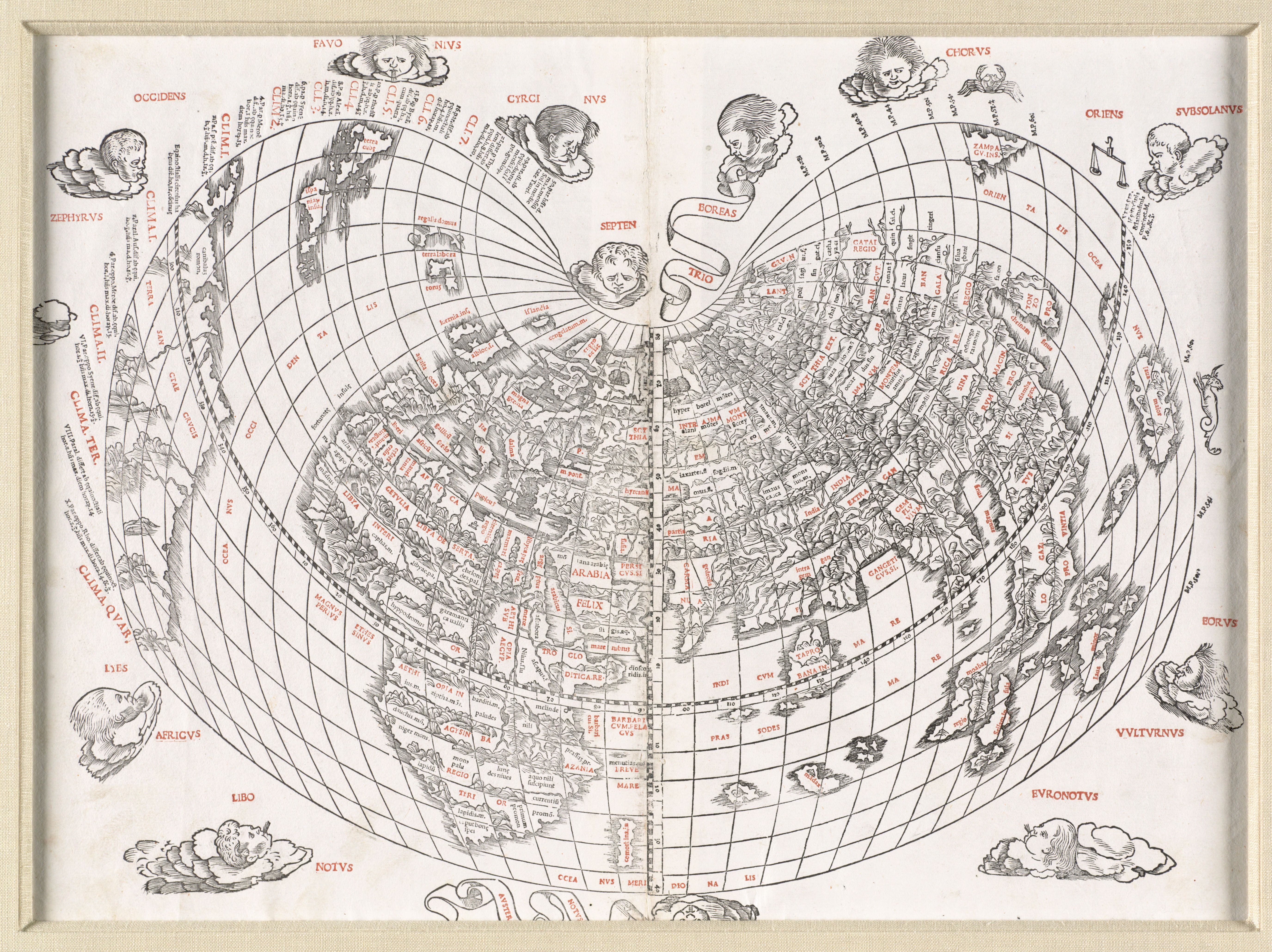
This 1511 map of the world forms a similar armadillo shape, but is actually a cordiform projection as it closely mirrors the shape of a heart.
The projection choice of this map is particularly fitting. Created in 1943 by Hungarian cartographer Erwin Raisz, the armadillo projection attempts to display a map with the “lively look of a globe,” that is, to make a “flat map… look 3-dimensional.” Placed into the context of the year 1959, the projection allows for a display of all critical world events, both on the surface of the Earth as well as outside of it in orbit. Raisz’s armadillo projection does make for an interesting challenge in depicting the Arctic—and here you can see nuclear submarines trying to jump across the projection’s gap as they making their way to the North Pole!
Keep an eye out as we digitize these new maps and add them to our Digital Collections portal!
Our articles are always free
You’ll never hit a paywall or be asked to subscribe to read our free articles. No matter who you are, our articles are free to read—in class, at home, on the train, or wherever you like. In fact, you can even reuse them under a Creative Commons CC BY-ND 2.0 license.