
Makaya Vicks

The Danger on Boston Commutes
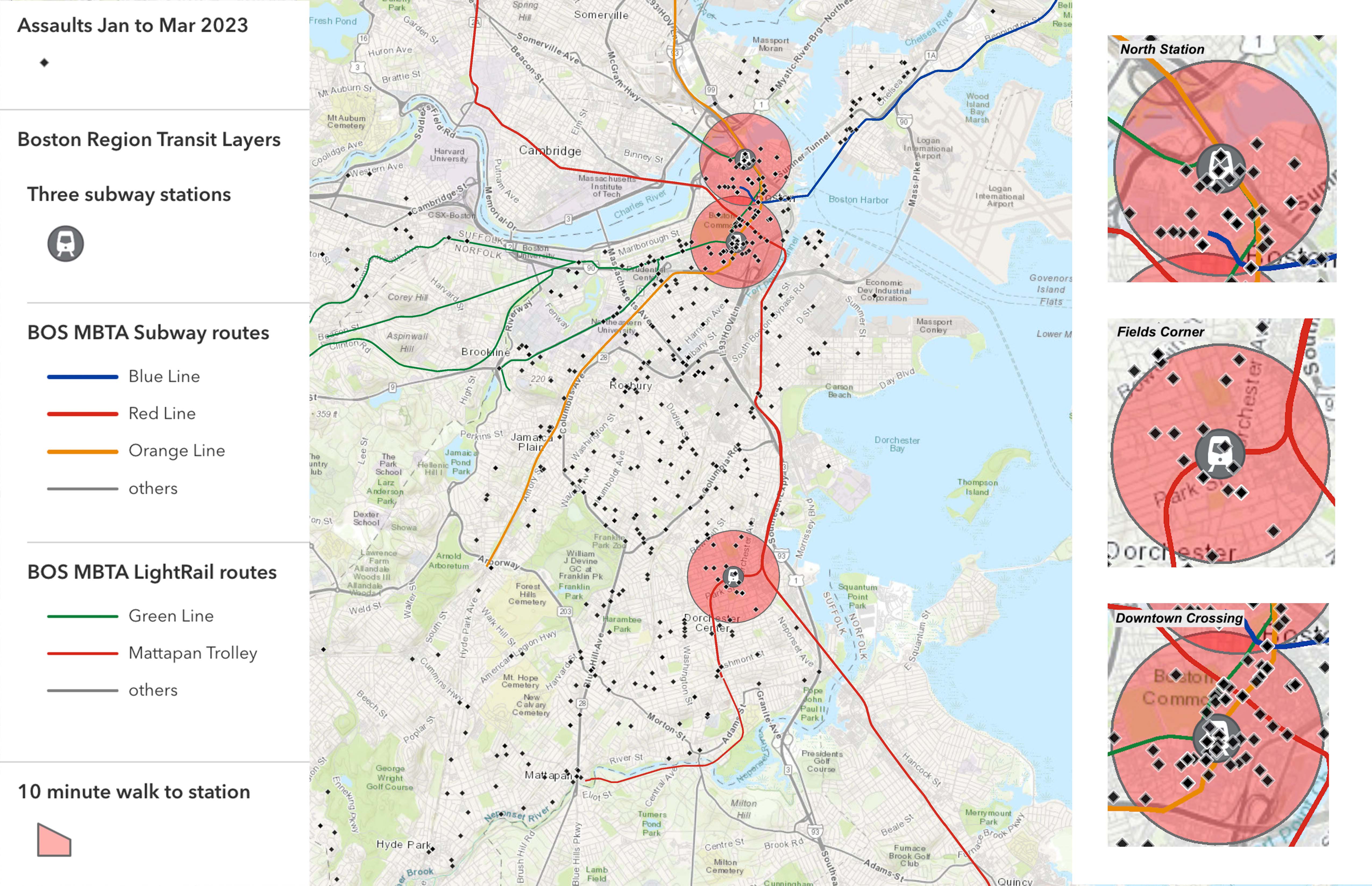
This map shows all the train stops in Boston. There are 3 big red circles around the map that represent the places where many assaults took place from January to mid-March 2023. The colorful lines around the map are all the different train routes including the Red Line, Orange Line, Blue Line, and Green Line. All the diamond dots are the assaults that happened near all the train stops. The three circles with little trains inside are used to show you the half-mile walks to the train stations. To create this map, I had to learn how to use the tools on the app. I had to find out certain information that I could include in my pop-ups and in my writing. I did some research on ArcGIS online and Google, to help me find out how many trips were taken through certain amounts of time, through a certain station, and other information. Also, a lot of my information came from the Boston Police Department public data set. To plot my points and symbolize my points, I decided that black is the color that shows more clearly, so I made most of my points black. All the big circles that are red are red because I think those are the most dangerous spots since a lot of assaults take place there, so I made them red.
I hope viewers will take away awareness and be more aware of their surroundings while they travel from place to place.