Map showing the distribution of the slave population of the southern states of the United States
Item Information
- Title:
- Map showing the distribution of the slave population of the southern states of the United States
- Description:
-
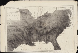
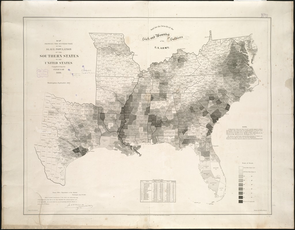
Torn in Two: Based on 1860 census data, this visually striking map plots the percentage of slaves by county for the southern states. Rather than showing a uniform istribution throughout the entire region, it is readily apparent that there were several major slave concentrations, particularly where commercial plantation agriculture was most profitable -- tobacco in coastal and piedmont Virginia and Maryland; sugar in Louisiana along the lower Mississippi River; and cotton extending in a broad swath from coastal South Carolina, through the piedmont regions of Georgia, Alabama, and the Mississippi River Valley to coastal Texas. Attesting to this map"s importance during the Civil War, it was intentionally depicted in Francis Bicknell Carpenter"s oil painting, First Reading of the Emancipation Proclamation of President Lincoln, which hangs in the U.S. Capitol Senate wing. The artist"s memoir records Abraham Lincoln"s fascination with the map, not just for its symbolic power and visual appeal, but because it allowed him to trace military movements, and to relate those actions to his emancipation policies. This map was also one the first statistical or thematic maps published in the United States. Although not explicitly acknowledged on the map, it was produced by the U.S. Coast Survey. Specifically, it was drawn by Edwin Hergesheimer, a recent German immigrant who was employed as the Survey"s Chief Draftsman. In addition, a statement boldly positioned at the map"s top center, stating that it was sold for the benefit of the U.S. Army"s sick and wounded soldiers, suggests that it reflected the interests of Alexander Dallas Bache, the Survey"s Superintendent. Bache was an ardent abolitionist and had just become vice president of the U.S. Sanitary Commission.
America Transformed: Enslaved people were introduced into the economy of the 13 British North American colonies in the 17th century. By 1860, when this map was published, the enslaved population, primarily of African descent, numbered almost four million people, comprising about 12 percent of the nation's population. This early thematic map uses shades of gray and black to plot the percentage of enslaved people by county for the southern states at the beginning of the American Civil War. In many places enslaved African people greatly outnumbered Whites. Such places often used a variety of laws and practices intended to limit communication, enact terror, and discourage revolts. Rather than a uniform distribution throughout the entire region, chattel slavery was concentrated in several regions where commercial plantation agriculture was most profitable.
- Creator:
- Hergesheimer, E. (Edwin)
- Name on Item:
-
compiled from the census of 1860 ; engr. by Th. Leonhardt ; drawn by E. Hergesheimer.
- Date:
-
1861
- Format:
-
Maps/Atlases
- Location:
-
Boston Public Library
Norman B. Leventhal Map Center - Collection (local):
-
Norman B. Leventhal Map Center Collection
- Subjects:
-
Slavery--Southern States--Maps
Southern States--Maps
- Places:
-
Southern United States (area)
- Extent:
- 1 map ; 66 x 84 cm.
- Terms of Use:
-
No known copyright restrictions.
No known restrictions on use.
- Publisher:
-
Washington, D.C :
Henry S. Graham
- Scale:
-
Scale not given.
- Language:
-
English
- Notes:
-
Map indicates by gray patterns, the percentage of slaves in each county. "It should be observed, that several counties appear comparatively light. This arises from the preponderance of whites and free blacks in the large towns in those counties. . . The figures in each county represent the percentage of slaves."
"Census Office, Department of the Interior, Washington, Sept. 9th, 1861. After a careful examination of the above very interesting map I am prepared to state that it not only furnishes the evidences of great care in its execution, but can be relied on as corresponding with the official returns of the 8th Census. [Signed in facsimile] Jos. C.G. Kennedy, Superintendent."
"Scale of shade" printed in lower right corner.
Includes population table based on census of 1860.
Description derived from published bibliography.
"Entered according to Act of Congress, A.D. 1861 by Henry S. Graham in ... District of Columbia."
"Sold for the benefit of the sick and wounded soldiers of the U.S. Army."
- Notes (exhibitions):
-
Exhibited: "Torn in Two: The 150th Anniversary of the Civil War," organized by the Norman B. Leventhal Map Center at the Boston Public Library, 2011.
Exhibited: "America transformed. Part 1: the United States expands westward," organized by the Norman B. Leventhal Map & Education Center at the Boston Public Library, 2019.
- Identifier:
-
06_01_006088
- Call #:
-
G3861.E9 1861 .M3
- Barcode:
-
39999059019511